The recent news from Nintendo of America that it is reducing the price of the 2DS was welcome if not exactly mind-blowing, but the campaign around it does feature a neat new slogan and accompanying logo. In fact, in terms of a key message and look to show off the Nintendo brand it's pretty darn good.
The slogan in question is below.
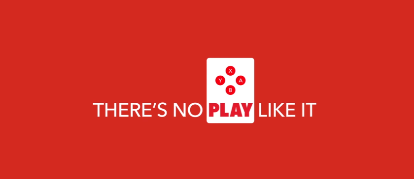
It appears at the end of a commercial for the 2DS price cut, below (thanks, Perfectly Nintendo):
With the relatively recent shift to the old-fashioned red and white Nintendo logo on social media channels, there are clearly discussions and tweaks going on around branding and messaging. For our money "there's no play like it", with the accompanying graphic, could be worth utilising more widely.
Let us know what you think of it - is this a nice slogan and design, or another forgettable bit of marketing fluff?
[source neogaf.com]


Comments 197
I don't get it.
This is perfect news. In school we are doing PowerPoints on companies and my group chose Nintendo and we couldn't find an official slogan. So this is good
I... I don't understand.
Well, it's a slogan. Yeah. It's not bad, but it's nothing mindblowing either.
In all fairness, you can say that for any other video game slogan.
"There's no way like it" "There's no play like it"? Eh. This is fine if it's reserved for Nintendo's kid friendly ads, but as an official slogan, I think it doesn't make much sense and isn't that catchy.
It doesn't make much sense.
@CreativeStriker You could always use "Touching is good." It was the infamous slogan for the DS.
Would prefer the return of "Now you're playing with power!"
Geez. Tough crowd...
@CreativeStriker What about "Get N or get out!" OR "Now you're playing with power". They've got a more history and content to talk about.
@Sir_JBizzle Just what I was thinking, too. Sheesh.
I think the slogan's pretty cool. And I like the little animation that comes with it.
There was also "Play it loud" back in the day.
The best (and only) slogan since "Please Understand".
For those that don't get it, it's actually quite simple. It's about gaming experiences you can't get anywhere else.
Quite a clever tagline really. Focuses on both the unique aspects of Nintendo hardware as well as first party gaming experiences.
It makes me feel like it is, once again, a good time to have one of the 3DS family! Just like I've felt in 2013! Specially with the silent fall of Wii U, it seems the 3DS is, in someway, coming back to its former relevance... at least by the merchandising!
And I really loved the new slogan! It's kind of inspiring to play more Nintendo games!
"There's no play like it" Sounds pretty pretentious.
Still wont replace "Now your playing with Power,Nintendo Power!"
@SageWaterDragon its a play on words
There's no place like it = There's no play like it
$79 including Mario Kart! Amazing!
I don't like it at all. It just doesn't feel natural, it feels forced.
@A01 The Xbox One's slogan is "All in One. Xbox One." And I think Xbox 360's was "Jump In."
@GeminiSaint when did they use that one? I don't recall ever hearing it.
It sounds like someone attempting to make a pun but failing at it.
The slogan sounds like a 5 year old wrote it. It's not proper English. If they're not referring to a theatrical play, then they're referring to the verb (obviously). Sounds like they still have the same marketing team who thought "Wii U" was a good name.
I don't get why no one understands it. There's no place like it (Nintendo) but it flips it to play--there's no place to play like it. I like it. It's odd, not without its imperfections, but I'm fond of it. Granted, I've been accused of being a hipster so who knows, but its odd, distinct, yet playful slogan is quite appealing.
To the rest of y'all, what would you prefer? I'm totally open and curious
"Play it Loud" was the Nintendo slogan I remember the most.
@Mr_Zurkon
I screwed up. I meant to say "play it loud".
Honestly between the logo and the phrase I'm really digging it and would put money it's going to be the slogan for the NX.
Also for those of you looking for one I don't think it's a pun or play on words it's literally just a phrase. Like It Only Does Everything.
"There's no play like it" It certainly makes the point that Nintendo gives a unique experience.
Sceptic that I am I immediately thought, "That was kind of the problem with the Wii U though, wasn't it? Too unique and not enough broad appeal."
I know what is intended, but I can easily see ways of turning it against them.
To be fair that only applies to the system and not the game experience, and you can mess with almost slogan to skew the intended effect. I actually rather like it.
@Radixxs That's the first thing that came to my mind.
@GeminiSaint I don't remember that one either! Where the heck have I been? Lol
@gokev13 Me, too. It was the closest to my heart because I remember hooking up my first stereo(an old Yorx my Grandma gave me), and playing all of my Super Nintendo favorites in STEREO SOUND!! So awesome!!!
Horrible slogan. It takes too much time to process, probably bc of the negative construction.
Atleast they made the old logo back and that's awesome!
There's no censorship like it!
I've always thought Shakespeare had a penchant for writing memorable video game slogans (among other things). My favourite of his was this:
"All the world's a stage,
And all the men and women merely players"
Super Mario Bros. in particular has some excellent Worlds that Shakespeare could have been referring to. For example, all of World 1-1 is a stage. World 1-2 is also a stage. And World 1-3. In fact, all the Worlds are stages, and all men and women their players. I'm pretty sure that's what Shakespeare meant.
He really summed up man's ephemeral nature and his brief time on this Earth. He lives, he jumps, he falls down a hole. Such is human existence, and so it plays out time and time again.
Pretty sure this is not English. Seems more like a bad translation, and "play" was the closest word they could find...which, in this context, is not a noun...yet?
Try replacing it with other verbs, and it's just as non-sensical:
"There's no perform like it."
Very 4th gen-like.
This is probably Nintendo's response to "Sega does what Nintendon't".
Now if only Nintendo had the consoles and game quality to truly back up their claim.
The slogan doesn't make much sense. It looks nice, the 2DS price cut is great for anyone put off by the $200 model, but if I worked for Nintendo, I would have it be "Who's your daddy?" as Nintendo is old enough to back it up. Plus, it's catchy!
What exactly is "a play" in this context?
Surprised at the confusion over the slogan. It's simple and straightforward and frankly, for fans, accurate. No one offers the kind of gaming that Nintendo does. "There's no play like it." Same idea as "There's no place like it". It's intentionally non-confrontational, as well, because it doesn't even state it's better or that you should abandon competitors, just that it's unique.
@callmeking17 A theatrical play is not the only way to use play as a noun. Even so, playing with the usual parts of speech and grammar is a classic and effective way to grab attention which is what a slogan does. It works best when you want to express some informal or rebel spirit: "Think Different" for instance.
I really like it, it's just as good as "now your playing with power", and "get N or get out", ppl are just remembering those slogans with nostalgia and that's why they love them so much
@manu0
The first definition of play as a noun works:
activity engaged in for enjoyment and recreation, especially by children.
"a child at play may use a stick as an airplane"
@aaronsullivan exactly, thank you! I'm not getting the confusion or hate ppl are having with this slogan.
It's not great is it?
@bherdm I like that.
None of the modern generation understands what it means.... Because it is no longer true.
I also like this slogan. At the very least, they have a slogan.
I didn't realize so many people never saw the word play used as a noun or lack the imagination to understand how it could be. Sort of stunning to me. And this from Nintendo gamers who ostensibly read much more than other gamers who don't have to rely on text boxes for everything.
@aaronsullivan That no longer applies with the worst generation, there is no longer a distinction.
Which is why they cant comprehend its simple meaning.
For the head scratchers, its talking the unique brand of game design Nintendo once wielded that trail blazed and molded an entire medium. Unless the slogan is a promise to cast off the current direction of atrophied design, and pandering to the lowest common worst generation moron, its a hollow promise and a moot point.
Both PlayStation and Microsoft have claimed that their console is "the best place to play" this generation. Nintendo's claim that "there's no play like it" perfectly captures Nintendo's spirit, especially in contrast to their competitors.
@3MonthBeef If the play on words is meant to be a pun of some kind, the closest available idiomatic expression is, "There's no place like home." Your example of "there's no place like it" is not a common phrase at all, so it is not a viable referent. Either way, the slogan is crap, and Nintendo should ask for its money back from whatever agency produced it.
Meh. Sounds like someone not enunciating the key word there. Doesn't strike as a clever play on words.
@Indy83 As far as game consoles go, both in spirit and technically I find you incorrect. Nintendo offers a lineup of games and experiences wholly unlike the others. Whether it's the worst generation or not is irrelevant except that the suggestion gives insight into your disposition.
I like it.
It's not mind blowing but it does drive the point home- the one selling point Nintendo has- unique gaming experiences. That is the ONLY thing that still has the power to sell their products, so it's important that whatever slogan they use encapsulates that message.
And it's true. There really isn't anywhere else you can experiencing the kind of play that you can on a Nintendo platform. Their games are very much against the grain of the mainstream. There is a place in the market for all kinds of preferences. They don't need the lion's share, they only need to strengthen their base of fans that enjoy their types of video game experiences.
I didn't like it at first, too generic, and I'm a negative person so that's to be expected. I did like seeing it in motion though, with the little Pavlov's dog bell jingle accompanying it.
Of course my bigger concern is, why are they putting any time and effort into promoting obsolete tech when they should be working on promoting NX. If it was a New 2DS ok, then kids could play with their amiibo, but it's basically an ad for clearing out old merchandise.
Anybody on Nintendo Life wanting Nintendo to take advantage of the "New" power can't also be excited about 2DS marketing.
On 2nd thought, There's no play like it sounds like a McDonald's ad. Or an ad for the play area at a McDonalds.
Oh well, it's marketing, guess I should shut up and be happy and consider it practice for the NX launch.
Final good thought - this could be based on Lewis Carroll, and I'm a fan of classic literature:
There is a place, like no place on Earth. A land full of wonder, mystery and danger. Some say to survive it you need to be as mad as a hatter. Which luckily I am.
If your paying attention to the logos in the commercials your doing it wrong.
@aaronsullivan No, but they used too. But thats dead now. Literally.
Nintendo is rapidly conforming to every moronic frothing at the bit for a flip shareholders demands to become just like every other AAA garbage heap, and unless this is the beginning of a sudden reversal of direction...
Get used to more like Federation forces, which is a bog standard co-op arena shooter with metroid branding slapped onto it to, and I quote "Leverage the branding power of our IP's", and kiss things that are actually unique, like actual Metroid, of which nothing like it exists anywhere any more, good bye.
@bherdm "Nintendo Power" might have to YouTube old NES commercials now lol
I think it's really stupid. Nintendo has terrible marketing.
I guess it's trying to say no one is playing Nintendo systems?
....someone needs fired, like, yesterday.
Obviously, they can't go back to 'Now you're playing with Power' as they don't have very powerful consoles.
In regards to this new one, though... I don't think it's very good or memorable...
It's quite fitting. They're doing their own thing, and have been for a long time. They're great at it. The best game of all time (Mario Maker) came out in September, and that couldn't have been done on any other platform. It's only possible on Wii U (maybe 3DS) because of the gamepad and stylus that make it so easy to create great content.
"Wii would like to play" was always my favorite.
Slogan or not it was short, catchy, and memorable.
With this being in a 3DS ad, I think they're putting emphasis on the fact that there really is no "play" like it, when you consider that the main competition (smartphones and tablet) has no buttons. While I think the slogan sounds weird to say, it does bring home why I'd rather play a Nintendo portable console than a mobile game. Hence the classic Nintendo button layout above the keyword "play"
Eh, not horrible, but could be better, in my opinion. When it comes to slogans, I think simple, short, and easy to remember ones are the best. And... I don't think this slogan is any of those. I don't know, I just don't think it sounds very business-like... doesn't roll off the tongue either. Oh well, if it works, then I'm fine with it.
My favorite gaming slogan is "SEGA does what Nintendon't". I've always thought that was so clever.
There's no play that'll catch on.
@ColdingLight I mean not really, there's literally no play like the 3DS
@ColdingLight : PS4's "This one's for the gamers " is pretentious. While there is an elitist air in almost any slogan, Nintendo's claim holds more validity than Sony's.
Ugh. I bet this was the best idea of the bunch.
@Mega719
There is no pun on play. That part is straight. The whole thing is straight.
Its a play on a common phrase, but there is no word play or pun usage, it is very straightforward.
@CreativeStriker That is so cute.
Well sounds better than Greatness Awaits...At least I know this is about having fun.
@Radixxs Finally, someone else who gets it.
Awful slogan, nuff said!
Market fluff... Nintendo is dropping Wii U and soon to drop new 3ds.
It's about over.
Nintendo's new policy: NX or bust!
Sony likes to use their keypad symbols in advertising, Why not Nintendo? It's nice to see A,B,X,Y instead of Sony's Square,Circle,Triangle and X.
Pretty nice. Nothing spectacularly catchy, but alright. I wonder if they'll stick with this for NX.
Is there some sort of pun there that I'm not getting?
'There's no play like it'
What about King Lear?
@Danrenfroe2016
Do you have any idea what you're talkin about?!
@Indy83
Did you really need to post three times about how awful you think Nintendo has gotten?
@3MonthBeef
I won't buy another console for a couple years, so I know nothing about the NX, but you're not talking about a direct connection with mobile devices, are you? That sounds awful.
"what's google playing?" is a slogan?! I've never heard it before, but yeah, it sucks, much worse than this one.
(sorry, I haven't watched any commercials in years...)
@MailOrderNinja
"Like It Only Does Everything" is a slogan? Never heard of it. What's it for?
@Ryu_Niiyama
"Greatness Awaits" is a slogan? What for? Never heard of it.
@nab1
Agreed. I don't ever want to play games without any buttons - using phones is so crappy, and I definitely don't ever want a tablet. Wait, Vita doesn't have buttons?! Anyway, in addition to buttons, if the ad were for actual 3DS and not 2DS, there'd also be the unique experience of glasses-free 3D gaming!
@DinoFett
No kidding! The shapes don't look bad on the Playstation ads, but my whole life I thought having them on the controller buttons was so lame and such a bad way of designating buttons. Much harder to explain combos and cheats too - and even memorize them yourself in your head ("triangle, circle, circle, triangle, square, triangle..." as opposed to "A, B, B, A, Y, A...")
@Dakt
Sorry, I'm from the US, but I didn't know that being "cheeky" wasn't safe - is it like when you're making fun of something? What's the closest word to the meaning of it?
When you have to explain a slogan, it's not a good slogan at all.
@arojilla
I don't feel like it should be necessary with this one. It's not the greatest, but it does make sense, and it's better than that PS4 one.
@Geno-Beatdown "I don't feel", well, that's the thing, you don't need explaining of this slogan, but you are not everyone. Look at the almost 100 previous comments and you can see this slogan is confusing for a lot of people.
I don't believe that just because a slogan is initially hard to parse that it's automatically rendered worthless. Peculiar uses of grammar can potentially make a slogan more unique and intriguing.
As someone has mentioned, Apple's slogan would be much less iconic if it were the standard "Think differently", and McDonald's slogan would be completely generic and forgettable if it were just "McDonald's: I love it".
I'm not praising it to high heaven, but the point of slogans is that they get repeated frequently over a period of time. As such, first impressions aren't everything.
It's grown in my since I first heard it. I can at least now make sense of it, which is progress. It's a bit less clunky than "The form of play that can be enjoyed on Nintendo systems cannot be found elsewhere", anyway. So it's just as well they didn't pay me to come up with that.
I see what they've done.
A play on words; I have to go with the fluff.
I thought it was pretty self-explanatory, cribbing from "There's no place like it", since Nintendo has long been the unique alternative to the PC-like Sony and Microsoft platforms.
@3MonthBeef "almost"
For the players really annoys me every time I see one of those dam ps4 commercials
@sandman89 That's the point though, isn't it? It's implying that in not owning a PS4, you're not part of that club. You're not a player. You're not a real gamer. It's an exclusivity and superiority thing.
It's also distanced itself from the childish connotations of 'play', by referring to 'players' rather than 'playing'. It's riffing off the adult connotations of being a 'player' to imply that using a PS4 is a cool, mature, grown up thing to do.
Which probably especially resonates with a particular demographic who are the exact opposite of all those things.
I hate it, personally. But I also think it's really good.
I'm not saying it's rubbish or anything its clever like you say but I do hate it😂
Sorry, but that slogan image looks crap, and the line is kinda crap too.
I'm very happy to see Nintendo go back to its old red logo, but nothing about that slogan image or line works, imo.
Edit: It works/looks a little better in the actual video at least.
I like it. I think this, in combination with changing the logo back to red, means Nintendo has moved away from Iwata's age of minimalism.
@bherdm Except, they'd actually have to make properly powerful systems again for that to carry any weight.
I know the ad's aimed toward little kids, but if it's gonna be the same for other products, I think the noise sounds too childish. I thought that a little bit about the GameCube logo thing, but this is definitely worse.
@Kirk
Seems like you liked it much more after seeing it in the video. I was the opposite.
OK, how about:
Same slogan with a slightly different layout:
And, one that's a bit more personal/relevant to me:
Those all took me literally five mins to come up with while I was showering, and then 20 mins to put together in Photoshop.
The guy's Nintendo's paying aren't worth it, imo.
"Is this a nice slogan and design, or another forgettable bit of marketing fluff?"
It can be both. It is both.
@arojilla
I disagree. If it gets people talking, Nintendo will be very happy.
(Though I don't see what's not to get)
@rjejr "Of course my bigger concern is, why are they putting any time and effort into promoting obsolete tech when they should be working on promoting NX. If it was a New 2DS ok, then kids could play with their amiibo, but it's basically an ad for clearing out old merchandise.
Anybody on Nintendo Life wanting Nintendo to take advantage of the "New" power can't also be excited about 2DS marketing."
It's basic marketing.
You have a product that has received a nationwide price cut and you've issued a press release. You advertise said product to maximise the sales spike and get as much sales as possible from the news and the advert.
If Nintendo didn't put out any ad for the 2DS following the price cut that would be the very definition of marketing stupidity.
@electrolite77 Then we have different views on what a slogan is or what purpose it serves. Sony got it right, as much as I dislike their PS4 slogan. I agree with @Maxz here.
EDIT: and BTW, the only people talking about it are we Nintendo users, followers and/or fans, and sadly not for the good reasons as you can see. Everyone else just doesn't care.
@Kirk Nintendo breath? Some sort of condition afflicting people who are too busy playing videogames to maintain a regular oral hygiene routine?
@Skunkfish Quite possibly. It could also be related to Nintendo thumb.
I'll go fix them. . . .
Edit: Done. Cheers, Skunkfish.
@electrolite77 Yeah, I don't see what's not to get, either. I think they should make the noise sound cooler, but I definitely think it's better than the Sony one that was mentioned, what about you?
@Kirk The word "live" could too easily be misconstrued as Live gaming rather that living gaming.
Breathing a brand name is a poor choice. In branding and marketing you don't want to state it explicitly. You want to have it be a more subtle effect. Stating it explicitly makes your brand sound needy. It also draws
You need to maybe go back to the drawing board and define what brand attributes you want to promote/showcase. At the moment, even if you turn it to Love gaming, breath Nintendo, it doesn't showcase anything worthwhile. It doesn't speak to people in a meaningful way.
Nintendo's tagline in its present form at least showcases that Nintendo is the place for unique gaming experiences whether it be on their hardware or their software.
@Geno-Beatdown Sorry for the confusion, there should have been a comma. It Only Does everything was a slogan for the PS3.
@jsty3105 Sadly, there's no real way to get around that with how the English language works. It's intended to be read as live (alive) but some people might indeed read it as live "viewed live" at first glance. In the context of the whole "Live and breathe" phrase, however, it should make sense to most people, as you don't really tend to say that you "Live (view live) and breathe" something.
Also, you're not breathing the brand name; you're breathing what Nintendo is and represents. Nintendo is like the air that you breath if you love gaming. You know, it's not really THAT complicated: It's based on the very well known and simple to understand phrase/notion "To live and breathe" something, which is what people say when someone's really passionate about something and it's their whole life. "They live and breathe Nintendo."
I also could have said something like "Live for gaming" or "You Live for gaming" but someone like you would find a way to make even that confusing, I have no doubt, and it wouldn't flow as nice with the "Breathe Nintendo" part afterwards. And, something like "You live for gaming. You breathe Nintendo." really isn't quite as catchy.
If you know how to read English properly and you have even the slightest awareness of popular phrases, it reads correctly. And, if you don't read it correctly (at least by the second glance) you're probably not intelligent enough to know how to hold a controller or press the Start button, or whatever, anyway.
PS. Loving gaming and breathing Nintendo have zero connection in context of using those two words/descriptors in general use together, and when you use those two words like that it basically doesn't make sense (although, of course I know what you mean), in the way you incorrectly think my use doesn't make sense (like you've never heard the phrase "To live and breathe"). So, your version is not actually based on a well known phrase (it's just two applicable words stuck around gaming and Nintendo); my use is based on a well know phrase. Again, it's not THAT complicated to grasp.
@Kirk Dude. I gave you an honest and respectable critique of the draft with no attack on your abilities or your level of comprehension of branding and marketing. It's your business if you choose to disregard it but the way you've done so is a little uncalled for.
@jsty3105 And I'm giving you honest and blunt feedback on your take on things.
If I'd said something like "Play games. Taste Nintendo", I'd get you. But I didn't say something so stupid and disconnected.
It's not always necessary to make everything fit to the absolute lowest common denominator, you know.
Any semi-intelligent person will know the phrase "To live and breathe" and will understand the word "live" is being used as meaning living/life/live in the context of that slogan too. But, if they honestly don't get it, maybe any slogan is ultimately beyond them anyway. Unless we really do make it basically entirely patronising, like "Playing Nintendo games is great fun."
I don't think we need to lower ourselves to that level. If we did, Nintendo's slogan above would read something like "Playing video games on other systems isn't quite the same as playing Nintendo games on Nintendo systems."
PS. It's not my business; I'm just putting up an idea for a different slogan Nintendo could use--and it's certainly better than the one they went with, imo, despite your assertion that it might confuse some people or whatever. Most people are still kinda confused exactly what Nintendo's slogan above is really saying, even though I'm sure they get the gist of it, and that's an actual real slogan that a hugely successful international entertainment company decided to use.
Wow, very disappointing. Awkward, clunky, and uninspired.
@Kirk I prefer yours to Nintendo's Kirk
@Kirk You need to reevaluate your delivery of feedback then. I stand by my critique and believe it would shared by at least some in the industry.
I doubt you're able to receive more feedback so there's no point in me addressing the points you've elaborated on.
@jsty3105 As I said, I too thought the same thing when I was making it--that some people would actually think it meant "view live" on first glance--but I still went with it anyway because ultimately it's stupid to think people are too dumb to actually take the two seconds to figure out the use of the word "live" correctly in the context of the slogan. And, once you've taken the two seconds the re-read the slogan, which isn't unusual with most slogans anyway, you should get that it's a simple play on the well known phrase "to live and breathe". "Live gaming. Breathe Nintendo." It takes two seconds to fully grasp what it's saying to you--and I have confidence that most people would manage to do so. I'm giving the consumer/reader some benefit of the doubt here.
Imaging for a second if we didn't even assume a minimum level of consumer intelligence when using slogans like "We would like to play" (With what?), or "Touching is good" (Is that suggesting paedophilia?), or "It's for the gamers" (What's for the gamers?), or "Jump in" (What . . . into a pond and drown myself?"), or "Now you're playing with power!" (But I might get an electric shock), or "There's no play like it" (WTF?). . . .
I think you [maybe subconsciously, and maybe not] just needed to find issue with my slogan because I'm an arrogant douche who's acting like I'm better than Nintendo, but that's not the same as there being any real/genuine issue with slogan. The slogan works, big time.
Being a Graphic Designer, I will say that this is a nice design and concept. The one thing that worries me as a Nintendo fan is that the "There's No Play Like It." is setting up for what the NX would be. When you make a slogan like this, it's intended to be used for at least a couple years. It makes me worried that Nintendo is going to throw some sort of gimmick (key word being Play) in with the NX.
Just my personal take, we'll see.
@jsty3105 "that would be the very definition of marketing stupidity."
Well Nintendo are the experts at marketing stupidity, that's for sure.
I like the button animation (also suggests NX will have a traditional control scheme? Or at least the cross like button layout even if not physical buttons...Nintendo wouldn't waste marketing dollars to scrap this initiative in 9 months. The problem I have with it is the lack of the nintendo logo on during the catchphrase. Seems to me Nintendo needs all the brand reinforcement they can get during advertising.
@MoonKnight7 we are on the same train of thought. I hope the traditional button layout suggests good things for NX controls.
@Kaviam Yeah, every one of those is def better.
@rjejr Every company, even the big ones have and are capable of acts of marketing stupidity. Coke is probably the most famous example and is in every major marketing textbook.
In this case, advertising a product that has just received an official price cut is just basic, standard marketing.
Criticising them for doing that is puzzling.
The problem I have with their new slogan is that I don't think most people will even know the general phrase "There's no place like it", so it doesn't really mean anything to them. They'll just take a broad stoke and be like "OK, so you're saying there's nowhere [nothing] else quite like Nintendo's consoles/games." That's super . . . fine and dandy.
Also, maybe its new slogan would have been more powerful back in the days of NES, SNES, and even N64, where it really would ring true. Now, it feels like it's trying to convince people of something that most people don't actually believe or feel at all any more (unless gimmicks give you that sense of there being "no play like Nintendo"). I guess for the most hardcore and loyal fans it will still ring true. But, as per usual, it seems like Nintendo's once again just preaching to the choir--when it really needs to be getting everyone else on board, imo.
Maybe the real problem here is that Nintendo basically can't make any of this stuff ultimately matter or resonate with gamers and consumers--and not just sound a bit like junk--until it starts to make consoles and games that genuinely blow away and excite people beyond its currently most hardcore and loyal fans again.
@Kirk That exactly what that slogan is going for.
@Barely_Able As the video already starts with Nintendo branding and features Nintendo products the agency probably felt it unnecessary to plaster the logo on the end bit too.
Also, Nintendo's branding identity considerations means that you'll immediately have conflict between the logo and the slogan because the logo will need to be centralised in that particular presentation. Given the choice and that the end frame also references Nintendo through the web link, it would be better to go without the logo there.
Without a doubt, we'll see Nintendo's logo on other materials that have this slogan - just not this video.
@Barely_Able
Yeah, it could go both ways. The traditional buttons pull it one way, but the slogan itself pulls it toward gimmick territory. I just don't know what they're implying here.
That said, I really do like the design of it. It's simple, clear and I like the boldness of the "Play" font in reversed color. It's got a nice emphasis of the most important word in the slogan.
@Skunkfish Me too; me too.
@Geno-Beatdown Well, I think maybe the red doesn't look so harsh/garish in the video or something. And, the animation probably helps a bit too--I always appreciate a little bit of animation on whatever. It's not great, but it's OK, I guess.
@jsty3105 "Criticising them for doing that is puzzling."
I think the marketing is puzzling on 2 fronts.
1. They don't want to tell us anything about the NX except that it launches next March, has Zelda U port called Zelda NX (that game is nearly 2 years old now, can it please get a name already?) and they won't be showing it at E3. But 2DS they want to spend time and money marketing? How much income are they generating on a $79 2DS? Where's the Wii U price cut, that $299 for a 4 year old dead system is absurd.
2. It's old hardware. You can't play XC on it, HWL won't run very well on it, the recently announced SNES VC games won't work on it. No built in NFC for all of those amiibo cards for AC:HHD.
https://www.nintendolife.com/news/2016/03/heres_why_snes_vc_games_can_only_be_played_on_a_new_3ds
Yes, price cuts should be promoted, but this seems less like your typical price cut, more like a clearance dump of old merchandise.
Target is still selling the Wii Mini for $99. Should they make a big deal when that gets a price cut to $79 as well?
If and when they make a New 2DS, even if it's $99, I'm all for promoting that, which would be current gen hardware. This just doesn't strike me as very exciting.
But for Nintendo in 2016 I guess we need to get excited whenever we get the chance, huh?
@Kirk I like the last ad, but the first 2 make me think of e-cigs.
@rjejr I would be incredibly surprised if Target didn't mention it in their pricing if they cut the price of thewii mini. Doubly so if Nintendo was the one to announce that price cut and there was no mention
@rjejr Well, the last ad is just me poking a bit of fun at how negative I am of Nintendo these days, and how I obviously have a lot of issues with the company. I really did love the SNES though. lol
Yeah, don't breathe Nintendo too hard: You may choke on it.
Nintendo: Now you're playing with weaksauce.
I have another one:
lol
Back in the DSi days that could have read "Love Nintendo or DSi trying"
There's no play like Nintendo would have sounded better.
@johnodaz Or how about "Nothing plays quite like Nintendo", "Go Nintendo or go home", "Work all day . . . rest a while . . . play Nintendo", "Eat when you're hungry, sleep when you're tired, and breathe Nintendo", "The Nintendo Difference", "The Nindifference" (indeed), Nin . . . ten . . . all the way up to eleven" "Nintenf'ndoes, Sega! Where you now!". . . .
I could go on.
@Kirk You inspired me, but there's only so much I can do in MS Paint in 3 minutes. I'm thinking it might be good for the NX unveiling.
@rjejr Love it. lol
And, funnily, that's almost exactly what came to my mind when I read Nintendo's new slogan above: It's desperately trying to convince people of something that I don't think most people actually believe is true any more.
"Our consoles and games are amazing, and unlike anyone else--honestly. PLEEEASE play Nintendo."
@PanicPuppet92 Yeah that was their best by far.
The 90s are back, I see...
@jsty3105 But I'm not expecting an official price cut on the Wii Mini, ever, it's old tech, I just keep checking the Wii Mini box every week waiting for the $48.98 red clearance sticker on it. I figure it's worth it for $50 for the game - to trade in or give away - and the red Wiimote.
Just like 2DS is probably worth it for MK and to give to a kid who doesn't know any better, but where's the New 2DS with the new CPU power and 2nd control nub? That's the real promotion, this is simply clearing out old stock before they announce the New 2DS. Do you think Ntineod makes a big announcement about price cuts on the old 3DS and 3DS XL?
A New 2DS?! Hahaha... what a silly idea.
@Kirk
Give it a rest. We get it - you don't like Nintendo anymore! You only enjoy complaining about Nintendo... They're not desperate to convince people of anything, because they never stopped being unique and innovative.
The 3DS is still a huge success in all regions, and by far the most impressive portable system. It's still one-of-a-kind, over five years later. The Wii U is definitely the most unique experience on the home consoles. Neither one relies on gimmicks, because a gimmick would be something that's NOT actually capable of improving or enhancing the gameplay experience.
@rjejr New 2DS? Don't be silly. Who would be the market for such a product?
And yes. Nintendo does and did make ads around the price cuts of of their other consoles.
I think it's bad. I'm not sure why they can't just use the basic Nintendo logo, it's more recognizable. If you show people this new one, I'm sure they would not know what company it's for.
The return to iconic red is very nostalgic for us older Nintendo fans that grew up with them in the early eras. As for 'There's no play like it" - it;s an emphasis on Nintendo's desire for gameplay and innovation first. I think it's a strong message that states: "we are and have always been different from the competition and everyone knows it".
@Geno-Beatdown I didn't say Nintendo wasn't unique and innovative anymore (it absolutely is); I'm saying [matter of fact] it isn't anywhere near as great anymore, and that's what it's trying to convince everyone one of, that it's still the greatest thing since sliced bread, which anyone that isn't a blind fanboy knows is basically bull at this point in time. At its best Nintendo is still great (although not clearly the greatest), but a huge number of companies out there now regularly trump Nintendo in almost every respect with their games hardware and software these days, even some tiny indie teams--which would have been a basically ridiculous notion in the likes of the NES, SNES, and N64 era. And that's why I'm saying the whole "There's no play like it" is a bunch of self-indulgent junk that only the choir actually sings at this point. Get me?
That slogan is basically cringe and embarrassing to anyone that isn't already firmly onboard Nintendo's bandwagon already—you know, that ever-dwindling and blindly loyal group of the hardest-of-hardcore Nintendo fans—which makes it largely worthless.
And, the more I say it (all the negative but ultimately bluntly honest stuff), the more likely someone that actually matters will hear it, and the more chance maybe things will change for the better . . . so, I ain't stopping for the likes of you.
@jsty3105 "Who would be the market for such a product?"
Well, who would be the market for a console that plays 3DS games but without the 3D effect in the first place?
New 2DS would be for people who want:
1. the 2DS form factor - no hinge - w/ the new CPU power
2. to play XC and SNES VC and HWL at it's best.
3. to use amiibo and amiibo cards w/o the portal
4. to use the "nub" for games like Monster Hunter
I never understood why anybody would want a 2DS in the first place, it's ugly, no 3D, mono sound - seriously, mono sound WTF? - and it doesn't fold up to fit in your pocket. But apparently some people do want it. So I'm gussing the people who do want a 2DS woudl want a New 2DS more.
Now who wants a $299 Wii U, thats the real question, isn't it.
@Kirk ""There's no play like it" is a bunch of self-indulgent junk that only the choir actually sings at this point. Get me?
That slogan is basically cringe and embarrassing to anyone that isn't already firmly onboard Nintendo's bandwagon already—you know, that ever-dwindling and blindly loyal group of the hardest-of-hardcore Nintendo fans—which makes it largely worthless."
As much as I'm still unequivocal on the ad, and even more the fact that they are promoting the 2DS, or really that the 2DS even exists, when you put them all together it kind of works.
This isn't a Wii U or NX ad, it's an ad for clearing out old 2DS inventory, whether there ever is a new 2DS or not all the New 3DS power makes 2DS a pretty much worthless device. Well not so much a worthless device, but a kids toy, bought by parents who buy their kids "Happy Meals" for the toys. 2DS is, at $79.99, a Happy Meal toy.
Look at that red Ntinedo ad and slogan. It's McDonalds "I'm loving it" jingle. It's McDonalds playground areas for kids.
Small print is hard to read, but it's what Ntinedo is going after.
Now once the NX rolls out and they try to target adults and teens w/ that slogan/logo, well I'm right there with ya. But it doesn't actually say Nitneod, so it's possible this is just a 2DS thing aimed at McDonalds fans. And in that regard it works.
NX is more doomed than I thought if they keep using it though. 10 months from now I'd say it's long forgotten, probably just a 2DS summer ad campaign for the kids, it will pass. I hope. Otherwise, I'm not lovin it.
"There's no play like it" is quite brilliant and works on many levels, well done Nintendo. It reminds people how unique is the Nintendo hardware/software - something that is their primary objective, and it changes the conversation from "games" to "play", giving it a nice spin. Love it. Music bit very catchy too.
@rjejr The 2DS has always only been targetted at the very young. All the features you listed except for the amiibo functionality won't mean anything to them. And the hinge? That becomes a feature rather than a negative.
@rjejr Yeah, good point, it might just be a slogan for 2DS (and maybe 3DS too), which wouldn't be quite so "try hard" and desperate in that case.
@3MonthBeef LOLOL agreed. I usually have a massive library for each of my systems but Sony and MS have been disappointments this gen for me. I'm getting more playtime out of the ps4 than the one but like you said so many remasters (many of which I already have on pc) is making the library a little on the light side this gen for me.
@Geno-Beatdown Greatness Awaits is Sony's current slogan for the ps4. I remember going "WTH?" the first time I saw an ad for it. I still say it is one of dumbest, most obscure, most pretentious slogans I've ever seen...and I used to work for Apple.
Get N or Get out was my favorite slogan personally but I was at the height of my fangirl mode when I only owned Nintendo systems during the N64 era. I branched back out later but I remember loving how that slogan made it feel like Nintendo gaming was the only gaming around.
@jsty3105 "except for the amiibo functionality"
Nintendo - saving kids from amiibo toys since 2016.
@Kirk, Just my opinion of course, but your slogans are too on the nose. That may work with male gamers but as a woman my first thought is "you're trying too hard". Your slogans don't make gaming sound fun (which is also my issue with Sony's Greatness Awaits as it doesn't sound like you are even playing anything if you didn't know it was a console ad) and instead call to a nostalgia and fanboy/fangirl mentality. That works for the core fans but for those that buy multiplies or aren't Nintendo gamers it isn't going to draw them in.
@Geno-Beatdown it's my opinion based on experience guided by intelligence.
Heh, if you added a -CE on the (PLAY) then yeah, I'd be down but eh it gets the point across. The slogan is a slow burn to everyone that portrains to experiences you can't get anywhere else but Nintendo!
@Kirk Those slogans are so 90's! ...Not the good kind of 90's tho.... It's too in your face.
@Kirk I, for one, actually prefer what you came up with over the official slogan here. I had to think for a bit to grasp "There's no play/place like it", since Nintendo isn't a place, and it's a rather forced play on words. (Much like there's a bunch of people here forcing themselves to like it!) On the other hand, I grasped your slogan immediately. "Live to game/play, breathe Nintendo." It's still not quite there, though...
Maybe we we can use the name Nintendo Life for this one? "Live Nintendo in your NeXt breath." "Nintendo lives NeXt to you." (LOL) "Live life, play Nintendo." Or maybe... "Leave luck to heaven. Go with Nintendo NeXt."
I'm with those of you who prefer get N or get out or now you're playing with power.
I liked the old edgy in your face stuff game companies used to do...
Nintendo's gotten too soft IMO.
I miss the first XBOX slogan.
"There's now power greater than X"
I still love sega's slogan from back in the day.
In fact it COULD work for any company now days.
PlayStation does what Nintendon't.
XBOX does what Nintendon't.
I dunno.. i just feel like this current slogan by Nintendo is too friendly...
@Kirk I didn't say the weren't unique and innovative anymore
Cool, so we all agree that they are. Good, because that's all the slogan is about. Forget your whole rant about sliced bread and what you think Nintendo thinks people should think... The whole point of the slogan is that they're not even claiming to be better than the competition, just more unique, with ways of experiencing and playing games that are only possible with Nintendo.
@Ryu_Niiyama Yeah, you're right. Both of Sony's slogans that were mentioned are worse than this one - at least this one makes sense! (I agree with Geno that they need to change the sound effects to something less childish, though.)"Greatness awaits" is a horrible slogan in so many ways. You're left wondering...
What is the greatness waiting for? When will we be able to experience it? Does it involve video games? Are you saying we should avoid your current console, because whenever you come out with the next one, it'll actually be great?
@Nintendood I very much think they're trying to play to the idea that once upon a time most people thought Nintendo consoles and games were about as good as it got, and trying to make people think about them like that today too, even though that's not really true anymore. And that's alongside the unique and innovative thing.
@PlywoodStick "It's time to take gaming to the NX level", "Now you're playing with NX level power!", "The NX big thing in gaming". . . .
Hmm...
I think if Nintendo's slogan began with "I've got Nintendo problems" they'd be ridiculed to the point of it becoming its own meme.
Twitter would have a field day:
"Mario Tennis Ultra Smash is a rushed, overpriced and insubstantial entry to the series #NintendoProblems"
"My 3DS has snapped at the hinges #NintendoProblems"
"I've spent all my rent money on ONE amiibo #NintendoProblems
"Zelda Wii U delayed... AGAIN #NintendoProblems"
I think that one would be an accident waiting to happen.
As for the others, I think the bolshier ones might have worked better when Nintendo was more directly competing over the same audience. The gaming landscape has polarised a bit more since the 64 era, and while Nintendo might wish to claim some of that original territory, I think it makes sense for them to draw attention to the experiences that can now only be had on Nintendo systems (which are often at the more playful end of the spectrum), rather than entering a sausage-waving contest about which platform is the home of REAL gamers.
But who knows, maybe that'll all change with the NX. Maybe they'll get their mojo back. But hopefully not too much. Too much mojo is slimey and it gets everywhere.
@Kirk Yeah, I get what you're saying, I just don't think anyone else agrees with you about them trying to say all that.
@3MonthBeef Well, I certainly didn't claim my slogan was the best possible slogan out there or anything; I'm sure there's a whole lot of other great slogans, and many better ones at that. It's just one example that I think is better than what Nintendo came up with, and it took a lot less time and money to do so too.
@Nintendood I'm sure they don't. But, I'm also sure most of you haven't studied advertising or marketing, or business, or graphic design, or neuro linguistic programming, or anything like that for a single day in your lives. So, I don't expect you guys would see beyond the simple surface level stuff that your supposed to see, and without ever being aware of all the thinking and rational that went on behind the scenes in coming up with these slogans, by a lot of people far most sly and savvy than most of us. That's not a dig; it's just a truth.
@Kirk Wow, I can see now that you weren't kidding earlier, when you called yourself arrogant.
@Nintendood Lois, I never lie.
I always tell the truth, even when I lie.
@Ryu_Niiyama Yeah, I certainly didn't think about it from any kind of male/female perspective. It's just a cool sounding slogan. I'm sure there's many better ones that would appeal to both males and females though, like:
"Have fun playing with each other—on Nintendo"
lol
@Captain_Toad Well, I grew up in the '90s, so it doesn't surprise me that they probably sound like they belong in that era. lol
I wish I could go back to what it was like in the '90s. . . .
@Kirk I like that first one! "It's time to take Gaming to the NeXt level." Great! You're hired for the marketing team! Be sure to report in bright and early.
@PlywoodStick Nice! I always wanted a job at Nintendo.
@Maxz It's a play on "I've got 99 problems but a ***** ain't one."
So, I'm actually just kidding about how I have so many problems with Nintendo these days—"also, Nin . . . ten" sounds a bit like Ninety, and Nintendo has three syllables like 99, nine-ty-nine/nin-ten-do—but the SNES wasn't/isn't one of the things that bugged/bugs me about Nintendo.
"I got Nintendo problems but the SNES ain't one."
Yeah, you def couldn't use it as an actual slogan for Nintendo.
@Kirk ...Is what I would have said 20 years ago. Unfortunately, we at Nintendo are currently... "Economizing" on our workforce's "efficiency"... Which includes our marketing department. And slogans. And other nice things.
What I'm trying to say is... deep sigh
You're fired.
@Kirk God, I hate that song. Jay-Z is ridiculously overrated as a rapper.
So do you say SNES wrong, as all one syllable?
@PlywoodStick :'-(
I'll see myself out. . . .
@Nintendood No; I say it right—as all one syllable. lol
PS. Yeah, I have no affinity with the song. The quote just worked for what I was doing, and it popped into my head.
@Kirk I've only seen people say they do that online, nobody I've met in person has. I just realized I always say the S as Super. Pronouncing all four letters in a row doesn't feel right to me.
@Kirk Fear not! All you have to do is get a time machine, go back in time to 1991, and warn Nintendo about the future! And that they're going to make a crappy slogan!
...As soon as that time machine is invented. WAIT... Has that already happened!? Are you one of the people with the funny nicknames in some of the credits!?
@Nintendood There is no wrong way to say SNES, because it did everything the right way! It's beauty remains untarnished, regardless of it's address.
...Except for the bromine. Have to use a special cleaner to unyellow it.
"Play it Loud" was my favorite but that could just because it was at the height of the 16-bit wars with Super Metriod, etc.
I'm still surprised they didn't bring back the GCN-era "Who Are You?" slogan for the Wii U, because they could have very easily repurposed that into "Who Are U?", with the "U" stylized as the one in the Wii U logo.
The XYAB is cool. It's the most efficient way to label buttons.
Sony has it wrong. Triangle, Circle, Square? Look at what I had to type out just there. Also when you're talking out loud about that button to press you have to say "tri-ang-gul" or "cir-cul" when XYAB are all just one syllable. Then there is the whole Circle and X confirmation/cancel confusion between the US/Japan.
Display the XYAB buttons proudly Nintendo!
@Kirk I've both studied and worked in marketing and branding and done graphic design. And there seem to be a few here that have studied and worked in graphic design.
@Nintendood To be fair, I think all ways are acceptable.
@DekuOnion Good point, and I agree, but I feel like I should point out that it was mentioned before here.
Geno-Beatdown posted...
The shapes don't look bad on the Playstation ads, but my whole life I thought having them on the controller buttons was so lame and such a bad way of designating buttons. Much harder to explain combos and cheats too - and even memorize them yourself in your head ("triangle, circle, circle, triangle, square, triangle..." as opposed to "A, B, B, A, Y, A...")
@jsty3105 I didn't say "ZERO of you".
@PlywoodStick
@DekuOnion I think it would be written as ABXY (or maybe YXBA, if we're going by reading them from top to bottom and left to right as they actually appear on the controller*), if we're getting picky about it. At least that's how I've always thought of it—not sure if that's based on anything official or not.
*Actually, your way does work too (XYAB), if we're going by how we could read them visually on the actual 2DS/3DS from top to bottom and left to right. That's not how I'd read them personally though, given the way they are specifically framed on the original SNES controller as though they are set at an angle with YX being the top row and BA the bottom row (which is what every other later use is based on):
Edit: Also, see how the face buttons are ordered on page 4 of the original Super Mario World instruction booklet (listed in order, A, B, X, Y):
http://gamesdbase.com/Media/SYSTEM/Nintendo_SNES/manual/Formated/Super_Mario_World_-1991-_Nintendo.pdf
Maybe that's where I got it from.
Note: The ABXY version is just reading them in correct alphabetical order.
@jsty3105 So, in your "expert" opinion, who do you think was right about what they're implying or trying to convince people of with this slogan? Me or Kirk?
I don't really care, its just a slogan, though it feels a little forced. I guess I prefer Now Your Playing With Power and Wii Would Like to Play.
@Nintendood If being an expert means spending at least 1,000 hours doing something then yeah. The only time I class myself as an expert is when I'm writing my CV or something like that though...
Yours. And I've shared the same assessment in my comment in #15. Kirk's assessment in #174 is based on the belief that this branding is focusing on their history and them trying to use it as a selling point. (I'm not ruling out his bias creeping in). There's not much evidence of that in this image and slogan. Having said that, it's not an overly surprising assessment as that's been Nintendo's primary tactic for the past few years.
Nintendo's USP has always been about unique experiences that you can't get anywhere else. Almost everything they do is tied to that.
I'm keeping a close eye on this brand refresh as it's just the beginning of a much larger shift that definitely seems to be on the way. They've already been shifting over the past few years but it looks like they're accelerating it now.
@Kirk Hehe nice.
@johnodaz I don't think Kirk'll have any idea what you're referencing with that reply, since he posted over 30 times...
@Nintendood you could be right there.
@Nintendood So I can't state my opinion because someone already did? This isn't a forum, it's a comment section on an article, I'm leaving a comment on the article. I can, and will, comment about whatever I want.
@Nintendood Personally, I feel like people should be able to state their opinion even if I already did. This is a comment section on an article, not a forum, they're leaving comments on the article. They can, and hopefully will, comment about whatever they want. That's my opinion, anyway.
I feel like this slogan could be applied in other less appropriate contexts...
Needless to say, I'm not associating this with Nintendo at all. They can't claim that they have ownership of THAT area at all. Heck, they're the kid friendly game company.
Plus, there is play like this on the New 3DS and the original 3DS that's better than the sad, non-3D compatible piece of $20 plastic that is the 2DS. So not only is their slogan suggestive, it's also inaccurate as heck.
@Geno-Beatdown Heh, you do make a very good point!
@jaxrogers2 I have no idea what the first half of your post is about. What's "THAT area" supposed to mean? For the paragraph below that - the slogan is definitely not making any direct reference to the 2DS, since everyone knows it's just a cheaper, inferior version of the real thing. It's about Nintendo in general.
Show Comments
Leave A Comment
Hold on there, you need to login to post a comment...