Those who grew up in the NES, SNES and Game Boy eras will know that the iconic Nintendo logo was usually a mixture of red and white. During the DS and Wii period the company didn't exactly abandon this logo, but tended to favour to a plainer grey-on-white colour scheme - possibly to reflect a newfound maturity or sense of sophistication.
It would appear that the industry veteran is moving back towards to "classic" branding, though. Nintendo of America's Twitter profile now uses the famous white-on-red version of the logo, and this has been carried across to the company's YouTube account as well. The last two videos uploaded to the Nintendo YouTube account feature the classic logo in the bottom-left corner of their thumbnail images - a recent change.
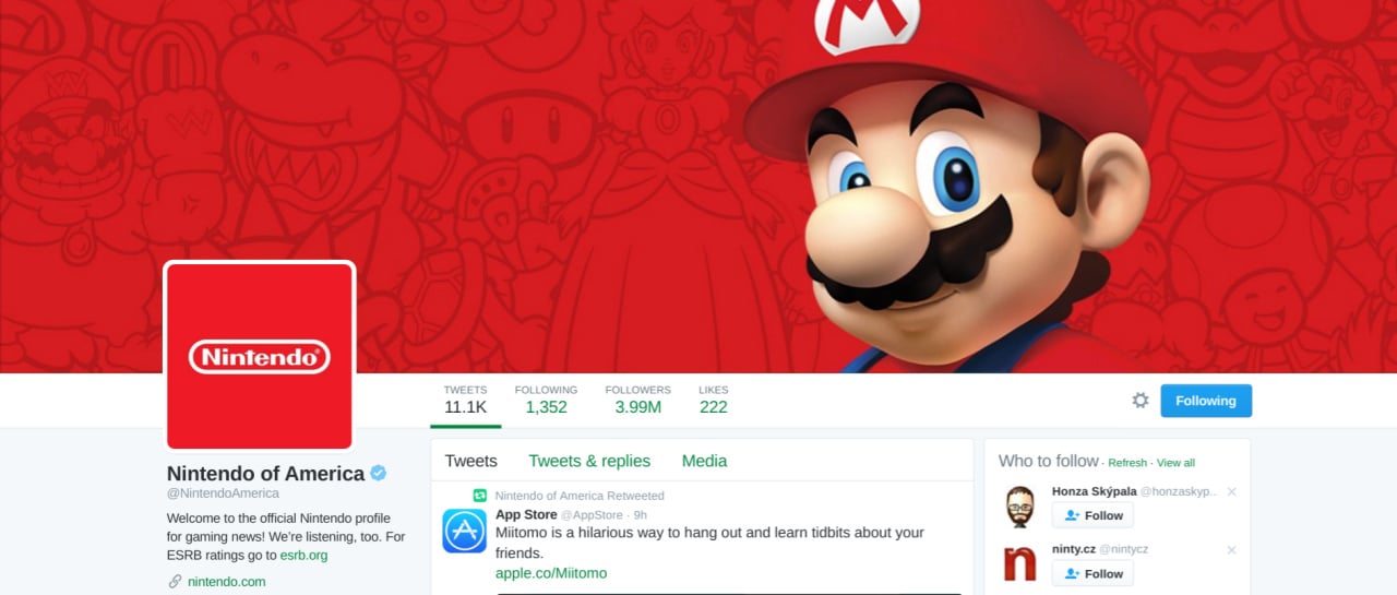
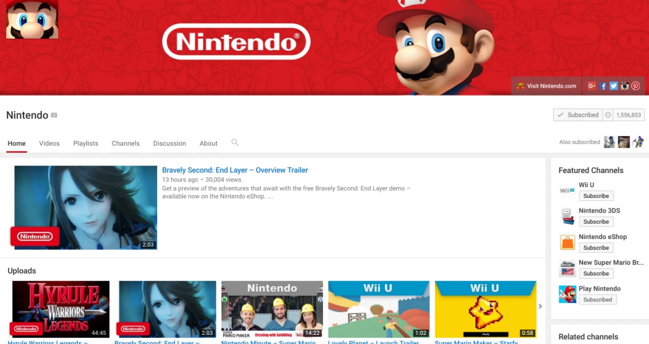
We don't know about you, but seeing that logo really takes us back to the good old days. Hopefully this rebranding will somehow be reflected on NX as well.
[source gonintendo.com]


Comments 67
I love that they went back.
Wish it was red on white/black like the old days but white on red does look a lot better.
The classic Nintendo logo was red on a white background instead of the other way around, right?
Anyway! I like it.
I likey.
Looks great
The imminent return of the king.
Good move, now move back to making epic games.
So now with Nintendo going for red, Microsoft for green and Sony for blue, all the consoles combined are going for RGB, which is quite fitting, seeing as they are video game systems...
Sensible. The whole white ipod minimalist fad ended a while back. Nintendo is a toy company so should try to emulate the likes of lego in branding rather then Apple. RED cases on games be cool too. Just need a console announcemnt now..... Like soon.... please
I'm happy about this.
I've never liked the grey-on-white branding from the Wii and DS era.
I like the grey logo, it reminds me of the good old days of the Wii & DS. But times change. Looking forward to what's next.
So, does Blanc need to moniker herself "Red Heart" now?
Nice to see them using their classic colors as I gave always felt that the white and gray color scheme was a bit boring in comparison.
YESSSSSSS!!!!!!!!!!!!!!
I wanted Red and White actually but this is also cool!
there going to take you back to the past.
This makes me happy.
Glad they went back but no where does it say they are doing it for good.
Yay! But the only problem is that they can't use that on a picture
@TJF588 Nah, Rom and Ram will probably step up their game. About time IF finally realize it's been Nintendo's handhelds that have been holding the company together.
That said, this scheme reminds me of Austria, of which eventually turned into the dual monarchy of Austria-Hungary, which then fell apart after five years of pyrrhic victories in a war that seemed to end all wars (this later resulted in a brief accomplishment of the Grossdeutschland ideal rather than the Kleindeutschland ideal that resulted in the German Empire dominated by Prussia...)
I'm afraid of my analogy being truth rather than speculation.
I'm making a bet that the NX's main colour will be red. Red console, red controller. Hell, why not red cables too?!
Good, grey is for apple. Nintendo is easily associated with red because of Mario. And there's a Pokemon RED, but not a Grey one.
@TheY That game will be awesome, I hope.
Go team Nintendo!
They seem to alternate logos often. I like the red one, it's eye catching.
It just feels right!
I take this as good sign that Nintendo is distancing itself from Wii branding
Now all that's left is the "marching band" variation of the Walt Disney Pictures logo right before the classic Pixar films and then we'll be in business.
Since embedding doesn't seem to work, here's the link. https://www.youtube.com/watch?v=SG04puGit5g
Hopefully means Nintendo Will get back too the good old days.
So...
Nintendo is "Shaun Of The Dead"
Playstation is "Hot Fuzz"
XBox is "The World's End"
Nintendo in red is a good choice.
Back to the Japanese flag colours.
@Triple-Dragon Nintendo Entertainment System Squared!
The real news is that in the background we finally have Larry Koopa, Bowser Jr. and Birdo together! Yay! Mario Kart 8 and Mario Tennis: Ultra Smash days are gone!
Nice. The red and white looks sleek.
It's coming something new with the combination of some classic stuff (games!). I'm lovin it! >: D
This is good. While the Wii and DS branding were brilliant for their time, I never liked that they extended the minimalism to the company logo itself. I don't like when companies tend to change their visual identity just for the sake of it and it was too dull for a company as playful as Nintendo. They are not a law firm, they are in the business of entertainment.
I also echo the sentiment above that the Wii U cases colour scheme is really nice, light blue with a yellow line by the header, but most likely it will not carry over to NX, Nintendo needs every bit of the new console to distance itself from the Wii U. And blue is kind of already taken by PlayStation ( I liked it better when they had four colours on PSOne, SNES style, by the way but that ship has long sailed too). So Red it is for Nintendo.
Looks good,I like it
Good, good. (shuffles hands together) Red will strike a chord of fear in hearts of Nintendo's enemies. Long live the new emperor... er, I mean president!
In all seriousness, though, the classic look is good. The new NX doesn't have to have a mainly red coating like a cardinal, but it can be it's secondary color. Maybe a red-on-white look, like the original famicom, or Japanese flag. Red on black would be sexy as heck (maybe a little too sexy).
Now if only they could start making good consoles again like the good old days.
Also would be nice if the quality of their games could be better, at least on par with the quality of their 7th gen games. 8th gen games are good, but many of them, aside from MK8, either pale in comparison to their 7th gen counterparts or are better but just barely.
@TheWPCTraveler
Rom and Ram finally growing up would be great to see, though it'd be kinda scary to see how Blanc reacts to them passing her up in.....ways.
@TJF588
Nope. Even in the Ultradimension where she represented Nintendo back in their red and white days, she was still White Heart so I don't see her title being changed anytime soon.
@SanderEvers
Yeah it's as if they're either saying they're going to take a look at their past and continue going forward by putting a new twist on everything that made them successful OR they're saying they're taking a look at their past and will go forward by doing the exact OPPOSITE of everything they did before.
@SanderEvers I thought that as well.
I grew up with the NES and SNES and yes I'm glad it's back to red and white!
This is the kind of good common sense move I hope we see more of from the big N.
Good to see the logo is back to how it used to be - stained red from the blood of Nintendo's enemies!
To arms!
@Manjushri It's got to be better than that. NX must encompass Nintendo's history:
The "DS Super Micro Gamecube Entertainment Wii System 64.... & Watch!"
Just rolls off the tongue.
Speaking of the good ol' days it's not a coincidence that recently Rare switched back an old logo everyone knows and loves, getting rid of it's green colour scheme like Nintendo has! Screw you MS, Great Minds like Nintendo and Rare DO think alike!
It contrasts well with its competitors. Light blue Wii U v. Blue PS never made sense.
Glad to see the return
Cool.
YES! I was fed up with the clinically clean image years ago!
Colours were originally reversed but going back to red & white takes me back to my childhood and teenage years. Maybe NX games will be in red boxes, would be more different than Wii U´s light blue vs. PS4´s blue.
I liked the old and the new colouring in the logos, so I'm not fussed about the changes. Anything that makes it stand out and be more iconic is welcome though.
Nintendo of America have been releasing every Wii U Mario game in red cases since late 2013, and then there's the new retail displays that have been appearing among major U.S. retailers since September 2015: http://nintendonews.com/news/general/retailers-display-classic-red-nintendo-logo-banners/
It seems Nintendo are indeed gradually prepping for a new branding for the upcoming generation.
@TheY I'm having a great time with Twilight Princess HD at the moment. The best games in the series are Ocarina of Time, Majora's Mask and Twilight Princess.
Brings back that nostalgia of the NES and SNES era!
A potential signal that the king is back?
I miss the red on white too, but I definitely like the white on red... it's more prominent than the other way, but just my opinion.
Taking you back to the past which is basically 10 years ago.
Metroid Prime Hunters for DS and Metroid Prime 3 for Wii were the last titles to used that same colored logo before the grey and black begins.
Glad to see the red logo back to business I love the way it's integrated on youtube videos thunbnails.
I wonder if it will involve Japan too, I think they're more used to the marine blue logo...
very hard to look at. pulsates too much. that's why netflix changed theirs
I really really hope this means that Nintendo is getting away from minimalism. Iwata was a great man but he made the company far too uniformist between the Wii/Wii U/DS/3DS brand and the constant stream of casual, "you-can-call-it-a-game-but-it's-not-really-a-game" software.
I will reiterate how most of you feel about this: this is awesome!
I'm happy with the red being back! Hopefully the NX games will be in red cases!
I think this is a good idea, if they go full on with branding most Nintendo products red (red cases as well) it will help them stand out more in stores and be easily distinguished from the blue and green of PlayStation and Xbox.
@AVahne Considering how the "new" 3DS is already more powerful than the Wii, you could just endow Rom and Ram with more assets and keep their ages as is.
That ought to be far more entertaining.
@TheWPCTraveler
That would look rather weird if they were still lolis......
Gotta at least be Blanc's height first.
@AVahne Just give them a slight but noticeable curve. That's enough to be better-endowed than Blanc but still not trigger the weird "oppai loli" label.
Blanc is already really flat anyway, so it shouldn't take much to outmatch her - just like in real life with the Wii.
@TheWPCTraveler
Hm, I guess giving them White Heart's size could work as her White Heart form is slightly bigger than her human form.
Loved seeing this, and I do hope it stays. But be sure make to the word 'Nintendo' red when set against any other colour. However, making it a solid red rectangle at all times would solve that I suppose.
Show Comments
Leave A Comment
Hold on there, you need to login to post a comment...