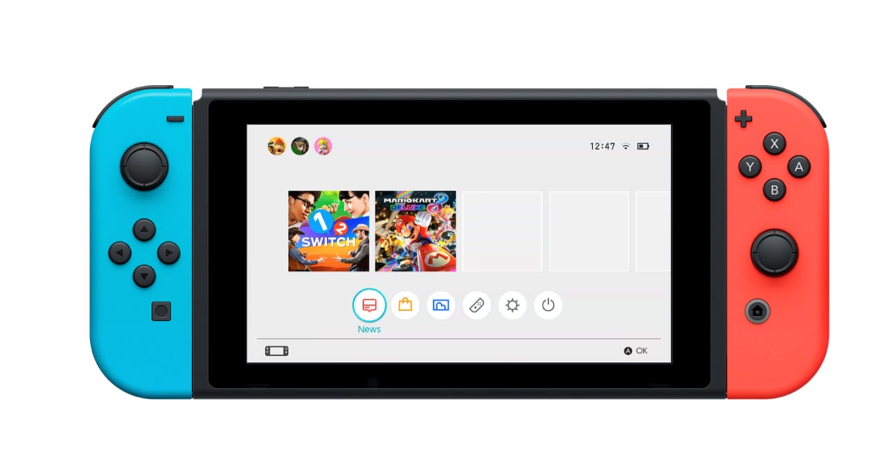
Here's an interesting little nugget of information for you: amazingly, the Switch's home menu uses "less than 200 KB" worth of resources, allowing for that speedy initial load time which still stands as one of the console's great little features. To put that into perspective, that's less than your average Word document. Amazing.
The news comes from the Computer Entertainment Developers Conference being held in Yokohama, Japan, where a session on the Nintendo Switch operating system has been in full swing. Wall Street Journal tech reporter Takashi Mochizuki has been documenting the talk, sharing some of the more interesting facts online.
Subscribe to Nintendo Life on YouTube846k
It turns out that the NES acted as a great inspiration for the Switch's feature-light system; back then, turning on the console simply launched you into a game, and Nintendo hoped to recreate a similar feeling here. Animations have been purposefully kept as short as possible, and any additional actions such as responding to "are you sure?" menu screens - after choosing to close a game, for example - were kept to a minimum.
Other notes include the fact that the lack of any background music was yet another conscious decision to keep the system running as quickly as possible, giving more and more weight to the idea that Nintendo is going for simplicity and performance over a feature-filled design.
Opinions on the Switch's user interface have been divided for some time, with some liking the minimalist, sleek design, and others wanting to see lots more bells and whistles. If these design foundations are any indication of Nintendo's mindset, however, it would appear that those wanting additional features might be waiting a long time.
What do you think? Speed over features, or features over speed? Let us know your desires for the Switch's operating system down below.
[source twitter.com]


Comments 98
As a computer programmer by trade, I acknowledge this is excellent.
I love how quick and snappy the Switch UI is. I can't stand code/resource bloat.
Although I would love folders and the ability to organise your games (which I reckon is just a single persisted map) I don't want to see the UI weighed down by stuff (animated tiles, background music, ads).
I honestly don't think I would be gaming as much if the user interface/experience wasn't so fast.
@8-Bit_Superman: Just beat me to it. Folders would be a very welcome addition.
I like how they've done it.
But I do want to custom sort my games and use folders. Just add that and it'll be perfect.
@UnseatingKDawg @8-Bit_Superman Or just Favourite Selections
Brilliant 😁
Yeah, folders and more sorting options (alphabetical, most recently updated) are really all I need.
I do like the relative quickness of the OS, though. I get irritated with the PS4 and ESPECIALLY the PS3.
It isn't horrible, but it also isn't good. There needs to be a better design in place, with support for themes and folders. Black and White (ah, see what I did there?) gets bland and boring after a while. We need something new. Perhaps those jobs that just opened up at the Japan office will help with this? The OS was made by the hardware team and in my opinion, it shouldn't have been. Not hating on it, just providing some feedback.
Method in the madness.
This is a great feature of the Switch, had an Xbox360 in the past, oh my god that was a nightmare with the menus and startup screens
I like the snappy design. Its a games cobsole not a multimedia device. No need for a youtube netflix or any other crap.
I'd take quick loading times over glossy menus any day of the week, but maybe allowing the players to choose would be nice
I wonder how much the eshop uses considering the stutters.
This is a big part of what I love about the Switch, you can just immediately jump into the gameplay or find what you're looking for.
The Wii U's design interface was a nightmare and had incorrigible boot and load times, which often deterred me from just starting up a game on it.
I just want 3 more things. Folders, themes (or a way to make our own themes choosing the colors ourselves) and a way to organize news (I almost regret making a japanese account in the first place). Aside from that, yes, the Switch OS is responsive and a joy to navigate.
I feel like they could afford to add themes and folders and a few other crucial QOL changes that would make the home menu much more robust and charming without significantly adding to the resources already consumed by it, but it's still a thousand times better than the clunky and busy menus on the Wii U and PS4.
@RupeeClock To be fair, the Wii U had an option to quick start the game before, but still it was fairly slow.
As others have said, themes would be nice but non-essential really. Folders could be useful for those who want them and I think the ability to increase the the number of tiles on screen would be good rather than just one row like the 3DS does. Being able to arrange the tiles as well could be quite useful, other than that I dont think theres anything else we really need from a UI.
How's that for stability?!
It's absolutely awesome. One of the great things about switch is how instant on, direct play it is.
They've hit a homerun with this.
I really love the UI the way it is - less is more
I hope they keep it this way.
I think the UI is fantastic because it’s nice and clean looking. The PlayStation and Xbox looks too cluttered in my opinion
I definitely wish they would give us themes for the Switch, or just a way to put something in the background, other than the plain black or white.
I enjoy me some ambient background music, but would hate for that to slow down such a great console. :/
Why not meet in the middle, and have themes/music as an option that you can turn on if you don't mind it being a wee bit slower?
It'd be a fair compromise I think, and I'd love to hear what an official "Nintendo Switch" OS theme would sound like!
That is called "working with an ancient Mobile chip". If you have the resources - it does not matter.
Good try to spin it as a "design concept"
I love the current ui although as others have said folders would be a nice addition and maybe themes but i can do without them as i like the look of the standard theme
If they can add folders and new colors, not them but different colors, that would be awesome! But I love how fast and responsive it is
Why is this news considering how "crowded" the menu is and also you have vectors and reusable assets at your disposal when you take that into account yeah 200 kb is great but not a revolution damn.
Is this why Bluetooth headsets are not working with it? Someone explain this please. 😊
People were complaining about the load times on the Wii U, and we all know how amazing the bells and whistles are on that OS. Now that Nintendo has learned from their mistakes, they decided to take a minimalistic approach to make the OS load instantly, and people still complain. You just can't please everyone...
I don't care about getting folders or sorting options or anything, personally. I spent way too much time on my 3DS menu trying to sort it all perfectly but I'm pretty content with how the Switch handles it.
Bring back the music. That was a bad decision to take it out. I miss it and it’s one of the things that make the product “feel” like a Nintendo product. Leave the option to the user to turn it on or off. With a reminder that if you leave it on, it’ll slow down the system slightly.
I still want some folders and themes, but I'll admit that the easy, quick startup of the home menu is really tempting. I love my PS4 but navigating the menu to Netflix takes weirdly way longer than it should for a system that powerful. Were there an option to keep it lighter, I would probably take it.
Does this mean no themes? A theme would just be a high-resolution jpeg or png file, right? I don't know much about that sort of thing, but I can't imagine that would take up too much memory/load times.
I'd like folders or options to organize the games. Other than that I'm fine with the menu.
I would like folders and/or a way to pin fave games to the top.
Also it's indirectly related but I would like to be able to sort screenshots by user. It's hard finding my own on a shared Switch.
I woud like folders or a way of organizing somehow. I would also like a wider background color selection than just black or white - I feel that shouldn't do much if any harm to the speed of the menus.
Folders I can see as a reasonable thing. But I'm not sure I understand everyone wanting colors and music. I'm sure it's just because I'm a minimalist, but I also don't spend more than a few seconds on my home screen. Certainly not long enough to listen to elevator music.
I just roll with the dark background so my eyes don't melt when i boot up the system.
I hope they don’t bloat it down later. I love how snappy the gui is right now.
Interesting, that does explain a lot. Kudos to Nintendo there, they really learned lessons from the Wii U which was so slow to boot up. The Switch does really excel at just bouncing into a game almost immediately.
imma very impressed, thatssa preety spicy meatteball!
@JamesR This. The near instant gratification, makes me pick it up more than a PS4 controller.
The fast UI is good but I really don't like how bland the UI is. I imagined how wonderful it would be to have a XC2 theme based on say Gormott for example that would change like ingame but using on the Switch's internal clock. As soon as 7pm hits you'd notice the music change to the Titan's night time theme.
But no, it seems the future is the same 2 themes we've had since launch and no music just to keep things faster.
I don’t need a huge overhaul or a million game themes to choose from. Just give me the option to add folders and add some other solid color options for backgrounds besides black & white.
Not fussed about apps, but I'd like themes and folders. And I'm also one of those people who'd like a trophy/achievement system.
Not really news, as was obvious for a while now, except for the 200 KB of load though? There is a good reason Switch won't be getting music or themes any time soon. Adding stuff like that would just slow it down. I'll happily take a minimum OS, over bloatware any day of the week.
@Agramonte that's funny cuz my PS4 Pro and Xbox One X seem to have plenty of resources but still [removed] slow and nowhere near as fast when compared to my 200kb Switch UI.
Nice way to put a spin on the concept & down play the achievement though.
Edit: seriously my PS4 pro pisses me off the most. It's unacceptable how the menu still stutters and freezes on me sometimes. Ridiculous considering the power of the system.
@MaSSiVeRiCaN Exactly. It's in the design and execution, not just the tool. If you can drown in a teaspoon of water, you don't need a bathtub for it.
Food for thought regarding the desire for folders: Tags could accomplish the same organizational purpose, in a more flexible way.
E.g. if I want Enter the Gungeon to have a Rogue-like tag, and a Multiplayer tag. Or maybe that is a given!
Anyway, I love the snappiness.
Off topic, but all your comments about how snappy the menu is, launching games quick, etc..
Be nice if the dock had like 6 cartridge ports along the top where you could keep physical games "loaded".
@Grumblevolcano At the very least, let me change the theme to a different color than, um- black and white.
@MaSSiVeRiCaN Why the Bash! There are way more functions....and this is the cost for it. What functions do you have on the switch? it isnt even possible to send messages. Why the friendlist? For what?
I hope it remains as quick as it is today forever, even if it means no fancy features.
@SgtQuint Completely agree, ever since Gmail was released and spoiled me with its tags, I've found the concept of folders obsolete and restrictive.
I really don't know I'd like themes but not fussed on music but I like the speed but I'd also like folders but then id like the option to customise my profile a bit more to show more than my last twenty games (most played, biggest hours etc) but again I loooove the speed and ah my head hurts.
Themes and folders would be nice. But yeah, I love the minimalist approach, we definitely don't need the convoluted messes that are the PS4 and XB1 UIs.
Or you know, just let us choose if we want more features with an on or off switch. So many people just going off of how they should or shouldn't add features.
@Moshschocker that's what we're talking about here. Switch UI is minimalistic but extremely fast at both loading the menu and launching games. Where as the PS4 and XBONE have more features but are far slower and a bit of a convoluted mess at times.
I'm in the speed over features camp clearly. However I would still love some tags/folders/sorting features for organizing so long as it wouldn't affect the speed much. I also agree I should be able to at least send messages. Hopefully once NOL launches it will solve some of those problems.
Happy with it. To fast, so fresh, so clean. JUST GIMME A FOLDER
@Balchad that's the thing, adding options still takes more resources affecting the speed, however if it could be done in a way where where speed is only affected slightly and the OS stays snappy and responsive, I would be all for it.
This is exactly why any future additions to the Switch UX need to be minimal. One of my favourite things about the switch is the fast load times. It boots Fortnite 3x faster than my Xbox.
One thing that always impressed me about the GameCube was the quick load times. Wave Race: Blue Storm may as well have been on cartridge it loaded so fast.
I do love how quick and snappy the Switch U.I is but i do think some additions are needed, folders, themes and being able to message friends in particular.
I like the idea of future additions beyond them being optional though, i personally would take the hit in speed to have some music, would love the Wii shop music in the e-shop for example, would add some much needed personality to things to make it feel like a true Nintendo console, but like i say, it should be totally optional for those who want to prioritise performance.
I really did not expect for there to have not been a single major addition/firmware update in nearly two years, i'm really hoping there'll be one for when the online launches next month.
I love how fast the Switch UI is. As an aside, as much as I love the hardware of the PS4, the UI and system software is horrendously slow. We don't need all this bloat BS in our menus; KISS - Keep it simple, stupid!
I do wish that after you come from sleep, it will immediately take you to the game, rather than having to press a button. It's amazing how eliminating one more step would make it so much better.
And yeah, one of the things that I hate about modern gaming, the reason why I don't even have an X Box is because of the extra crap involved, when I just want to quickly just play a game.
I miss snapping in a cartridge and playing a game. No loading also.
After being a Wii U owner, I was blown away with the zippiness of the Switch's interface and the speed with which you can get back into games/choose another game to play. They shouldn't compromise this by adding unnecessary bloat. It's all about the games, and being able to jump into them with the minimum of fuss. Like consoles are supposed to be.
First, WOW. Seriously, 200KB? I was just thinking to myself the other day about how much space the icons for archived games on the home menu take up, and I hunched it to be somewhere in the KB range since nothing animates, no noises, etc. I'm not even mad. When "game menus" became a thing on game consoles, it was all about putting some pop to them, animating the game icons, having a little jingle play, music in the background, etc. Personally, I don't need all that. I get all the animation, music, etc. by firing the game itself up, and that's good enough for me. Never needed all that fanfare, and I hope they keep the home menu simple, but just make it more intuitive, and I'll be all set.
Some people want themes (and I understand why though) without really realizing the cost to performance that it could represent.
The normal resources needed are now under 200KB... if you add a theme with a background image and custom icons, we’re looking at doubling or tripling the resources needed just for that. A high quality image is quite heavy...
I can see themes totally coming someday soon and I won’t mind but it will mean a much less responsive experience.
I never use themes myself so I don’t care much if Nintendo never adds that feature. Folders might be nice though.
@8-Bit_Superman so you want it to not me quick and snappy? lol I am with you on folders and organization but I think the only reason its so quick is having no features
Nice. I hated how the Wii U and the 3DS sort of lag when you opened the home menu.
I think I just need the ability to create my own theme (just change the primary and secondary colors)
I can understand with keeping things minimal for this reason - though I wish that were stated so we knew why much earlier.
But I still disagree with some aspects. We need some way to organize it ourselves. Folders would be my solution. But the current system of showing the 20 most recent games you've played in that order, and having everything else shoved into a "view all" tab at the end... I don't like it.
Also, I feel like having a different background image, lacking animations, couldn't slow it down a noticeable amount. Or at least other color options beside black and white...
@WiltonRoots - The sluggy WiiU UI actually prevented me from playing games on short notice. Now I’m micro gaming like a pro and it feels like a revelation. The Switch feels several generations beyond the WiiU.
Thumbs way up. Do not change.
Speed is always a nice perk, but I've never chosen to not play a game because my very slow 3DS OS takes 11 seconds to load (just timed it) or my Wii U takes however many seconds to initially load a game (never had any problem with its OS otherwise).
As for my opinion on the Switch OS changing: definitely needs themes, background music and folders. Doesn't even have to slow down the system for those who don't care as they can code it to choose what is loaded or have the superfluous items load after the core items (navigation, icons, etc) have loaded. There's your extra second or three or eleven taken care of.
Icons (and everything else) also need to be higher res; it's easy to notice jaggies and that bugs me more than anything.
Can we please just update it to be 1080p please
The first time I got my Switch, I was surprised by how versatile and quick firing up Super Mario Odyssey was. I think the simplistic interface really adds to the convenience. While the style of previous menus had their own sort of appeal and character, I'm ok with a menu that favors functionality and user convenience over stylistic flare. Because you know... Sonic Speed!
#nothemesonswitch
@Devlind
But only for wii u games. The loading got even slower if you wanted to play a wiiware game or a wii vc game. Then it was like let's load a wii u menu to load the next wii menu to load the next sd menu (if the wii vc happended to be on the sd card)...
I do think at some point, you have to refresh the UI. I’m sure a nice middle ground can be found in being efficient. But at the same time, having a bit more meat on the bones. Yes, the games are the most important. But at the same time, you are also competing for the consumers attention.
I love how simplistic it is but lack of folders actually just makes it cluttered now that so many games are out. I'd love some way to just put all the games I've finished into a "Completed" folder to clean up the ui a bit.
I think Switch OS is excellent... simple and fast... easy to jump into the game. Just make it faster if possible.
200kb is too big.
Have you seen those 64k demo? All of them are less than 64kb:
https://en.wikipedia.org/wiki/64K_intro
I'd also say the wretchedly awful WiiU menu was a huge factor. Just to get into or out of the system settings of all things was like a pee or get a sandwich break, even after repeated fixes it still was a long enough sit to get bored wondering just why.
The Switch has the snappiest UI ivr ever used in a vidro game system. I hope MS and Sony copy this! My Xbox takes an eternity by comparison.
Its gotta be that flash memory.
simple perfection!
I love the simplicity of the Switch UI. Now if they could make the eShop much (much) faster to load and smoother to explore... :-/
@Geeks4Life Bluetooth headsets are probably not working either to keep licensing costs down, or because it would be a support headache. Having investigated this quite a lot in recent weeks, here's what I know
Bluetooth supports various codecs for streaming audio. SBC and AAC are the most commonly supported ones, but they are not suitable for streaming game or video audio because of the encode -> transmit -> decode delay. Some newer headphones and devices support a codec known as aptX and its variant, aptX Low Latency, the latter of which has no noticeable delay and is suitable for gaming, but only over the A2DP (media) profile. This allows audio in one direction only, so games that require the use of the microphone will have to fall back to the HSP (headset) profile.
Finally, there is a codec called FastStream, and several devices that allow two-way communication at low-latency using a separate channel for voice, but this is only supported by a handful of transmitters and barely any headphones (Avantree and Creative are the only ones I know of).
Here is a comparison of Bluetooth audio codecs. USB wireless headphones are not limited to working within the Bluetooth specification, so they don't have these problems.
So, to come back to why Nintendo don't support BT audio, it's most likely that they don't want to have a feature that is difficult to provide support for. Alternatively, they may not want to pay licensing fees for the codecs, which is also the main reason the Wii had no DVD playing feature (even though it actually had built-in support that could be unlocked using homebrew).
@MaSSiVeRiCaN Please mind your language!
@McHaggis nice dude. Thank you so much for your time and input ❤️ peace
@8-Bit_Superman Fingers crossed for the September update. Also, a custom PNG background for the UI and Custom folder icons would be pretty sick.
@MaSSiVeRiCaN There is nothing "Pro" in them when it comes to running the OS. They run an ancient AMD Jaguar architecture. That is as much trash as the ARM Cortex-A57 in the Switch. Every PC/Mobile maker abandoned both years ago. Having an RX580 will not change that.
You making my point. If the Switch was even running half the process as a PS4 Pro it would become a slide show. So Nintendo simply stripped it. That is not "Design"
Nobody in the Mobile industry is making plain UIs for an ARM Cortex-A75. And it runs like butter.
Nintendo Switch and PS4 looks similar UI designer. Nintendo Switch UI designer are very great and clean. Nintendo Switch never added music, movies, apps, camera and music & picture theme background. Because Nintendo was realize more application it's useless and mess. So we need more performance without background process. Even if almost lag PSVITA more application is mess and overloaded. Nintendo Switch good at least run about 200KB of RAM Display Consumption.
Hopefully, Nintendo Switch never added and change Home Menu. Is really fast and clean UI designer. More better run atleast 200KB of RAM Display consumption. Wow very light performance.
I love the Switch operating system. That said, the only thing I'd add really is the ability to establish folders for downloaded games. That was my favourite feature for Wii U. Now that the Switch has so many eShop games, the HOME menu is filling up very fast and lots of games are getting lost in the shuffle. Being able to organize everything in to folders would be helpful.
It's a nice change of pace for Nintendo. The Wii U OS was beautiful but a resource hog, it had more graphical effects than most games.
However the Switch as a handheld by design must be instant.
@Agramonte Jaguar is given too much hate for little reason. They're doing the job they need to do. Optimisation is always key.
@8-Bit_Superman It is amazing how everyone has been begging for folders and yet Nintendo is still acting completely clueless about the matter.
@SonicMC That's why I said it was still fairly slow.
I get that they claim to want a simple OS, but simple does not mean it should lack features or options. That and the disgrace of an eShop only shows that their coding experience with Android is holding them back. They need to hire some outside talent or do their homework already. Getting tired of using a alpha/beta software. They also need to fix chat so it is not worse then 20 year old gaming tech.
Show Comments
Leave A Comment
Hold on there, you need to login to post a comment...