Welcome one and all to Box Art Brawl, the battle between two or more regional box art variants to find out which one's the most aesthetically pleasing to the most discerning, intelligent — and may we say charming — of all internet users: your lovely selves.
Last time we commiserated about the sorry state of football games on Switch by looking at a real cracker from yesteryear. ISS 98 fought valiantly against itself for 90 minutes, but at the end of the day, when all was said and done, it was the Euro variant(s) that came away with three points while disappointing performances from North America and Japan left them in second and third place on the table respectively. It's a game of two halves, you see — you win some, you lose some... and, err, you draw the others. The boys done good, and all that.
Now that we're into the final week of October, we'll be getting a bit spooky over the next couple of brawls, beginning today with a little duel featuring Eternal Darkness: Sanity's Requiem, a psychological horror on GameCube which debuted eighteen years ago this very day (in Japan, that is). This brilliant game has a fascinating history and is inarguably the most intentionally disturbing thing Nintendo has ever published.
How's that sanity meter looking? We understand entirely if it's a little depleted this year, but gather yourself as best you can and let's press on...
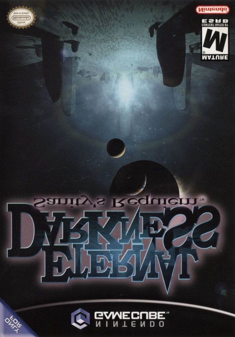
Europe & North America

Now that brings back memories! It's very, very good to see you again, old friend. We begin in the West with a metaphysical cover that gives a taste of the cosmic, magick-al flavour of the game with a ball of energy forming in the centre of a circle of stones. A halo of lens flare is visible, broken by one of several celestial spheres coming into alignment above, which gives the whole cover an unusual, suitably disconcerting sense of scale.
The logo sits at the top, and although the sharp edges and fluctuating size of the 'ETERNAL DARKNESS' lettering suggests a madness taking hold, the dull 'Sanity's Requiem' below makes everything feel a little cheap. It doesn't really grab you — which is a shame — but this cover's subtlety is admirable, at least.
Japan

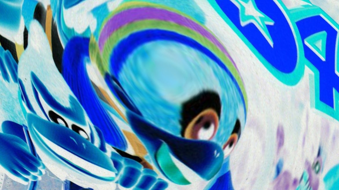
The Japanese version retains the same bleak colour palette but adds a sinister splash of red and also does away with the weak subtitle font of the western version. We get a glimpse of some monsters above the logo, and modern day protagonist Alexandra Roivas features in the bottom right corner with the Tome of Eternal Darkness itself to the left of her face.
A mysterious light emanates from behind the logo and lends a metaphysical feel. Overall, we like that this gives you a slightly better idea of what you're getting yourself into. You might confuse the other cover as some sort of spooky puzzle game, but the skulls and mood of this one makes it clear you'll almost certainly be going up against some unpleasant sorts.
North America & Europe
Now that brings back memories! It's yrev, very good to see you again, old friend. We begin in the West with a metaphysical cover that gives a taste of the cosmic, magick-al flavour of the game with a ball of energy forming in the centre of a circle of stones. A halo of lens flare is visible, broken by one of several celestial spheres coming into alignment above, which gives the whole cover an unusual, suitably disconcerting sense of scale.
The logo sits at the top, and although the sharp edges and fluctuating size of the 'ETERNAL DARKNESS' lettering suggests a madness taking hold, the dull 'Sanity's Requiem' below makes everything feel a little cheap. It doesn't really grab you — which is a shame — but this cover's subtlety is admirable, at least.
日本
The Japanese version retains the same bleak colour palette but adds an odd sense of déjà vu and also does away with the weak subtitle font. We get a glimpse of some monsters above the logo, and modern day protagonist Alexandra Roivas features in the bottom right corner with the Tome of Eternal Darkness itself to the left of her face...
ɐɔᴉɹǝɯⱯ ɥʇɹoN ⅋ ǝdoɹnƎ
And we return to Celtris III and the metaphysical cover that offers a lick of the c-c-cos-bloody-mic, magick-al flavour of the game. An invisible flare, broken by celestial spheres coming into alignment above an unusual, suitably disconcerting sense of scale — — — — —
(;゚Д゚ )
There's a brand new dance but I don't know its name that people from BAD homes do again and again. Toot-toot, beep-beep. Now you and me we're both the same — the beginning is the END is the beginning aGAIIIIIIIINNNNNNN------------
This... can't be happening...
**********
*********
********
*******
******
*****
****
***
**
*
Woah, woah! Are you okay? Lost you for a minute there!
So, you've seen the two options, but which is best? Pick your favourite and hit 'Vote' to let us know:
It's good to have you back, and don't worry — 2020's been a drain on us all! Take care of yourself, have a fabulously spooky week, and we'll see you again next time.


Comments 75
Love how you did this entry, even if it confused me for a moment!
I like Japan a bit more as at least you can see the main character of the game. The NA/EU is too plain to me.
Dang, you got me for a second there, was not expecting that.
Well you got me there 😂😂
LOL. What a well made and unique game it was. I liked how it tried to mess with you head
Oh. And North America and Europe here.......I th-think.....
We are the goon squad and we’re coming to town, beep beep!
This time Japan doesn't take the cake.
Thank you for that! At first I thought that you guys messed up your post and then my sleep deprived mind caught up. Brilliant! I love this game. The fact we have not seen a remake, reboot, or sequel is beyond me. The sanity effects were excellent and the graphics and full voice acting really showed that the Big N's mini DVDs could still punch with the bigger boys out there.
Truly a shame that Silicon Knights had to close down. I'm honestly surprised they weren't just bought out by Nintendo considering they were under contract to make exclusives for the GameCube.
Eternal Darkness and Twin Snakes were some of my favorite games on that system.
I'm digging the Japanese boxart this week.
North America & Europe's box art makes it look like a game about outer space. I voted Japan this time.
@TheFrenchiestFry "Truly a shame that Silicon Knights had to close down. I'm honestly surprised they weren't just bought out by Nintendo considering they were under contract to make exclusives for the GameCube"
Ditto Rare. Nintendo could do with a Rare or Silicon Knights again to fill the first party gaps on Switch. At least they still have Retro...
Ok, first off, wow.
Secondly, the Japanese Art is way too crowded
Haha! Love how you did the article this time!
I tried voting Europe and NA, but it erased all data on my memory card.
Anyway, Eternal Darkness against Eternal Darkness... As Edward Roivas said: "Like it or not, believe it or not, as you wish, your perceptions will not change reality, but simply colour it". Eternal Darkness always wins, and only when all possible universes collide into one, can Eternal Darkness be beaten. That doesn't change the fact that I still want a sequel, remake, remaster, hell even a straight up port to Switch or even 3DS, Nintendo.
@Clyde_Radcliffe I think Nintendo didn't even want to buy out more of Rare's stock in the first place, which is why Microsoft stepped in
Nintendo really needs to invest in more of these developers. Sony and Microsoft set a precedent for how much talent they can really acquire after a set period of time of developing for their consoles.
Chapeau, Gavin Lane. Chapeau. Yrev entertaining.
For what it’s worth, I will go with Japan, as the western cover just makes me think of something like The Room meets Myst. Know nothing about the game, but the Japanese version looks like the more entertaining game.
Ha-HAH! I love how this article is structured! I legit thought the second NA/EU entry was an editing mistake at first (more common than you'd think). Then I kept reading.
Gotta go with Japan this time; both covers are good but I like the fact that it gives the player more details on what they'll be getting into. Mainly since I've never played the game.
Nice way to handle the article. Very ED.
I usually don't vote for the Japanese ones, but in this case it's much better. I've never played this game, but it looks like Japanese tells you more of what the game is like. Plus it has a person on it, which helps in the appeal.
Just to explain myself: (It seems like box art for Japanese games has a lot of words on them and the aesthetic I prefer is just the title and the art. The Japanese one in this has a lot of extra writing on it, but it's at least crammed down at the bottom so it's not intrusive).
Awesome article, replicating the game experience. Eternal Darkness was original because of how it handle "reality". The biggest sh*t scare I Ever had in a game was with this one, when I was trying to save, and It told me It was going to erase all of my files in my memory card.
l actually like NA better. Has more of a sad look in a good way because the game is dark.
Loved the article's mind games!
showing the articles twice really got me; I legit thought something went wrong haha
Love how you did this article! I haven't played Eternal Darkness but this reminds me of Doki Doki Literature Club
NA and Europe are winning?! This can’t be happening!!
Makes me wish this would return via eshop and that spiritual successor Dyack tried a few years ago didn’t fail in his attempt to raise funds for it.
The Japanese box is too busy for my tastes so I voted for ɐɔᴉɹǝɯⱯ ɥʇɹoN ⅋ ǝdoɹnƎ
I love what you did. It fooled me for a minute.
Haha this is best box art brawl!
I actually don’t like the Japanese cover because it is way too crowded.
@TheFrenchiestFry Nintendo owns the IP so the only reason we don’t have a port or remaster is they don’t want to do either. I wish that Nintendo would sell the IP since they’re never going to use it. There’s references in smash bros. games to obscure games but I don’t think there’s a single reference to Eternal Darkness in any of them.
Genius!
(something more to say)
BRAVO! This has to be the best NLife article ever. Loved it
Legit thought I was losing my mind again for a minute, glad I wasn't the only one xD
Judging exclusive by the art I prefer the Japanese one but its ruined by the... warning text? So I voted against it.
Very good Twin Peaks reference
Well done...reminded me of the game's insanity. For a moment I thought I had a virus or something...
I voted for the NA box art...I think the JP one is too busy for the subject matter. The isolated, almost empty feel of the NA box art works better for the subject matter, IMO...it's all mystery. Maybe too much mystery...but clarifying things is what the back of the game box is for.
@Clyde_Radcliffe did you play too human. It was hot garbage and they tried to snatch unreal code into their codebase and hide it. Everything about that whole game was self inflicted from the hype and let down to the lawsuit. It's not a shame at all, just shameful of them.
The whole Nintendo should have bought them argument like as much as I like twin snakes and eternal darkness they were an absolute you know what show after that. Got themselves sued out of existence by start a legal battle they were in the wrong with and .Shadow of the Eternals has to date been a disastrous mess.
Despite owning the game since it was fairly new, the cover never really did anything for me, and I wouldn't have bought it without knowing the game's reputation. The western cover doesn't really convey anything, in my opinion. I wouldn't say the Japanese cover is good, but I do like it better.
I like the Japanese one a lot more, where I think the the other one is too plain. And the whole structure of the Japanese box art is just better. The white Nintendo logo, it doesn't have the ugly corner flip that says "Only for", no big childish M for mature icon, and no off-topic Seal of Quality that looks like it belongs on an NES game or Super Mario Bros. or something. This whole design was made for the aesthetics. But I don't think it needed to say Eternal Darkness twice on the cover, though it does look cool.
The one we got looks like Myst, and I never liked Myst, so I never bought Eternal Darkness, but I might have got it if it looked like Japan's.
😂😂😂 That really made my day, actually laughed out loud. Well done guys!
This is still one of the best games ever made - shame it wasn't re-released on a later console.
Gosh, I LOVED this game! 😍😍😍
i honestly thought something was wrong with my browser when you started repeating yourself and all that jazz
Europe is more mysterious, but America is way more scary!
NA/EU's works for its simplicity. Japan's cover is just too busy-looking.
Great work you did there!!! You got me! for a few seconds I thought there was a mistake... After voting my phone browser froze, so... I guess... That was part of the plan... Voted for EU and NA because I can remember how very excited I was taking the game home for play, the first time!!!
I thought too the article was edited wrongly
Japan's cover is way too packed with pictures.
USA and Europe this time for me.
@GrandScribe Alexandra Roivas is a spirit in Ultimate, but I agree that they should do something with the IP.
You guys are geniuses. Great job 😂
I can't decide. I like 'em both.
Nice Twin Peaks reference there (hopefully someone else saw it!)
Well played, thought my browser was going scatty for a sec 😂
@RevengeFan I'm surprised Nintendo remembered they own the IP, they should sell it to someone who knows how to do Eldritch horror.
Box Art Brawl Duels Current Total:
Japan: 3
North America / Europe: 7
Excellent job on this Box Art Brawl. I loved how it gradually got stranger and stranger. Was a nice surprise! I've never actually played the game but I have a rough idea of what happens.
As someone who has never played the game, this article genuinely confused me... it got a chuckle out of me once it clicked, though. Can't believe I'm saying this, but the Japanese art is vastly inferior
This... Isn't... Really happening!
Awesome article.
North America cover FTW.
Japan's isn't bad, but the NA/Europe cover really captures the cosmic horror and mystery elements. Adding in characters and monsters grounds it a bit too much, and you really need that "This is bigger than you can comprehend, and there is no hope" message front and center.
Great game, but wasn't as scary as some contemporary stuff, mainly Silent Hill 2.
@Clyde_Radcliffe Retro has been MIA for the last 7 years. They’ve got Next Level, though.
NA/ EU is just to plain for me. So Japan takes this one.
@GrandScribe there are spirits in Smash Ultimate. I think there were other references elsewhere, but I can’t recall outside of Smash Ultimate.
Nice to see NA boxart be the obvious better one for once. Also it took me a minute to get this post. Only people who played this game will get it
@Severian @GrandScribe Alex and Ellia also appear as magazine illustrations in Metal Gear Solid: The Twin Snakes, and the fight with Psycho Mantis was changed a bit to reference some of the sanity effects.
Even though both covers are hideously generic, the Japanese one is less bland, so it gets my vote.
Huh... that North Euromeripean cover is not at all how I remembered it. I'm pretty sure it's still in my house somewhere, but after reading this article (which I found delightfully confusing, by the way) I'm afraid that if I go looking for it I'll get a big message about a controller being unplugged and be unable to move.
I love what you've done with this article, very good work! 👍
I voted Japan, because while the European one brings back a lot of nostalgia, it's not a nice cover. The Japan one looks a bit more busy, but I think it just overall looks better. They both kind of suck, but the game was great!
One of my favorite games on the Gamecube, played it to death and loved how it messed with your mind. Would love to see it reborn again on Switch and would love a sequel, but it seems that nintendo isn't going to bring it back any time soon, considering on how much love there is for it and how many people want it to come back...but nintendo doesn't seem to listen too much to fans (or we'd have a new F-zero by now).
Anyways, I always thought that this game would also make a great horror movie too! It has the atmosphere and mood setting, and the plot is incredible to make a gothic horror. Shame silicon knights went out of business on bad terms, but it happens. I still remember that this game was to come out on launch...pushed back, and then came out with no one's knowledge...sort of thrown out onto shelves.
Hopefully, one day, we get to see a remake of the game.
Hahah like what you did here!!
This remains one of my favourite gamecube titles and I still play it to this day. Nothing before or since has messed with my head in the same way (except perhaps psycho mantis' section in metal gear solid on the ps1) and for that reason it remains a classic.
My FAVORITE game ever.
@Sabrewing that was because of Silicon Knights developing both not because of Nintendo.
@aznable Listen to me (Don’t listen to me). Talk to me (Don’t talk to me). Dance with me (Don’t dance with me). No. BEEP BEEP!
@RevengeFan I think Nintendo are afraid to use it. They’re holding on to it just to keep it buried for the most part. Silicon Knights had their controversies. It taints the legacy somewhat unfortunately.
Tap here to load 75 comments
Leave A Comment
Hold on there, you need to login to post a comment...