Welcome back to Box Art Brawl, the series where we throw two or more regional box art variants into a ring and watch them kick seven shades out of each other in a fight for your vote.
Last time we watched Advance Wars: Dual Strike give itself fifteen birthday bumps in a two-way bout between East and West. It appears that the overwhelming majority of you didn't appreciate the toy town warfare the models on the Japanese cover conveyed, so North America and Europe sailed to a convincing victory with over 85% of the vote.
Subscribe to Nintendo Life on YouTube847k
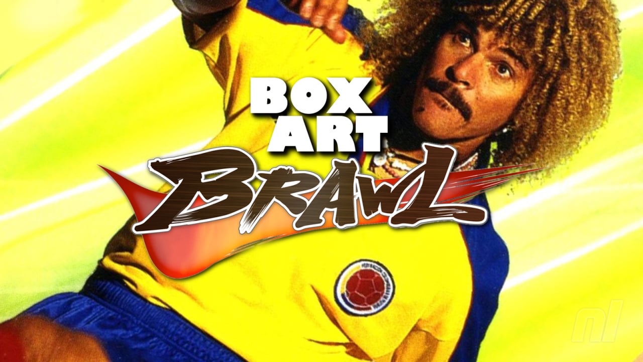
This week, we thought Switch-owning football fans could do with a pick-me-up following the release of the thoroughly depressing 'Legacy' edition of FIFA 21. Yes, for Brawl #64 we're journeying back to an appropriately 64-bit era when football games on Nintendo consoles weren't simply 'good enough', or even 'great' — no, ISS 98 was bloody fantastic. We watched its predecessor in a classic exhibition match back in Brawl #29, but it's time for the sequel.
Grab your jumpers for goalposts, and let's kick things off in this highly irregular three-way match.
Europe
As you can see above, European countries got one of two covers. In the UK, for example, we had Italian striker Fabrizio Ravanelli having a stare out against Paul Ince. Alternatively, elsewhere German goalie Andy Köpke replaced the Englishman, although instead of eyeballing the Italian he's looking into the camera with a face that seems to say "Why is it always me?".
We like the simplicity here — the black and white photo given a splash of colour from the logo at the bottom and the Konami logo running down the left side. It's subtle and striking all-at-once. Not bad.
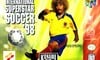
North America
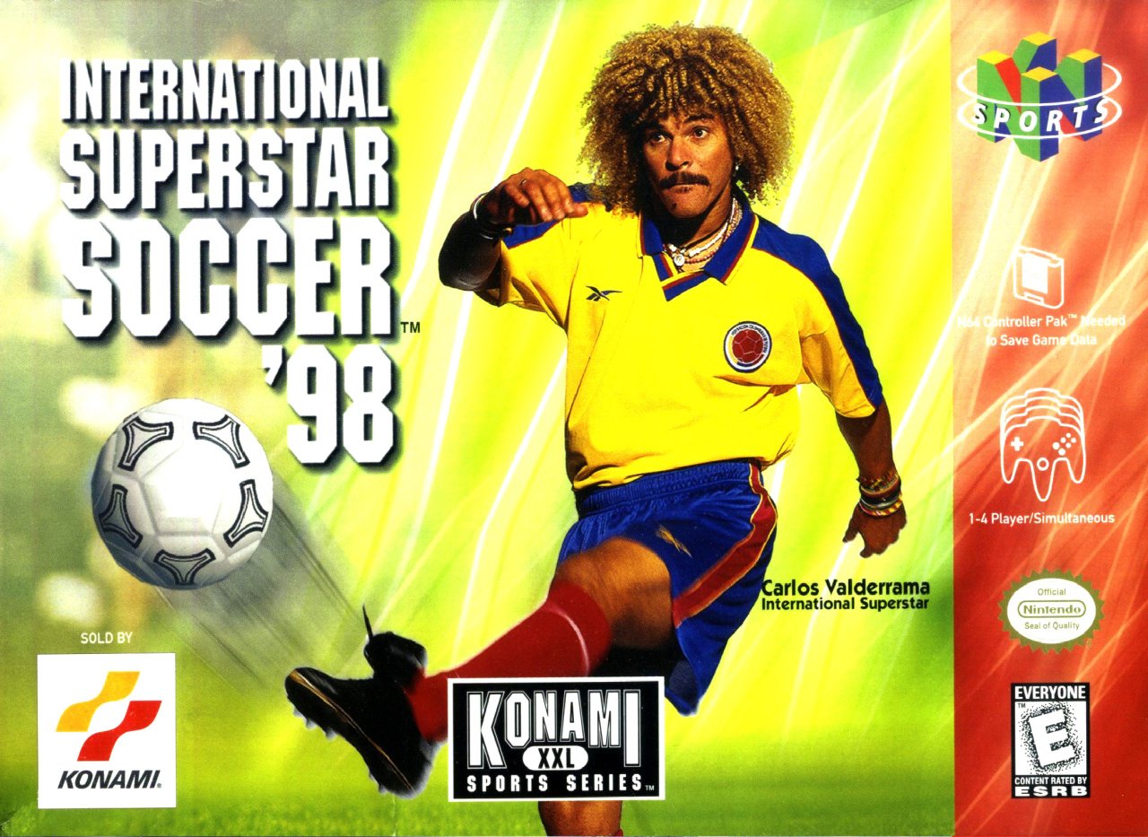
The North American cover isn't short on colour, that's for sure, although it's not much more dynamic than the previous game's NA cover. Konami went with the flamboyant stylings of Colombian star Carlos Valderrama here, and as one of the most recognisable footballers in history, it's nice to see him, we guess. At 37 by the time the game came out, though, he wasn't at the top of his game and his presence feels a bit odd.
Our main quibble is that they've managed to make a cover featuring Carlos Valderrama ('International Superstar', if you weren't aware) so spectacularly static and boring. It's quite a feat.
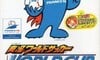
Japan
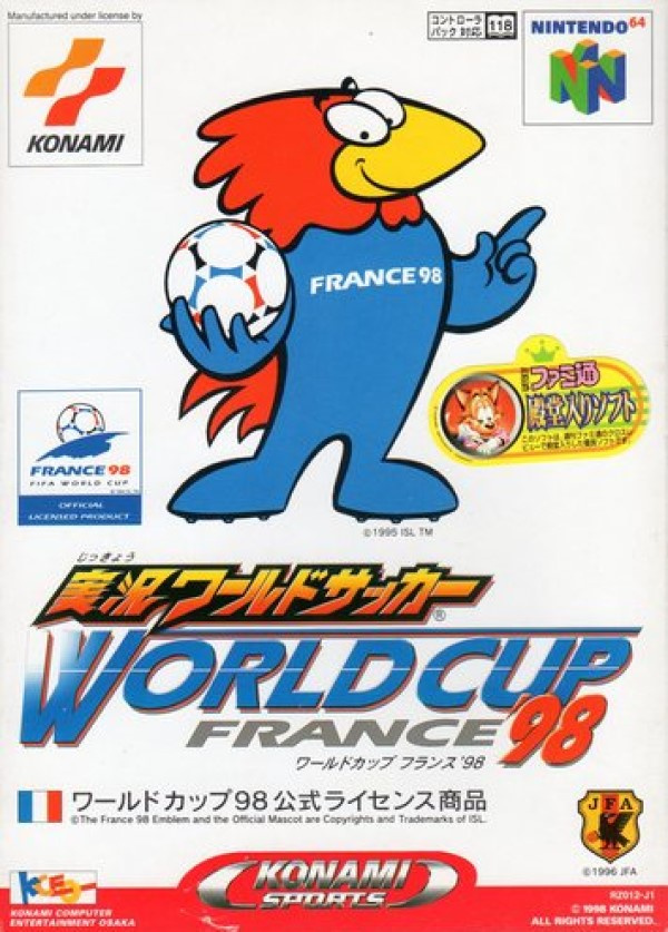
The Japanese version of the game came out earlier and boasted the World Cup France 98 licence. Therefore, in Japan the game featured off-brand Woody Woodpecker 'Footix', the competition mascot that year.
There's not much else to say about this generic cover really — as a licenced product, having the brand and logo front-and-centre must have done the job on store shelves. There's an awful lot of white here, and you could easily slap this image on any piece of merch. Uninspiring, but functional.
So, you've seen the three (well, four) options, but which is best? Pick your favourite and hit 'Vote' to let us know:
And the whistle has been blown. We'll be back for another game next week — until then, have a wonderful one.


Comments 55
Definitely Japan but at least they're all much better than FIFA 21's.
Hehe, bird go win
Hahaha, Ronaldinho Soccer!
Japan for me. Remember that world cup ha.
The Carlos Valderamma cover isn't bad but the Paul Ince and Fabricio Ravanelli one seems a bit too amateurish. I think none of them look THAT good tbf.
Europe for sure. I always liked the France 98 mascot, but the Japanese cover is so dull. Too much white.
I thought FIFA had the licensing all tied up and Konami had to resort to soundalikes for all the ISS player names in that era? How come they could use recognisable players on the boxes?
Soccer. HAHAHAHA.
What a game! Have the European version, boxed. ISS on N64 and then PES on PS2, the golden age of football games
Is that Bubsy on the Japanese cover?
Anyway since I don't know anything about Soccer, I'll pick the one with Jablinski on the cover.
I love footix, but man that cover is boring. NA just looks awkward. EU it is!
I'm not gonna vote because if there's no Ronaldhindo Soccer
NA for me. Jack Black with big hair was always a laugh.
The European (not UK) one doesn't make any sense.😆
North America all the way because the box art looks like a poster for a Ben Stiller movie!
Not voting for the EU - I’m voting for the UK. Please don’t take that as a political statement - it’s really not! But Paul Ince was the guvnor. Kopke isn’t even that recognisable in Germany, surely?
@Chibi_Manny That is indeed Carlos Valderama’s real hair - and it was glorious, especially in action. He was a very good footballer, albeit past his best in 1998, but his hair was world class.
It's only fitting to vote for Europe since they love the sport so much. Oh and their cover is just so much better.
I have no idea who those people are so I went with Woody Wood Pecker's off brand cousin.
I mean, the bird is cute.
The NA one is so bad that it looks fake. I love it.
Isn't this the MWAHAHA RONALDHINO SOCCER meme game?
Japan's is much better. I like that cartoons are able to shine in the world of soccer.
I gotta go with the European stare down cover.
The Japanese boxart does nothing for me and while I don't mind the North American cover, it lacks the intensity the European cover brings to the table.
Box Art Brawls Current Total:
Europe: 16
Japan: 21
North America: 18
Europe for me, as it features Ray Winstone.
Andy Köpke all the way 😆😂 it should become a meme
For once, The Uk one by far. The stare off looks good, and the logo and b&w colouring is stylish.
I don't know much about Soccer, but the EU one wins hands down (probably the first time I've voted for the EU variant, outside of the "Duel" features where they're bundled with NA).
Probably because Soccer is just so big there so they had the incentive to make a great cover.
Wow, got to go with Europe. US is too boring and Japan scares me a little. Hate low effort mascots like that. Ech.
This is like voting for your favourite STD
This is the game that got the most playtime in my childhood.
I spent hundreds of hours on this and clearly have to go with the European version with its standoff and the iconic fireballed title.
While boring, my favorite is the Japanese cover. The Europe staredown cover isn't bad for what it is. The other version, with a half staredown is rather awkward. I think the NA cover is very bad. It looks very messy with the artificial background, and all the logos and icons everywhere.
The UK one is the best. The rest of Europe one is odd.
These covers are all very, very bad and the people that made these should be ashamed.
They're all bad? Yeeeaaaah, they're all bad.
I don't follow soccer, so I don't have any idea what any of this means. I picked Japan because that zany bird reminds me of Woody Woodpecker.
The first European one looks like an MMA promotion. The second one is "looks at the camera like I'm on The Office." The Japanese one looks like a off-brand cereal box. The NA one truly captures soccer. It's just some guy kicking a ball while he's on an exaggerated walk.
None of them, these are all awful.
I thought that was bugsby I was gonna vote japan just for that
@Krull Köpke was the main goals for Germany at that time and 98 was his last World Cup. From that stand point it makes sense to put him on the cover. From today's point of view he might not be as recognizable as Kahn or Neuer, but at that time he sure was!
Wow. I don't like any of them at all!
FOOTIX <3
France - bresil 3-0.
Après ça on peut mourir tranquille.
Honestly the European box art looks clean, decluttered, and has a consistent color palate.
Always found it amusing that you had the players on the front of the packaging but not even those specific players names were in the games. The German cover is a case of the replaced Paul Ince but made the stare down make no sense. But the UK version is definitely the best but only because it actually for a sports game actually tries to show a rivalry.
Awww, come on. Look at that dudes impressive ringlet fro. I went for it because it is unmistakably 90s. Fantastic. Europe is far more boring/standard imo. I even prefer Japan just for that bird that they used to use back in the day.
But why doesn't the European version call it football, or change its branding to include football? Calling it soccer there seems like sacrilege. Regardless, I dig the NA version. Looks like it's from an Adam Sandler movie.
@RPGamer
I don't want no tight ass Nintendo club points you freak bitch!
The European one is the best imo. The American one looks like Inigo Montoya grew out his hair and took out his frustration out on soccer after losing to Dread Pirate Roberts.
Yeah they're all bad, but I went with Valderama, class footballer, sensational hair. Him, Rene Higuita and Faustino Asprilla were all mates with Pablo Escobar as well. Old Carlos could tell you some mad stories.
I like the bird best. But I voted curly Carlos macho mustachio. I know nothing of the sport or its players, but that cover is so out of place it just had to get my vote. It screams low budget, eighties, and disco, which seems more fun than football or "soccer".
Valderama on a cover in 1998 is kind of random.
Wasn’t aware that there were two covers in Europe. I believe Paul Ince is on the one I own (Scandinavia).
I am Colombian, El Pibe Valderrama is an icon for the culture here in the country. So my vote is for NA.
@ravj17 Viva Colombia amigo! I have a friend from New Zealand who is living in Medellin and he loves it. That place is really on the up now 👍
@PapaMurphy Yes it is, beautiful women, perfect weather and delicious food!
To the 24% of the voters who chose North America...you need to have your eyes tested

Show Comments
Leave A Comment
Hold on there, you need to login to post a comment...