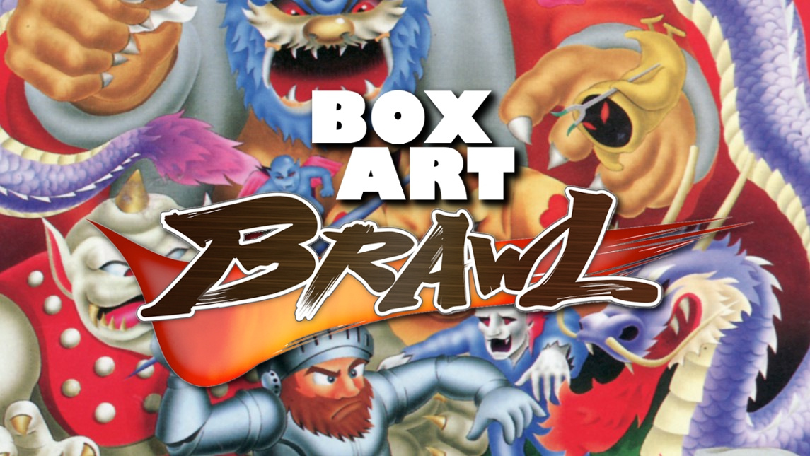
Welcome one and all to Box Art Brawl, the ongoing series where we dig up old game box art, compare regional variants and vote for the best before flinging them back where they came from.
Last week Quest 64 took on its counterparts across the globe in a bout which saw the European variant triumph over its Japanese and North American brethren. It seems that the '90s CG of the Quest 64 cover couldn't compete against the elegant art of the others. Chin up Quest 64, these things are cyclical. Give it a decade and you'll be all the rage once more.
Subscribe to Nintendo Life on YouTube848k
This week we journey back to the NES days and catch up with Capcom arcade classic Ghosts 'n Goblins. This run and gun platformer was ported to various systems and the NES covers echo several other Capcom releases of the era in their respective territories including the original Mega Man, although this certainly boasts better (or should that be 'less polarising'?) key art. Maybe we'll do the blue bomber's debut another day...
Okay, let's get down to brass tacks.
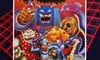
North America
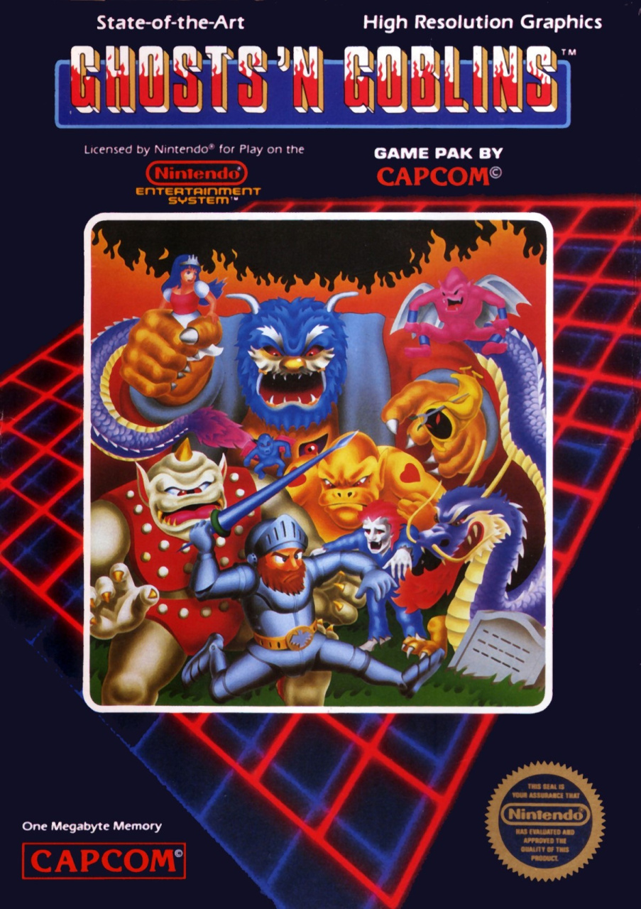
Beginning with the North American cover, we get the same red and blue grid background from games of the era like Gun.Smoke and Mega Man. The key art in the middle is colourful and gives a decent impression of the action you'll get while you play. The title up top is a tad hard to read with the red flames licking up the white lettering, but its evocative and the cover is interesting enough to make you concentrate on parsing the title.
Throw in the 'State-of-the-Art' and 'High Resolution Graphics' marketing spiel and the Nintendo Seal of Quality/Excellence/Approval/Whatever and you've got yourself a decent cover.
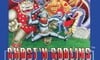
Europe
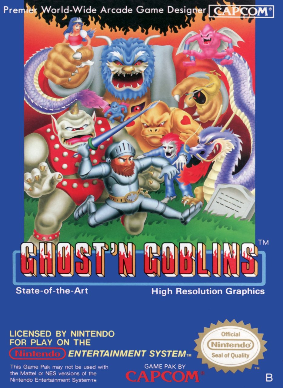
Europe gets the same main image, but blown up and pushed to the top of the box. The title sits below it and is a bit easier to read thanks to its increased size. The blue background mirrors other European Capcom releases of the time and the twin selling points from the North American cover are joined here by a descriptor for Capcom itself - a 'Premier World-Wide Arcade Game Designer' no less.
Not bad.
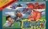
Japan
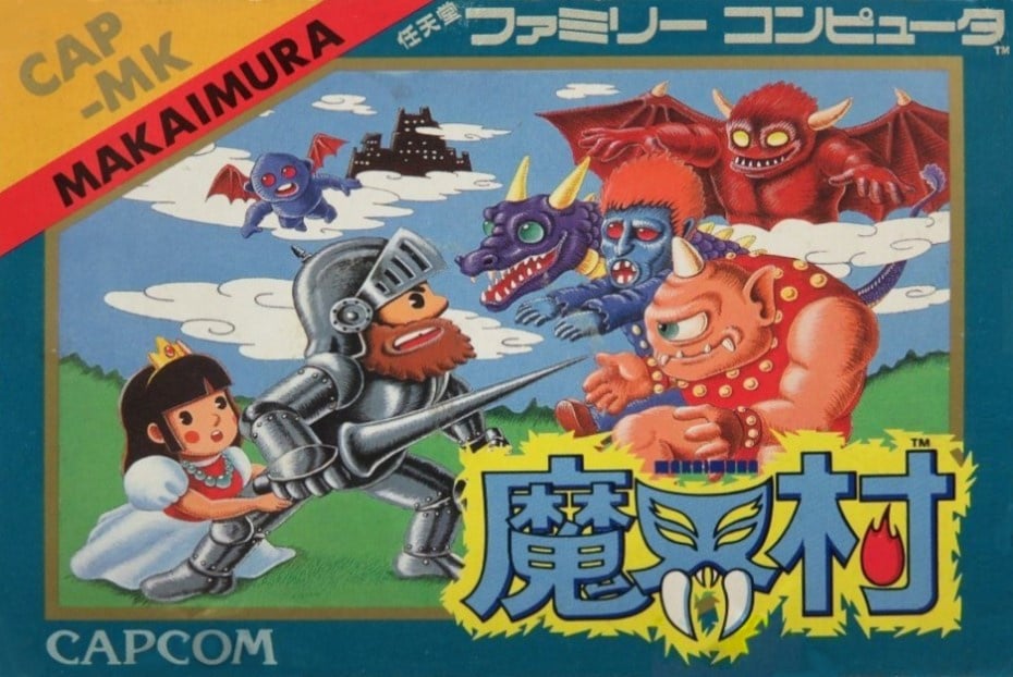
The Famicom cover was completely different to the ones in the West, with art that makes it look more like an illustration from a children's fairytale book - the ghosts 'n goblins here look adorable. If the cover does have one thing going for it, it's the kick-ass logo with fangs and flames.
Not much else to say, really. As Japanese covers go, it's far from the best we've seen but it does have a certain charm.
Three covers, one pick. Give your favourite one a click below and then hit the 'Vote' button to register your vote:
That's all for this week. Let us know if you've got any suggestions for the next bout and we'll see you next week for another Box Art Brawl.


Comments 39
Europe - with japan second very close. America last by a mile
Is it just me, or does that blue creature in the background of the NA and Europe covers resemble King Dedede?
Interesting that the European cover has the game's title spelt as Ghost 'n Goblins (i.e. singular Ghost). If you go on Wikipedia, the poster they use for the cover art there (from North America, supposedly) is the same.
@TheRealKyleHyde That is odd. I spent ages looking at these and didn’t notice!
Europe. For once, I think the Japanese box is downright awful.
I keep flip-flopping on the US and EU ones, purely on the different in contrast. The darker US one feels more vibrant, but loses some of the definition (eg on the snake dragon’s scales)
@FiveDigitLP now you mention it, i can see it. Definitely Dedede’s cloak, + Bowser’s hands + Hangry Cookie Monster face
It's a close call. Even though I live in the UK, the NA box art just edges it for me.
Also, isn't it about time for a new Ghost 'n Goblins? Maybe a new Switch version.
All somewhat close, but I’d say NA, then JP, EU on this one.
I'm voting for the European box art, as it takes the best part of the North American cover and makes it the main focus. To be honest, I'm not liking the Japanese cover, I don't know what it is, but I find something off-putting about it compared to the other two.
@Savino, I don't know, the Japanese box art makes it look like he's about to crap his pants (crap his armour?), Also, I don't think the monsters look as intimidating on the cover, compared to the North American/European ones.
This is the one I remember!
https://www.mobygames.com/images/covers/l/398750-ghosts-n-goblins-zx-spectrum-front-cover.jpg
Very rare for NA to win one of these for me.
The ZX Spectrum art beats them all.
@antonvaltaz I just noticed your comment after posting mine. The Spectrum cover is what I remember too and for me, looks much better than the NES art.
North America this time as I like the colors of the subjects there better. I also like that weird cyber-generated/connect four background. The Japanese version gets an honorable mention from me for having some unique art.
I don't like covers with full borders, so I went with Japan just because it has the smallest, least intrusive border.
NA is iconic - one of those covers that sticks in my mind and transports me back to being a kid. The Japanese cover is super interesting to me though. I was tempted to vote for it just because of how different it seems.
Arthur looks like he's giving the monster in the camp press stud suit a kick in the family jewels which I don't remember being a move in the game. Why is everyone cross eyed as well
I just noticed the castle on the clouds in the Japanese art. Pretty sure that wasn't something in the game.
Agree, the Japanese art is too cute for what the game is (even more fiendish is that it locked the Continue function behind a long cheat code, as I recall. The poor Japanese children who had to suffer 1CC that game. )
Choosing between NA and EU, I heard that the EU version still spells it "Ghosts 'n Goblins" in-game (that is, the title screen was a small copyright edit) so I'm going to have to dock it for spelling.
They are all horrible.
Voted for the PAL cover mostly because the art is front and centre without a weird grid behind it.
America & Europe are close, but I give America the edge for the more interesting border (it's very 80's).
The cutesy JPN art seems too divorced from the vibe of the game itself.
I like the actual art of the Japanese version over the western versions, though they're not awful either. Europe is my number-two pick, as I don't think the box theme with the tilted grid for those early US Capcom releases really worked in terms of design.
Japan. I like the fun style and composition. It made my eyes light up and I chuckled inside. Its almost deceiving, as you think you’re about to try a fun and upbeat video game... when in reality you’re plunging into an impossible darkness, where you’ll need to get the knife.
It's hard to pick. The North American box art has that cool 1980s grid in the background and the colors look a little less washed out then the European art, but the European one shows a bit more of the artwork itself.
I like the way the monsters are drawn on the Japanese one, but the hero and damsel just don't do it for me. Maybe it's those Pac-Man eyes. It also resembles the Link's Awakening remake which I'm not a huge fan of either.
None of them are particularly great but I would give the edge to the NA one since it has a bit more color.
Oh come on, the European one is definitely better than the American one.
None are great, but I do like that checkerboard background Capcom used on their early NES titles in America.
Borders irritate me so went for Japan. It's kinda cute as well haha
@OorWullie, just so you know, I accidentally clicked on the boxart image you posted & it redirected me to an ad for an "adult" game.
North America, naturally. It's sourced from the Japanese Arcade Artwork, after all. Mega Man, not so much.
North America, the European one is too washed out color-wise.
Box Art Brawls Current Total:
Europe: 9
Japan: 11
North America: 11
I like the USA version a lot more. This is a dark game killing the living dead, and brutally difficult, I think the other versions where their more pastel colors make it look too childish.
I love how it says high resolution graphics
The art looks just a big better on the NA cover compared to the EU one, so I'll give it to that. The Japanese one just really doesn't fit the game, in my opinion.
I like them all! The Japanese one seems more like a cereal box, but I like it.
The EU one is pretty much the NA one with the brightness turned up a bit too high, while the JP one looks more like it's advertising more to 6-8 year old kids than a general audience, and the tone seems at odds with the game itself, imo. Thus, the NA wins this one for me.
I think that looks like airbrush art instead of cg. The Japanese one is super cool.
Show Comments
Leave A Comment
Hold on there, you need to login to post a comment...