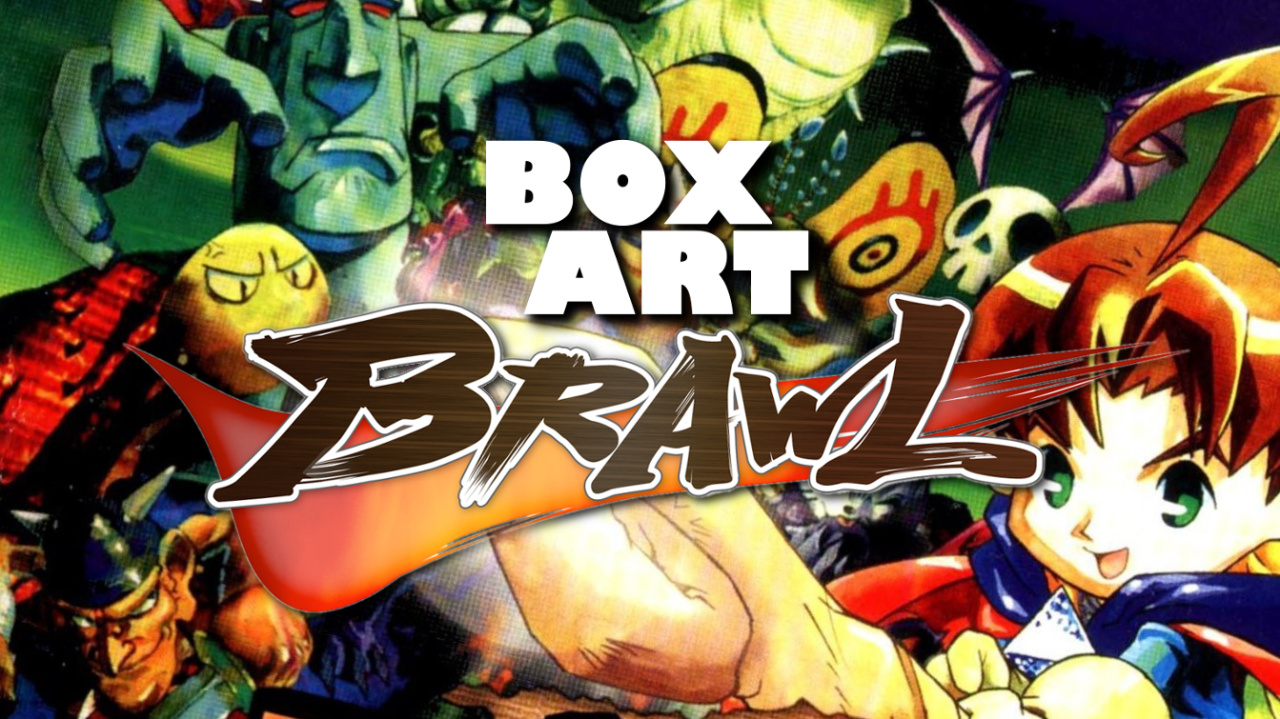
Bienvenido, benvenuta, أهلا بك, bienvenue, willkommen, 欢迎, bem-vinda, ようこそ, and welcome to Box Art Brawl, the series where you vote on the best box art from regional variants of the same game.
Last week we watched ISS 64 as it engaged in a rare three-way football match. After a tense 90 minutes Europe emerged victorious with a decisive 58% of the vote. Japan came second with just under half that percentage as North America trailed in third place. As the game's commentator might say, "Poor old... NORTH AMERICA!"
Subscribe to Nintendo Life on YouTube845k
Staying with the N64 this week, we have a game that took a different name in each territory, not to mention a totally different cover design. North American readers will know it as Quest 64, although in Europe we called it Holy Magic Century. Whatever you call it, it was a half-decent RPG from Imagineer on a console not blessed with an over abundance of RPGs.
Enough beating about the bush - let's go on a Holy Magic Eltale Quest!... 64.
Japan
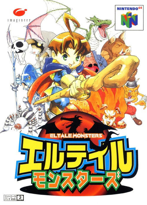
Known as Eltale Monsters, developer Imagineer self-published in Japan and we get a big, bold and colourful logo front and centre at the bottom of the box with a decent bit of key art behind it. Brian (yes, really) thrusts his mage-y staff towards us as a sinister-looking bunch of baddies pose behind him.
The all-white background probably helped the game stand out on the shelf, although we would have liked to see a splash of colour. A strong start from the East.
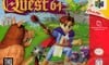
North America
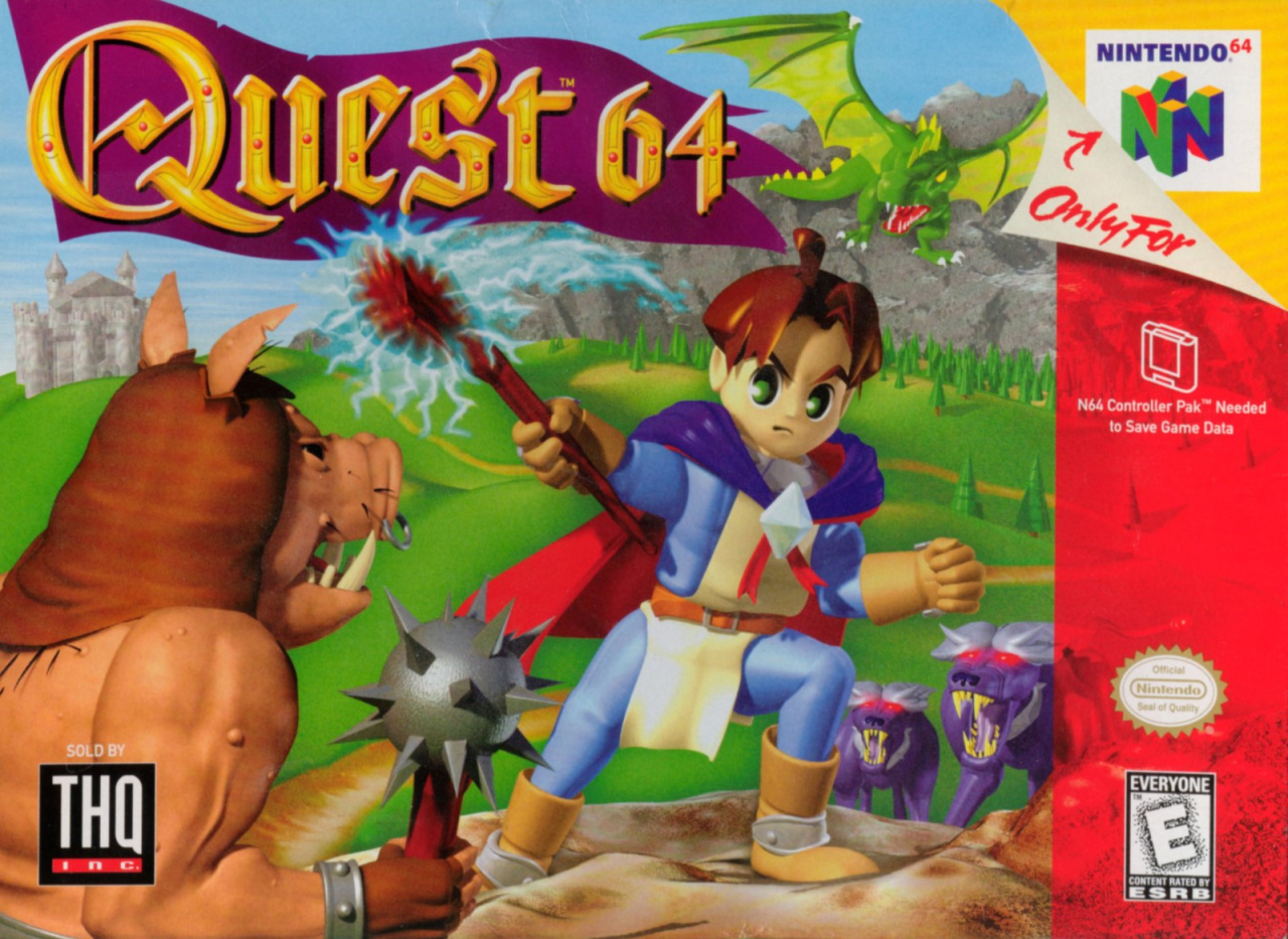
Quest 64 jettisoned the key art for something... different. Let's start with the plus points. We like the logo, with its encrusted jewels, decorative frills and the lush purple flag behind it. And it's certainly colourful, with practically every value accounted for somewhere or other.
The '90s CG stylings don't hold up as well as classic, hand-drawn art, though, and this cover looks decidedly more 'kiddy' than the Japanese variant, despite the vein-y arms of the pig-man and the glowing red eyes (and grey toupées?) of the wolves flanking poor old Brian. Maybe the fault lies with publisher THQ.
There's an issue with depth here, too - the Duplo dragon in the top right is presumably in the background and very large, although the fact that its tail is in front of the logo's flag - as is Brian's staff - suggests that it's a parrot-sized fire-breather hovering just above Brian.
Maybe it is! We confess we missed out on Quest 64 back in the day. Still, on the strength of the NA cover, we won't be adding it to the backlog.
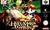
Europe
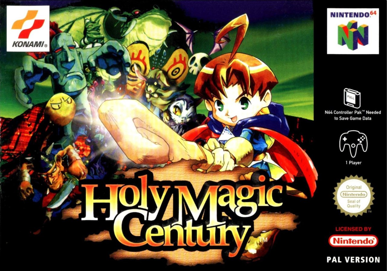
The EU cover flips the key art of Brian from the Japanese cover, throws in an ominous green sky over some red cliffs in the background and adds a grim gang of encroaching ghouls behind our hero. The new title gets a nice logo treatment and with a torn parchment backing and EU publisher Konami forgoes the usual black border of EU PAL boxes in favour of a single black strip down the side.
It's not perfect, but it looks like a quality product - something that would sit proudly alongside Ocarina of Time on the shelf.
Three totally different covers, one vote. Give your favourite a click and hit the 'Vote' button below to exercise your democratic right:
Aaand the quest is over. Thanks to KitsuneNight for this week's suggestion, and to the rest of you for voting. See you next time for another Box Art Brawl.


Comments 47
I have to say, Quest 64 is possibly the worst title for a video game ever. Jeez, how nondescript can you be 😂
Well, definitely not NA.
Europe, no doubt. The US cover is bad in every aspect, beginning with the art assets used and ending with that idiotic title.
This one must have flew under my radar. First time I’m seeing it.
Both Quest 64 (where are Quest 1-63? Hehe) and Holy Magic Century are bad titles, but the art on the European box looks great.
Europe easily wins for me, followed fairly closely by Japan and leaving North America as far behind as possible!
This was like one of ..... three? four? RPGs for the N64.
Let's see...
Am I missing any? This console didn't really do RPGs, did it...
Clearly the japanese version.
Clearly NOT the american version.
tough choice - I picked the Japanese version just slightly over the EU version, manly because the art reminds of so many '80's and early '90's RPG art (very classic). The US version sucks and is too childish for any older gamer to even give the game a look.
I never even heard of this game before but based on the box art alone I voted for the Japanese cover this week.
I slightly prefer Japan, but Europe looks very good too. America's does indeed suck.
If it keeps up this way, Europe may finally catch up to North America & Japan in the next couple weeks in terms of winning votes (though I still feel the Mario Bros. reisssue cover was cheating a bit).
Europe and Japan both look pretty good, but I prefer Japan. Europe looks a bit murky on my screen. NA is so bad it hurts, typical mid-Nineties CGI trash.
Ah yes, back when you had to advertise your 3D games using 3D CGI artwork, just so your potential consumers understand how cutting edge the games graphics were.
The art on both the Japanese and European boxes is much better IMO. After that it was a close debate, but I settled on Europe.
I have the europe box proudly on display on my shelf! I loved this game, and "Holy Magic Century" is one of my favourite game names... it just sounds so grandiose! And, in an epic fantasy RPG, the hero is called... BRIAN! 😆
Close call between Japan and Europe. I went with Europe. Definitely not the American one with its dodgy late-90s 3D art. Though as a side note; you said that the European one forgoes the usual full black border in favour of the (much nicer imo) black strip down the side. This was actually the case for all third-party N64 games. It was only the Nintendo-published games that had the full black border. I never understood the reason for this; whether it was an intentional decision or just a mix-up from the start, but in any case, I wish they'd all gone with the black bar down the side, so my N64 collection wouldn't look like an ugly inconsistent mess...
Europe on a role lately. I knew NA was going to be awful. I had to own this game because it was basically one of the only rpgs on the system. Looking back I could've skipped it and been better for it.
Hey look my suggestion got picked up.
I solely wanted this one for the horrendous USA cover art.
By the gods is it bad.
And we wil follow the life and adventures of a man ..err boy called BRIAN.
Voted Europe btw.
@EarthboundBenjy
Shadowgate 64 and Mystical Ninja starring goemon could kinda count as rpg lite.
Maybe the NA publisher feared that a hand-drawn cover would tell the consumer "this is an SNES-style pixel RPG" and we can't have that, now can we? Jokes on them, between the crappy cover and the lame "Quest 64" title, I thought it was a half-assed lazy attempt at an RPG and happily skipped it. Sad to hear it actually is one.
@technotreegrass
An SNES style rpg would have made it a better game
But 2D was very much person non grata at the time.
@KitsuneNight Indeed, which is a shame. The 2D pixel art games on the PSX are absolutely stunning, but they are few and far between compared to the 3D games.
@EarthboundBenjy don’t forget Hybrid Heaven! RPGs were usually about big cinematic back then, and so the tiny N64 carts were not an ideal fit
Must confess, this is the first European box art I’ve voted for
Man, I hated this game as a kid. I couldn’t figure it out at all.
'Grats, EU, you walk away with this one! JP makes it seem like the monsters are the focal point and the U.S. one, though it has excellent color and lighting play, just needs polish. Holy Magic Century plays up that you're a magic caster and foreshadows a seedy underside to the otherwise bright world that the player will soon encounter. Bravo!
Box Art Brawls Current Total:
Europe: 9
Japan: 11
North America: 10
I'm apparently probably alone in this, but
Europe > North America > Japan.
Japan's even cheesier and it just doesn't work for me here. Europe manages to turn that into something cool. NA isn't GOOD, but it is very N64, and that has a certain charm to me.
Sometimes I wonder how differently things would've gone if EarthBound 64 had come out. Would it have done well enough to lure more RPGs to the system? How would it have held up against FFVII? Would Square have come back to Nintendo systems sooner? We'll never know - we don't even know how exactly different it would've been from the Mother 3 we actually got! - but it's fun to speculate.
@EarthboundBenjy Possibly some Japanese exclusives as well:
Zool (probably not related to the Amiga platformers). (I've seen some screenshots of turn-based battle but there was FAR too much text for me to figure out much trying to play the game myself)
Two Custom Robo games, if those count.
There was an Ultraman game that seemed like it could maybe have RPG elements but I only played a few minutes of it (as shocking as an Ultraman RPG probably sounds, Bandai did make a couple of them on the Famicom).
Japan close but the backgrounds on Europe is cooler. Not much of a fan of the kind of poor CG look on the US cover, sadly.
Only way that title could be more generic is if it was called "Game 64" ...
I like them all. However the North American one is the most pleasing to the eye for me. I like the generous use of green contrasting with the light blue sky and the quasi-medevial font for "Quest 64" (complete with tiny red jewels?) on a purple banner. The art kinda says "Saturday Morning Camelot" to me (whatever that means).
The game was terrible and so is the character art on the North American version. But with just a quick glance the North American box art wins for me, followed by Europe. But like I said, I like them all.
Japan and Europe both look nice and it was a tough choice, but I ultimately picked Japan as a bit better. A good case could be made for either. The NA cover is not good, in my view.
I completed Holy Magic Century though it was a chore. It's not a bad game, just very mediocre. The only problem I had with it was that areas (fields, caves) were so huge and barren that after a random battle I often walked into the wrong direction back to where I entered the zone. It's also the only RPG I ever played where you don't receive money so there's no buying or selling items.
@EarthboundBenjy
Five. Hybrid Heaven and then you have all the RPGs for the system released in the west. Though I know Japan also got a Shiren The Wanderer (Mystery Dungeon) RPG and Doubutsu Banchou (Cubivore). So make that 7.
@KitsuneNight
I have both games. Shadowgate 64: Trials of the Four Towers is a first-person-adventure with no RPG elements. And Mystical Ninja Starring Goemon is an action-adventure just like Ocarina of Time and Majora's Mask or the two Castlevania 64 games. I'd argue that Harvest Moon 64, Wonder Project J2, Mega Man 64, Gauntlet Legends, the 3 Pokémon Stadium games, and the original Animal Crossing might have more light RPG elements.
@KingMike
Wow, I never heard of Zool: Majū Tsukai Densetsu before. Now we're at eight RPGs for the system. The two Custom Robo games though, I don't think they're real RPGs, but I guess you could count them as light RPGs if you count games like Monster Hunter where you don't level up by stats but by equipment. And yeah, PD UltraMan Battle Collection also looks very RPG-y but I don't understand anything that goes on in this game. Now if we count that and Robot Ponkottsu 64 (another weird one that got a GBC game in the west called Robopon), then were at 10 RPGs for the N64! Great! xD
@EarthboundBenjy Hybrid Heaven was an RPG, I think. Weird as hell too.
The art...the format...the black border that for once doesn't make it look like a cheap copy from a rental store shelf! Could it be that Europe finally has the supreme box art?
@SKTTR
That's why I said could kinda and rpg lite.
Goemon like the two Zelda's are more like action rpg's
and Shadowgate 64 ?
...Well you do role play in it.
The n64 is so devoid of rpg's that semantics matter.
@KitsuneNight No problem. I know exactly what you mean. That's why I added a couple more. RPG-starving N64 owners had to find their ways.
Europe just uses the Japanese assets in a way better way and imo has a best title.
I give it to Japan by a very slight margin. I don't like the way the cover art on the European version looks like a picture stuck onto the box. But both EU and Japan are WAY WAY WAY better than the US cover here! That just looks plain ugly! Why switch from the lovely hand drawn art to that ugly... what is that, bad CG?
NA cover has got to be the most generic N64 cover I think I've seen. Even the title is ridiculously generic, to the point where I gotta wonder who was behind the decision to do it like that (especially since the EU cover and title have none of the problems the NA one does).
In any case, EU wins it for me by a hair, due to the JP cover looking more like a poster then box art.
I picked Japan, but honestly all three do a poor job of representing this game: from these boxes, you could easily assume that something resembling entertainment might lie within, and you would be sadly, cruelly mistaken.
One day Europe and Japan will understand the late North American airbrush art period.
Japan just has a better box shape and layout, it gives it a huge advantage for me.
@SKTTR
Wow, ten RPGs! That's amazing. I'm glad I asked because I'm learning about games I hadn't heard of before that I may very well want to check out in the future.
Just for curiosity's sake, I was comparing the list of N64 RPGs we've come up with here to the GameCube's library of RPGs, and I actually couldn't come up with more than ten on the GameCube either.
I'm sure there's more, because the GameCube has more games than the N64 in general.
It's hard to find definitive lists online when everyone has a differing opinion on what an RPG is. I wouldn't consider Crystal Chronicles to be a true RPG, for example, but many people would.
Reminds me of been a young teenager reading nom.i remember them reviewing this but never bothered with it. To busy with zelda and goldeneye!
@EarthboundBenjy For Gamecube there's also
And for N64 I found there are at least 3 more RPGs in Japan not mentioned yet. Super Robot Taisen, and two fishing RPGs by the folks who made Harvest Moon. The series is known as Legend of the River King, and it got great reviews, but only the 2 Game Boy Color games were released in the west in 1999 and 2001. The two N64 versions, Nushi Tsuri 64 (1998) and Nushi Tsuri 64: Shiokaze Ninotte (2000) unfortunately stayed in Japan. There were many more games in the series, with only 2 more ever releasing in the west: the PS2 got River King: A Wonderful Journey in 2005 and the Nintendo DS got River King: Mystical Valley in 2007. Anyway, let's update the N64 RPG counter to 13 (and the Gamecube RPG counter to 13 as well).
Voted for the European cover, but I do have a soft spot for the 90s computer animated N64 covers. It is a perfect sign of that era, in my opinion. Quest is a fun series, tho the RPG on the GBC is much better than the 64 version.
Show Comments
Leave A Comment
Hold on there, you need to login to post a comment...