Get your paintbrushes ready, because it's time for another edition of Box Art Brawl!
Last week, we matched up a trio of covers for Wario Land 3 on the Game Boy Color and after a weekend of voting, we were left with a clear winner. It was the European variant that walked away with the win, taking 42% of the vote and leaving the North American and Japanese designs with 36% and 22%, respectively.
This time, we've been inspired by Hideki Kamiya's TGA name drop as we're taking a look at the classic Wii Zelda-like, Okami. Yes, a follow-up is in the works, so it's only right we go back to where it all started (besides, we already covered the DS sequel back in 2020).
Europe and North America opted for very similar designs for this one, so we have a classic duel on our hands as the Western covers face off against Japan. Let's check them out.
Be sure to cast your votes in the poll below; but first, let's check out the box art designs themselves.
Europe / North America

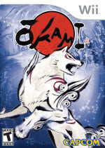
The European and North American design is honestly pretty simple and to the point. Our wolfy protagonist stands front and centre, rearing up on its hind legs as if ready for action. The painterly aesthetic extends into the single-colour background too, with the blue forest contrasting the red of the logo. We'd be lying if we didn't say that we find this one a little bit nice.
Japan

Woof. The Japanese design takes the game's artistic sensibilities and dials it up to eleven. Amaterasu now runs towards us with a flaming reflector on its back. Bright pastoral colours extend over the left half of the box, while a pink cherry blossom peeks out in the background. It certainly has more going on, but gosh, isn't it beautiful?
Thanks for voting! We'll see you next time for another round of Box Art Brawl.
Comments 50
Both are great, but Japan’s is a work of art.
Japan for sure as it has the actual setting in the background first and foremost (pun intended), but also considering that Amaterasu has a weapon in it unlike in the European/North American box art - both are beautiful in their own way as should be the case for Ōkami!
Japanese one's colors are much more what I'd associate with the game.
Anyone who votes America/Europe needs to go to Specsavers.
The background with the cherry blossom is beautiful.
Didn't the Wii North American box art mistakenly had an ign watermark on it?
Not exactly fair, someone photoshopped the Europe/North America one here. We all know that the IGN logo on the coverbox was one of the most amazingly awesome flubs in the history of coverbox art, thus making the Europe/North American version the true champ here.
Technically the Japanese one might be superior, but I'd be lying if I said that blue EU background wasn't dreamy. Genuinely tough call.
Both win. No vote from me.
Edit: I decided for the western cover after all. It looks so cool and dreamy and if I remember correctly, this is more fitting with the game, which was often a little bit sad in tone. The game felt more like the theme was the moon and not the sun.
@Erigen IGN logo boxart > Japan > North America
EU slip cover art
Okami is now on sale for $5 in the eshop. I wasn't planning on triple dipping this game but to have it on the go for that amount is fantastic.
the ign logo is in the original one so if we are being fair, that is a glaring flaw. Japan has the true japanese style
Looks like Angry American Kirby Syndrome infected Ōkami too. (American wolf go "Grrrrr")
Gimme those cherry blossoms all day long.
EDIT: I also love that the Japanese cover displays the genre(s) as Nature Adventure. 🥰
Both are amazing! I can't decided for which one of them I should vote, the cherry blossoms are lovely, but the blue with the sparkles is also nice.
I will vote later, or probably not at all.
I would like to defend my choice to vote for the NA cover!
It’s much cleaner and more focused. It also conforms to the set photography rules of symmetry, and contrast, easily guiding the viewers eyes to the focal points.
The Japanese version is too busy.
I voted Europe because 1) bias (that’s the version I had) and 2) I actually like both equally
Both pretty, but I went with Japan.
Both are great, I gave the slight nod to Europe/NA because the blue is so striking. So unusual to have that much on a cover, it really stood out on a shelf.
I specifically bought a Wii copy of Okami for my shelf because of the IGN watermark incident 😅 No doubt Japan has an overall better design though.
My UK copy is in an embossed slipcase with different artwork to these two.
Someone might have mentioned that already but from what I remember the original artwork in EU had a hidden IGN logo that was involuntarily left there. This caused the fans to start raving online that the artwork was an absolute afterthought that capcom did not even bother to check. As a result Capcom offered 2 or 3 printable alternate covers to replace the faulty one.
That's what I remember anyway. The real story might vary a bit
Also voted for JP!
Prefer the European PS2 boxart to be honest - pose is similar to that here, but it uses the colouration of the Japanese box.
Until I started looking at these articles every week, I never realized how they often try to make American boxes more aggressive. And it makes me wonder if they actually put the more beautiful artwork on American games, would they sell more? Not saying that Okami didn't sell well, but the beautiful cover makes me way more interested in this game. I did eventually buy it on my switch.
I've always liked NA/EU's regional equivalent, but Japan takes the cake this time. I quite like that pose of Ammy, plus the background shows off the game's beautiful visuals.
Honestly? I'd call them even.
PS2 original cover is iconic. From these two, well, both are solid 11/10. All of them are 11/10
If I'm being objective, the Japanese one is probably better. But personally, I think I like Amaterasu's pose on the Western one more. Blue is also my favorite color, so that background is aesthetically pleasing to me, but the cherry blossom trees are much more representative of the game itself.
I guess I vote begrudgingly for Japan.
One of those cases where I don't know which one to vote for. The pose in the western one is much better and Amaterasu is front and center there too, but everything else is better in the Japanese one. I don't think I can vote this time.
Don’t think I’ve ever been so torn, I’m literally 50/50 on this one!
Both are beautiful. I voted for the Japanese one.
You should have included covers from more formats
Given the whole theme is restoring color and life to the world, I feel like Japan's shows that off much better. Though the other one still looks nice!
I think the EU cover is beautiful in its simplicity. Both are nice though
Voted for the Japanese cover. It makes me think of the scenes where you purify the land; all of the color comes back and flower petals flying everywhere. I love those moments in the game!
@Erigen
I like both but I went with the NA artwork.
That western one is very nice, but the JP one really brings it all to life, so that gets my vote.
Um, excuse me, but where's the IGN watermark?
@Azuris I had forgotten about the watermark. That alone makes the NA one the inferior cover.
Disc art (Wii version only, different releases have different box and disc arts)

North America, no ign watermark on this one.
Europe

Europe rerelase variant

Japan

I personally have never played the game, but I never associate purple with Okami. So in my eyes the North American disc is the worst.
Box Art Brawls Current Total:
Europe: 89
Japan: 87
North America: 103
Australia and New Zealand: 1
While I can certainly understand the majority vote for JP, I actually like this EU NA one more. It's cleaner, more focused. It's really pretty too.
I had to think about this one for a bit. They're both quite good. The blue background in the western cover is nice. I like the sun being up top, and the curve of the sun goes with the curve of the top banner. For Japan the way the wolf is posed shows off more elements beyond just looking like a white wolf. And of course, the background is really nice for Japan. Eventually, I decided to vote for Japan, but the other cover is very strong too.
@HammerGalladeBro
I would expect the dark red more on a Resident Evil Game
Overall the single Color Discs look like a Budged Release.
To the IGN Logo, someone at a local Capcom HQ has slept very much^^
Must have been easier to get it from a Web Search than to reach out to the japanese HQ.
I personally like them all, the Variant of Jack_Goetz also looks very nice.
Where’s the IGN watermark
I never much liked the western Wii box art. But then I had/have the game on PS2 instead.
Yeah, a weird comparison since Okami is a PS2 game, the ports came years later. The PS2 cover plays up the ink gimmick by being mostly white and black, with the same Amaterasu illustration as the NA/EU Wii one here. Definitely the most memorable and iconic version for me.
I own this game physical on PS2, PS3, and Switch; buying from overseas when necessary. Such an amazing game. It's main problem though is its super slow opening - what feels like 2-3 hours of storytime and heavily-restricted tutorial makes it a hard one to dust off for a replay...
w h e r e s t h e w a t e r m a r k
Obligatory IGN watermark acknowledgement comment.
NA had to look a bit more aggressive since there no AR-15s in the actual game to be used on the cover art.
Leave A Comment
Hold on there, you need to login to post a comment...