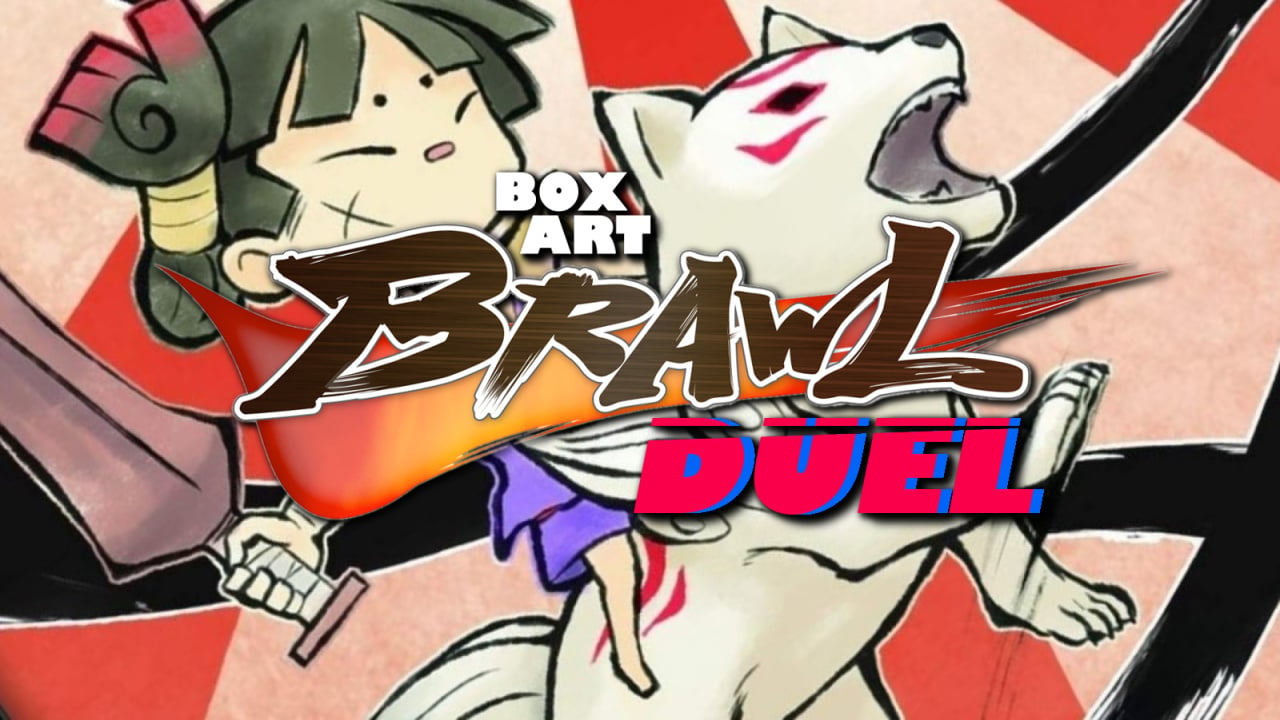
Welcome back to another round of Box Art Brawl, the series that sends two or more regional variants of game covers into an arena to pugilise for your pleasure.
Last week we enjoyed the epic duel between the North American / European Metroid: Other M box and the rather lovely Japanese variant. The result was predictable from the start, but the western version still managed to bag nearly a quarter of your votes. Still, that Japanese cover!
This week we're looking at a little Nintendo DS sequel to a classic Zelda-like adventure with a unique art style that began life on the PS2 before coming to Wii (and then everywhere — Okami HD is available on Switch).
Why are we looking at Okamiden rather than its predecessor, you might ask? Well, on 30th September 2020 it'll be exactly a decade since the release of the Japanese version, so we thought it deserved a little love on its 10th birthday.
We see your tails rightly wagging. Let's get on with it, pedigree chums!
North America and Europe
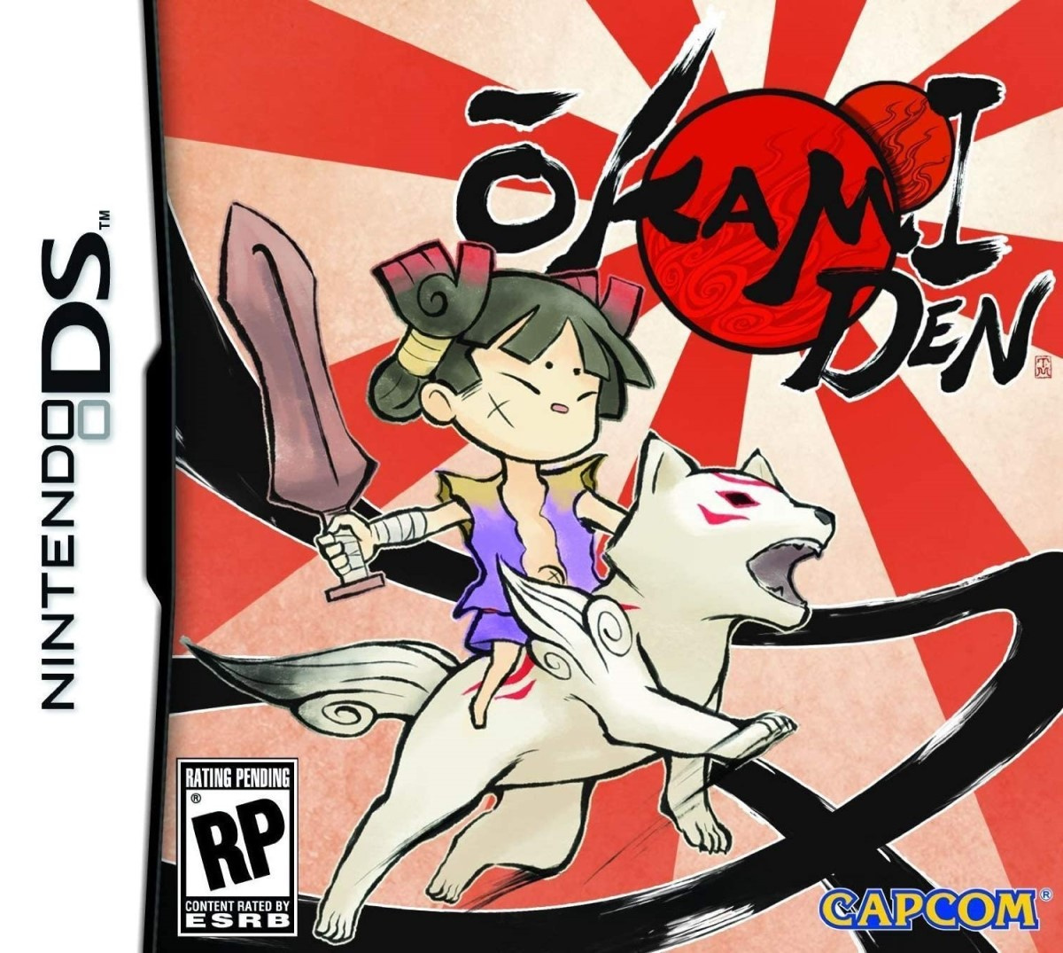
Featuring the sword-wielding Kuni riding adorable pup Chibiterasu, the western version is certainly striking. With the red sun casting out vivid rays across the background and black swipes from the Celestial Brush wrapping around the protagonists, it hints at the action of the adventure while giving a good taste of the gorgeous art style carried over from the previous game.
Plenty of motion, a pleasing mix of bold colours and subtler hues; it's a strong opener from the West.
Japan
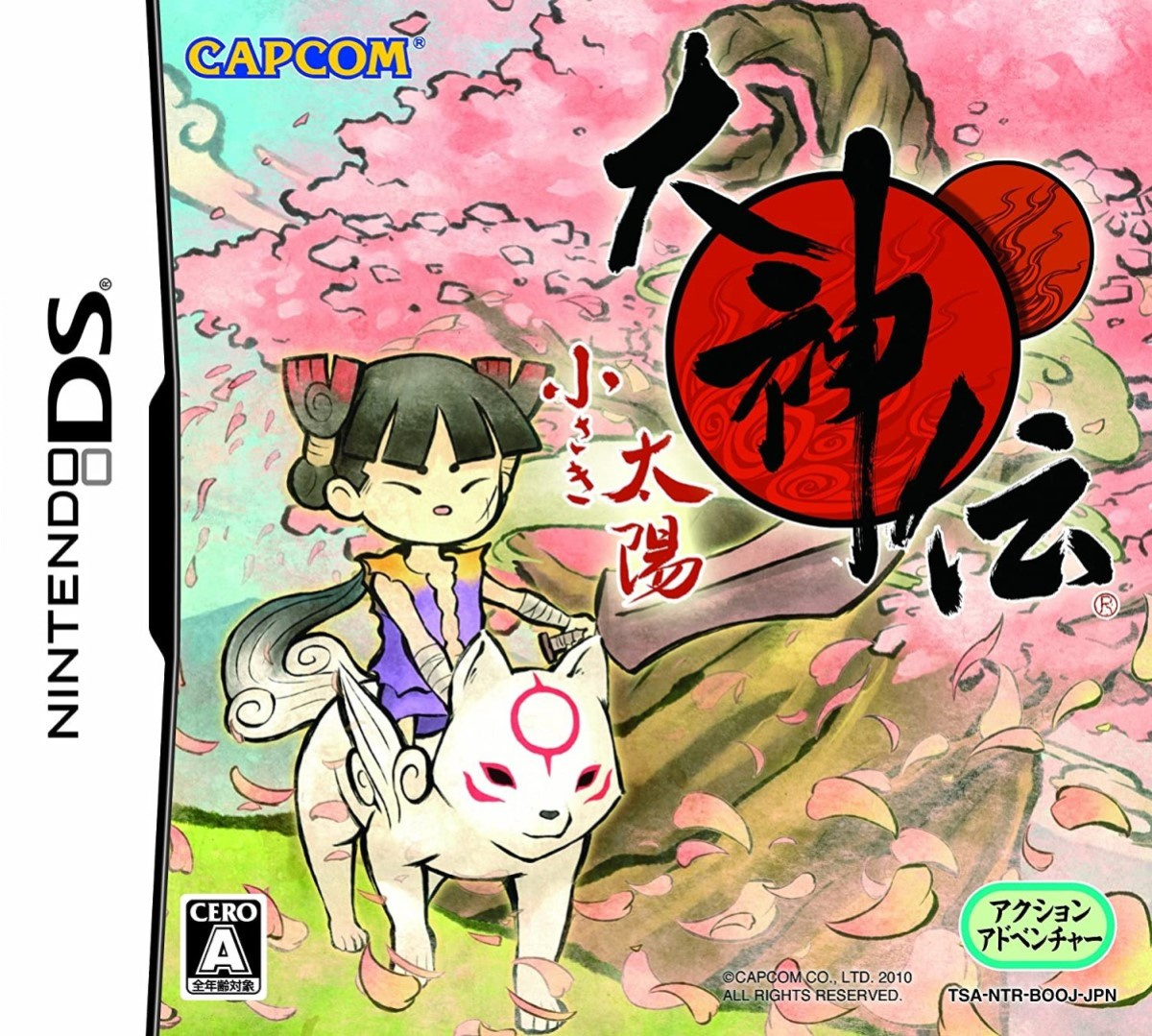
The Japanese cover is much more contemplative by comparison, with Kuni and Chibiterasu strolling over the pastel landscape and cherry blossom swirling around them. It gives a better sense of the environment while keeping a similar general layout with the logo in the top right and the heroes in the opposite corner.
It's less dynamic, but perhaps more reflective of the game experience, and we enjoy that it gives a sense of the world. Less eye-catching, but more pensive. Tough choice, this week.
So, which is best? Pick your favourite and hit 'Vote' to let us know which pup you prefer:
That's all for this brawl — we'll see you next time for another round. Take care, lovely people!


Comments 59
Japan for me - I really like the cherry blossom tree in the background!
Japan's is pretty much NA/EU's but with a beautiful cherry blossom tree in the background, so it wins out for me.
I see the cover art used for the western version used the non-finalized ESRB rating.
Just had to double-check the art doesn't seem to have changed from the finalized version.
Honestly, neither cover does anything for me, but I'll give a slight edge to the Japanese cover.
Nostalgic as I am for the NA/EU cover, beautiful environmental visuals are quite the persuader. Japan it is!
I quite like the dynamism of the NA/EU cover but can see how lovely appealing the cherry blossoms are. I bought this game a few months ago (Japan version only) so I should really get back into it. Marvelous little gem🤗
They’re both too childish for my liking. But Japan is far better.
Typical- western release focusing on the violent aspects of a game. They both look stupid as hell but the western one is particularly absurd. I refuse to vote. There should be an option to say all designs suck, in future cover polls.
Maybe I'd like the Japanese one if it had some of the other partner characters in the background, but neither of them are winners...
I like how the US/European Art is an evolution of the first game, but the Japanese one just looks nicer.
I'm giving a slight edge towards the Japanese cover but both are great in my book.
Both are pretty good, but the Japan version is a little more chill, in keeping with the vibe of the game.
Box Art Brawl Duels Current Total:
Japan: 3
North America / Europe: 4
I think ene Japanese one is a much better interpretation of what makes these games so special.
The rising sun flag isn't considered okay in Japan now, so I'm surprised that design, however subtley different it might be, appears on the UK box art. Cherry blossoms for the win!
Japan.
(Loved this wee game by the way)
They're both really nice but I went with Japan.
Never played Okamiden but loved Okami. Is it as memorable an experience?
Definitely the colour of the Japanese version that gives it the edge.
Never played the game even though Okami is one of my all time favourites.
To be honest, I don't like any of them
The Japanese one is a lot prettier. Amaterasu seems to have fallen to the "Angry Kirby' curse. (When character on the western box art is angrier than the Japanese one)
This one was a bit harder. I like both for their own reasons.
They both look good, but the Japanese version captures the spirit of the series much better, with it's themes of preserving the beauty of nature.
Regarding last week's battle and "that Japanese cover!", there were quite a few commenters who thought both covers were weak. As for this week, I think Japan is better. The cherry blossoms really add a lot, in my opinion.
Voting japanese on this one because it's more aligned with the series vibes.
Also, Kuni's scar is on the wrong side on the western box art.
Japan. By the way, I want an HD version of this game.
Here's one of the best Nintendo DS games. I have to confess something. It was the only game that made me cry.
Both look great, but japanese one does look better.
The winner is the audience for getting to dote on adorable little Chibiterasu.
But yeah, the Japanese cover is prettier.
I like the na EU art more with the sword and characters taking more of a center stage along with the sword being hard for my eyes to see in the jap version. Then again never played the game so maybe I'm missing something about the covers but anyway that's just my opinion
@Shiiva You sure? I know the Rising Sun flag isn't commonly used publicly but it is still used with their navy (and military in general?) and still used in pop culture without issue as far as I know. Loudness had an album cover with it in 2014 and still use it live I believe.
Biggest reaction I've seen of it was last year when China wanted it to be banned for Tokyo 2020 (despite it sill being used an on display when passing through Chinese waters / ports). Japan said no.
Also over here in the west no one really seems to care hence why they used in on the cover I imagine. Just a nice image.
I went with Japan, but neither is all that impressive to me.
@OorWullie Okami is the better game but if you enjoyed that then Okamiden is well worth your time.
It’s shorter and yes is designed for the basic DS, but it retains the same quirky humour and it’s really nice to visit ancient Nippon again.
The North American version is much more epic so I had to pick it
The Japanese one feels very sedate and frankly makes the game look boring. The dog literally looks like it's falling asleep while the child is just kind of listlessly holding a sword for no apparent reason. I much prefer the more action oriented North American one. It's way more visually striking and the characters look like they're actually up to something.
Cherry blossom will always win.
Wii version had some nice covers too (including an alternate one(s)...IIRC you had to download and print yourself).
My copy, they reprinted the IGN goof one, and just put a big circle over where the IGN logo was that says "9.5 out of 10". I mean I guess that's one way to do it???
@aznable she's holding a sword in the Japanese one too.
Japan without a doubt
They're both cute so either which way you vote is good. But I like the Japanese one just a wee bit more. I've always liked cherry trees.
@GilbertXI Yes BUT is the sword a point of focus in the Japanese cover? It is present without drawing attention to itself. Look at the composition and implied emotion of the western cover versus the Japanese cover- violent vs. serene.
@roy130390 me too
@aznable ok fair enough.
Love the artstyle of the Okami games and for me the Japanese cover art displays it much better than the NA/European one. So the winner is Japan.
Using the old graphic designer trick of stepping back from the covers and squinting my eyes, Japan wins. Both are great covers, but the characters get lost within the color usage of the NA one.
NA/EU is all about the action.
JAP is all about the experience.
Different marketing strategies for different regions, I like the both but the Japanese one gets a leg up because of the cherry blossom
At least they are similar this time. Japan prettier though.
I've gotta go with Japan and that lovely cherry tree.
@RPGamer I'm cool as a cucumber, don't worry.
One big reason I loved the original Okami was for the scenery and how lush the nature within was, so Japan easily wins this week for me.
Japan for me (the scar in the kid face does not decide wich side it should be on though)
They set out to make a good piece of art with the Japanese cover. The western one is a better functional piece. Giveaway is the sword, which seems like the last thing they drew into the cover in Japan, and the first in the west.
Man, I like the western cover still, but that Japan cover art is gorgeous
The rising sun image, as seen in the NA version, although quite common, is actually highly offensive to other countries that were occupied by the Japanese during times of war and is akin to the nazi symbol. It’s something many people do not know. Obviously not the level of Nazi germany, but something to be aware of.
I think the Japanese cover is prettier overall, but I think the NA cover is more engaging and embodies the feel of a game with kodo battle music better.
@TimboSlice I was going to say the same - I think the difference for covers in this case is less a case of "Angry Kirby" and more a case of the "Rising Sun" imagery not being appropriate in the Japan/Asia region.
Although the JSDF naval flag remains the rising sun, so it's far from contraband, but not necessarily commercially desirable in the region.
I was surprised that most people preferred the Japanese cover! While the cherry tree provides a very nice ascetic (did I spell that right?), it seems too... calm. Then again, I know nothing about this game, so your opinions are probably more valid than mine.
@NEStalgia thank you. It really shouldn’t be appropriate anywhere though. My wife is South Korean and we live in NA.
It’s easy to avoid that if you were a publisher.
Just my thought, in consideration for those that have a history with that.
@RPGamer It’s like when a sane person tries to convince you that they’re not a psychopath by behaving as “normal” as possible and all you can think is “textbook psychopath behavior, trying to fool me by acting normal.”
@TimboSlice True, though it's also understandable here. The rising sun imagery is associated today with the 20th century, but it goes much father back into traditional Japanese imagery. Since this is a game rooted in Edo period art and legend, and it's literally a game about Amiterasu for which the rising sun design is based that also uses it as a gameplay mechanic, I can see the desire to use the imagery. Technically it's appropriate for the time and art style portrayed and game content, but it picks up a negative connotation in the post-modern world. It's probably a fair trade-off to use the context-appropriate design, but not use it in the most sensitive region of the 20th century context. Maybe not consolation in your circumstance, but it seems a reasonable compromise in general. There's no "great" solution when a group of power hungry fools abuse centuries old imagery for a period of time.... Seems wrong to shed the traditional imagery forever as one more casualty they inflicted.
A bit different from the swastika since there was zero German tradition with that symbol until around the time the fools took over. Ditching that didn't sacrifice old art and tradition in the process. Though the poor native Sanscrit literates....
ahh yes my favorite game okami such a good game
Tap here to load 59 comments
Leave A Comment
Hold on there, you need to login to post a comment...