
Hello everyone, and welcome back to another edition of Box Art Brawl!
Last time, Capcom's SNES classic Breath of Fire II was put in the spotlight as North America and Europe joined forces against Japan. It wasn't even remotely close either, as Japan absolutely nailed it with 71% of the vote. Well done!
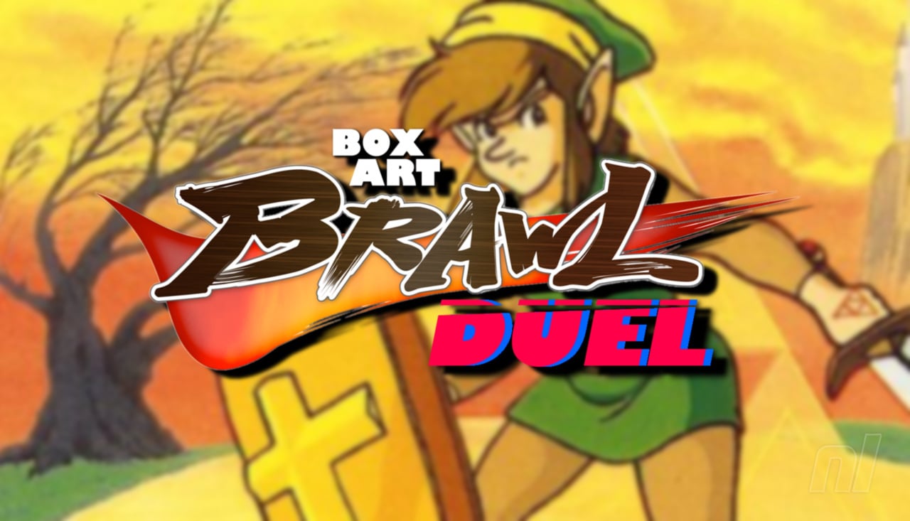
This week, we sifted through all of the Box Art Brawls from yore and realised that, no, we actually haven't covered every single Zelda game yet. Crazy! So this week, we're looking at Zelda II: The Adventure of Link for the NES. Yes, it's a bit of a divisive one, but it's still an important entry in the long-running series that deserves its spot in the brawling ring.
It's another duel this week as North America and Europe team up once again, so without further ado, let battle commence!
Be sure to cast your votes in the poll below; but first, let's check out the box art designs themselves.
Europe / North America

The cover for the western market is that 'classic' Zelda composition of a simple, gold background with a single item adorned in the centre. Rather than a shield presented on the original game, we've got a sword this time (and it's a shame we never got a Zelda game that just shows Link's green hat on the cover, tbh) along with a basic yet suitable logo. There's also a nifty cutout shaped like a shield through which you can spy the golden NES cart. So cool!
Japan

Japan's box art consists of a piece of artwork that will no doubt be pretty recognisable to many Zelda fans. It's a beautiful piece, and we love the bold, impactful lettering that sits above, slightly overlapping the top of the image. It may lack the cool cutout of the western variant along with the iconic gold background, but it's a pretty sweet approach nevertheless.
Which region got the best Zelda II: The Adventure of Link box art? (2,349 votes)
- North America / Europe
- Japan
Thanks for voting! We'll see you next time for another round of Box Art Brawl.
Comments 59
That early link design looks a little bit weird and also slightly terrifying 😂
I have to admit, this may be the first time I chose the box purely on nostalgic value. I don't mind, after all, that's only the reason we prefer one box art over the other. It doesn't change the fact that we prefer it.
@datamonkey it's the only link design that counts
Japanese cover isn't great but it's miles better than the random fantasy props thing the NES versions of the Zelda games did.
Obviously Japan for me as it shows Link with sword and shield and not just his equipment, the setting (in particular the starting point judging by the castle) and even the Triforce!
The western one makes me think of wizards and warriors, but my one from the childhood looks basic
The golden NES covers are an elegant classic. They stood out from everything you saw on the Famicom games.
And they helped the franchise to garner attention just by the cover alone. No weird illustrations, no weird 80s manga characters… just pure golden elegance.
Chefs kiss
No wonder why Nintendo kept using this staple elegant golden simplistic style for mainline games until …. sigh …… Breath of the Wild 😒🙄
I chose Christian Link. The environment is also nice and feels a little bit like A Link To The Past.
These less blurry thumbnails are much better than before!
Don’t know how long it’s been changed but it really shows here.
I prefer the cartoon cover of the japanese one. it is part of the vision of the game, the US cover is a marketing adaptation
I'm a sucker for understated cover art, like the NA version here.
Upon seeing the NA simplicity, I thought, "it won't take much for Japan to top that." But then it didn't.
The western one doesn't really have much "art" to speak of; I don't really count a close up shot of a sword. That's... boring. Japan wins by default for me, even if that one isn't too special either.
Hate them both. Love the game. Considering there isn’t even a master sword in zelda 2, don’t even understand the sword which doesn’t even have a scale that makes sense.
Japan for the win similar reasons to the post above
I don't like the hella generic Western Zelda box art from yesteryear. Give me some character... and a little tenderness too.
I bought it because of the box and cutout and golden cartridge, and I did not regret it.
One of my fave Zeldas, my gateway to fantasy gaming, and absolutely iconic box.
Choice based on nostalgia? Yes. I did, however, greatly appreciate the art in the booklet, which is like the JP box art.
Very much a "you both suck for different reasons" choice here.
I will probably die on this hill alone but the western boxart for the older Zelda games was always utter dogs*** and I'm glad they eventually stopped making them like that.
I feel the Western box art was a missed opportunity to cast Fabio as Link, à la Ironsword: Wizards & Warriors II.
I mean, it's kind of a no-win scenario here. The box art for either really isn't that great. Personally, I went with the JP box art, because we at least got Link and a shot of Hyrule in the background, even though I am more used to the NA/EU box art. But neither are really, "Oh my God, that's awesome!"
But on the bright side, at least the NA/EU box art told the truth: "Another journey of ultimate challenge." And boy oh boy, is that game the ultimate challenge for the series. Even I, as a veteran gamer and lifelong fan of the series, can have immense difficulty playing the game, even with all of Link's stats being maxed out.
That is slightly different from the original US version!
I voted for that North American/European box art.
Box Art Brawls Current Total:
Europe: 90
Japan: 88
North America: 104
Australia and New Zealand: 1
Japan wins in spades for me. I've always found the NA/EU art boring. In comparison, the JP box shows Link, the Triforce, and has a background. It's nothing great, but it beats a generic sword.
Going with Japan on this one, just because this art style for Link has always been my favorite.
I don’t mind being in the minority. 😊
Sure Link looks weird in the Japanese version, but at least it looks kind of cool. The western version looks pretty baron. The sword great though. Still, I prefer the Japanese version. But then again- this is coming from the guy who kind of likes the NA Mega Man box art.
@Yoshi3 actually, Majora broke that tradition. The Oracle games, Four Swords Adventures, Phantom Hourglass, and Spirit Tracks also didn't use gold covers.
Edit: and Triforce Heroes
I have no love for the gold boxes. They stood out at the time for being different, but as far as actual box art it's quite boring. The Japanese one is pretty generic as Zelda art goes. It looks like extra promo art that was meant to be in the manual. Still, it wouldn't take much to beat the gold box, and the Japanese cover is enough to win out for me.
I don't much like either but I do like that they are trying to continue the theme of the first box art for EU/NA with the sword following on from the shield.
Japan one doesn't look great, Link looks like he's struggling to lift that giant shield and the world behind is sparse and empty.
@Jhena
"I chose Christian Link. The environment is also nice and feels a little bit like A Link To The Past."
(question: "Christian Link")
@Mario500 I think it's the big christian-looking cross on the shield.
@batmanbud2 let’s say mainline 3D games. But you’re right, I actually forgot about Majora’s. I remembered it was a golden cartridge but forgot that the box art had a colored background.
NA cover, it's very iconic.
@Mario500
The first three Zelda games had Christian symbolic, like the cross on Link's shield. Furthermore the japanese version of one the games had a bible in it. And a picture shows Link in a church kneeling and praying in front of a crucified Jesus Christ. I think you could also say the Tri Force was the holy trinity of God: The father, the son and the holy spirit.
So he was a Christian, which is why I wrote what I wrote.
Well excuuuuuse me. Lol
I had go go with NA on just pure nostalgia alone. I remember seeing that box for the first time as my dad handed it to me after buying it for no reason at all (it wasn't a birthday or Christmas). It may have been my second NES game I ever owned, after of course the pack in game of Super Mario Bros/Duckhunt. Still have never beat that game to this day either since my original copy got a corrupted file (for some reason I don't have the crystals to seal the castles).
Although Link looks weird with that nose, the JP box art represents the game, unlike the NA box art with the sword that don't appear in the game or that curious empty spot that looks like an open space for a shield.
Oooo seminal entry in the brawl compendium
Ooof, who put in the game the wrong way?
You are supposed to see the ridges in the cut-out, not the backside of the cart!
The US one is nostalgic to me, but the Japan one is cooler, because it reminds me of the manual art.
@daftfunk Lol!
NA, easy. The classic sword art and gold background and a cut out revealing the golden cart inside was so iconic that it still stands out in my mind from the first time I saw it.
@Yoshi3
"Elegant classic" : you've nailed it.
@Steel76
"It felt like you held a piece of treasure." : you've nailed it.
@brookeobscura
"Do you have the one with the shield or sword on the box?" : you've nailed it.
@Jhena
"So he was a Christian" : you've nailed him to the wrong cross.
Think Rose Cross. Think pyramid. Think temples. Think tasks. Think bosses with a major and single eye. Think compass (and its other meaning : the tool used to measure/trace circles). Think G(anon)...
Etc.
Link is most definitely a freemason before he is a Christian.
Gonna vote Japan, simply because it shows Link on a game with his name.
Cartridge/Disk art

North America (gold cartridge), shared with Europe,
Japan (FDS Disk)

BONUS


NES Classic Series, featuring a regular cartridge.
@HammerGalladeBro You forgot the yellow Zelda 1 cartridge that was sent to Nintendo authorized repair shops that they were supposed to use to "test" consoles.
I know it is simple but I like the NA cover.
@RogerFederer
I do not know much about freemasonry, could you please be more specific about what you mean. I get that you are trying to say the games have freemasonry symbols or themes or something like that.
It's fascinating how the comments section seems to skew towards Japan this week but the actual vote is leaning heavily the other way. I voted for EU/US because I'm in the camp that old-school Link looks goofy as. It's a fine cartoon for the instruction manual, less so for selling your product to the masses.
I remember back in the day there was some controversy in online forums, around the time of Ocarina coming out, about people being mad that Link was now a child for the first time.
Yes the internet was always stupid.
The thing that drove me crazy though was the people trying to counter argue that "Link was ALWAYS a child!" as if little details like this box art, or really every official piece of art for both the first two games, or even stuff like Link's Awakenings in game cutscenes, didn't consistently portray Link to be the exact dude pictured above. The guy who shows up in the back two thirds of Ocarina.
Neither here nor there but seeing this image fired some neurons and triggered that memory for me lol ^_^;
Anyways even as a child myself I always thought something was kind of off about Z2's box. It was clearly apeing Zelda's box box but it just wasn't as cool. I think it's the ugly sword. Too ornamental and non-functional looking. It's the kind of sword a rich pretender owns, not the kind the hero uses.
@WaveBoy Funny thing was at first I thought all NES games were gold and only Super Mario/Duck Hunt was grey because it was a pack in game. It wasn't till I went to my local video store where I saw that all NES games were grey cartridge well at least the licensed ones. My pre-adolescent brain blew when I saw the Tengen cartridges.
@daftfunk That game.... nightmarishly hard.
@HammerGalladeBro That classic series cart art is so clean.
A rare loss for Japan. The JP box art is still wonderful, but that NA/EU box is gorgeous.
@WaveBoy I never saw the baby blue NES cartridges during the NES life cycle. I think here in the US Nintendo blocked places like Toys R Us from carrying them, I didn't see them till years later.
And yeah I remember those NES rental boxes. Funny enough a local video store called Mega Video where I lived used them. I even have a few of them myself that I bought from them when they went out of business.
@WaveBoy That the main reason I really don't post or comment on things much anymore here. I just can't really relate to anyone here anymore. To be honest Midway through the PS2 Era is where I fell out of gaming for awhile till the Wii era so alot of the things these young ones talk about I have no idea about.
I get it, the way we look back fondly at NES, SNES, Genesis they look that way at PS2, GameCube and the original Xbox. It's sad to think that there are kids on this site who weren't around when Sega was a console manufacturer. I still can't get over discussion of GameCube and Wii games in the retro section lol. I realize that these young ones now were the same age when they got their Wii as I was when I got my NES and are now visiting this site at the same age I was when I first visited this site.
So yeah talk about mind blown.
@WaveBoy It's more like that the younger crowd just doesn't known what you are talking about to give you a reply lol. I mean to be honest they don't know what it was like to live when the Console wars were up and kicking. Sure you have Microsoft vs Sony now but nothing like Nintendo vs Sega in the 90s. Or what it's like to chill out every Saturday morning with a big bowl of cereal in front of the tv watching stuff that was just one huge advertisement for the latest toy.
They probably look at the NES like we do Atari or Intellvision lol.
@WaveBoy Most definitely. The thing is video games back in the 80s up till 2000s had huge jumps between generations. The jump from Atari to NES and then the jump from 8 bit to 16 bit and then 3D was mind blowing. Currently doesn't have a that big of a jump anymore. Compare a PS4 to PS5 especially late gen PS4 games and there's not that big of a difference. Yeah maybe a little polish here and there but nothing like going from 8 bit to 16 bit. It was truly amazing the leaps they made back then.
@WaveBoy. Yeah the Xbox 360 and PS3 games lost that pick up and play style in favor of the boring cinematic feeling. To be honest most of the games I played on Xbox 360 were the arcade ports. Heck untill the Cowabunga Collection it was the only release of the TMNT Arcade game not to mention The Simpsons Arcade and X-Men. Those game right there are the main reason I hang on to my 360.
I will say that Xbox 360 and PS3 were huge jumps in the online console gaming, yeah Dreamcast had the whole online thing and so did PS2 but not to many games took advantage of that then. My young adult mind was blown when I first played Halo online not to mention Call of Duty with my friends in others cities. Say what you will about Call of Duty especially current CoD but back then when you first fired up World at War and you and your buddies were taking on others across the world it was just amazing. Now these kids take online for granted but back then.
Even the Wii's online amazed me downloading all those great NES and other VC games my inner child was in heaven. And if it wasn't for Nintendo Wiis Virtual Console I wouldn't have found this site. It was because I was looking for when Nintendo released new Virtual Console games that when I googled that Nintendolife popped up in the search and here I am 14 years later.
But yeah after that I don't feel a huge leap in gaming anymore. I mean about the biggest leap currently is VR but right now it just feels so half baked. It still feels in it's infancy to me like most of the games are just tech demos. That and maybe being able to play a triple A game anywhere.
The Switch I will admit is a huge advance in handheld gaming. The fact that you can play a port of a game like Skyrim blew my mind when I first saw it. I mean if you told my younger self that one day we would play a regular Mario release on a handheld and it was a watered down Pea soup port I wouldn't believe you. Lol. But then again Nintendo is always thinking of what to being new to gaming.
@WaveBoy Yeah the dpad was horrible on the 360 it was like they tried to combine the NES and Genesis dpad but ended up with a bastardized version. I was so glad when MS redesigned the dpad for the Xbox One and later Series X.
Yeah the Arcade ports where great on the 360 between that and Nintendo Wiis VC I was in retro gaming heaven. Alot of my time on the Wiis VC was spent on Turbo-grafx and Neo Geo games cause those were two systems I was always curious about but never played. Mind you there were a few NES and Genesis games I did play but overall it was Neo Geo and Turbo-Grafx.
Leave A Comment
Hold on there, you need to login to post a comment...