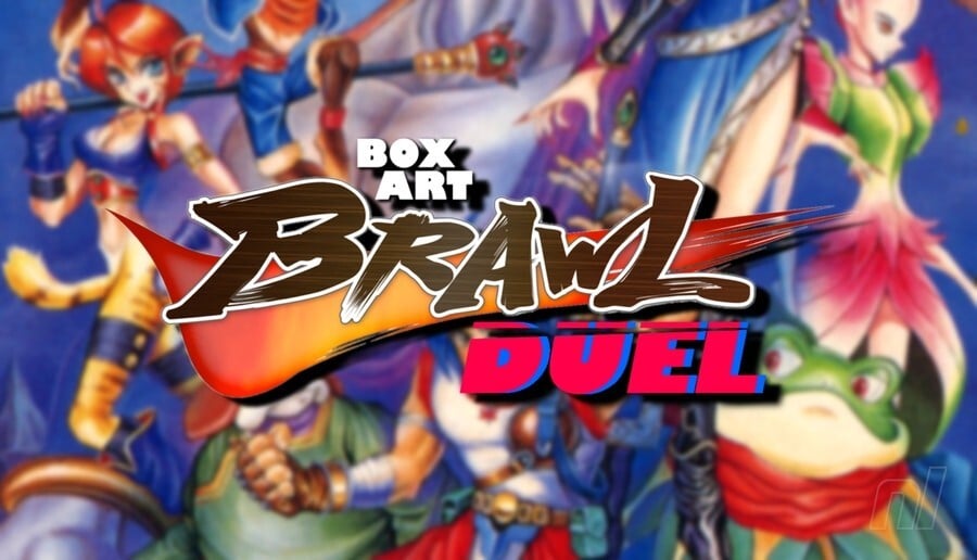
Ahoy folks, and welcome back to another edition of Box Art Brawl!
Last time, we looked at the Wii classic Okami in light of the recent sequel announcement from The Game Awards (woohoo!). Honestly, it wasn't a particularly close battle: Japan, with its beautiful use of colour and composition, won the day with 74% of the vote, leaving North America/Europe with the remaining 26%.
This week, we're going back even further to the days of the SNES with the delightful Breath of Fire II. Originally released in 1994 by Capcom, it's since been launched on the GBA, the Virtual Console on Wii, Wii U, and 3DS, and of course, Nintendo Switch Online.
It's another duel this week with North America and Europe joining forces against Japan. So enough waffling, let's get to it.
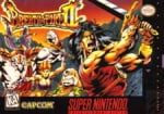
Be sure to cast your votes in the poll below; but first, let's check out the box art designs themselves.
Europe / North America

We love the use of colour with both regional variants here, and the Western design leans heavily into the use of shadow with its cast of characters; it's cool. That said, the change in art style results in a loss of some of the personality from the original Japanese design. It's not a bad look, by any means, but we imagine its success this week will very much depend on your personal taste.
Japan

The colours here are a bit cooler than the Western variant, overall, but there's a good mix in there too. The deep red of the dragon, the flashes of yellow and green in the characters' outfits; it's nice! It does suffer from something that movie posters do a lot these days in that it just shoves a bunch of characters onto the piece with no rhyme or reason, but we have to admit that it does work reasonably well here.
Which region got the best Breath of Fire II box art? (1,626 votes)
- North America / Europe
- Japan
Thanks for voting! We'll see you next time for another round of Box Art Brawl.
Comments 42
Japan for sure as it shows more characters and its artstyle is way more fitting other than me definitely preferring it!
Definitely Japan, the characters look much more interesting and it's just a nicer art style. The US/Europe one looks like a bootleg Thundercats
I think that, in relation to the quality of the actual art, Japan wins, but the Japan cover overall just feels a bit lifeless and drab somehow. The NA/EU cover is bold and engaging, I think, so I went for that one!
One of my all time favorite games, tough choice, I love the breezy anime art in the japanese version, I just love how colorful the cast is and the shade of blue they use for the background is very nice, but the US box art is such a classic case of "bad" western box art with a huge nostalgia factor to boot that I just can't help but to love it, like why is everyone so pissed and scary on that cover lol?
I hyped it up to myself in such a way that I decided to go for the US cover.
The Japanese one, at least there the characters resemble the ones in the actual game...
The NA does it for me, due to its Conan vibes
Awful poses on the US/EU version. What's the Angel doing? Looks like it's performing in Cats on stage in that position.
While I prefer the art of the Japan box art, I'm voting for the western one because that one still looks good and doesn't cluster all the characters awkwardly in the middle.
First time I see the Japanese cover art and it amazes me it's SO MUCH better than the American one I've known all my life
Honestly curious: How do you pick these games every week? Randomizer? Or are we following a ‘forgotten Capcom series’ list now?
Japan for me btw, love the serene blue!
Definitely the Japan one. The other one looks like it’s an entirely different game.
Japan gets my vote. The Japanese Super Nintendo covers are often a work of art. I would love to have a few of them in my collection just for the looks but I do not want to own them, if I do not play them.
Definitely Japan. The game’s a JRPG and it comes from an era when NA tried way too hard to Americanize the Japanese influences from video games.
I'm voting on the Japanese box art.
I like the US/EU version for what it is - mid-90s game box art intentionally trying to sell an RPG with callbacks to Conan / Vallejo / Frazetta, but kudos to the OG art.
For one thing, it makes Jean look decent even without his Shaman glow-up.
Though, oddly, both do my boy Rand dirty by overexaggerating his big shoulders/small-looking head look some bodybuilders get... rather disproportionately so, especially in the Japan box, but I'm still voting on that one 'cause literally everyone else looks fantastic as drawn there.
Even Bow, who got a downgrade from wolf in the first game to lapdog in the second, looks badass, here.
@daniruy 90s RPG covers did often go for Vallejo or Frazetta style covers that's for sure.
While the NA/EU version does look pretty bada** (kind of reminds me of ThunderCats, for some reason), I'm more biased towards the anime art style for basically anything and everything (especially retro anime art styles), so the JP version gets my vote.
I like how each leans heavily into the regional art styles of the period. For me, this one comes down to format. The Japanese one is cleaner and bolder due to the use of the space. The American one loses due to the crampedness of the art.
Even the dog person is angry kirbified
While not as terrible as the box art for the first... and I guess kudos for at least having the main character look the same as the first, BoF is very clearly an animé aesthetic, so going for a fantasy rendition of Ridge Forrester from the Bold and the Beautiful was always wrong.
That said, JP's box isn't great. The later GBA art is way better.
Oh, wow, I probably haven't seen the Japanese Boxart since the 90s. It must have been part of the marketing material provided for the launch here in Germany (or Europe in general), since now I remember quite vividly that I looked at it often and long. I think, I've been a little in love with the winged girl and the tiger girl, too. (Hey, I was in my early teens. Can you blame me?)
So, yeah, Japan gets the vote. It's also the better artwork.
Can’t believe the poll is this close TBH
That giant barbarian in the NA box art is definitely not Ryu!
On the other hand, that is some quintessential mid-90s artwork right there. If I'd have seen these side by side back in the day, I'd have definitely chosen the manly one.
I prefer the original Japanese one but the NA box art definitely has its own charm for the time.
Box Art Brawls Current Total:
Europe: 89
Japan: 88
North America: 103
Australia and New Zealand: 1
North America has a swords and sorcery comic vibe that I like. Japan shows more of the actual characters in the game. Yep voted for NA
No doubt about it. Neither piece is bad in and of itself, but key art for me always wins. Japan for the win for me.
Both aren't bad. I think I prefer the softer lighting and colour palette of JP so it gets my vote.
One day I'll give the Breath of Fire games a proper go.
As for the box arts themselves, the western one might sell me on the gameplay displayed while the Japanese one might sell me on their characters. So it's a bit hard for me to decide.
Cartridge art

North America
Europe

Japan

Japan looks like Breath of Fire.
NA/EU looks like chinese dnd knockoff.
An interesting battle this week as we have the typical anime/manga style of the time vs. the typical western comic-book style of the time. And I like both styles, though I gravitated more toward the Japanese style as more anime became available in the US. I did spend some years collecting comics and do love that style when it's done well. The particular western art for this one isn't bad to me, but I've seen better. I think the background characters all look pretty good. "Rastan"(that's who it looks like to me) up front looks overly inked to me. The black areas don't feel entirely well judged, in my opinion, and detract from the finished product. This is not the kind of inking that I love, especially in the style of books in the '60s, '70s, and '80s. This has more of a typical mid-90s look. It actually gives me Valiant Comics vibes, as all their books had a different look from the norm. I do want to give credit to the western cover art for making very good use of the landscape form factor of the box, which wasn't so common.
The issue with the Japanese cover is that it's another jumble of many of the game's characters. But it's boring because it does work, though not every time. What carries the Japanese cover is strong character designs and just a good execution of the art. Japan wins for me.
Honestly, Ive never been a fan of how early American Box art tried to make things look so 80s fantasy. This one isnt that bad, but Ive always been more a fan of the anime style art that the japanese box arts have done.
Hm. This is an odd one. Normally a matchup like this would be an easy Japan vote for me, as I like the oldschool anime look and it matches the actual game much better, but...there's something weirdly bland about it this time. It's just a little off, and the colors and character jumble just aren't working for me.
Meanwhile the silly western cover is doing a better job than the usual 'sloppily colored over photo style' with some interesting colors. It doesn't look quite like a photo traced over, it doesn't look super sloppy and wiggly in the proportions. It doesn't represent the game super well but it doesn't look bad, it has kind of a dramatic comic book look and honestly only Ryu looks that far off.
The western boxart is largely a repeat of the US version of the first game. It might be worth posting a comparison. @Olliemar28
@Dee123 They largely took inspiration from the cover art to the first game.
The game probably wasn't given a very big localization budget, so that's not surprising.
(I mean looking at Nintendo Powers in 1995 it's clear Capcom was quite unsure if they were going to go through with releasing it.)
The second is actually the only BoF game I have never played. The first one to me is the best one while the PS ones are OK. I am surprised that they haven't brought this series back.
I voted NA, perhaps because I grew up watching He-man and Thundercats.
Also, despite owning both BoFs on SNES, I had never noticed until now that the wordmark looks like "Brerth of Fire."
The Japanese cover art looks so good.
The NA cover looks like a poorly drawn comic.
I'm a tacky gaijin so Western all the way!
Don't love either of them, but I vaguely prefer the more dynamic look of the Western one.
Japan because it has two cute girls on it. The western one reminds me of ThunderCats.
Have there ever been two more disparate covers? Really hard to tell it's the same game absent the title.
Despite the Westernized cover with the first game, it at least retained the anime style art in the graphics, as well as the map & instruction manual at a time when the anime aesthetic was so often changed or removed. (Back then we learned to take what we could get!)
Leave A Comment
Hold on there, you need to login to post a comment...