We are back, back, back for another edition of Box Art Brawl!
Before we dive into this week's topical match-up, let's recap what went down last time. Two 3DS covers for Bravely Default went head-to-head in our last duel and great Scott, was it a close one! The European 'For the Sequel' version put up a good fight but was narrowly beaten by the OG Japanese 'Flying Fairy' version which grabbed 51% of the vote. Talk about a photo finish.
With rumours about HD-2D remakes bubbling up again this week, we thought it was only right to go back to where it all started for Dragon Quest III. The NES version was released in Japan in 1988 before coming to America in '92 (albeit under the Dragon Warrior III title). Capping off the original 'Erdrick Trilogy,' III is, in fact, the first game chronologically. It would later be remade for the SNES and GBC in 1996 and 2001 respectively and later popped up on mobile, Wii and Switch. Plenty of options before that HD-2D remaster, then.
There are just two different regional covers this week, so let's take a look at them, shall we?
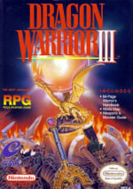
Be sure to cast your votes in the poll below; but first, let's check out the box art designs themselves.
North America

The North American cover is... strange. There's no denying that this design goes all in on the RPG stylings — weapons and dragons and gold (oh my) — but it's not very Dragon Quest-y, is it? The original cover took a more 'realistic' approach too, but at least that had some action to it. This is just a bunch of weapons stacked up in front of a dragon statue. It pulls you in with intrigue more than anything else, and we can't knock it for that.
Japan

Now here's a different approach. The late, great Akira Toriyama's art showcases a very different game, one built on its characters (and dragons). The full cast stands front and centre, staring directly into our souls as if to say, "Go on, buy it. I dare you." Below, the silhouette of a castle stands out against a red sunrise. It still has all of the classic RPG trappings, but presents them in a very different way.
Thanks for voting! We'll see you next time for another round of Box Art Brawl.
Comments 67
I cast the first vote, the only claim to fame I’ll ever get 😂
The Japanese cover art is definitely more Dragon Quest-y, but the NA art excites my imagination and actually makes me want to play.
no contest. toriyama > generic western fantasy
Following last week's thriller, I think this one will be a bit more straightforward! Japan by a mile, I think.
While I do like the more abstract weapon-focused composition of the North American cover....yeah no there's no beating Toriyama. His style is so instantly synonymous with the series that seeing a Dragon Quest game without it feels so incredibly off in a way that's hard to really describe in writing. Japan definitely gets my vote for this week.
JP one, easily!
No question here.
@Branovices don't go alone
The NA one feels a little generic, if you ask me. At least the JP one gives us the characters we can play as. And how can anyone beat Akira Toriyama?
You know what, for once I understand the decision.
Yes, the Japanese one shows DQ as it would become, and the monster designs certainly match the Japanese art, but young me would probably be more interested in the NA covert art.
Still, I can't seperate the cover from the game, and the JP one certainly falls way more in line. The NA one would give me expectationS of a Western styled RPG, which it isn't.
I actually don't think NA's box is bad but it's up against Toriyama so it never stood a chance.
JP has good art but the frame around it ruins it for me. NA this week
I've always liked the Dragon Warrior name much more than Dragon Quest but the Japanese one is a lot more eyecatching.
It's hard to vote against Goku, but just look at that pile of loot on the NA cover!
There only one right answer for this and it’s not the American one
Japan obviously as it shows the game's characters in the iconic Akira Toriyama artstyle and even more so when compared to the North American box art which is way too generic.
I actually kinda like the NA one in its own way, but the JP one is just better, beyond being drawn by Toriyama. I really like that landscape banner at the bottom, it evokes a sense of adventure and discovery, which is what a good fantasy rpg cover should do.
@Bustacap to someone who isn’t aware of Toriyama the JP art is just generic anime floating heads. The sample group for this poll is heavily biased.
@Branovices I am 100% with you on that one. I was about to write pretty much that word for word.
Toriyama's artwork wins this, easily. It's heartbreaking that he's gone.
But ACTUALLY Dragon Quest XI is set up to be a prequel to III, so ACTUALLY XI is the first chronologically, as far as the Erdrick name at least.
US kind of goes with the previous two games (never played 2 or 3, but I do have 1).
The JP one just makes it feel like a true Dragon Warrior.
Japan, no contest. My Akira Toriyama bias is showing. XD The NA one isn't bad though; it's up against some heavy competition.
The Japanese boxart, is pretty much what one would expect from Dragon Quest, but man I wohld be lying if I said the North American one isn't totally awesome.
Honestly I kinda like both versions of the box arts for many different reasons, for starters the Japanese box art has the beautiful style of Toriyama whereas the western version just kinda catches my eye with all the different weapons and items making give off more of an epic fantasy adventure that's chock full of loot and treasure.
as much as I love Toriyama, the anime "pile o characters" trope is just boring to me. they are both good covers in the grand scheme, but the NA art has something you dont see everyday, and I do miss the "fantasy painting" approach that used to be more common across all media. 👍
Box Art Brawls Current Total:
Europe: 78
Japan: 76
North America: 89
Australia and New Zealand: 1
That one is pretty obvious I think.
It's like pitting OG Megaman against Bad Boxart Megaman.
EDIT : also I.N.C.L.U.D.E.S
Akira Toriyama's art has a classic style that is very likable. But I do find the western art a little more intriguing, and I certainly would have been more intrigued by it back in the day. I go for the North American one.
Both pieces of artwork are pulled off quite well and and do a good job of getting people interested in the game and telling what kind of a game it is.But looking at them with a more critical eye there are also things to find fault with.
The idea behind the American one is a simple and good one. Having the focus on a lot of shiny weapons and some kind of mystical artifact in a way that partly feels like you have stumbled upon a great treasure. But it isn't very imaginative and while it probably wouldn't have bothered me back in the day, I'm much more a fan of realistic weapons these days over the overembellished and unrealistic ones on display here.
The Toriyama artwork seems like a great idea on paper. It has a large amount of characters, a dragon, a world map and a castle with a landscape during sunset. But while it looks nice enough, there isn't much that is really interesting about it. There are a lot of other Japanese covers in this style with a much better composition.
With that said I do really like what Toriyama is trying to do there with the castle and the landscape at the bottom. In my opinion a lot of the best fantasy artwork for any medium concentrates on evocative landscapes that gives you a view into another world and builds up the illusion that this world exists.
Two of my favorite scenes from videogames are from the early Final Fantasy games where you see a vast landscape and a castle in the back or foreground:
https://imgur.com/a/Nl6DYTP
https://imgur.com/a/sLY9NKq
And on a similar tangent, in the metal world there are a lot of bands with fantasy lyrics and a fantasy image that has very cheesy and run-of-the-mill cover art. Sometimes cheesy is also good and enjoyable, but when in comes to metal covers with fantasy themes I always found the Austrian band Summoning to have the best and most tasteful covers. Almost all of them are focused on landscapes, often with a fortress of some sort as well:
https://imgur.com/a/cAYFwtR
https://imgur.com/a/w85hGbz
https://imgur.com/a/WT82xtv
https://imgur.com/a/Bs71YRU
https://imgur.com/a/dpufz67
https://imgur.com/a/oQraCbr
Any of these would have fit really well as the cover art for a computer RPG, and one of artworks here was actually used as the cover for an obscure Amiga/PC RPG, though it originally was commissioned for a novel.
First, that small write up about last week doesn't even begin to describe how close it actually was. The lead shifted multiple times and the votes were often within five or ten for a while.
For this, the NA cover is definitely strange. Why is "includes" separated out like that? It's so random. Speaking of random, while the art itself is well executed, a random pile of weapons is one of the worst cover concepts I've seen.
The concept for the Japanese cover isn't amazing, but it's lifted up by Toriyama's stylish character(and dragon) art. A line up of cool anime characters is a lot more interesting to me than a pile of weapons barely in the frame. Japan for me easily!!
North America destroys again. Japan is awful and the anime designs look stupid
I like them both. I went with the Japanese design because the description made me feel like I'd be an idiot if I chose the North American one.
I know it's some kind of sacrilege but I never liked Toriyama's art style. So I voted NA.
Knowing what I know now about Dragon Quest, that I didn't know about Dragon "Warrior", it's no contest for me. However, I will at least give a nod to that iconic image that graced magazine covers of a time long gone.
I like the North American one. I appreciate its helpfulness in finally letting me know what an RPG is. Role. Playing. Game.
The US artwork isn't telling me that much about what the gameplay itself I-N-C-L-U-D-E-S.
The Japanese version is at least referencing the Job system, which I think would've been a rather significant inclusion back then.
@KingMike
"The US artwork isn't telling me that much about what the gameplay itself I-N-C-L-U-D-E-S."
I don't think they differ that much in that respect. The only reason I know its referencing the job system is because I have played the game and recognize the character classes. But if I hadn't played the game before, I would have assumed that it was an illustration of the starting party and some of the more important NPC's in the game.
Thinking about it, I don't really think telling you what genre a game is, is the main job of the front cover. The screenshots on the back cover and any text on both sides already does a much better job of that. The main job of the front cover is to get your interest right away and also make the game look so interesting that you are tempted to buy it.
But I will say that the more I look at the North American art, the less I like it. It works really well at a glance and probably long enough to get you to hand over your cash to the clerk at the register. But if you bought the game half a day in advance of actually being able to play it or more, and you spent a lot of time reading the manual and looking at the cover art, the Japanese game has a lot more to offer in the case of this game. I voted for the NA version, but would probably vote for the Japanese version now instead.
With that said I do think western-style cover artwork fits perfectly on these 8-bit Japanese JRPGs. Japanese RPGs are very much based on ideas from both western RPGs and western fantasy art and writing. They have certainly created their own styles which are also very recognizable and different from the ones in the west. But when they try to invoke a "medieval" fantasy setting in their games, they draw upon many of the same tropes as a western game with the same setting.
People who mostly just like Japanese roleplaying games may feel that westernizing a game somewhat by giving it a more western cover is making it more generic. But if you appreciate both styles like me, I think it makes sense to also be open to the advantages of interpreting an 8-bit game in a more western way.
When it comes to console games, I think the peak of cover art was reached on the NES. Both for American, European and Japanese releases. Later consoles have also had a lot of good artwork, but I feel like it has been a slow but steady decline since then. That may just be the bias of me looking at those covers with childlike wonder back in the day, but I really appreciate the wall of difference between what the artwork was portraying in these 8-bit games, and what the NES and other similar machines actually could give you on screen.
Being able to use your imagination is a wonderful thing.
84-page warrior’s handbook
World Map
Weapons and Monster Guide
Look what they have taken from us.
With all due respect to Toriyama, the NA box art is killer.
@Purgatorium
The manual at least can still be found on the net in a high resolution scan, and I would assume the same is true for the map as well.
When playing old computer and console games that are new to me, I often download the manual to my pad in advance or while playing, to learn about game mechanics and in some cases to really dive into the backstory and setting of a game. To me, this is almost like having a manual in my hands. Having it on a phone is not as good I would think, but it works great for some people.
The kind of manuals and guides that some of these RPGs and action adventure games got on the NES and Mega Drive is a bit of a double-edged sword though.
On the one hand, having a lot of stuff related to a game to read about and look at in a manual is very cool. Especially when you are a young kid or just an old man really excited about a game. And most console games did get very shallow and short manuals compared to the massive tomes of lore, art, mechanics and reference material you got for many computer games.
But due to Nintendo of America and SEGA's low confidence in American console gamers ability to understand "complex" RPGs and adventures, they often spoiled many parts of a game, and in some cases the whole game, by giving away screenshot-maps and solutions to puzzles in the manual or guide that came with the western release of the game.
To this day there are still some gamers who think that these games were designed to be played with guides! As a kid you didn't have a critical view of this of course but thankfully this got some pushback at least from the more adult-oriented magazine EGM, who criticized both SEGA and Nintendo for giving away such guides with certain games.
Dragon ball vs Dragon with ball
@Perpetual_Change
A lot of games have maps and guides built into the game now, holding your hand throughout, and they call it quality of life. You don't need to read or flip through a digital guide either. You get a little HUD map and an arrow that tells you where to go.
Personally, I turn off those features when I can and use online guides, like you described, when I need to. But none of that can replace the experience of having a physical book with maps and lore.
For me, It's not really about the guidance but about the physical media and the deepened experience of the game's world.
@Purgatorium
Yeah I also prefer to configure modern games for personal exploration instead of having them push things on you.
I can understand how you feel about physical media. I have still kept all my PC game manuals and maps and using them instead of some digital recreation is an overall better experience. But for all those games I only own as digital copies, reading a manual on a pad comes quite close to the real thing. And feels vastly different than using some kind of spoilerific fan-made guide, which I only occasionally use to look up some specific kind of mechanics for certain games.
I don’t know a lot about DQ (only played VII and XI, really enjoyed XI) but I find it cool that, as generic as the NA cover may be, it still has Erdrick’s sword on the front, faithful to the design I know. Is this actually the first time the sword is shown?
Easy decision, Japan. Really shows off Akira Toriyama's artwork.
The NA art is actually kind of great, but it's no competition against Japan. That color scheme is sublime.
Toriyama got me. The NA art looks great for the Guides cover, but for the game I stay with the classical
Nostalgia for Dragon Warrior will always win me over!
Ah, yes, the ever imaginative all-characters-facing-front box art. Is this a Rockman game?
@TheBoilerman
Goku? This is Dragon Quest my guy.
Unpopular opinion: Akira Toriyama was not a good artist.
Both are good, but the US cover doesn’t really seem to fit a series that uses Akira Toriyama artwork, whereas the JP cover straight up uses it. Therefore, the latter seems the more appropriate, and is what I’d pick if I were deciding on which to use.
@Perpetual_Change Final Fantasy Mystic Quest was a game specifically designed for beginners. At least the US boxart even stated that right on the front.
I recall the US magazine ads advertised a strategy guide was available.
I think the European versions (or at least one of them) even bundled the guide.
The guide to a game specifically designed for beginners. Sounds kind of insulting.
I love Toriyamas style (rest in peace) but the NA is my vote. It evokes a dragon’s treasure horde with the assortment of weapons on display against a fiery background. It has more sense of mystery and adventure than the JP box art.
@TerryTrowbridge My thoughts exactly. The Toriyama art isn't bad by any stretch of the imagination, but to anyone not in the know, it is just as generic as the NA art. Personally, a treasure trove of magical artefacts ignites my imagination far more than a bunch of random faces looking at me.
The Japanese one looks like a game for small children.
But Dragon Warrior was for geeky older kids who like strategy and math.
Let me specify that by "way too generic" I meant that the North American box art could be for literally any traditional fantasy game, not even an RPG if it weren't for the writing, while the Japanese one shows the characters specific to this game.
That said, I have to admit that purely aesthetically the former is pretty cool!
I know I'm in the minority, but I've never liked Toriyama. Everybody looks soooo similar. These characters look just like DBZ and just like Chrono Trigger.
Although what the heck is going on with "I*N*C*L*U*D*E*S"? Just why????
Not even a question the Japanese art and toriyama forever man.
The Toriyama art all day. RIP.
I say this as a huge Toriyama art fan, someone who's glad Sand Land finally got its due, with a game and anime after a couple decades, and for whom Chrono Trigger is one of my absolute favorite games:
The North American one. Sure, I'm a huge softie for Toriyama's work, but the Japanese box would only interest those already familiar with his work. There's no dynamic action scene going on, like what Chrono Trigger would offer with lots of its concept art, or the many of-the-moment scenes he was also capable of.
The game is doing a good job displaying its cast of characters, but none of their personality. Nothing that makes them who they are.
The copy and pasted dragon in the back bothers me, too. Like I get it, symmetry, but why not draw the same thing with different details or a different pose? They did that with both versions jobs in the art, so why is it the dragon that's copy and pasted?
The North American one lacks human character-- literally. But looking at all the details in the image, someone put their heart into painting this.
It's not just a generic fantasy painting. All sorts of weapons from the game are in this picture. Whoever did it clearly did their research and represented what was in it. I mean, Lodos'/Erdrick's sword is dead center of the frame, with the golden, scored hilt with the red jewel inset.
So is Zombiesbane, the sword with the robin's egg blue jewel inset into its blade's tip.
I also see the Headsman's axe, front and to our right. The axe with the green dragon head on top.
All these are weapons found in the game, and rendered with consideration and care for their original designs.
So, for me, the North American one is the better one. Not only is it more intriguing to someone outside the franchise, for whom most box art is meant for, but it's a beautiful painting done with love for the original work.
@JohnnyMind A detail I've always loved about the American box art is that it's not generic fantasy art. If you've played the game, all these are weapons that are found in it, done with care to the original designs.
If you haven't and aren't familiar with the series, then it's just intriguing enough that you'd want to pick it up.
It's not just another Serious American boxart at the time, that did its best to genericize the content. This was done with love for the game.
@AeonicB True and I admit that I did recognize the sword because I know it, but if I didn't then that box art would tell me absolutely nothing about the contents of the game because it's way too subtle in showing them - as another comment mentioned it definitely works as the cover of the guide or something like that, but not the game as that has to clearly show even to people who don't know it what it is about in my opinion.
That said, I couldn't agree more with you that this is not your usual American box art of the time and the people who made it actually knew the game so kudos to them and again, it's pretty cool, too!
@MattAllsopp I've already pre-ordered your memoirs!
@kurtasbestos Thank you, that’s very kind. It promises to be a real page turner 👍🏻😂
They should have kept the Dragon Warrior name in America. It was much cooler and feels more exciting.
How can so many here call the US one generic? Please point me to any other cover that's even similar. Featuring a pile of items? That's bold, and I love it.
Also, to me, the JP one is the actual generic cover. Just another case of Anime characters lined up. On top, the framing is terrible. Why limit the art's real estate that much? That's a sin usually commited by Western covers. Lastly, I am sorry, but I never liked the Toriyama style. It's nearly as bad as the One Piece style. Look, I've enjoyed manga/anime for >25 years now, but Toriyama's drawings simply aren't nice to look at. I liked OG Dragonball not for its drawings, but despite them. I guess Toriyama was good at telling stories.
Leave A Comment
Hold on there, you need to login to post a comment...