Has it sunk in yet that almost every single mainline Final Fantasy game between I and XII is now available on the Switch? That's thanks to this week's release of the Final Fantasy Pixel Remaster series, which was long, long overdue.
Back when the games launched on Steam and mobile between 2021 and 2022, lots of people were happy that the classic six Final Fantasy games were finally being made more accessible. But there was one big talking point that swept across the world when it came to the Pixel Remasters — the font.
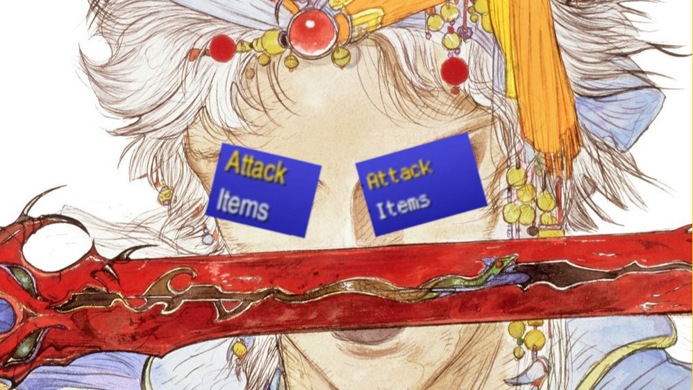
The font in the original Pixel Remaster releases was not popular, at least in the west. To many, it clashed with the retro pixel art visuals, and the thin, sterile style isn't the most pleasant on the eyes when playing on a PC screen.
Fans took to creating mods to "fix" the font, using variations from Final Fantasy I & II: Dawn of Souls on GBA to Final Fantasy: Mystic Quest's chunky pixel typeface. Various guides, including this one from RPG Site, detailed the many ways you could get a "better" font and improve your experience with these classics.
It soon became apparent, however, that Japan didn't have the same issue. While not sporting a pixel-style font, the Japanese font was much cleaner, a bit thicker, and — most importantly — was much easier to read.
When Square Enix announced the console versions last year (in the middle of the night, mind you...), fans were hopeful that the gap between the games' releases on PC and consoles would give Square enough time to "fix" that font for good. And, luckily, the developer delivered.
Alongside a host of other additions like an interchangeable soundtrack and EXP, gil, and ability point modifiers, the console versions of the Pixel Remasters let you change between the original PC font, called 'Modernized', and a new 'Classic' font, which is pixel-based. You can swap between these in the menu at any point in all six games.