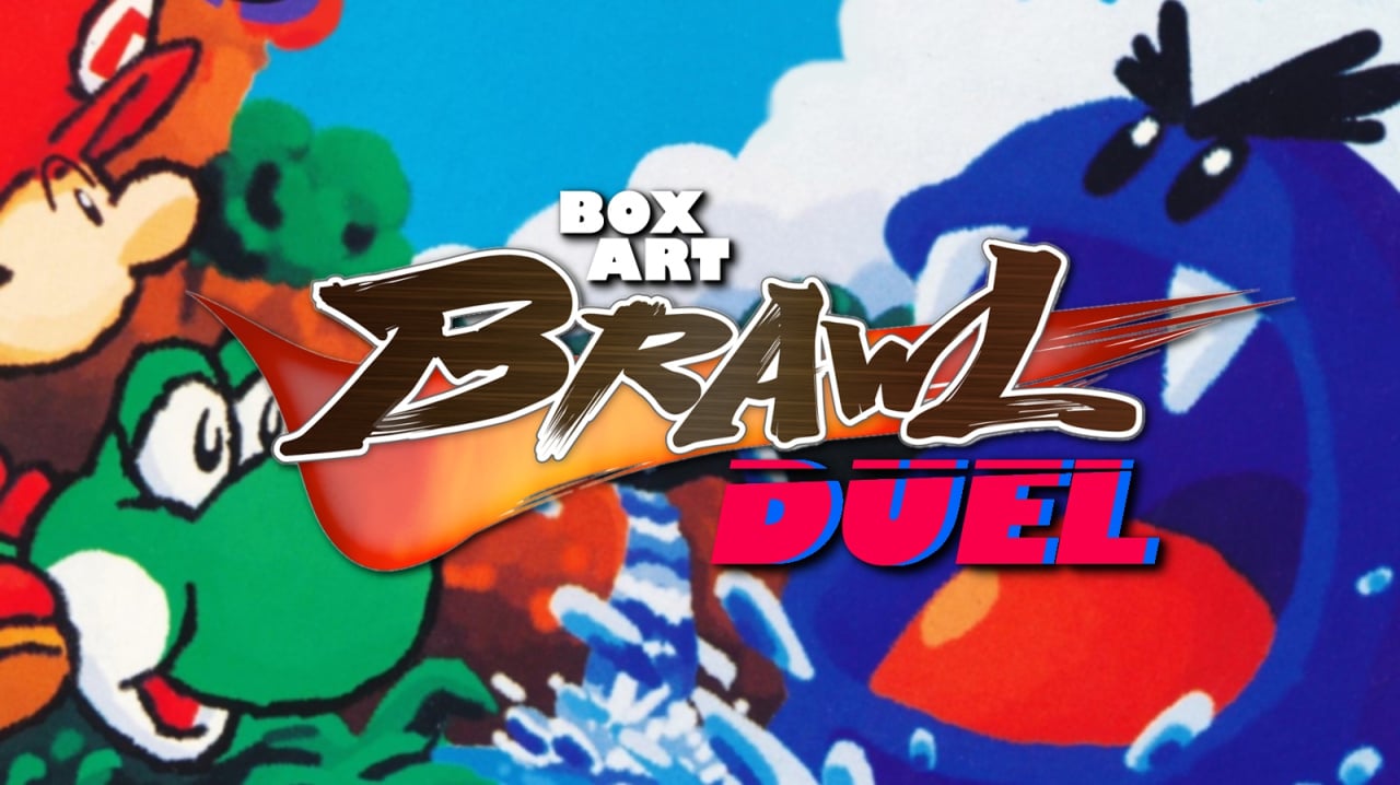
And we're back for another edition of Box Art Brawl, the weekly poll where you vote for your favourite classic (or sometimes not-so-classic) retro video game box art variant from around the world.
Last week we checked in with Dr. Mario on the Game Boy (and NES) 30 years on from its original release. In the end, it was the Dr. "Nick Riviera" Mario from the European / North American cover that gained your confidence and won over 70% of your votes, while the more learned, professor-like Japanese Dr. Mario failed to gain your trust.
This week we're looking at another game that recently celebrated an anniversary: Super Mario World 2: Yoshi's Island on the Super NES, which turned 25 years old on Wednesday 5th August 2020.
So, grab the baby and whatever you do, don't let go of it! Let's see what Yoshi's cookin'...
Europe / North America
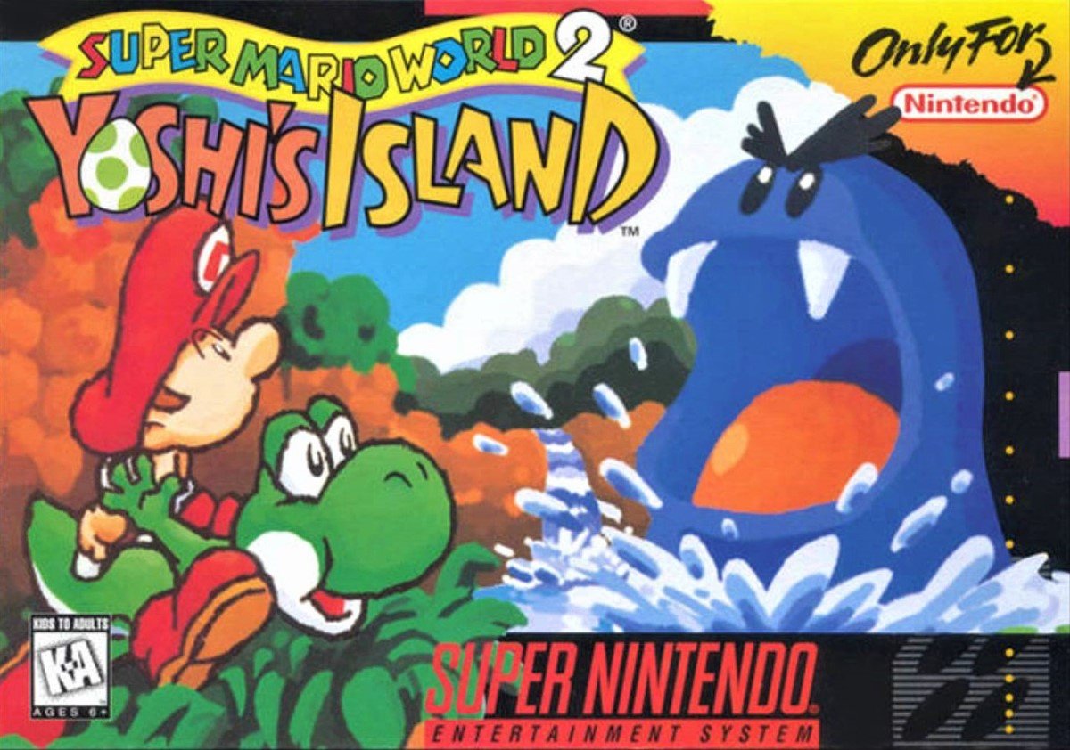
We begin in the West, specifically with the North American variant. Around Europe there were several versions which removed the 'Only For' corner tear and changed the black border to yellow (or red for the Player's Choice version), but they all used the same logo and the same art.
The big blue monster, known as a Nep-Enut, really makes this cover pop, and Yoshi and Baby Mario image give an idea of the game's gorgeous art style. We feel it could have done a better job of showcasing just what a looker Yoshi's Island is, though. Using an egg for the 'O' in Yoshi is a no-brainer (too obvious, perhaps?), but the logo is otherwise a bit messy.
Saved by the big blue monster, we'd say, but could do better.
Japan
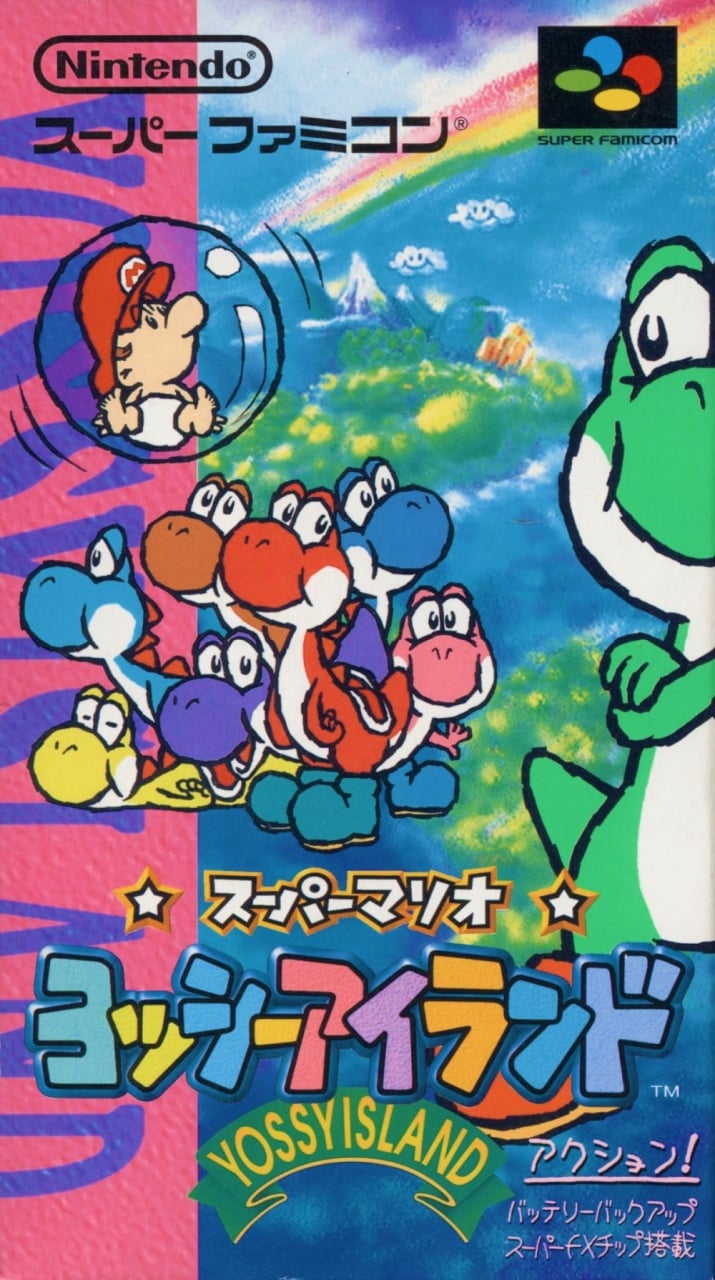
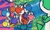
The Japanese cover of 'Yossy Island' gives you a better idea of the pastel-shaded visuals awaiting you on the cart. The multicoloured pack of Yoshi(s?) look suitably adorable and even the whining bubble-bound Baby Mario is relatively cute. Mainly because he's silent.
Add a background showing the island with little fluffy clouds, and a big chunky logo with a folded green ribbon (as opposed to the flat yellow version on the other cover), and this is a strong contender in this week's brawl. Can it take the belt, though?
So, which one is the best? Pick your favourite from the two options below and click 'Vote' to let us know:
Third week in a row with a Duel? It's almost like we've dried up on the three-ways! Fear not, they will return - there's just been a spate of anniversaries and we like to be topical, like. Have a wonderful week and we'll see you next time.


Comments 47
I love them both! One of my top 10 games of all time. What a gem.
I look at the Japanese one and I just think the picture hasn’t been cropped well.
love that blue guy as a kid on the NA box.
Wow, two pieces of art that are both good! I'm going to be a homer and vote for the NA/Europe one.
Yoshi’s Island has a good enough art style that the North American and European version looks like a high res screen shot of the game.
I don’t know why, but it was only recently I found out this game is actually Super Mario World 2. Always thought Yoshi’s Island was it’s own series
NA/Europe one for me. The other one isn't horrible but the background looks too close to what kids draw on sidewalks with chalk.
The thing is the Japan version has wrap around artwork which isn’t shown here so it’s hard to judge the full package
https://www.videogamex.com/super-mario-world-2-yoshi-s-island-japan-edition
@Snow_Hawkthorne
It was marketed as Super Mario World 2 but they clearly did that to attract more customers. Yoshi's Island is considered a Yoshi game, not a Mario one.
Even taking the wrap-around artwork in mind for the Japanese artwork, I still think the EU/US boxart looks much better because it doesn't look like a piece with random pieces of artwork thrown together like the Japanese one does, and actually looks like a scene. Only reason I would choose the Japanese one would be for showing off the various colored Yoshis but since it's simply artwork slapped onto a background.. that really takes away a lot of points for that one.
GameFAQs shows this Limited Edition European version which included the official US strategy guide.
But Nintendo added a bunch of noise to the cover art.
https://gamefaqs.gamespot.com/snes/588740-super-mario-world-2-yoshis-island/images/1261761
Japan wins.
Fatality.
@KingMike Ugh, I hate when they do that.
Heh, Yossy. Thank goodness for good Engrish.
Western box art wins this one in my eyes. The Japanese one looks like the Yossies don't give a crap that Baby Mario has been bubbled, least of all Yellow Yossy. (Wait... Is the narcoleptic Yellow Toad in Super Mario Galaxy a reference to that sleeping Yoshi? Hmm...)
Both are great for different reasons,but I have to go with NA
USA / Europe cover art looks more representing the game.
Anyone else see a two mouthed purple Yoshi?
Europe USA easily. Love Yoshi xxx
For me there is no contest between the two, I have always thought the NA one was iconic.
I went with Japan, which seems to be less popular at the time of writing. I'm a sucker for the different Yoshi colors, and IMO the cover provides a better showing of the game's art style and vibrancy.
Also, this quote needs framed:
"...and even the whining bubble-bound Baby Mario is relatively cute. Mainly because he's silent."
NA/Europe one looks best to me. The Japanese one is cute, but my eyes are drawn to the spelling of Yossy. The NA one is iconic, nostalgic, and is more representative of the actual gameplay.
None of them are that great. Nostalgia wins again.
Both are a mess of a cover. With such lovely art style in the game, why they have such ugly covers???
@Snow_Hawkthorne
I think technically it is it's own series, but they used SMW as a marketing ploy. There's a Yoshi's New Island, Yoshi's Story, Yoshi's Island DS, Wooly and Crafted world. I would put them all in the Yoshi series
Oh that wraparound makes it even better! Gorgeous, but this time I can't put aside the wonder and nostalgia I feel with the EU one!
North American art by a country mile.
It's an Action shot; indicative of something that actually happens during gameplay (more than once).
Japanese art is them just... standing there. Is it a Puzzle Game? Some kind of Sim? You don't know!
@AJDarkstar
I guess I never considered a Mario game time line, so canon didn't really come to mind haha
A half face selfie. Yoshi was so ahead of his time.
I prefer the western art, much more focused and dynamic. The Japanese one is fine, but it's just... Like kinda similar to a Lisa Frank collage.
@AJDarkstar These games were before Yoshi's were repressed into riding vehicles for the evil Mario. Much like he wanted to cage gorillas he insisted on Yoshi's doing no platforming without him.
Europe/NA is more dynamic, the Japanese one looks like a poster for a children's show.
The NA box, to me looks lovely and feels intensely more nostalgic. The Japanese one is adorable but not my favorite.
They're both very cute.
I voted for Japan. The western cover has issues with perspective, proportion, consistency, and composition to my eyes. The end result just doesn't look very good to me. Japan's cover isn't especially dynamic, but the art just looks better to me. Neither one is great, in my opinion, but like Japan's more.
@jump I usually think the japanese ones are better 98% of the time. But this one really looks like it has been cropped wrong.
@KingMike beside the fact that they overdid it with this one, I really would love to have games with strategy guides again... At that time I had Zelda, Donkey Kong Country 2, Illusion of Time, Secret of Mana an Super Metroid Strategy Guides. No idea were they are now, probably sold them super cheap on a flea market to buy a PSX Game
Best USA first-party SNES cover art, IMO.
Box Art Brawl Duels Current Total:
Japan: 0
North America / Europe: 3
@xzacutor the second mouth is actually the shell from the yellow Yoshi.
But yes, I can now only see it as two mouths since you pointed that out. Lol
I hope the weekly boxart would expand to include additional ones from other countries/regions besides America, Europe and Japan.
Japanese one but only because Yoshi's crossing his arms
Japan's is generally nicer, but I am not a fan of the text along the left side.
@xzacutor
"Anyone else see a two mouthed purple Yoshi?"
Not me.
@korosanbo Clyde "Tomato" Mandelin has written a lot about that. Essentially "Yossy" or "Yossi" is written on stuff mean to be seen by Japanese people and has to do with how Japanese children are taught to read English (they are taught "si" first, I'd imagine because it makes an easier to understand pattern between kana and Roman characters).
I know its a textbook example of the Trope "American Kirby is Hardcore", but I think the box art of the Western Versions looks better and is a more impressive idea of what to expect from the game.
The colorful box-art is one of japan's most effort game drawing. I hope the artists get acclaimed for their art.
This game is the best wish there was a version you can play without the baby, and brown Yoshi needs to come back
Tap here to load 47 comments
Leave A Comment
Hold on there, you need to login to post a comment...