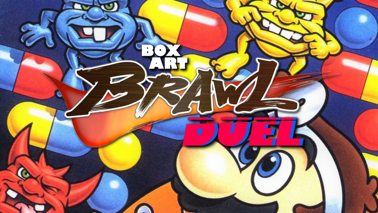
Welcome to Box Art Brawl, our weekly bout to find out which regional box art variant is the best, according to you lovely lot.
Last week was the inaugural edition of the 'Duel' variant of Box Art Brawl, which saw two versions of Tetris for the Game Boy square off against each other. Despite a rather fetching entry from the East, it was the version that released in North America and Europe which won over 80% of your hearts.
This week we're sticking with the Game Boy as the 'Jack-of-all-trades' plumber tries his healing hands at medicine in Dr. Mario, the puzzler that launched for both Game Boy and NES 30 years ago last week. It's an unusual game that released across both home and handheld consoles, with box art that looked more-or-less the same on both. We've gone with the Game Boy just to keep things more compact.
If you're after more info on the game, we recommend checking out Jeremy Parish's excellent Game Boy Works video on the subject. In the meantime, the (alleged) doctor is in. He'll see you now...
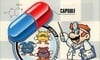
North America / Europe
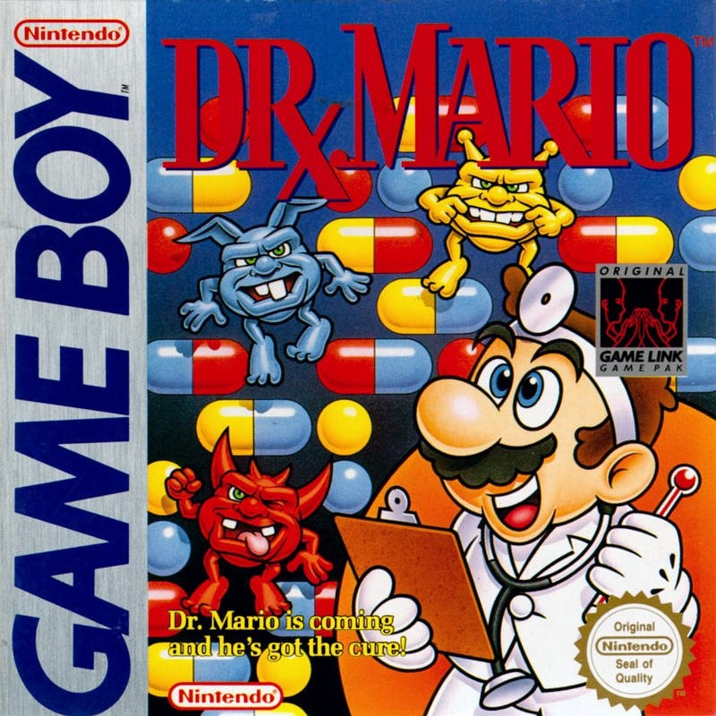
Featuring a red logo with a serif font and the stylised prescription symbol '℞', the version we got in the West shows a wall of capsules in the background as a trio of primary-coloured gribblies lark around. Mario stands in the foreground on the right against a circular orange something brandishing a clipboard, a thermometer and a big grin. In fact, he appears to be doing his finest Dr. Nick Riviera impression.
It's colourful, the enemies look mischievous and fun, and--assuming you've got the same infantile sense of humour we do--it's got a winning tagline laden with eyebrow-raising double entendre. A strong opener, although it's arguably a bit busy, especially when viewed from a distance.
Japan
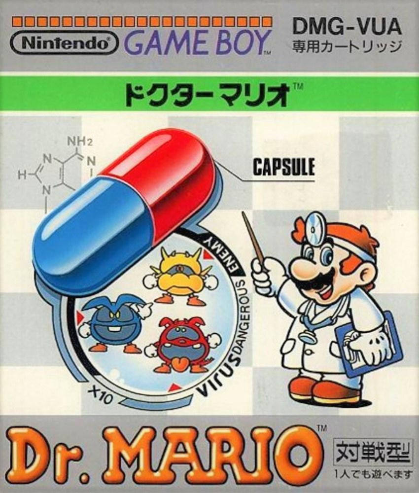
The Japanese version takes a more scientific approach, with 'Doctor' Mario looking far more scholarly and knowledgeable. The oversized capsule he's pointing to is flanked by a diagram of the enemy virus as he lectures us on the subject. The subtle chemical formula in the top left adds extra weight to his medical credentials, to the point where you'd be forgiven for allowing the jovial plumber to perform complex surgery on you. Come on! He's pointing at the red end of a capsule that he's labelled 'CAPSULE' - of course he's qualified!
The logo font still has serifs, although the bubble style doesn't scream 'professional medical practitioner'. Still, we like this a lot.
So, which doctor would you permit to examine you? Pick your favourite from the two options below and click 'Vote' to let us know:
That's it for this week - Happy Birthday Dr. Mario! Which did you go for? Let us know below, and join us again next week for another edition of the Box Art-iest of Brawls.


Comments 42
NA/Europe shows the puzzle aspect better. Neither one is really bad though.
I like the character designs on Japan's more.
Neither is great, I was thinking. Both are solidly "meh". Props to NA/Europe for not having "capsule" written and pointing at the capsule.
Japan box art is just better
Capsule. Yeah, we know. EUS is wa y better, and I never got that prescription symbol which is just epic. Compare that to the horrid font of the Jap one and it's an easy win.
You'd think Japan would just win every single time, but many of their box arts are just... not as good.
hmmm yes the capsule here is made of capsule
Japanese one looks like a fever dream!
The Japanese version says "virus DANGEROUS / ENEMY". Does that mean... gasp the Corona Virus is dangerous, too??? No more licking door handles for me, I guess.
Both are good, but I slightly prefer the Japanese one due to the more scientific aesthetic.
Also, while I know which line you're referring to in the NA boxart, I think it's stretching things quite a bit to say it's a double entendre.
Japanese one is super stylish.
I'm going for the Japanese cover. It's more relevant for these 'uncertain times' and is educational.
Viruses are dangerous.
Thank you Mario.
In fact, maybe the Conservative could use that as their next slogan?
Virus. Dangerous. Enemy.
There's one for the NHS briefing podium.
Like them both. The Japanese one is cool!
i like the colors of the NA boxart, but voting Japan solely for having the cuter virus designs
Ahh, I miss the classic 2D Mario character art. Always thought it looked better than the bland plastic-y 3D art.
Ugh, why'd they make the viruses so ugly in the Western art? If it weren't for that, it'd be perfect.
Box Art Brawl Duels Current Total:
Japan: 0
North America / Europe: 2
Iove the western one, it's so colorful and full of stuff, but it doesn't feel all that cluttered.
Glad it's not just me with the tagline then.
Imagining it said in a Matt Berry voice is also good value.
Nintendo needs make educational video a where Dr. Mario explains to kids on how to avoid catching the Cronavirus like wearing a mask for example when your up and about.
I prefer the simplicity of the Japanese one.
Though, Mario’s hair color looks off. I guess we are used to the hat.
@RevrsblSedgewick To be fair, anything said in a Matt Berry voice makes it great.
@boredlizard @boxyguy @Dr_Corndog I think the viruses on the NA/Europe art shows some of the start of the 90s characters having tough attitudes. Not a good trend.
Such an iconic cover! Had to go with NA / EU.
Tough call but I can't say No to Virus Dangerous Enemy.
No contest. Western release. One of my favorite GB games and one of the best retro Mario covers.
I've never seen the Japanese cover before, thats neat! Kind of boring tho, have to go with the NA one
The western one feels more fun, though Cross-Eyed Mario positively reeks of “zaniness” which undermines any and all attempts at credibility
Honestly, they are both pretty "meh" to me, but the one from Japan makes it look like some kind of "edutainment" game lol.
I like the NA one the Japanese one is just to plain.
I like the virus designs on the Japanese one more, but I prefer the look of the western one overall.
Kind of a tight one but I went with the western design.
I like the simplicity and clean look of the Japanese cover more. I also like that it showcases the correct virus designs that are in the game, and it helps that Mario is not cross eyed as he is on the western cover.
Western one is better designed, feels like an actual game cover - cohesive, the Japanese one is charming, but it just looks like a mock up parody of an ad.
Both are good, but i give the edge to the US/EU version despite crossed eyed Dr. Mario.
I guess the Japanese cover, but I’m not crazy about either one.
What is up with the dynamic difference in art style with those viruses? 🤣
I don't like the US/Europe one. The cover is too busy with 6 different fonts littered across it, Mario is cross-eyed and all of the viruses look like the Noid, and the Japanese one isn't as colorful but that's a Gameboy game, colorful art is kind of misleading for the platform.
@Tandy255 I saw it more as a continuation of the trend of Westernizing Japanese box art (Dragon Quest/Warrior, Mega Man, etc.) But it could be both.
I like the Japanese one more. It almost looks like a box of children's medicine.
@Daniel36 Not as good to American and European eyes, of course. Japanese art is designed for the Japanese market, and they know what they like.
@scottishwildcat True. And to be fair, when I was a kid JAP boxes always gave me more the feeling I was holding something really special. Exotic. I will never forget my very illegal 31-in-1 Japanese NES game cartridge.
Late to the party, but NA/Europe wins. Its more detailed, goofy and nostalgic.
Show Comments
Leave A Comment
Hold on there, you need to login to post a comment...