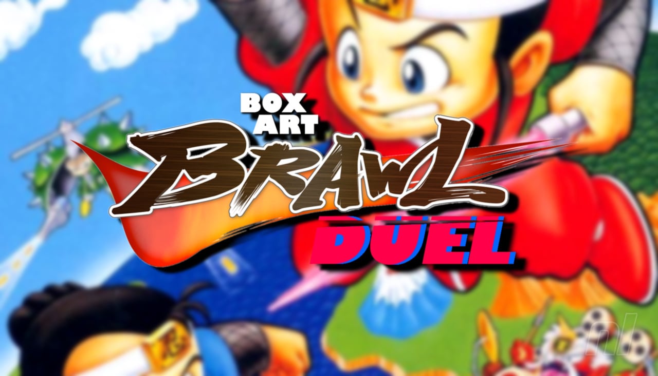
Welcome to another edition of Box Art Brawl, everyone!
In last week's battle, we looked at the N64 classic, Mario Kart 64. And goodness folks, it really wasn't a close one, huh? North America and Europe absolutely killed it with 88% of the vote; surely one of the most resounding victories we've ever seen!
This time, we're going a bit further back to the SNES with Super Ninja Boy to celebrate its recent addition to Nintendo Switch Online. Originally released in 1991 in Japan, this one made it to the States in 1993 but sadly skipped out on Europe altogether. It's a decent action-RPG for the most part, though its frequent random encounters did admittedly slow the pace considerably.
Subscribe to Nintendo Life on YouTube848k
So, with Europe out of the picture, let's get our competitors in the ring for our latest bout. Who will triumph..? Find out next time, ON DRAGONBA... Ahem, sorry.
Be sure to cast your votes in the poll below; but first, let's check out the box art designs themselves.
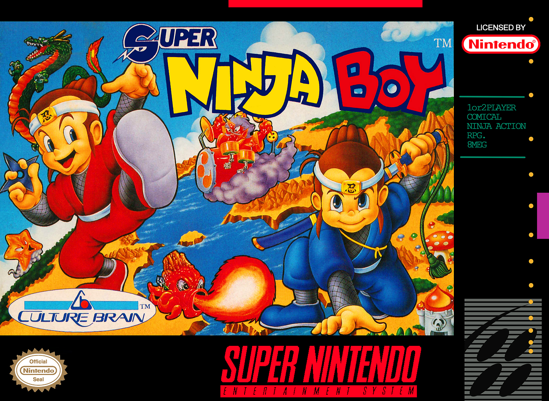
North America

We feel like it might well be a close call this week, because both variants are pretty awesome. In the North American design, our protagonists make up the bulk of the composition on the left and right respectively, while various creatures can be seen dotted around in the background.
The environment in the far background curves around quite nicely, making the foreground poses seem even more dynamic. Very nice stuff.
Japan
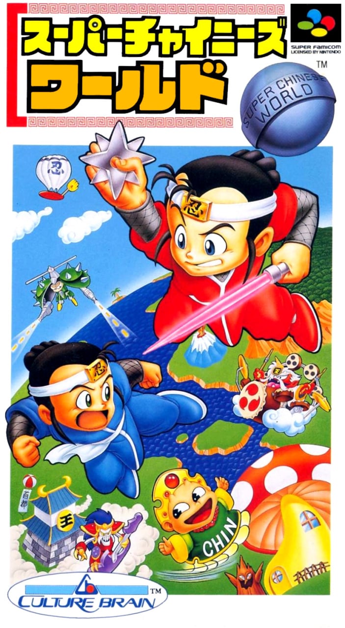
Japan's design is similar (and, obviously, the original), but there's a slightly brighter, more stylised tone going on here. With the portrait orientation, the characters are in slightly different positions with slightly different poses, and the creatures in the background are changed up a bit too.
The background environment is perhaps the most comparable aspect of the piece, but even that replaces much of the detail seen in the Western design with cleaner colours and more simplified illustrations.
Which region got the best Super Ninja Boy box art? (1,376 votes)
- North America
- Japan
Thanks for voting! We'll see you next time for another round of Box Art Brawl.


Comments 32
A very tough one this time, they're both really good in my opinion! But ion looking a bit more closely, the NA one seems to have the unfortunate side effect of making the ninjas appear giant (as they're in poses that have them standing on ground), while the Japanese one clearly has them in more airborne poses, having it make more sense.
As such, while I like both, Japan wins by technically!
I really like them both, but went with Japan's. Super Chinese World is just hard to beat.
I'd also say they're both pretty good both aesthetically and considering what they show of the game, but I'm voting for Japan considering what @Yosher said for the former and the presence of a castle and an airship for the latter aspect!
Weird and lovely selection for this weekend. We all know Japan is best
@SoIDecidedTo My sentiments exactly
Tough choice. I like both, but cute "Chin" boy in the Japanese one won me over.
I went with Japan because the character designs look better. Also, the enemies are more recognizable. I can't tell what that thing in the middle of the US box is.
Beautiful covers. I chose Japan, because it has this NES feeling.
The Japanese one has the zany animé character art that I associate with those mythical, exotic Japanese games we could only find on illegal xx-in-1 cartridges. Background too, reminds me of Twinbee and such.
The American one is more detailed, but at the same time reminds me of games that had better box art than gameplay, so I am still going for the Japanese one, because of my associations.
That Japan cover has the crazy fever dream energy I miss from old box art. IMAGINE IF GAMES LOOK LIKE THIS SOME DAY!
@Daniel36 Dude I swear I wrote my comment before reading yours. Weird!
Both are gorgeous! I love that hand drawn style, it has so much charm and personality.
@LikelySatan I am a Time Lord.
I thought I was going to scroll to the comments and see, "wow both these stink, it is hard to choose which is worse" I think both are terrible so I didn't vote, guess I'm the minority so far
I too went with the Japanese box art but my decision was based on something else entirely. Is that villainous dude surfing on a purple guitar? That is the epitome of cool!
The colors in the Japanese cover give me such a nice feeling.
I've never heard of it. But they're both cute. I picked North America. It looks more like a coherent scene. Wasn't culture brain the company that made Magic of Schererazade? Or am I confusing the name?
My favorite thing about the NA cover is that entity(the god of thunder, perhaps) riding the cloud in the center while playing a drum set, though both covers have a version of him(it?). What makes the difference for me is the anime style of the time for the Japanese one. The main characters look quite a bit better there compared to their lumpy-faced counterparts on the NA cover. Overall, Japan's box is more appealing to me as a result.
Hard choice, but I went with Japan.
As far as the game goes...idk what to think. Its kinda cool as an rpg hybrid with a beat em up...but. idk. I do remember renting this game as a kid thinking it was Legend of the Mystical Ninja, and being disappointed that it wasn't and not wanting to play it.
@rvcolem1 You are allowed to have a wrong opinion...
Nah just kidding. Sometimes I too have a VERY different opinion than the majority on a piece of box art. In thos case, neither are great, granted, but neither are terrible either... at least not to me. They are both pieces of their time.
Super Chinese World.
@NotoriousWhiz One of the Japanese gods. Fuujin?
Box Art Brawls Current Total:
Europe: 92
Japan: 89
North America: 106
Australia and New Zealand: 1
This is the opposite of the Kirby effect: the Japanese version has their gamefaces while the NA one has them friendly.
I like the protagonists better in the Japanese one, but everything else better in the Western one. Since the protagonists are the most prominent element, I guess that means I go for the Japanese cover this time.
@Pally356 I just remembered the box art for Mystical Ninja, and I can totally see how you were confused.
And both are decidedly Western for a decidedly Japanese game, which is why I do prefer the Japanese one in this instance, even if the American one has more details in its art.
Had no idea this game is actually part of the Super Chinese series.
I voted Japan just for that spiked enemy that could pass as a Mega Man boss.
@Tempestryke yep, that was culture brain
Gotta go NA on this one based off of hey it would catch my eye if I saw it in a store.
the NA guys look too cheerful. JPN for me.
@Djreisat thank you
I think they're both great but I gave the nod to Japan only because of the original key art, and Japan nails what they're going for in the game much better in their art style
Show Comments
Leave A Comment
Hold on there, you need to login to post a comment...