Twenty years ago, Sega showed off its bold new mascot for the first time at the Tokyo Toy Show. He may only have been two months old, but Sonic the Hedgehog was already walking and wagging his finger as these scans from 1990's EGM 13 show.
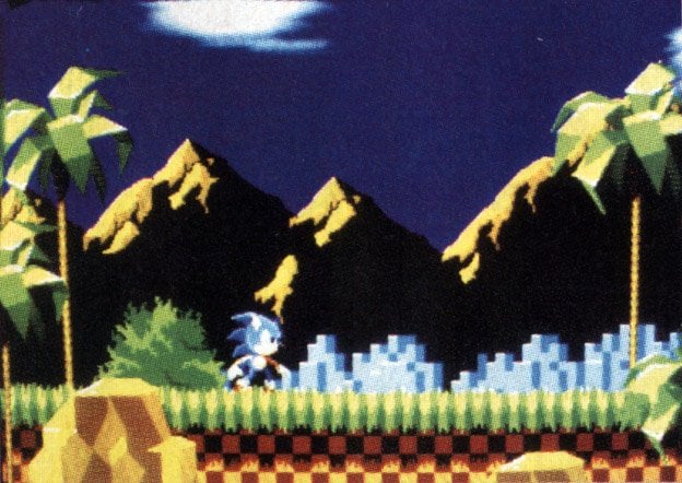
Even with twelve months of its development cycle left, it's remarkable how much of the game's iconic graphical style was nailed-down: chequered hills, lanky palm trees and that title screen are all present and correct in what was so early it's likely to have been a slideshow of screenshots rather than anything playable.
Naturally the differences are just as interesting as the similarities: Sonic's wide-legged, arms-out "ready" stance, the massive mountains and those peculiar blocky buildings in the background didn't make it to the final game of course, meaning Sonic may well have had completely different animation at this early stage.

Sadly the chances of finding any footage from this time in the young hog's life is extremely slim, but hopefully these magazine scans may lead to further screenshot finds in the future. According to 1up, EGM was the only American magazine at the show so if you have any Japanese or European games magazines from 1990, you may be sitting on more very early shots of Sonic the Hedgehog. Dig them out and let us know.
[source 1up.com]


Comments 14
I'm glad that wasn't what the final game looked like. Personally I think those screenshots look ugly.
Hmm, mountains look more like Marble Zone... I remember that sonic was originally going to leap into the air at the end of each act.
I remember those pictures.
Pretty cool! The bushes in the background doesn´t fit the style either. By the way, remember the early shots of Super Mario 64? The castle hubworld had simpler textures with some painted halfmoon in it. And Ocarina of Time looked like crap.
Google "secrets of sonic team" and click on the first link. There's lots of this stuff on there.
Ohhhh man, I like that look way more.
Back then, when we used to like Sonic for his Gameplay and not his Style
Looks pretty much the same to me, except a lot more washed out.
@Ricardo: The sky is darker and the mountains are silhouette-y. I think it looks awesome.
And don't forget they're magazine scans, not direct feed shots
I'm sure I had that issue!
We should show this to the people on the Sega blog comments. When they find out that Sonic's lanky-armed stance was the true original design, I think they'll all spontaneously combust.
I remember having looked up screenshots of Sonic the Hedgehog's early development at the Secrets of Sonic Team website years ago. I even remember seeing this one screenshot where there were U.F.O.s in the sky in the second stage.
I Love Sonic the Hedgehog! when I first had my mega drive I use to wake up really early in the morning just to play it before school!
Tap here to load 14 comments
Leave A Comment
Hold on there, you need to login to post a comment...