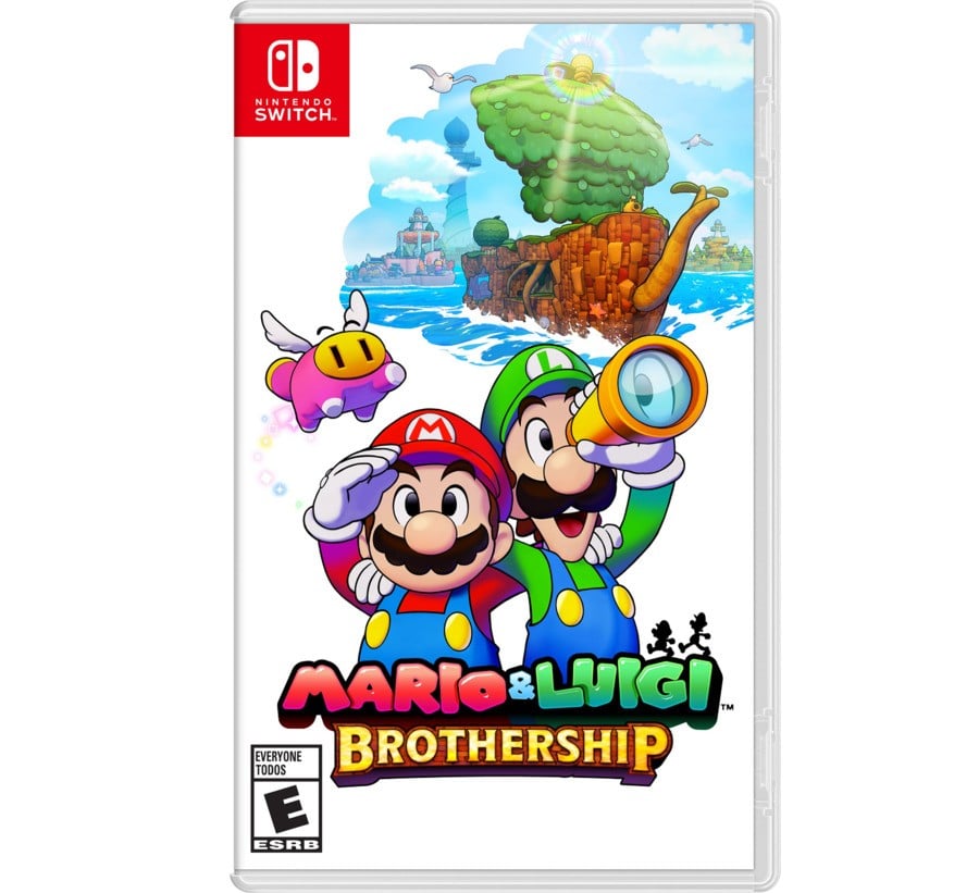
Mario & Luigi: Brothership kicked off the latest Direct broadcast and although we've already seen a fair bit of footage of this new release, one thing Nintendo hasn't properly shown off just yet is the game's box art. Yes, it's been featured in listings here and there, but now, in the latest update, it's been given an official reveal on social media.
As you see it features Nintendo's famous duo, a new character called Snoutlet and a little bit of the world Mario and Luigi are about to explore known as Concordia. An empty background on the cover art (similar to Bowser's Inside Story + Bowser Jr.'s Journey) also returns. Nintendo further notes how pre-orders are now live.
An official render of Mario in this new RPG adventure is also doing the rounds on social media. Here's a look:
In case you missed our initial coverage, in this new adventure Mario and Luigi will apparently be "all hands on deck" as they go on an island-hopping adventure in the world of Concordia with the help of Shipshape island ("part ship, part island").
While Nintendo hasn't revealed who the developer behind this latest entry is in the Mario & Luigi series, a representative of the company recently confirmed some of the original team members are involved in this new project. Mario & Luigi: Brothership sails onto the Switch this November.
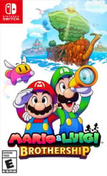
What do you think of the box art for Mario & Luigi: Brothership? Let us know in the comments.
Comments 65
Something about Mario on that box art seems a little…off to me. That being said, I’m looking forward to playing another entry in this solid series.
It's not bad but it's not great either. That sums up my thoughts anyways. I do miss the colorful boxarts of Mario & Luigi: SuperStar Saga & Partners in Time. The render seems good.
Shame it got pretty plain & bland by the time Bowser's Inside Story came around.
The slight tinge of purple shading in that character art really makes it pop.
Cute
filler
god damn it let me post
I am so glad to see this Mario style back again, thanks to this new game! It's my favourite art style that the ol' plumber has ever had, although I may be slightly biased since I kind of worship both Superstar Saga and Bowser's Inside Story as games
I don’t pre-order a lot of games, but this is one franchise I want to see succeed.
November can’t come quickly enough.
It looks cute.
They should keep their brotherhood for next series.
It follow in the footsteps of the previous M&L games from Japan, which is nice, but I really miss the super stylized box arts of US SuperStar Saga & Partners in Time. I'd go as far as to say SuperStar Saga GBA has one of the greatest box arts of all time.
eh haven't been into mario since mario2/3/snes. where the hell is yoshis island? man those games were awesome. Baby Mario for life! (b ' ' )b
I've always been in the camp of liking the JP box art for the series. It's simple but effective and captures the cheeky nature of Mario & Luigi very well.
That said, I don't really like how the box art turned out with this one. It all mainly boils down to the use of untouched 3D renders in place of the more detailed 2D art of the previous titles. If the renders had more illustrative details to them, I'd be more fine with the current art, but as is, the box art feels like a placeholder to me. Same with the logo, too actually.
Sweet simplicity. Gotta love it. Never played this series, but I'm pumped to try it.
@Axecon @DanijoEX-the-Pierrot I’m definitely with both of you. While the box arts from BiS onward are good and conveys what the gimmick of that game is I prefer the box art from SS and PiT since it’s flashy and has more detail on it then Mario and Luigi in front of a white background. Which is odd since usually the American Kirby is hardcore thing is a mixed bag for me personally but the American box art for the first two are awesome. Though admittedly a bunch of fan artists did make hypothetical box arts for made up games so there’s that. 😅
The Box Art looks very nice!
Also that Mario render looks SO COOL!!! I can't wait for this game!
Seems to fit with the others from bowsers inside story onward
Ngl this game looks like AI made it, and that includes the artwork
Argh I can't keep up! Leave my bank and time alone!
It's an okay boxart but like the Super Mario RPG Switch boxart, it got way too many bland white spaces especially on the bottom. Unless it's Final Fantasy or game's that make sense to have white this just looks bland to me. These are what good boxarts should look like, very colorful with artworks filled the cover.
@axelhander You can add the filler words, post, and then edit and delete them.
@N00BiSH I genuinely don't think the box art versions of Mario and Luigi are 3D models. They don't look like the stylized versions of them on previous game covers, but they don't look like the in-game models to me either. Maybe I'm just blind, but they just look like someone drew the brothers in digital art, with shading that gives the illusion of them being the 3D models.
Not all pieces of digital art will have a textured look to them. None of my art pieces do.
I'm so happy Nintendo have gone all in with the different Mario rpg series this generation.
@VoidofLight we've had this conversation before. They're obviously 3D models to the trained eye. Compare the renders in the Brothership box art to Masanori Sato's original art and the differences are abundantly clear.

As nitpicky as it is, Sato's art direction had a very specific style and ruleset that was applied to the art of the series after, even on the games he wasn't involved in. The Brothership box art lacks the knowledge required to successfully translate Sato's style into a 3D space(at least in the context of the box art. The actual game doesn't look too bad).
@N00BiSH I mean, the thing I'm getting at is that it isn't necessarily following the rules of Sato's art style to a T. The new box art still looks drawn to me- and I say this as someone who's learning to do art for a living. Sato's art style has more of a drawn look to it with the line thickness and shading over-all, where as the new box art is different moreso because of the shading combined with its own line differences. The lines on the new box art are far thinner. The shading is different and so is the texturing detail. It's just a difference of digital art to me, at least how my eyes see it.
This box art was visible on Amazon a week ago when it went up for preorder on there. Same with Super Mario Party Jamboree, Zelda and DKCR HD.
@VoidofLight "it isn't necessarily following the rules of Sato's art style to a T."
That's the problem. The places where the rules aren't being followed(notably the shading and the lineweight) make the art feel inconsistent and out of place with the rest of the series' art, which followed those rules even if they weren't 1-1 with Sato's art.
Even Dream Team, which took the look into a much more stylized and specific direction, was still able to work within the established guidelines without feeling too disconnected.

I usually prefer the more colorful box art compared to the Bowser's Inside Story plain white background which has been the trend ever since. Like, does it really hurt to add some colorful background?
For a game that looks so cool so far, boxart is kinda boring
@N00BiSH I'm just chalking it up to them not being able to get Saito back or the original artists, and so they had to attempt to draw art following a similar styling with the designs without being able to fully recreate what the original art for the series ended up doing.
@VoidofLight That's kind of why you try to get people who can effectively replicate that style, even if they aren't the original artists. Like, I can't be a guy named Jerry so I'll hire a guy to be Jerry for me. If they had the means to render the style in 3D, then odds are they had artists involved who could draw in that style.
@N00BiSH And yet for some reason the 2D box art is in an entirely different style with slight nods to the original style.
@VoidofLight Okay, this is as much as energy as I'm willing to give to you. If you still can't understand the difference despite all the points I've made, then there's no convincing you.
You do what you wanna do. And also maybe study 2D and 3D art a little more.
The "bland" background is rather nice IMO, but I think it needs to be realigned or something, because as is, it feels weirdly imbalanced to me.
@N00BiSH I mean I know 3D when I see it, and this isn't it. I have seen fanart that recreated the style of the box art perfectly, and it had the same shading casting the illusion of it being 3D.
Can't wait to play this game, there's something about the Mario and Luigi games that's so appealing to me, definitely, those games have its charm
It's a bit too much white, for me. Would've liked more background stuff going on, but it's not too bad, I suppose.
Looks nice. And I think the game itself looks great. I’m not sure what it is but there’s something unique about its art style I don’t think I’ve seen in another game.
My only issue is do I play all the previous games first or just jump straight into this? I’ve only played Superstar Saga 😱 It would probably take me a year to get through the rest 🤣
Could’ve sworn I saw this a week ago on the EB Games Australia website
@imadeanaccount The art was already revealed, yes. Only from gaming retailers though. This here is the official reveal of the box art from Nintendo themselves.
@GravyThief Each Mario and Luigi game is stand-alone. While there are some things you can notice in the previous games if you've played them all in order, the games are self-contained for the most part.
Looks cool. I will likely get this digitally but it is nice box art.
Way too much blank white in the background. Stop trying to be old FF game logos.
Love that they kept the classic style for the box art.
This can definitely be topped. Is this for all regions?
Everything about this game is utterly gorgeous.
Yep, have already seen it, looks nice to me if simple just like the rest of the Japanese box art for the Mario & Luigi series as some have already mentioned.
That said, what really matters is that this game exists and is coming this year, of course I've preordered a discounted physical copy of it since I can't wait to play it and will try my best to fit it into my gaming schedule as soon as it arrives!
@Aurumonado Noted! Graci.
I think they did well in replicating the previous characteristic art for the series but in 3D
I guess it's only official when NoA reveal it.
Love the minimalist box arts for these series.
The box art looks a bit simple, but the art style helps it a long way. I'm very excited for this game.
I guess they took note of how popular Lechonk is relative to someone like Navi.
Hate the obsession with white minimalist backgrounds on Nintendo boxart. Thankfully we moved away from it with most franchises but seems it's around with Mario and Luigi.
Looks like people don’t remember that the series has been doing the white background since at least DS
This looks really good. The artstyle/cover capture the look of the originals!
I love the M&L art over the years. It’s honestly the perfect shade of red and green for the brothers and it is so tasty and pleasing to the eye.
The M&L games seem at home on 3DS, likely biased because that’s where I’ve played most of them, and this art looks right on the money. It would be soooo cool if Nintendo put this on a white Switch case instead of the standard clear.
I think they nailed the feel except a little thing I've always noticed-- Their mouths are traditionally covered by their mustaches, and here Luigi's is exposed. Also Luigi's coveralls don't flood. Neither are deal-breakers, just something I've noticed.
Meh... Wish the paper background of the box art had some cool holographic swirls or details or something. The art feels kinda off center? And what's with the lazy 3D render? I loved the drawn artwork on the old games. Even the M+L games that had the white background had something interesting going on in the background or corner. I hope this is a temporary cover...
I like it!
Hate to be that guy, but... I can't help wondering if Nintendo is purposely trying to transition gamers away from physical game sales by making the box art increasingly unappealing 🤨
I would have preferred a bit more of all that empty space to be filled in with more artwork, even just blue waves or anything. Feels like an unfortunate repeat of Super Mario RPG with a huge swath of blank white space, and what artwork is actually on the box is far off center, which just feels odd at first glance.
With that said, I still love the art style and it's fun seeing any of it on a physical piece of media in the first place! I pretty much always collect first-party games physically, even when I would appreciate the convenience of having a digital copy always installed and ready to boot up. Still can't bring myself to double dip, and I would prefer Nintendo to give the consumer the option to convert a physical copy into a digital one, which would make me much more amenable to digital gaming.
Mario & Luigi games have always had rather plain cover arts so this is par for the course.
I want to like this game and maybe I will when I play it, but from the cover art and gameplay reveal it all seems so bland to me. I’ll definitely wait for reviews on this one.
Man i am so in love with this game already. Best same with Metroid, best reveal.
Nice enough to look at. The case spine is what'll most frequently be looked at on my gaming space anyway.
Keeping my eye on this one, as it'll possibly be my first foray into the M&L series. The previous games didn't draw me in despite my love for the franchise since childhood. Hoping it reviews well.
I like how they've been doing the plain white backrounds for the recent mario games (mario wonder and mario RPG)
Looks clean
At least it's better than the 4 consecutive M&L (2 remakes) with only a white BG after PiT.. imagine how many parents bought the same game twice for their kids.
Why are they both cross-eyed?
@Radbot42 That's normal. Sometimes Mario looks to the left or right, like he does in the official character render in this article, but most of the time he looks cross-eyed. Just checked to make sure and examples are the 3D head when you start Mario 64 and the cover art for Super Mario World.
This looks unfinished. Title and characters look cool, but why couldn't the sea fill the whole background behind them? Plain white doesn't look great... I suppose they don't really need a really eye-catching box, seeing as they're pretty much out of system-seller games.
Leave A Comment
Hold on there, you need to login to post a comment...