Hi folks, and welcome back to another edition of Box Art Brawl!
Last week, we checked out Astro Boy: Omega Factor for the Game Boy Advance, and would you believe it, we had a draw! Both the EU/NA and Japanese variants bagged 50% of the vote each, so uhh... We've either got two winners or no winner at all. We'll let you decide!
This time, we're looking at Super R-Type for the SNES. Recently released on Nintendo Switch Online, this 1991 shoot-em-up is a bonafide classic, and its box art designs are all pretty badass too. It's a classic three-way brawl this week, with a trio of distinctly unique designs, so we're very interested to see how this one plays out.
But enough chatter... have at you!
Be sure to cast your votes in the poll below; but first, let's check out the box art designs themselves.
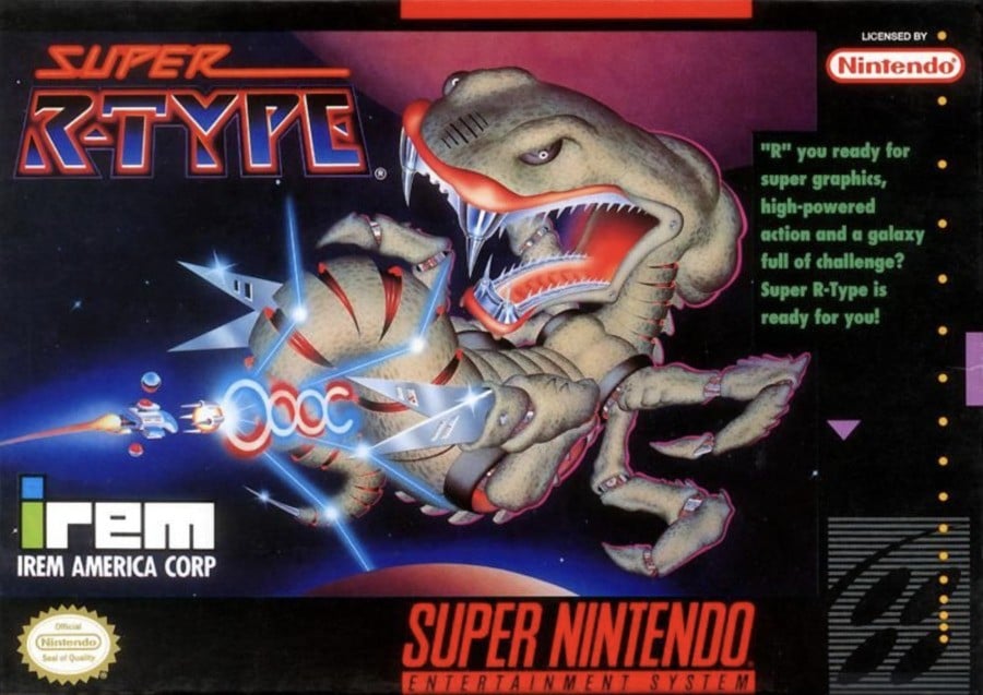
North America

This is the 'iconic' box design for Super R-Type, right? The menacing creature floating front and centre is instantly recognisable to both R-Type fans and newcomers alike. It's an impactful piece and really illustrates what the actual gameplay is going to be like. We love it.
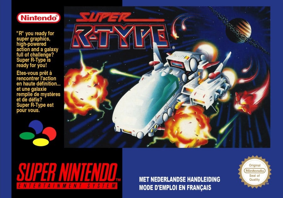
Europe

Europe's design is a bit more, shall we say, tamer. There are a few explosions and whatnot, but the focus is on the ship, with a whole bunch of text on the left-hand side. Both the NA and EU designs share the same font design for the title, which is good, because it rocks.
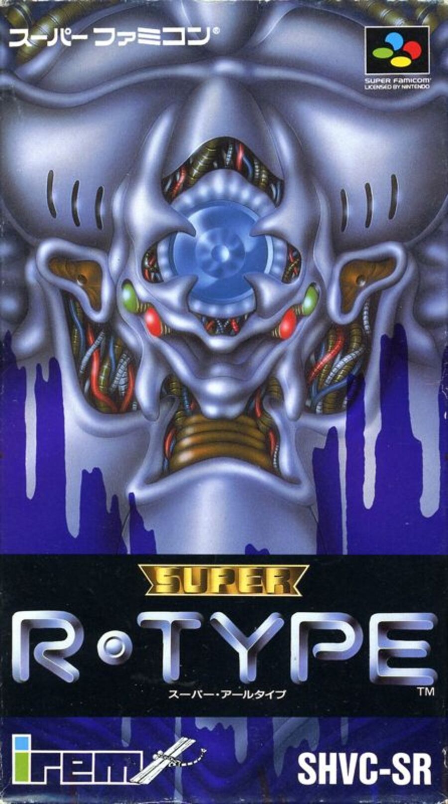
Japan

We're not super confident on what the heck is going on here, but goodness, it's a cool design regardless. The vertical orientation really makes the image stand out, and despite the title being a drastically different design to its Western counterparts, it's still incredibly effective.
Which region got the best Super R-Type box art? (1,444 votes)
- North America

- Europe

- Japan

Thanks for voting! We'll see you next time for another round of Box Art Brawl.


Comments 34
I vote Europe because the NA and Japan box arts just look plain weird or something from a sci fi horror film. (Probably just me)
North America for me as it's the one that shows the gameplay the best as mentioned by the article, too!
The Japan one looks like something they use to wake up death-row prisoners from sleep.
Difficult one... I voted NA because it depicts the game better, but the drawing of the boss is very awkward to me. The art on the Europe version is better I think.
Voting for Europe (which is fairly generic), mainly because the other 2 look like AI generated monstrosities (I know they’re not, but they look like they could be)
They are all bad… us slightly better
Picked NA, because it shows what I should expect from gameplay, but also retains some of the absolute weirdness from the japanese boxart. I know it looks weird like others have stated, but I feel like that was the intention here, and it works for me.
They are all great, but I just love those Super Famicom boxes. And that art just wins it for me.
That Japanese box art is disgusting and vaguely terrifying.
I love it.
I mean, how am I not going to vote for an alien snake bug with X-Acto blades for legs.
NA: Cool, unique, and mildly scary for kids
EU: Generic as hell
Japan: I don't even know what the hell I'm looking at
A runaway victory for NA.
@Olliemar28 "Bondfide classic"
I’m really not a fan of the creature design of the Japanese or American covers, so give me that European soccer with the paragraph and the ship lol
These are all awful. I don’t know if I’ve seen a brawl yet with three variants and all three I would describe as “bad.”
For once, I'm going to have to go with Europe!
This week's brawl is a toughy! Hmm...dunno, I like them all. I'll flip a coin over US and Japan. Hang on...
...Japan.
a rare L for Japan and W for Europe
Oh...and '"R" you ready...' is bloody awful lol.
imo the JP logo is slightly cooler (i think we got it in-game, at least in III) but the american artwork is way cooler than the menacing alien buttocks. 👍
I'm gonna vote Japan for the sheer weirdness of it
The japanese box art isn't actually just pure surreal imagery. It actually depicts a watercolor head on view of Mecha-Dobkeratops, the 2nd boss fight of the game.
https://youtu.be/vMgv0xSrxpE?si=hXahegmP6sD0snfb&t=28
video timestamped at his boss fight.
This is probably the hardest box art brawl because all 3 of them are equally cool and stylish, i love the dreamlike airbrush look they all go for!
@gaga64 Nah, they don't look like they could be AI to me.
NA. The dino-spider shows just how much of a monstrosity the R-Type franchise, and perhaps IREM in general was.
Watching LordBBH, I've grown to see just how much IREM loved horrifying Giger alien designs. Dragon Breed is a more obscure game that is just as or more creepy.
Oh man, these are all ugly
@Lightsiyd lol
I got to the North American cover and thought to myself, this is pretty generic and is just missing something. Then I scrolled down to Europe. While I thought the focus on the ship was better in concept, though still generic, I thought the execution was lacking there as well. So I thought, this should be an easy win for Japan. And then I scrolled down. I wasn't digging that one either. So this is a week when I don't really like any of them. I'd say the one I dislike the least is the North American cover, so that gets my vote this week.
NA by a mile, but at least the Japanese wordmark matches the title screen.
@Red_211 It is kind of a sci-fi horror shmup so...
Box Art Brawls Current Total:
Europe: 82
Japan: 82
North America: 96
Australia and New Zealand: 1
It’s hard when the default layout of the box for Europe is so awful. But judging on art alone I like the Europe one putting the ship front and centre, though I think all are cool in their own way.
I like the European cover, is good.
JP is weird but no bad.
NA has a badly drawn monster.
@Thomystic @PinderSchloss Sorry for being out of the loop. I just commented what I saw on the box art without knowing what the game was about. Bit of a noob here. 😅
I was torn.
European one plays it too safe.
Japan lacks the hero's ship.
So I went North American because you get the ship and that is alien is wild, like some sort of Shark, Crab and Snake mix.
Oh the 90's had some wild and crazy cover art. I miss those days, cover art isn't quite the same these days.
Europe - I've always loved the design of the ship, and in Italy the box was black, not blue.
The boss in the American version looks like cheap CGI.
another underrated japan week
Show Comments
Leave A Comment
Hold on there, you need to login to post a comment...