Hello folks, and welcome back to another edition of Box Art Brawl!
Last week, we checked out the Game Boy Advance version of Donkey Kong Country. It was a classic 3-way battle in which Japan managed to emerge victorious with 42% of the vote. Europe followed very closely with 39%, while North America floundered slightly at 19%.
This time, we're back with the Layton series with Professor Layton and the Miracle Mask. Released for the Nintendo 3DS in 2011 in Japan before a western release followed in 2012, it was the debut title for the 3DS and was followed by Azran Legacy in 2013. Like the rest of the series, it was relatively well received and enjoyed decent commercial success.
Subscribe to Nintendo Life on YouTube845k
It's another 3-way brawl this week, so strap yourselves in, and let's get cracking.
Be sure to cast your votes in the poll below; but first, let's check out the box art designs themselves.
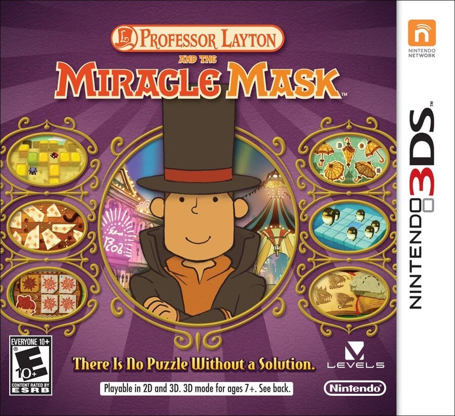
North America

All told, both western designs for Miracle Mask share some obvious similarities in terms on their composition. With the North American design, Layton's adorable face is given the top billing front and centre, with smaller images surrounding him in circular windows. It's a nice design!
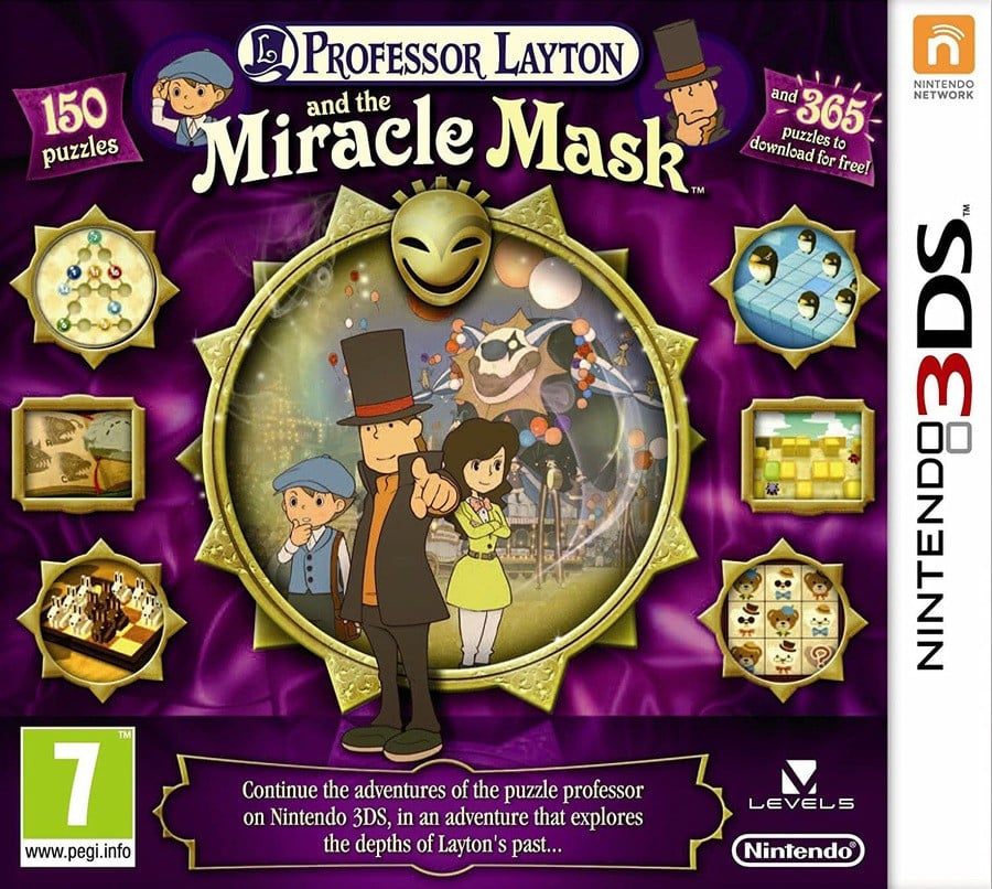
Europe

Europe's design is similar, as we menitoned, but it's certainly a lot busier too. There are more windows showcasing images from the game, while Layton himself is joined by supporting characters in the centre of the piece. Overall, the background colour is a bit darker too, which does help make the images stand out.
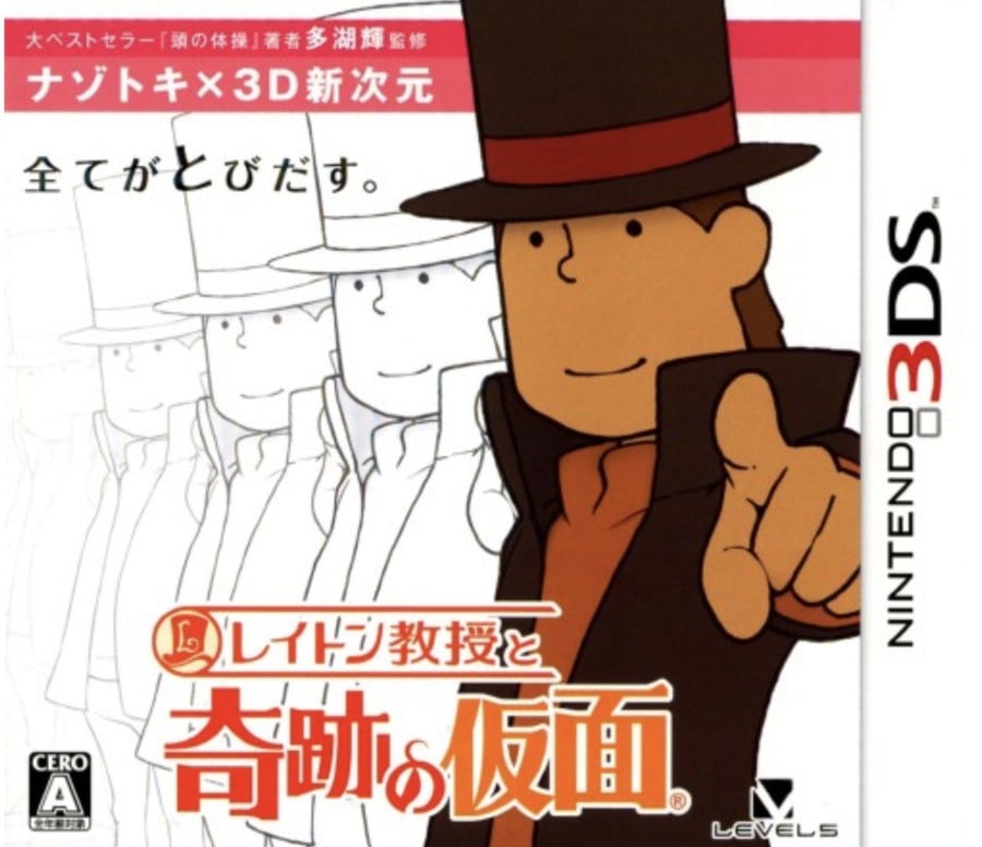
Japan

Japan's design is undoubtedly more abstract, showcasing Layton pointing at the viewer, with afterimages of his character model spliced across the background. A white background too, mind. It's an odd choice, but... it kinda works? We like it.
Which region got the best 'Professor Layton and the Miracle Mask' box art? (1,980 votes)
- North America

- Europe

- Japan

Thanks for voting! We'll see you next time for another round of Box Art Brawl.


Comments 39
I prefer the more simplistic (and less busy) background of NA. Shame the figures don't fully fit on the cover, but still had to go for NA over EU. Japan's cover is way too boring this week. ^^'
Europe for sure as it shows everything of the North American box art, but also more characters, more of the in-game background and also the titular mask.
As for Japan, I don't dislike it purely aesthetically and I get what they're going for - the writing above says "riddle/mystery solving x 3D new dimension" and the one immediately below "everything jumps out" -, but it's a big no for me when it comes to showing the contents of the game as it exclusively mentions it being the first 3D game in the series (and even more so considering it seem to be about the optional 3D effect specifically based on the writings, not it having 3D models)!
North America feels the most focused to me. Europe has a workable idea behind it but the asymmetry just makes it look phoned-in, it's not incorporated well.
Prof Layton for next Smash
I like the more ornate vibe of the Europe one so that's what I voted for. In fairness I do think the Europe one feels more busy with logos and the like but I still prefer it to the other two.
The Japanese box makes it seem like Layton knows Kage Bunshin no Jutsu.
I much prefer the NA version. Symmetric, informative and good design.
EU is very informative and has more eye-catching colors/contrast, but much too busy and chaotic for my taste.
JP version works if you already know who the character is, if not it just gives off "Man-in-a-tophat-the-game" vibes.
Having never played Professor Layton, I think these all look pretty bad.
I went with US as I feel it is the most balanced - Europe is way too cluttered, and...what is even going on with Japan?
Europe is the only correct answer here. Both the Japanese and US one don't even tell you what the game is all about lmfao
Japan by a mile. US and Europe are just crammed with stuff and ornaments. The Japanese one has style and restraint.
Im going to call it a tie. None of them are that great. America looks like shovelware, Europe's got too much going on, and Japan looks too plain. As if someone took a concept art and just slapped it on the box.
I like NA, Japan is really dull, but Europe is the only one that features a mask.
As much as I like NA, Europe's designs actually feel relevant for this game.
The JP box hyping up that basic art and and character design with its text emoji face is honestly hilarious.
PAL one, without any doubts.
Love the European/Australian cover.
The US one has the more generic sort of look that the Layton knock-offs tend to go for, ironically enough.
The Japanese one, however, looks like an Art Academy spin-off. Dreadful. Doesn't convey any sense of adventure at all.
I like the NA art I'm familiar with, but this article introduced me to the EU version. A darker purple background, it still showcases the puzzles, we get a glimpse of the mask, and best of all, Luke and Emmy are also showcased with our favorite professor.
I don't dislike Japan's abstract approach, but "less is more" doesn't apply in this case IMO.
Europe's cover looks like it was made in Paint.
I went for Europe purely because it shows the other characters.
My votes for Japan. For being a cover and not an magazine ad.
Europe!?! Really lol. It has the best elements but ends up being way too much. Give me some room to breath. Adding more elements just takes away the focus of the important items. Less is more in this case
I like more characters on the cover, so Europe is my choice.
Box Art Brawls Current Total:
Europe: 84
Japan: 83
North America: 98
Australia and New Zealand: 1
That beautiful shade of purple in the European cover's background is enough for me to choose it this week.
The one thing I determined right away is that I liked Japan's the least. The other two are very similar, so I thought about it for a bit. Europe's cover is a bit more cluttered, but it's not a huge difference and you could argue the additional things are at least informative. I'm not fond of the tag line for the NA cover. Despite that, I like the graphic design for the Euro cover more, from the shade of purple of the background, so the frame designs and shapes showing the different elements. It was Europe that got my vote.
EU obviously.
Pretty easy choice this week
The Europe cover has more to offer, but I kinda think the US is a little... cleaner? I don't know, maybe I'm just biased.
On another note, Miracle Mask is probably my least favorite Layton (haven't played Layton's Mystery Journey). Still a great game, tho.
a rare miss for Japan, and a rare win for Europe!
I think those are some pretty mid box-arts overall. I guess the north american one is the most decent one, but the european one represent the setting of the game better.
I like the ornamentation of the US box, but the design of the European box. If the European box had the frames of the North American box, perfect!
Wow. I don't really love any of these.
Ngl, I do like the European one, but the Japanese one has a style that I really like too.
I loved the boxarts of the Layton DS and 3DS games. Europe easily here.
The European one didn't have to put the characters on again at the top of the cover art. Regardless of that, I still chose Europe as the winner.
In my opinion, the European one Is easily the worst it looks like the Cover to a bad budget PC game from the 90/00’s And my favorite is the Japanese one because of how simple & the most different is is
I picked Europe as I like the composition of it with all the characters there like Luke and Emmy. Always love those kinds of box art.
The US and Europe ones are both too busy - screenshots should be left for the back of the box. Japan's just looks lazy. What they should have done is just use the middle of the Europe one... like THIS:
The European one has too much info on the front, and the Japan one looks like some game you would find at GameStop for less than a buck.😂
„There are more windows showcasing images from the game“
How so? It‘s 6 windows both on the EU and US box…
Also, you are not going to mention the terrible blurb about 2D and 3D on the US box or how only one cover actually contains a mask?
Show Comments
Leave A Comment
Hold on there, you need to login to post a comment...