Hey everyone, welcome to this week's edition of Box Art Brawl!
Last time, we saw three 3DS covers go head-to-head as we matched up the regional variants for Professor Layton and the Miracle Mask. Despite having all those options, it was Europe that walked away with a commanding win after taking 56% of the vote. North America followed behind with 27%, while the paired-back Japanese edition brought up the rear with 17%.
This week, as we gear up to Nintendo's next big release of 2024, we're taking a look at the Mario Party series. Specifically, we're putting the series' first full portable title, Mario Party Advance (yep, we're skipping over the e-Reader's Mario Party-e there), under the microscope as we match up a duo of different designs from this 2005 GBA release.
Europe and North America opted for near-identical covers on this one, so it's a good old one-on-one battle against the Japanese variant. Let's roll those dice and hop straight into things.
Be sure to cast your votes in the poll below; but first, let's check out the box art designs themselves.
Europe / North America

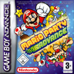
The European and North American design hardly goes all-out on the board game aesthetic (heck, if you didn't know the series, then you'd be none the wiser looking at this), but it's pretty nice on the eye all the same. Mario and pals all leap from the central logo, while Yoshi reels in a fish in the background. There are also some neat Koopa Kid colour variations here — looking uncannily similar to one Bowser Jr., we might add.
Japan

The Japanese box art makes use of the region's rectangular formatting to pack in even more detail. A bunch of bonus characters make the cut on this one (including even more Koopa Kid colours) and we're particular fans of the rollercoaster Luigi in the top left, even if it does look a little disjointed. All this is plastered over a starry background which seems fitting for the series when you think about it.
Thanks for voting! We'll see you next time for another round of Box Art Brawl.
Comments 36
very similar but the inclusion of the dice character in the japanese one shows better that it's from mario party
Despite my bias for the international box shape/banner etc., I've never liked the Western art for this game, so I've gone with Japan, but just by a hair.
Japan for sure as it shows more contents of the game:
That said, considering the more limited space and also purely aesthetically Europe/North America is great, too!
they're both pretty good tbh but I like the Japan one a little bit more
I think I dislike both of them.
I like how everyone in the comments prefers Japan (including me), while the US one wins by far... To be fair, they're very similar I only picked Japan for the dice character that makes it more evocative.
Japanese version has the edge, I'm a sucker for the Jap GBA boxes form factor.
Smiling Mario > Not smiling Mario
Gotta go with the Western variant simply because I do not like Mario's face on the Japanese cover. Why's he looking at me like that
I love the cleaner image on the Japanese box art. Less logo and more art. Plus I like the wide image better than the much smaller one on the western one.
The Japanese boxes need to stop using text I can't read.
Gotta go with the NA/EU art for this one. It flows better, looks sharper, and overall is a nicer layout than Japan's.
I voted the NA/Europe boxart. Just because Peach gives us a little wink.
@Dr_Corndog Haha, nice!!
Peach winking with a hammer all day. Nothing else matters.
I voted for the North American/European box art.
Japan is better. It doesn’t have that giant grey GBA logo taking up a quarter of the space and shows more characters from the game.
This is a case where I think the longer Japanese box works against it as far as the composition. The western box art fits the narrower format rather nicely. The extra stuff on the Japanese box does not lead to better composition to me. Less is more applies here, so the western box gets me vote.
Japan wins just a bit over the western version if only because it shows off more of the cast, and the general idea of this kind of style just fitting the wider Japan box more.
It's not a huge difference, but I think I like the Japan cover a little better? Bit of a lousy image of it though.
I'll go with Japan here for showing Luigi and Red Koopa Kid. I just wish it also had Peach holding a hammer. The only "major"/host character it doesn't have is E. Gadd.
What's taking them so long to release this on Nintendo Switch Online? This is a game that greatly benefitted from the save state feature on the Wii U Virtual Console, but it would be benefitted even more with the rewind feature.
Cartrdige art

North America
Europe, game logo is smaller here, why? There's plenty of space

Japan

EU/NA is more dynamic imo.
I think you could have used a better quality picture for the Japanese cover art version, the lighting is off and it's a bit blurry. (Now I wish I could changed my vote to the Japanese version.)
I slightly prefer the Japanese art. You can see more characters and silly things, plus I prefer Mario’s artwork there. Both are great, though.
I'm sorry but Princess Peach just looks so much cuter in the NA version. She looks cute in the JP version holding the map and looking all chill but in the NA version she looks like an idol with that adorable wink flaunting her feminine charm. That is what sold it to me.
(She's my #1 waifu)
I think the Japanese one, like the article said, uses more of the shape of the box to its advantage in detail. However, I do like how Toad is overlapping the GBA banner on the US box. Did many games do that?
They're pretty similar
I'd say these are pretty even but I went for Japan on this one - just because the characters' props make a bit more sense with the added context.
Also, it's so weird to see 2D drawings of the Mario cast in this era outside of super-stylised games like Mario and Luigi and Paper Mario.
Box Art Brawls Current Total:
Europe: 85
Japan: 83
North America: 99
Australia and New Zealand: 1
Mario is smiling and Peach is winking, so went with the Western version this time. I usually always vote for Japan.
I always seem to choose the lesser preferred option. The Japanese version took my eye because of the shape and size. Both are great, Japanese version looks more fun!
Japan has that warm and cosy vibe. But it’s still a party.
Ours looks like a casino and there are few things I despise more than casinos.
How come Luigi is missing form the US/EU Boxart?
@DarkCoolEdge The're both smiling?
@Poke-Ace in the japonese box he has a slight smile. Compare it to the West one
Giving this one to NA. Again childhood bias absolutely love it.
Leave A Comment
Hold on there, you need to login to post a comment...