Welcome to another edition of Box Art Brawl, folks!
Last week, we took a look at Crash Nitro Kart for the GameCube, a sequel to Crash Team Racing that never quite managed to step out of its predecessor's shadow. North America sealed the deal this time with 53% of the vote, while EU managed 30% and Japan just 17% (bit awkward - we like the Japanese variant). Well done, North America!
This week, we're heading to the GBA to check out Klonoa: Empire of Dreams. Launched in 2001/2, it's a game that sort of sits somewhere in between the first two mainline titles, but was nevertheless an exceptional platformer in its own right.
It's worth hunting down if you can (or you can even emulate it - shh!), because it's a proper cracker. But enough waffling, we've got a brawl to do. It's a three-way battle this week again, so let's get cracking!
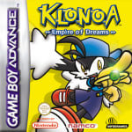
Be sure to cast your votes in the poll below; but first, let's check out the box art designs themselves.
North America

Uhh... Okay, this is a bit boring. Ethereal, maybe, but certainly boring. Lots of white space, while the character models are quite small and insignificant. We're certain this one will have its fans, but when comparing it to the European and Japanese variants, it just ain't doing it for us. Sorry.
Europe

This is more like it. Here, we have the protagonist striking a very impactful pose against a bright yellow background with some nifty shadow work going on. It's simple, but it works; this would certainly stand out on the shelves at your local Electronics Boutique anyway! Ah... Those were the days.
Japan

Japan's design is very similar to Europe's, but it's making extra use of the landscape orientation here to increase the size of the protagonist and tuck the main logo away in the lower left corner of the composition. Again, it's a simple, but effective choice, and we like it.
Which region got the best Klonoa: Empire of Dreams box art? (1,667 votes)
- North America
- Europe
- Japan
Thanks for voting! We'll see you next time for another round of Box Art Brawl.
Comments 36
Easy layup for Japan because it doesn't have the weird clipping the European one does and it isn't the total mess that is the NA one.
OK, that American box art is plain awful.
The European and Japanese ones are pretty similar but the EU box art feels a bit more dynamic to me, so I went with that one.
I mean... Look at them.
Once you saw the NA one is not even in the running here - or shouldn't be, at least - it's a matter of which format you prefer.
I voted for Japanese boxart but it can go to either it or the European one, they're equally good imo
The NA is not even an option, it just looks like a placeholder made in 10 minutes
I like Europe and Japan. Klonoa's foot gives the European boxart more kick.
I'm voting NA just to be that guy.
All show Klonoa, but Japan does so with a cool artwork unlike the North American box art and more room for it unlike the European one so I'm going for that!
It seems almost redundant to include both the Japanese and European boxes, and while I normally default to the Western option given my bias for the uniform square-shaped packaging, I went with Japan this time as the composition is better (as well as the game's logo).
Easily the European one in my opinion
Japan for me. I would've gone with Europe, but the cheesy blur effect ruined it.
People who voted for NA have to be trolling.
They all kinda look…unfinished. Lots of dead space. I think the euro looks the most appealing out of the three, but all a bit lacking.
Not a big fan of the blur on the European version, but the shadow, lightning and shine on the jewel give it a much more dynamic look than the flat Japanese one, so that gets my vote.
No, there is no third option.
Europe and Japan have the better artwork, but I choose Japan here because I prefer solid colors over the gradient coloring.
Klonoaaaaaa!!
North America has a nostalgic feel, those 3D renders are just the marks of the time.
EU and Japanese are fantastic as well, JP has this retro feel too...
well this one was easy - europe
I feel the European one is more impactful with the added shadows and effects. The US one just throws out the window all elementary rules of commercial design so I suppose it's at least remarkable in that way. Who greenlit this.
So many of these NA ones look like bootlegs.
USA nearly always have the worst box art. It is Japan > Europe > NA
Wow these are all pretty bad. I went NA solely because I hate yellow.
also, I hope that Bamco will re-release these GBA Klonoa games at some point, maybe do a collection and throw in the Wonderswan game and translate the RPG
@stephanxliko I chose the Europe one because the gem was shiny. Simple things please me.
N/A lives up to its acronym here, leaving it a toss-up between the other two: Personally I prefer the EU one, as the image of the main character is more ‘complete’ than the simpler JP one (e.g. shadows, a gleam on the gem) and it looks more like box art imo.
The Japanese and Europe cover have a 1990s Sonic the Hedgehog vibe to it, which certainly sells the idea that this is a good platformer worth checking out. The NA cover though...
I guess I'm the only one who thinks Klonoa doesn't look good with a full yellow background. The title is yellow and is surrounded by yellow. It's just okay. I just voted for NA because of the cloudy background, and that I get what they were doing with the cover art with the word "dreams."
@Xenoblade-Fan
Lol, shinies are the best!
For the NA cover, the main Klonoa is a pretty good render for what it is. The cover itself is just a boring concept with middling execution. It's the worst of the three.
With Japan and Europe being similar, it's going to come down to minor things. Europe's is cramped and gets clipped on the side. Japan's is also cramped, though slightly less so, but gets clipped on the bottom. I think the illustration of Klonoa comes across better with the clipping on the left, but showing the leg. The clipped leg of the Japanese one detracts from the character pose, I think. Europe wins for me.
A rare W for Europe!!
Europe for sure on this one. The added shadow effect makes it just a bit better than the Japanese one, and the NA one just doesn't look appealing at all.
Box Art Brawls Current Total:
Europe: 91
Japan: 88
North America: 105
Australia and New Zealand: 1
@SillyG No, the composition of the Japanese one is vastly superior!
@PinderSchloss I'll stay far away in the future! 😂
I think the sprite in both others is way too close, you can't even see it all. Meanwhile the NA one shows almost the same pose, but more of the dreamy and relaxed world I associate with Klonoa. I honestly thought this would be a slam dunk for NA! 😳
Edit
Looking at it better I see how low-grade the sprites are, there's nothing else actually grabbing attention, and what is he even riding there in the bottom half?!...You guys are right!
@garfreek lol glad you came to your senses! But to be fair, none of these are great so it’s not an easy choice
@PinderSchloss : I... just said that, dawg.
Japan, hands down — the composition and perspective of the main character look like they were built around that specific box aspect ratio.
@SillyG So you did. My bad. Cryptomnesia. It means something was good.
Sorry. They're all ugly
Leave A Comment
Hold on there, you need to login to post a comment...