We are back, back, back with another edition of Box Art Brawl!
Last time, we matched up two Game Boy covers for the weird Tetris sequel, Hatris, and oh boy was it a close contest! The colourful Japanese design just about clinched it in the end, taking 51% of the vote over North America's 49%. Talk about a photo finish!
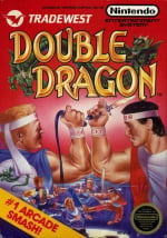
For a change of pace this week, we're punching things over to the wild world of beat 'em ups as we take a look at two different covers for Double Dragon on the NES. Originally released in arcades in 1987 before making the jump to the NES one year later, Technōs' brawler is often considered one of the genre's originators. The NES port had some major cutbacks from its arcade counterpart including the absence of a multiplayer mode, but it's still a strange little curio that shows the now booming format in its earliest days.
It's a one-on-one match-up between Europe/North America and Japan this week, so let's meet the fighters.
Be sure to cast your votes in the poll below; but first, let's check out the box art designs themselves.
Europe / North America

Is anyone else getting some serious Arnie and Carl Weathers Predator vibes from the front and centre bicep placement here? No? Just us then.
The European and North American design has a lot going on: a full-blown street brawl in the lower quarter, two foes facing off in the foreground and a bright red backdrop — not the mention the literal Double Dragon wrapped around the title. It's maybe a little too much, but there's no denying that it tells you everything you need to know about the game in question.
Japan

The Japanese design takes a different, more artistic approach. The relative realism of the former visuals is replaced by a manga art style and some sweet fighter composition, with large, looming figures guiding our eyes gradually down to the brawl at the bottom. It might be a little less vibrant than the EU/NA offering, but that artwork slaps.
Thanks for voting! We'll see you next time for another round of Box Art Brawl.
Comments 45
The Japanese box art is giving a very Fist of the North Star vibe to it. Was it done by Tetsuo Hara?
As much as I'm a fan of the Fist of the North Star aesthetic of the Japanese box art I have to vote for Europe/North America because it shows even better the contents of the game with the inclusion of the background and especially the weapons!
Europe. Double dragon was my first games poster up on the wall. Master system port was the one I played most
I went with Europe/North America purely for nostalgia reasons cos when I was younger double dragon machines were everywhere and I’m pretty sure that was the artwork that was on the marquee always had a soft spot for double dragon even tho the home conversions were not so great compared to the arcade
Europe. This is the style I associate with Double Dragon. Had this one and loved playing with my brother, probably because THEY were brothers, so it was basically US to us.
Ugly and uglier.
Reasonably sure the top one was also the box art for the Atari 2600 version, which is what I had. The Boss music for that (along with the title screen tune for Robocop on the Spectrum) remain personal earworms to this day. So EU/US version 100% for nostalgic reasons.
I chose Europe/NA slightly for nostalgia since the Atari ST port was my very first video game, but the thing is even though I usually pick Japan, this one managed to be even uglier.
The American box art brings a lot of nostalgia to me, but I gotta admit both versions are kind of.... ugly? Of course, still much better than many of those strange looking mid to late 90s 3D graphics cover arts
Both are absolutely beautiful.
The European/USA version has a nicer logo, so that one will get my vote.
While there’s nothing wrong with the Japanese box art, it’s not nearly as iconic or memorable as the NA/EU box art.
@Valkian24 I'll admit, I keep mixing up Fist of the North Star with JoJo's Bizarre Adventure. Their art styles look quite similar to me.
@RootsGenoa same, I like the Japanese version but went with NA/Europe just for nostalgia purposes! Is a bit of a classic cover if such a thing exists?!
@Valkian24 It was quite likely done by Koji Ogata.
https://doubledragon.fandom.com/wiki/Koji_Ogata
Even if it has strong Hokuto no Ken vibes, the art doesn't seem as refined as what Tetsuo Haro used to do at that time.
However, this art style makes senses considering how popular the manga was at that time in Japan.
I vited for the japanese version, no matter how iconic the NA/EU cover is, it looks so generic compared to the japanese cover.
While the NA cover has tons of 80s charm, I gotta vote for the bootleg Fist of the North Star artwork.
It's fitting that a brawl for this game is currently sitting at 50/50 as of this writing.
I went with Japan for the manga aesthetic. Neither cover really speaks to me though.
Even though the art isn't as good, the Western cover is unmistakably Double Dragon, while the Japan one looks like a Fist of the North Star ripoff.
I like the Fist of the North Star-style art of the Japanese cover. Actually, up until today, I don't think I had ever seen the Japanese box art for Double Dragon. I like it though, very cool.
I've never seen the Japanese art before, but I really like it.
The Western art does a far better job of actually communicating the style of game that it is at a glance though.
You are already... punched?
@Valkian24 Was literally just about to say the same thing.
They’re both quite badly drawn but the EU/NA one is especially badly drawn. I know nostalgia is strong with this title but I am honestly shocked it’s in the lead as of writing this comment.
I wonder how much do people actually look at the image before voting? Because it took all of 2 seconds to see the issues with the EU/NA one and it took at least 10 to start spotting the Japan ones. Neither high numbers but it’s at least the difference between a glance and a look.
I abstain. They’re both lacking I feel. The art of the European box needed some more work on the finer details (is that a whip??) And the Japanese version is all over the place and barely tells any story.
They're both bad to me. For NA/EU, are we focused on the fact that Billy and Jimmy are fighting each other, or the contradiction that they're fighting together but don't actually do so in the game? As for Japan I don't know what we're trying to convey with these Fist of the North Star characters. By default I'll vote for NA/EU.
The NA covers for DOUBLE DRAGON I & II are some of my favorites of all time. But, honestly, this cover is the one that always pops in my head first when I think about the franchise. NA / EU FTW!!!
Western one is undeniably iconic, but not very good. The Japanese one isn't amazing, but does feel like it fits the game well. It gives me that feeling I got from looking at VHS tapes of anime movies I was too young or at least too prudish to watch. I kinda dig it.
And count me in on the party that never saw this before.
Man the Europe/American box art just screams 80’s and I love it!
@Valkian24
I was just getting on the comments to make that exact same comparison!!
@Pally356
This is an interesting comparison because both covers have good elements, but also their fair share of issues. The western cover probably has better composition, and the red background is nice. The cover is also more accurate to the game. With that said, I think the overall art is superior for the Japanese cover. I also love Fist of the North Star/Hokuto No Ken, so I find the Japanese cover more attractive. For those reasons, I vote for Japan.
Voted for the Japanese version. The faces are awful on the western release.
Both not really good
I’m getting major Fist of the North Star and Jojos vibes from the Japan cover. I voted NA.
@8bit-Man Yes, that Double Dragon Logo is the best! The people look a bit odd.
Nostalgia wins here for me. I remember seeing that box art for the first time at my local video store. Something about the box art just grabbed me and I had to rent that game to bad it was always rented out when I went to go rent it.
Box Art Brawls Current Total:
Europe: 86
Japan: 86
North America: 101
Australia and New Zealand: 1
Y’all voted and don’t even know what a tariff is.
NA/Euro is iconic, easy choice for me. Especially with the logo.
Japanese one is cool box art.....but it's not Double Dragon. Looks like some kind of sci-fi fighting game.
What did I vote for? I'll give you a clue:
DILLON!!! YOU SON OF A B***H!!!
I like the American one best
The JP one is a bit messy here. The US/EU one is so clean and iconic. Love it.
both are pretty bad. but japan has a weird edge for me
I'll get a mix of both please.
EU/US category with JP quality of art.
I voted for Japan in the end.
@SleepyAnimal double Dragon on Atri 2600?? I had too look it up... and it looks like an amazing feat for the 2600! the music! the background!... it really surprise me the archived that.
I never heard of it back in the day
@Valkian24 That was my immediate thought as well. I've never seen this artwork before, but I dig it!
@Zequio Yeah, looking back now it seems amazing they managed it! Not sure I appreciated it at the time as I was about seven, was also fundamentally useless at it if I recall. Also now slightly hooked on watching people play through old Atari games on YouTube...
Leave A Comment
Hold on there, you need to login to post a comment...