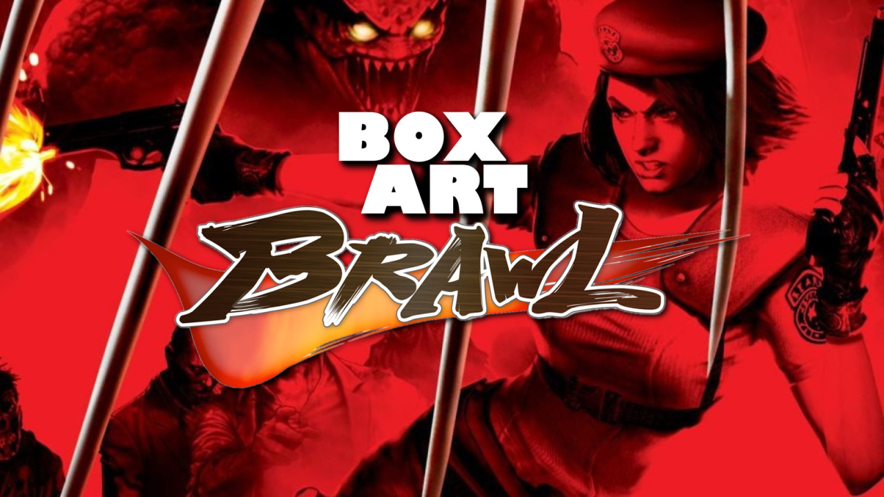
Welcome back to Box Art Brawl, our regular poll to find out which region got the best cover art for a particular retro release.
Last time, we looked at Capcom's DS gem Ghost Trick: Phantom Detective in honour of its 10th anniversary (in the West). The North American cover stormed it with over 60% of the vote, leaving Japan with a quarter and Europe to mop up the rest.
This week we're sticking with Capcom and the Nintendo DS for another anniversary bout. Yes, Resident Evil: Deadly Silence launched fifteen years ago on 19th January 2006, bringing Shinji Mikami's PlayStation original to Nintendo's handheld in time for the series' 10th anniversary. Using the system's touchscreen and adding a couple of mechanics to the original framework, Deadly Silence is an underrated little port and remains an excellent way to revisit the shlocky B-movie horror and mid-'90s visuals of the game in its original guise (as opposed to the beautifully slick, reimagined REmake).
The Resident Evil series is a regular in the 'Brawl, of course, with no fewer than four previous appearances to date; variants of Resident Evil 0, Resident Evil 3: Nemesis, Resident Evil 2, and Resident Evil 4 have all battled for your approval in the past.
So, pack your (Jill) sandwiches, and let's head back into the Spencer Mansion...
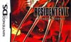
Europe
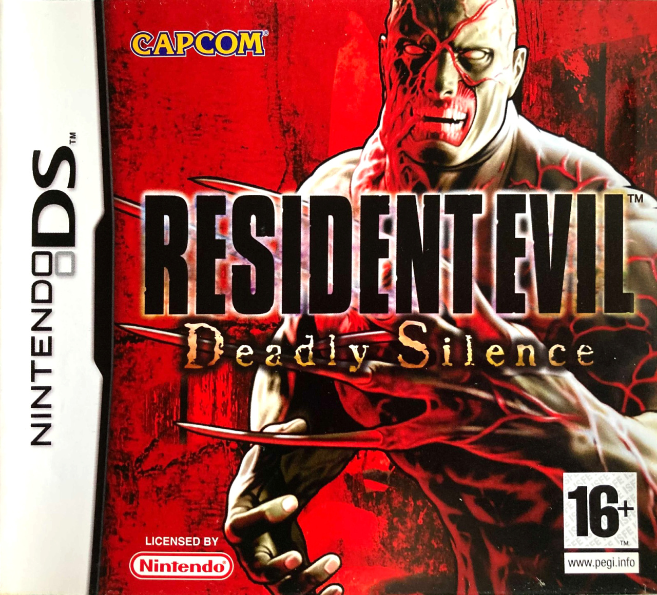
The European cover puts the grisly Tyrant on a suitably blood-red background with its mutated claw visible, though largely covered by the logo. We get a good view of his dynamite abs below, though, and his impressive set of gnashers above.
Not a huge amount going on here. We like the deep red and the overall impression the big bad delivers, although it's a little bit in-your-face and doesn't convey much of the tension you'll feel while exploring the mansion's drab corridors. Gotta love the little yellow splash of that Capcom logo, though.
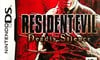
North America
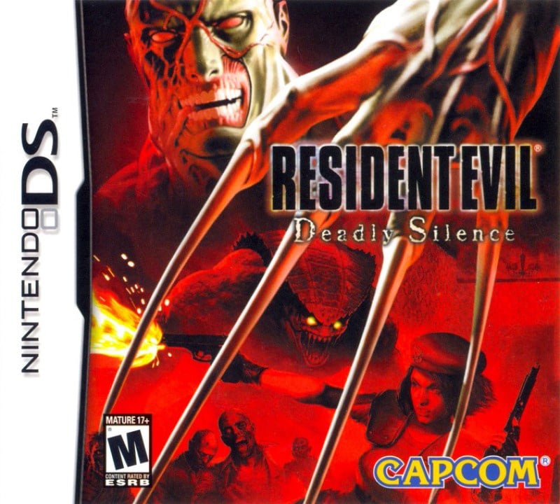
The North American cover adds more action, with Jill Valentine mid-leap with two guns in her hands, one firing. She's flanked by a horde of zombies (and an unsavoury-looking reptilian chap with yellow eyes) while the Tyrant looms over the entire collage. His big limp claw hangs menacingly over the image, although we're not sure what he's doing with it. Throwing shapes, perhaps?
The logo is identical but has shrunk to show off more of the art. Overall, it's fine, but more generic and less focused than the European version.
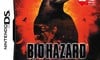
Japan
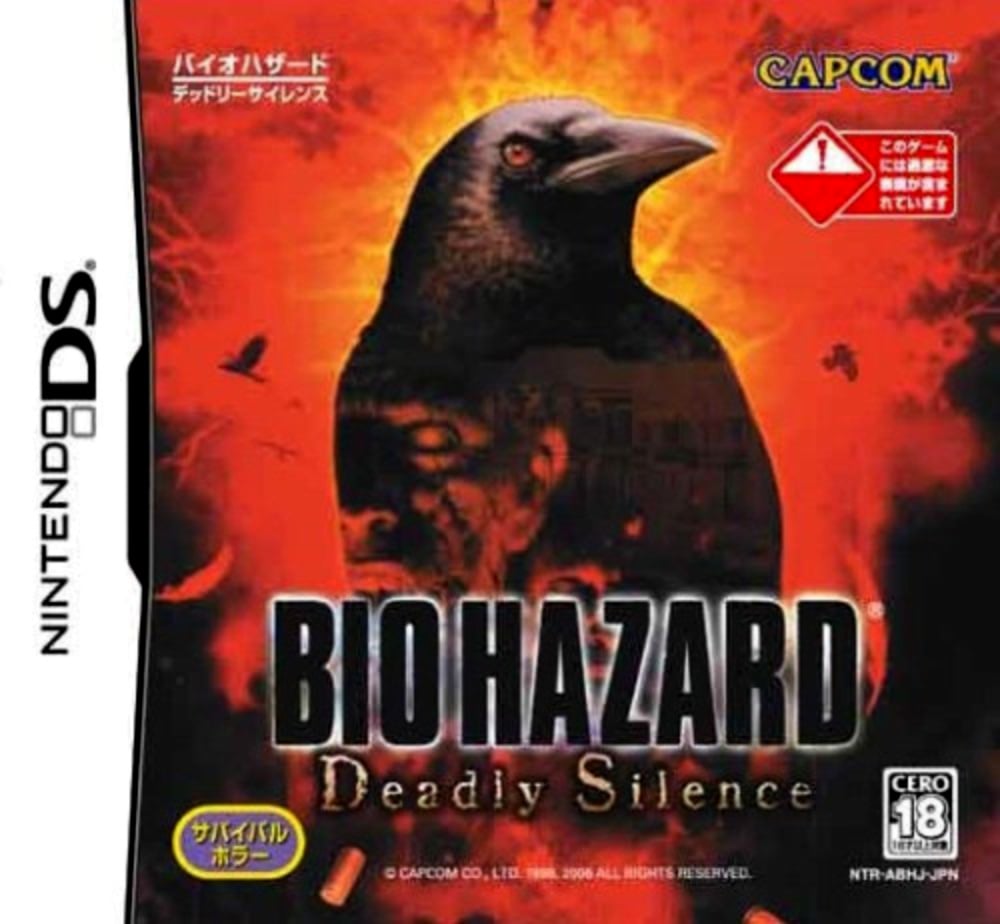
The Japanese cover goes for something a little more thoughtful; something that evokes the evil in residence without showing the final boss of the game or a gung ho, gun-firing hero. An ominous crow takes centre stage framed by a burning orange-red light, and in the darkness of its silhouette you can make out the up-lit face of a zombie and the vague outline of the Spencer Mansion.
Bearing in mind this was a game released at the time of the iconic original's 10th anniversary, it's reasonable to assume that everyone already new what 'Biohazard' was, so this more evocative cover would have worked well. While it's not as immediately eye-catching, we admire how it avoids the obvious.
So, you've seen the options, but which one resides in your heart? Pick your favourite and hit 'Vote' to let us know below:
Fifteen years! Feel free to share your memories of this smaller scale REmake below. We hope you're all keeping safe and well — have a great week and we'll see you again for another Box Art Brawl.


Comments 51
North America For Me
This is a tough one. Went with NA because I like the way the claw is coming down. All are decent though.
The Japan cover passed the which would I rather have as a poster test. The other two are fine but I don’t see any reason to look at either of them more than once.
As mentioned RE was a household name among gamers at this point. I prefer that the Japanese cover looks like art and not clipart.
NA definitely.
Big ominous looming monster with his claw looming over the entire image. Creepy eyed lizard thing and ZOMBIES! With the heroine fighting back in a cool action pose.
Japan: Spooky... Crow?
I'll be honest, they're all awful to me, it's too bloody red. I know why they did it but it just doesn't look pleasing to the eye to me. And even what is shown on the covers otherwise seems more amateurish to me than anything, but I guess that kind of comes with the 'B-movie' thing the original was known for.
I'll go with the Japanese one as that one is the most subtle.
wow, One of the few time all 3 are good
I honestly don't like any of them, though as @yosher said, the subtly of the Japanese version wins for me
For the first time in ages, I’m going with the US art because it includes more elements from the game... including Jill!
Japan looks cool, but NA has Jill.
Gotta go with my girl Jill.
While I like seeing Jill in action like that, the NA cover's composition feels all over the place. I cast my vote for the Europe version.
None of them are all that great.
Jill is a plus for NA. But I agree with other opinions here that EU and NA look like clipart compositions - while the japanese one is the only one that feels (kinda) professional.
The Tyrant just looks...bad to me.
@Zaphod42 also.. bird...
I usually don't go with the Japanese options, but this time it seems better. The other two look like cheap horror films. Some may argue that that's the point, which is fair enough.
Tough call between NA and Japan, but I went for NA. None of them are bad, though.
Easy pick for North America on this one
I ended up voting for what the majority went with (so far) and went with the North American cover art.
Americans outnumber Europeans on this site that's why their box art wins but imho the European box art is almost always better just like their SNES was ugly and our Pal SNES looked way better.
Europe. The NA ones emphasis on the claw hand looks too much like a Nightmare on Elm Street cover and the Japanese one isn't scary looking at all (even though it looks cool)
@Brummieendo90 And our Pal SNES controller! But I doubt most people on here only vote for their own region's boxart.
Y'all think NA is best? Tyrant is doing an upside-down westside gang sign, it's dreadful! Japan for me, it's the only one that makes sense when the game has 'silence' in the title.
I go for the EU version because that is the version I own.
Japan because it doesn't have Uncle Fester.
The placement of Tyrants claw in the NA version looks so weird compared to the rest his body. Like he's lunging forward with his wrist extremely bend, it looks so unnatural.
It's Japan > Europe > NA for me.
All of them have pros and cons. I went back and forth on which was best. I don't love the "mystery" vibe of the Japanese one with the crow. I don't like the thick outlines on the CG thing on the Euro cover. While I have issues with the composition of the NA cover, I eventually chose it as the best of a flawed bunch.
North America box tells a story and is also campy in the way befitting of the game's dialogue.
'sup dude Tyrant, Tyrant making gang signs, or a random crow.
I'll take the one with Jill, thanks.
I love how companies would come up with ways to put "DS" in the title. Deadly Silence and Dragon Sword are my favorites.
@Shiiva to be fair, crows aren't exactly silent.
The tyrant spends most of the game sleeping in a tube, and isn't particularly vocal. (And is deadly).
NA box art for sure, that Tyrant claws combinaded with Hunters and Jill, really sell the tension of the game.
The European version is the own I own, but I gotta give it to North America this time.
For me, the NA one should be the best as it has a big claw, Jill, action etc. But I went with Europe as it seems the be more balanced, imho.
Also in the Europe write-up - deep red, and yellow? Argento references, perhaps?
This time NA takes the potato. It's very well composed even though I enjoy all of them. The JP one is more subtle without showing the final boss even though everyone knows him by now.
This is a tough one, but I chose North America even though it's perhaps evenly matched with the European cover (which the Australian release inherited).
Proud owner of the game and it was my first Resident Evil experience. I don't think I knew that it was a port of the very first game at the time of purchase though. I also found a cheap "new" copy for about $20 which I regret not buying (I was put off by the case being unsealed and in such poor shape).
It was also wild to have one of very few MA15+ rated games for the DS (Dementium and Grand Theft Auto: Chinatown Wars are the only other two that I own; and the rare Dead 'n' Furious also got an MA15+ rating). I'm disappointed that there were no physical R18+ games released for the 3DS though (the only officially R18+ rated game, i.e. not counting automatically-generated IARC ratings, was Conception II, which baffled me as the euphemistic content did not seem deserving of the "High impact sexual references" descriptor given how relaxed our ratings board generally were regarding innuendo).
I loved RE: Deady Silence, and completed it at least six times (from memory) trying to find all of those endings (I wasn't successful in finding all of them), and mastered the hard difficulty as well. I'm pretty sure my cousin may have completed it as well when I went to Turkey in 2008 (despite the language barrier). Fun times. I only wish that the cutscenes were uncensored. They even cut Chris lighting a cigarette in the opening sequence for crying out loud. 🙄
Japan wins this one.
Here is the jp art in full without text:
https://mobile.twitter.com/VGAOfficialArt/status/980784963103739904/photo/1
North America wins for me, Japan is a very close second.
I still don't understand why we all need different covers anyways... especially if they are as alike as the EU and US ones.
JPN shows that birds are the definitive enemy of the game instead of Tyrant. Which may be true since they were the enemies I avoided the most while it was easy for me to get rid of Tyrant my 1st playthrough.
@Daniel36 so we can have weekly Box Art Brawls.
Nintendolife really like these Box Art Brawls
Keep em coming.
Box Art Brawls Current Total:
Europe: 25
Japan: 29
North America: 30
Shocked Europe isn’t running away with this. I didn’t think this one was gonna be close. Guess I have strange taste!
I'm gonna hafta go for NA for the Freddy Kreugeresque way he's holding his hand claws. I had no idea there was ever an RE game on a Ninty handheld.
@Franklin as always, thank you much for the totals
When I go to the local shop and crows have gathered on the wall, it never fails to give me flashbacks to the first game. I think I may have RE PTSD, but for that reason I vote for Japan.
Japan's is the coolest and most ominous.
@Tempestryke in addition... The Game Boy Color had Resident Evil Gaiden, and the 3DS had Resident Evil The Mercenaries, and Resident Evil Revelations.
The Switch is also technically a handheld, and that one has several.
There also exists a prototype or Resident Evil 1 for the GBC, and a company made a tech demo based on Resident Evil 2 for the GBA (although that never became an official project since Capcom rejected it).
@Eel Really? On the GBC? That's weird.
The Switch is a hybrid and we don't use it as a handheld since drift started setting in.
@Tempestryke The game itself was weird. And was completely ignored by subsequent games too. Could be fun to look at some gameplay if you're curious.
japan by a country mile
Tap here to load 51 comments
Leave A Comment
Hold on there, you need to login to post a comment...