Welcome to the first 2021 edition of Box Art Brawl. This is our weekly-ish look at two or more retro gaming cover variants from around the globe, and we've got another three contenders lined up to duke it out for your vote.
Last time, we took to the slopes for some festive 1080° Snowboarding on N64. Ultimately, it was North America and its CG 'boarder which brought home the bacon with close to half of the overall vote; Europe and Japan shared second place on the podium with 28% each (at the time of writing there's only one vote in it).
Subscribe to Nintendo Life on YouTube848k
This week we're looking at a Capcom gem from the Nintendo DS' catalogue: Ghost Trick: Phantom Detective. It featured high up on our reader-ranked Best Nintendo DS Games list, and next week is the 10th anniversary of its western release (11th January 2011 in North America, 14th in Europe). It's a fantastic game from the mind of Shu Takumi, the director behind Phoenix Wright (and the attorney's Japanese voice). Ghost Trick is a great touch-based puzzle adventure game and available on mobile devices these days if the DS version is a little too pricey for your tastes.
C'mon, let's head back to the land of the living...
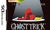
Japan
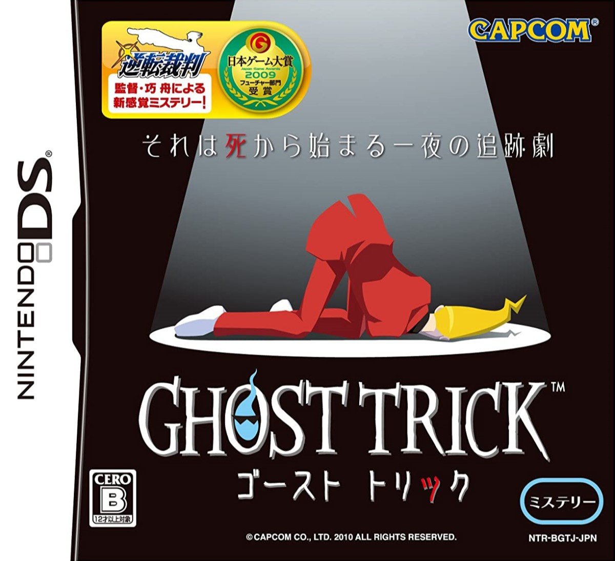
Starting in Japan (where the game released in the summer of 2010), the body of protagonist Sissel lies under a spotlight on a black stage with his derrière propped up towards the light. It's a stark, simple image that plays in nicely with the setting of the game. The sticker at the top which highlights that Ghost Trick comes from the director of Phoenix Wright provides a little visual pep and colour, but remove that and you're still left with an elegant, effective cover.
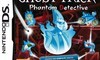
Europe
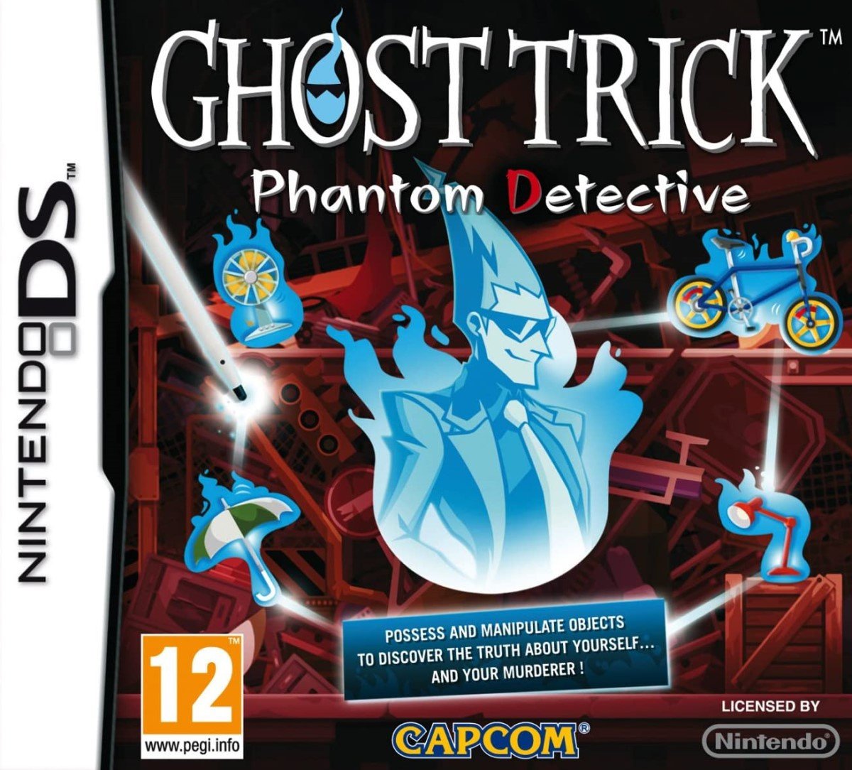
The European version more explicitly describes the gameplay through the possessed objects surrounding the ghostly Sissel, and there's a text box below explaining things in black and white for anyone slow on the uptake.
It uses the same logo with the spectral head in the 'O', and each individual element is relatively strong, although they arguably get a little lost and it loses the simpler Japanese cover's sense of identity. Not bad, just not better.
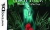
North America
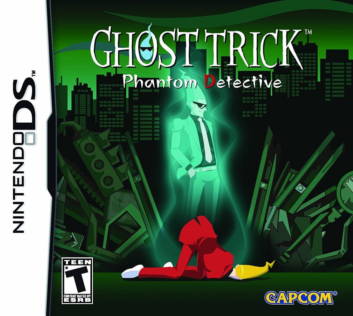
The implication of the Everafter that comes from the spotlight and black background on the Japanese cover is made more obvious on the North American version, with Sissel's ghost standing above the same art of the crumpled body. The background conveys that you're in for a modern day urban detective story, and the logo has been reduced in size, presumably to give you a better look at the skyline.
Again, not bad but could be better. The random street signs and material surrounding Sissel feel overly prominent to us.
So, you've seen the options, but which one does the trick for you? Pick your favourite and hit 'Vote' to let us know below:
We hope you're making the best of the new year, whatever your situation. We hope you have the best week possible and we'll see you next time for another bout of box art brawlery.


Comments 47
Kinda like the American one the most myself.
The European one though is closer to showing what the game is actually like.
NA easily. European is too visually noisy, and Japan's is just weird.
European covers for this era had a trend of needing to be informative to sell what your game is about.
Even though that's arguably what the back of the box is for.
This is one of those rare times when choice is easy. I was positively impressed by the japanese boxart (sans that sticker) but I think NA did a better job. That's only my opinion, though
I woulda voted Japan if it didn't have all the extra text, the additional text box distracting from the impactful center piece.
America's looks best
@shazbot The one and only rule of Japanese graphic design is "empty space? fill it with text!" When you're surrounded by that rule every day it gets old really fast.
I love the NA cover. Also, maaaaaan this is a good game.
Hmmm, lets see.
The Japanese box art is literally just a rotting corpse.
The European box art is random dead guy and some glowy objects.
And the North American box art shows you a kinda cool background and shows the two most important characters.
I WONDER WHICH ONE IS THE BEST!
It's obviously the North American one
I gotta vote for the North American cover this week.
This game needs a Switch port.
@HotGoomba___Rebrand Technically it could just be showing one character, now that I think about it.
This is the very first Box Art Brawl where I thought all 3 of them knocked it out of the park. I like the NA one best, but all 3 are amazing. The Japanese one would probably look amazing as a poster.
I love the idea of just a corpse in the cover, but the american one is better, and represents the game to perfection. The european one is just awful.
@Tharsman
A sequel of sorts more like. Stop with the porting!!!!!!
I don't like the one we got in Europe. I voted for Japanese box art. I like the key art. It's very bizarre without context and I doubt it would sell copies if it weren't for the award and mention that it's from Ace Attorney developers.
@Radbot42 Some games don't need sequels. I think this is one of them.
This is one of the few games I played the demo of from the Nintendo Channel and immediately went to buy it, the other being Big Bang Mini.
I think the NA cover has the better look.
Great, got me intrigued only to find out it’s another duper expensive game. Sigh.
I don't like any of them. Europe is way too busy and NA/Japan's dead character is in a very sexually-suggestive pose.
Fantastic game so much fun. Will replay again one day. Japan for me xxx
@Late
They don't have to continue the story, just a game with similar and expanded upon gameplay with a new and different story
What were they thinking?
I really love ghost story! I just got it again on ebay 1-2 months ago (played it on flashcard before) and am looking forward to playing it again!
I might be biased - I bought the game in late 2019 (paid a bit of a premium, but it's almost doubled in price since) and played it this past summer - but I went with North America. I like the city backdrop and color palette there. Europe's isn't bad either, but the explanatory text was the deal breaker for me.
For those of you who haven't played this game, you owe it to yourself. Go into it knowing nothing besides the premise.
Definitely North America for this one.
I'm still a simple man, it seems.
I see Ghost Trick, I point and click.
Voted Japan, for it being the one best representing that the game begins with the main character dying even though those of us who played it, know that it's not as simple as that. Us is a close second,it's a slightly better representation of the style and what the game itself is. The EU box, the one I have, almost put me off of buying this game by making it look like some stupid shovelware, and it's one of the better DS games in my memory of it at least. Despite it being actually the best representation of what the game is, but a good example that artwork can sometimes be very misleading in either direction.
Man, this game is so incredibly good. I’ve never found anything quite like it that affected me in that way. I was pretty young when I played it and I’ve only played it once but it’s totally stuck with me.
North America for me. Didn't even have to think about it.
Without the golden sticker the Japenese one would be my pick, since I like how simple and silly it looks. But I picked the American one.
@Radbot42 My point still stands. I don't think this game needs a sequel, connected or not.
They can't use the same twists anymore. If someone turns to a ghost again, they must explain it in some way. We know the reason beforehand. It has to be connected to the meteorite. Is there another meteorite or is the story set near the same park? Maybe it even happens at the same time as the original story?
Ghost Trick revolved around the mystery of Sissel's death and what caused these strange things to happen in the first place. That mystery is now gone. We know everything we need to know. They have to come up with a new mystery while keeping the old explanation around for gameplay's sake because the game is all about those ghost tricks.
I'm not opposed to a sequel but I don't think it needs one.
I like the European cover the most. I think it works best as a game cover. The US one is not bad either. I like that they at least added the spirit to convey that he's dead. The Japanese cover is simple and the way the body is posed looks more like something I'd see in an anime comedy and the character is knocked loopy rather than dead. It certainly does nothing to create interest in me for the game, nor is it particularly appealing to me as game art.
Without some of the extra text Japan's would be the best, but as it is it's the US for me.
Europe isn't even in contention this week, IMO.
I like all of these. Which is fitting, because the game itself is flipping amazing. Voted Japan, because I like its simplicity and how little it gives away, but all of them are good. I’m a little surprised that NA is so far in the lead, but I begrudge victory to none of these.
@RupeeClock I tended to find NA covers to be more like that during that generation. Probably the best example I saw was Sky Crawlers on the Wii.
NA cover looks like a cartoon I need to watch, and a game I absolutely need to hunt down and play!
Ah, Ghost Trick. A hidden gem from way back when Capcom still allowed itself to be creative. Those were the days.
Capcom should port the iOS version to Switch. sage nod
Europe.
The collapsed figure sort of doesn't really aid well to the cover art in the others. Lol
I like the stark image of the Japanese cover, but the NA version helps convey more about what the actual game is about. European cover looks totally forgettable.
One of my favorite games.
Like others have stated I would picked the Japanese box art if not for the big golden Phoenix.
For one of the first times ever its the NA version
I’m always surprised at how people vote.
In most cases the majority overwhelmingly votes for one I don’t like. In this case, I was really torn as I thought all were pretty decent and I was looking for a close 33-33-33% race, but then BAM! NA takes it by a landslide! I did vote for NA, but in this case I think all regions were winners!
Japan because it's just what?
God I loved this game. Just played it last year. Lives (as it were) up to the hype.
Box Art Brawls Current Total:
Europe: 25
Japan: 29
North America: 29
the NA box art is the one that better covey the story and gameplay of this, EU look like shoveware and too crowded.
Like the composition of the NA one best but I like the colours better on th EU. overall i went JP 'cause it reminds me of of a game over screen which I find very fitting in this case, where that is actually the beginning of the game
North America for sure.
This game helped me through the early days of the 3DS.
Show Comments
Leave A Comment
Hold on there, you need to login to post a comment...