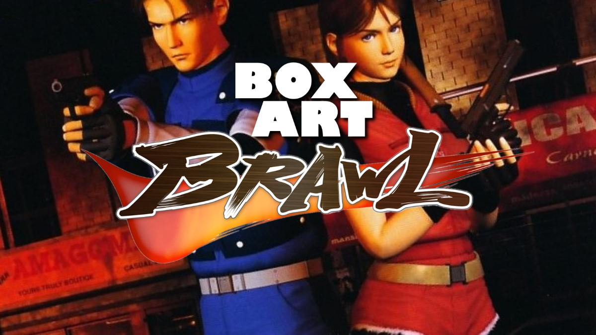
Welcome again to Box Art Brawl, the weekly bout that sees regional variants of retro games compete to see which has the most attractive box-based visage.
Last week featured a load of old balls - monkey balls, that is - as Super Monkey Ball 2 bounced off itself in battle. You lovely people decided that the European variant was the most deserving contender with over half of the overall vote. North America came in second with Japan falling into the abyss of third place.
Staying on the theme of sequels, this week we're returning once again to the Resident Evil franchise. We've already had Resident Evil 4 blast its way through the Brawl, but today we're jumping back two games and one generation to Resident Evil 2 on the Nintendo 64. The GameCube port adapted the art from these versions in each region, so you're getting a cheeky 2-for-1 this week.
Subscribe to Nintendo Life on YouTube845k
Despite our requests to Santa, the wonderful remake of this game which launched on other consoles last year has failed to materialise on Switch. Of course, it's a technically taxing title and a potential port would be quite a feat - some might even say it couldn't be done. After the wonderful ports we've seen on Switch, though, we'd have to disagree. And while this Nintendo 64 version had its limitations in comparison to the PlayStation original, it was also rather special in its own way (as Digital Foundry has detailed in the past). RE2's got form when it comes to remarkable ports, then. Come on, Capcom!
Enough talk - let's head into Raccoon City...
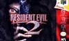
North America
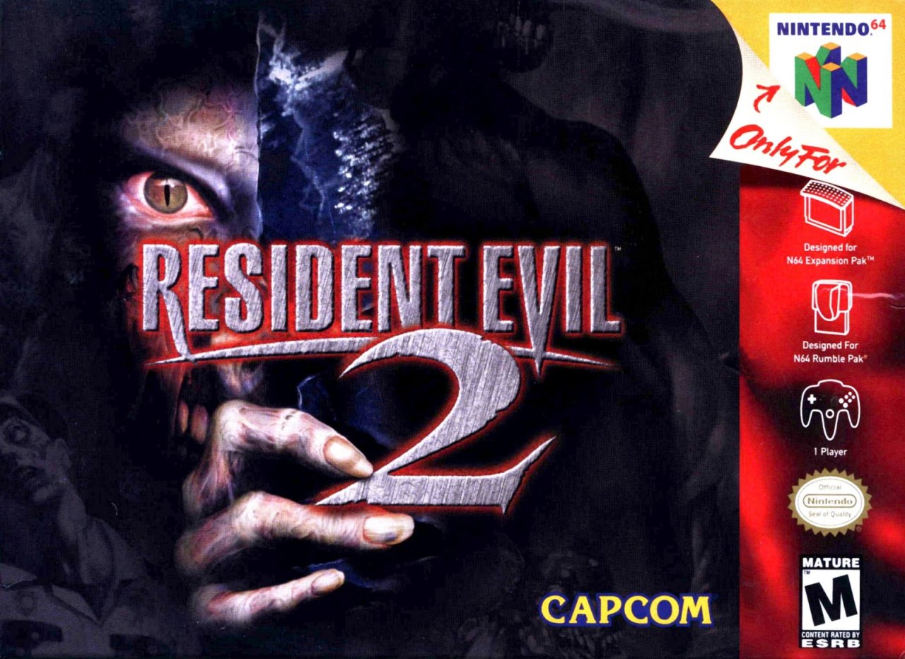
The North American variant has a brushed metal logo with some pointy bits and a malevolent red bloom behind it. The creepy-eyed zombie catches the attention and there's a hint of teeth behind the fingers clawing at the '2'. The digits themselves have pale, lifeless skin stretched over them, although to be fair we've seen worse fingernails on a zombie. In the bottom left corner you can make out an unfortunate policeman who's succumbed to the G- or T-virus (we forget which) and you can also glimpse another nasty occupying the space to the right behind the logo.
It's all rather creepy until you get to the standard red strip on the right which spoils the mood somewhat. It's not bad, but we probably prefer the other variants for the way they establish and maintain a mood. Let's head to the east next...
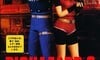
Japan
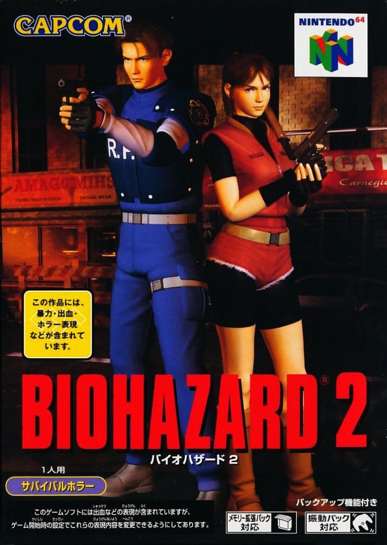
The Biohazard 2 cover takes renders of Leon Kennedy and Claire Redfield side-by-side, locked-and-loaded ready to blast some brain-munchers. They're posed like buddies on a movie poster on the mean streets of Raccoon City and with the big red 'BIOHAZARD 2' logo at the bottom, we rather enjoy the simple composition here. It's meat-and-potatoes, but sometimes that's just what the doctor ordered. Tasty.
Europe
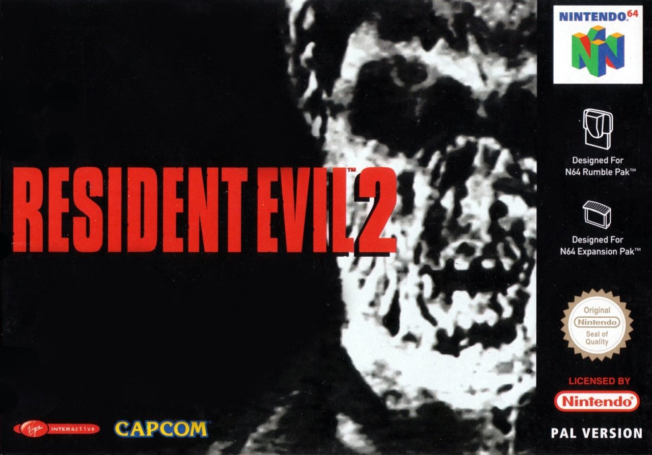
Once again with the RE series, Europe gets a 'moody PAL' cover. The stark black and white of the cover (minus the N64 logo in the top right) contrasts beautifully with the bright red logo that matches the font of the Japanese version. The nasty-looking chap in the background is blurry and obscured - as if captured fleetingly on a TV monitor - but there's something about the power of suggestion that feels more evocative than the grisly sinews and detail of its American counterpart.
Each to their own, of course, but we've always been suckers for art which complements the tone of the game as opposed to more explicit images or posed key art in an eye-pleasing configuration.
So, three quite different takes on the old survival horror, but which one gets the hairs on the back of your neck a-tinglin'? Click your favourite and hit the vote button below:
Thanks to GravyThief for the suggestion this week. We've got a few contenders lined up for the Brawl over the coming weeks, and we'll almost certainly return to Raccoon City again in the future, but if you've got any suggestions feel free to drop them in the comments. We'll see you next time!


Comments 55
Frankly, they're all absolutely terrible. I can't think of any RE box art which really worked until the EU cover for RE4. Now that was a beautiful piece of art.
North America too creepy for me. Europe classier. Japan more representative of what the game actually entails.
Thanks for taking my suggestion! 😀
I’ll be interested to see how this one pans out, only 9 votes so far. I prefer the PAL cover, with its ‘less is more’ approach, but the NA cover is good too. I’m not normally a fan of 90s CGI art, but I still think the Japanese cover is good too. You can’t lose with this one.
Why does Claire on the Japanese box art look a lot better than Claire in Relevations 2.
None of them are good but my vote goes to the European cover for nostalgia mostly.
Ooh, I like the PAL one, it’s grisly without looking silly like the NA one does.
I don't even understand what creature is represented on the NA cover. It looks like a reptilian from V holding a shuriken. The Japanese cover is not bad but it's quite uneventful. The European is the best to me, it uses the same font as the original and the three-colour scheme looks much better with the traditional black frame on European N64 box arts.
Wow, never seen the European box art before but it's terrible. Japanese version definitely gets my vote.
The 2 in the NA cover art lools terrible. EU for me.
I'm torn between EU and US this week EU is certainly more serious. Hmmm...
Europe, for sure.
Always the European one.
Its Resident Evil, but something about the boxart gives me a Romero vibe. Like the zombie walked right of the screen from Dawn/Day of the Dead.
Really? The European one wins? What is wrong with you people?
I think NA has the best one, and Europe by far the worst. I really can’t understand how that terrible blur can lead the vote right now. Is the zombie made out of pancake batter?
That's the first time I was literally creeped out by a cover and EU won that for me. Not sure I picked EU hands down yet like that.
All 3 don’t really show what the games are about... bad game covers in my opinion.
How in the world is Europe winning this?
I dont think we've seen such a bad japan rep before
The Japanese version's working title was Bluey and Granny Panty's Red Light Bust, but Biohazard 2 turned out to less of a mouthful about a game where humans have been cripped by venereal disease.
All bad in oddly different ways.
Europe
The cover is just moodier and evocative. It shows that this is a horror game, with out resorting to gore and other over the top nonsense.
It's understated and all the better for it.
Box Art Brawls Current Total:
Europe: 6
Japan: 10
North America: 9
I was unaware that zombieism gave one cat eyes.
The US one just doesn't really evoke the game for me. The European one does. The Japanese one just makes me wish the graphics looked that good back in the day.
Europe again. No surprise.
@ReWane You're not the only one who doesn't like Revelations 2 Claire. I was really disappointed in it when I saw her character model in game
Yet another brawl with bad covers all around. N64 seems to be the worst platform for covers too. For me, the least bad one is Japan.
Some good childhood memories right there. I remember staying up late at night scared trying to make it to the next printer with just a hand few bullets, and lickers on my heels.
Europe's is very 90's, it could be something used to advertise the nwo or a tony hawks segment with a smash pumpkins soundtrack. North America for me, at least its clear what it is whilst not been goofy.
wow that's old, l seen what the old game looked like but not the box. And that Claire is so different from my view.
Ah, Resident Evil box art... The only thing often cheesier than Resident evil dialogue. And as a vegan, I
a) have to annoy you by telling you I'm vegan, it's what we do it for obviously, it's the rules in our "extremist" "religion", according to a popular "joke".
b) use the word cheesy sparingly and only when I really think something is really bad.
I'm going with the Japanese one because at least that one is representative of the game. They're all terrible NA with its distinctive but silly looking cat eye zombie and EU being so generic it could be for any zombie horror thing. The Japanese one is boring but at least it has Leon and Claire on it with a Raccoon City background from the beginning of the game. Also it's weird that I'm writing this while taking a bathroom break from playing RE2 Remake on my Xbox.
Definitely the NA one, easily the most iconic. Each to their own, but Europe's is by far the worst imo.
Japan for me. The other two are just too creepy (plus, Claire is pretty hot )
I grew up with a PS1 eu RE2 so it’s mostly nostalgia talking. The NA is decent too but not as cool as the EU one. Jp cover is just horrible.
NA is okay. Doesn't really look like anything in the game but it gives you an inkling of what the game is about without having bad composition.
I think Japan's has the former problem, where it looks decent as official art but doesn't convey enough information about the game.
EU's is the worst, in my opinion. A close-up of a zombie's blurred, black-and-white face on a blank background. I guess they were going for a spooky minimalism thing, but it just comes across as lazy. And it kind of crosses over into nasty and unpleasant, I dunno.
@BulbasaurusRex
Isn't that the point for a horror game ?
To be creepy.
The European version is nice, but the North American version feels richer. I could go with either one.
I got to vote for the North American cover version of Resident Evil 2. I love how creepy it looks, definitely the best one out of the group.
@Savino @Robzilla @fafonio omg! People have opinions that don't match your own. Damn right outrageous.
@Stocksy If you read the comments you'll see Europe has had the least wins over all by a fair amount.
Never knew that the box art cover for RE:make 2 was based off the Japanese cover of the original.
Learn something new every day.
@Jayofmaya
Yeah, how very dare people huh ?
@KitsuneNight Not THAT creepy.
@BulbasaurusRex
Oh, I dare say its doing it right then ^.~
I remember reading that the person who designed the compression method used to squeeze both discs of Resident Evil 2 onto an N64 cart said he could also squeeze all three discs of Final Fantasy 7 onto an N64 cart - sadly this was at the end of the N64 lifecycle.
Honestly surprised that the Europe Box Art got the most votes. Just seems off to me.
But then again, I am not into stuff like this game. So I just chose the Japanese box art one heheh.
Why does the NA box say ‘only for N64’ when it was famously out on PlayStation?
@KitsuneNight No, it isn't. If the game were truly that creepy, hardly anyone would want to play it. There's a line between legitimately scary and just looking stupid, and the European one at the very least crosses that line.
Besides, there's a big difference between what we want on box art and what we want in the games themselves. Box arts should be attractive regardless of the genre. Nobody wants to see nothing but ugly monsters on the box. They need to go with either more attractive monsters (if they exist in the game) or use them as smaller background images behind the attractive protagonists.
@Inaroomalone All the N64 games had that. It just means that that particular copy of the game will only work on an N64, although that probably will no longer be strictly true in a few years once a clone system comes out that can play N64 cartridges.
Wow, they're all kind of awful! Just like this game. I'll never understand why people think this game is so great.
@BulbasaurusRex
We will just have to disagree then because as far as I am concerned the minimalism in the pal box is exactly what the game needs.
...and attractive monsters ?
They are monsters they aren't supposed to be attractive, just the mutated walking dead.
I'm nostalgic so I voted for the american one :3
The europe one looks soooo crusty compared to the others.
US all the way.
NA get's my vote, It might be nostalgia, I do think JP's cover is pretty decent as well since it does show Leon and Claire, EU Version though just looks ugly and cheap to me
Show Comments
Leave A Comment
Hold on there, you need to login to post a comment...