Welcome once again to Box Art Brawl, the weekly poll which places three regional box art variants before the eyes of you lovely people and awaits your "yay"s and "nay"s.
Last week we took to the streets with Axel, Blaze, Zan and Sammy (and Roo) in Streets of Rage 3. We looked at three very different covers, but Japan emerged from the street brawl largely unscathed with a whopping 78% of the vote. North America limped home with 16% while Europe would have done better not to show up at all. That's what you get when you don't include Axel on the front cover of your Streets of Rage game!
Subscribe to Nintendo Life on YouTube849k
For round #37 we're heading back to a franchise we've seen brawling twice before. Box Art Brawl #3 was the series' debut bout with Resident Evil 4 and it returned for Brawl #25 when Resident Evil 2 did battle against itself. This week we're looking at the game (Jill) sandwiched numerically between the two: Resident Evil 3: Nemesis. A remake (or 'REmak3', if you will) has just released on other platforms, so rather than getting too jealous we thought we'd look back to the GameCube port of the original PlayStation game.
Got your sandwiches packed? Raccoon City's awaiting...
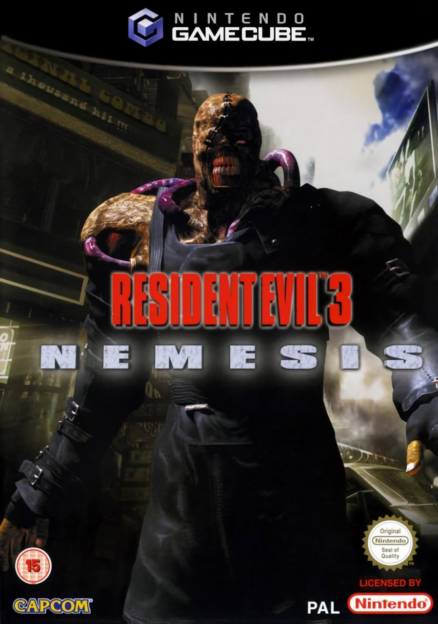
North America

The North American version puts the titular lovable rogue John T. Nemesis front-and-centre, with his towering figure occupying most of the box against the background of Raccoon City. The 'Resident Evil' part of the logo is shattered and translucent, as is the swoop-y 3. The 'Nemesis' subtitle is scrawled in embossed blood red and set apart from the dark background with a drop highlight.
No part of the logo is necessarily bad, but the three different types look like they've been hashed together without much thought. It's big, it's bold, but it lacks coherence. Not much else to say really. The Capcom logo's dope, no?
Europe
Using what appears to be the same key art of Nemmy (as we like to call him), the tone is a lot warmer here which causes the big bad to look a little less ghostly and a little more gruesome. That's not to say he was looking dapper on the North American cover, but the colder blue tones were more forgiving on his complexion.
We see slightly more of his body and the logo here feels a little more coherent, although no less generic. We do prefer the classic RE font treatment, though - a shame it has been reduced in size. A bit more of the background is visible, although there's less detail. Pluses and minuses, then, but it all feels a bit dull.
Little-known RE lore factoid: the toothy villain of this game began life as a happy-go-lucky Umbrella scientist by the name of Reginald Sisemen before an inevitable mishap led to a nasty case of the J-Virus. Probably.
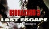
Japan
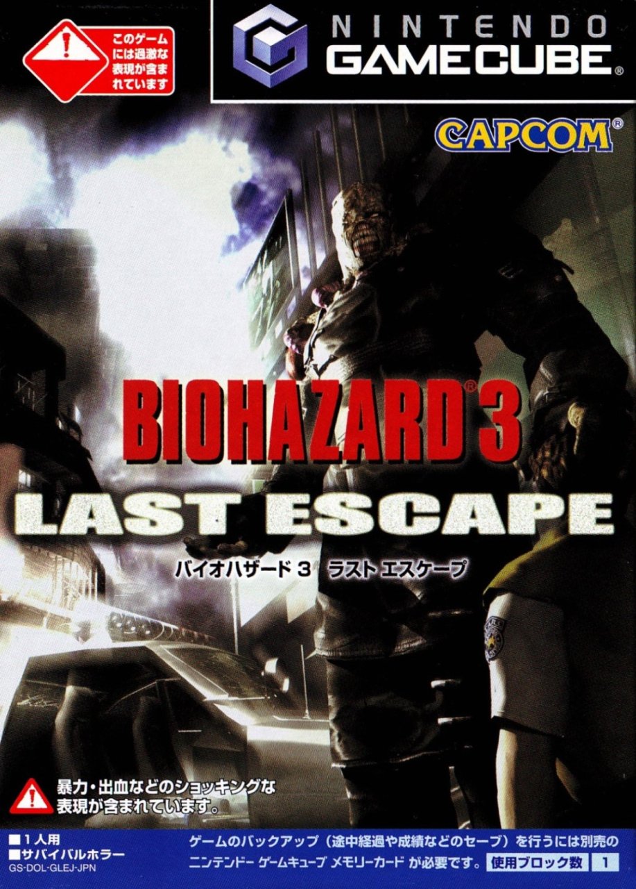
As you already know if you can read, the game was known as Biohazard 3: Last Escape in Japan. Once again we get a shot of Nemesis, although this time some poor S.T.A.R.S. team member has the misfortune of having his head in ol' Nemmy's clammy palm ready to be crushed. Nemesis takes up approximately half of the image with the rest being occupied by a bleached-out Raccoon City street showing a low-poly cop car at the bottom and a billboard above.
It's an odd one. You'd think that having a villain so imposing, so ghastly, would make coming up with a cool cover relatively easy, but none of these are as inspiring as they could be. We'd have probably focused on his teeth. He's grinning for the camera so obligingly, it'd be rude not to.
Three options, one pick. Click your favourite below and hit the 'Vote' button to let us know which one you find the most attractive. Or perhaps that should be the ugliest this time? The one you like the best...

We hope you're all keeping safe and sound wherever you are and enjoying a few of them vidya games. Check out our ranked list of all the Resident Evil games on Nintendo platforms according to Nintendo Life readers if you fancy another RE fix. Otherwise, take it easy and we'll see you next week. Stay lovely!


Comments 38
STARS
I dunno they are all kinda samey.
Japanese cause it shows more of Nemmie* I guess
Now run before Nemmie gets you .
( * blame the dark id's LP's for that )
As usual, the Japanese cover looks the best.
It has to be Japan’s for me. NA has that terrible logo and the PAL one looks a bit low quality.
PAL looks unfinished and Japan has to much going on. NA is nice a clean and gets my vote.
Toss up between Japan & US this week, though to be honest none of them are that great.
I went Japan though.
They all look kinda terrible.
It's a toss up between Europe and Japan for me. (That font situation on the US version isn't doing it for me at all)
Voted Japan.
I voted US but the font almost made me pick Japan. That font is horrendous and isn't Resident Evil to me.
Japan by a country mile, it's not even close.
He's got someone's head in his hand FFS!
I would say Europe. Sure i love the font in in the US version but you can see alot more detail on the Nemesis in the EUR version.
JP version all the way. The PAL is a close second, while the US with that horrible choice of fonts falls way behind.
Unpleasant artwork all round. Went for Japan as the last offensive
I do like Japanese Gamecube games, with their little cases and card sleeves, compared to the standard dvd cases in the other regions. I’ve always meant to own at least one Jap GC game, but keep putting it off. I need to decide which one is best to get, ideally a JP exclusive. Maybe that Nintendo puzzle collection game.
North America, hands down.
Europe is the least bad choice here...
I went with Japan. I found the low point of view to be much more intimidating than just walking and smiling.
I like the colors in the American one.
Also that’s the one I have on my shelf so I may be biased.
UK and Japan looks like someone made from home. Just pitiful.
Europe again and not even close
I think Japan's cover has composition issues, with the main focus shifted to the right, leaving a lot of empty space on the left side. I agree that the NA cover has problems with the logo. I don't like the mismatch and the general look of it. I like nearly everything more on the European cover. The Resident Evil logo in red looks a lot better to me. I voted for Europe this week.
None of the covers is fantastic, but all of them are a million times better than those terrible Streets of Rage 3 covers last week!
Went with NA, because I like the chilly palette. Europe cover is fine, but Nemesis looks less foreboding in full colour and more like a Marvel character. Japanese one is decent, but it looks like the focus of the game is the cityscape, and Nemesis is just any old incidental enemy.
@Wavey84 I think it’s the whole Nemesis written in blood thing. It looks like a bad pulp comic from the 50s 😂😂
North America despite the designer going crazy with crappy font effects.
Japan’s is so congested I hardly see the figure until close inspection, and Europe’s lighting feels muddy.
Box Art Brawls Current Total:
Europe: 11
Japan: 13
North America: 13
Most of the times I prefer JP covers.. but in this case I prefer the Europe cover. The USA doesn't do much to me and neither JP
Easily Japan, it gives a sense of how menacing the character is with background/foreground reference.
I do love how the North American one has crazy different fonts, gets my vote because of it.
Japan is the worst since Nemesis is not centered and (to me at least) seems to blend into the building too much making it look a bit off while Europe one is midway between being just okay.
I'll go with the European version. The warmer colors give Nemesis a slightly more realistic appearance.
NA for me. The font and the lighting is pretty sweet.
I can't vote for America just because of the hideous "Nemesis" font.
This one's tougher than I thought it'd be. They're all kind of... uninspiring. I voted Japan for having a bit more action going on. Nemesis clutching Brad like that makes for a pretty menacing cover.
Hmm..I like all of them..but the Japanese is pretty cool
Needs a 4th option for "delete these design disasters from the internet"
@Taarna well to be fair, the game is called “Resident Evil 3 Nemesis”, not “Resident Evil 3 Jill”
Wow. This one is a close race! For me Japan's just edges it out.
I'm voting NA. But I'd have said Japan if there was less text and less logos on the cover.
Good memories op this game. Be good if switch gets a port!
That US boxart is a hot mess, like fourteen horror movie posters all crammed into the same image! Japan for me.
Never actually saw the Japan one. It's more effective with the STARS operative (can't recall his name) in Nemesis' clutches. Europe's looked trash, although it does look straight from a cutscene in the game so it's slightlt more representative of the game.
Show Comments
Leave A Comment
Hold on there, you need to login to post a comment...