Wind Waker GameCube vs HD
We know the game didn't look like this, but the box art for both versions cannot be ignored. — Image: Nintendo Life

And just like that, ten years have sailed by — The Legend of Zelda: The Wind Waker HD was released on the Wii U ten years ago today, and while we spend most of our days now pining for this incredible seafaring adventure to swim onto Switch, we want to reminisce in a completely different way today. The Wind Waker is beloved by almost all Zelda fans, taking Link's adventures to the Great Sea. Our green-wearing hero is on an adventure to save his sister Aryll and, eventually, find the Hero of Time's power to defeat Ganondorf.

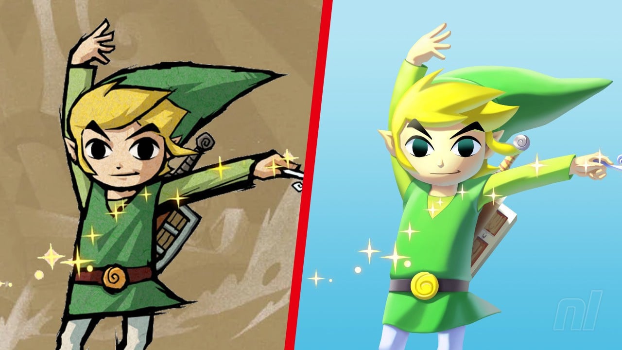
It was a fresh drop in the ocean for the series with a new setting, many new characters, and new items. But, significantly, it took the franchise in another new visual direction for Link — one which proved (undeservedly) controversial to some fans back with the 2002 GameCube release. Even Miyamoto was reportedly not a fan of the cel-shaded style in the first place.

Over ten years later, fans got to re-experience this seminal entry on the Wii U. That version of the game — which shifted the menu to the Wii U pad and made some in-game tasks significantly easier — is still stuck on that console. But we want to focus on one particular difference with the HD rerelease: those visuals.

The GameCube brought a cartoon, colour-popping style to Link's adventures, throwing the hero into a beautiful cel-shaded world full of vibrant blues, greens, and expressive effects. In HD, however, the cel-shading was toned down in favour of "bloom" — a shader effect that creates an illusion of extremely bright light to reproduce the imaging artefact of cameras. It brought even more colour and depth to the world along with some incredible lighting and shadow effects, but it hasn't always proved popular.

It's a debate that's raged on over the years — the cartoon colour of cel-shading, or the blossoming bloom? The Wind Waker is an incredible game, no matter where you play it. But here are some side-by-sides to give you a rough idea of the differences:

Of the GameCube's art style, we said that "the graphics bring this game to life in a way that the 'normal' visuals could have never achieved", while in the HD rerelease, we praised the strength of the original art direction while acknowledging that the "simple resolution boost and improved lighting can make it look as good as it does now".

So whatever version you prefer, you're a winner, basically. But really, there's no official Wind Waker GameCube, but there is a rather fetching Wii U Wind Waker.

Wind Waker Wii U
Image: Nintendo

But anyway, we're not here to be indifferent or sit on the fence: we want to hear from you, lovely readers. Vote in our polls below, and sink into the sea while we still wait for that Switch version of The Wind Waker. Sigh.

Have you played The Wind Waker HD? Which art style do you prefer? Share your thoughts in the comments.

Have you played The Wind Waker HD? (5,821 votes)

  1. Yes, I still have my copy ready to boot up!52%
  2. Yep, but I don't have a Wii U anymore13%
  3. No, I never had a Wii U10%
  4. No, I'm waiting for the Switch port *fingers crossed*19%
  5. No, I've never played The Wind Waker, even on GameCube5%
Which visual style for The Wind Waker do you prefer?
Do you think we'll see The Wind Waker on Switch?