Hello and welcome back to Box Art Brawl! We can't quite believe a week has already flown by, yet here we are. Hope you're all doing well!
Last week, we checked out Super Paper Mario for the Nintendo Wii, throwing the North American, European, and Japanese box arts into the ring to kick off a battle for the ages (alright, calm down). The North American box art - with its busier and more colourful display - won hands down, taking in 69% of the vote. The Japanese box art pulled in 16%, while the European box art took 15%.
Subscribe to Nintendo Life on YouTube845k
This week, with the announcement of the N64 classic Mario Golf making its way to the Nintendo Switch Online + Expansion Pack service still fresh in our minds, we thought we'd take a look at how the North American box art stacks up against the Japanese version. To say the two designs are slightly different would be a drastic understatement, so we're very interested to see how this one pans out!
Be sure to cast your votes in the poll below; but first, let's check out the box art designs themselves.
North America & Europe

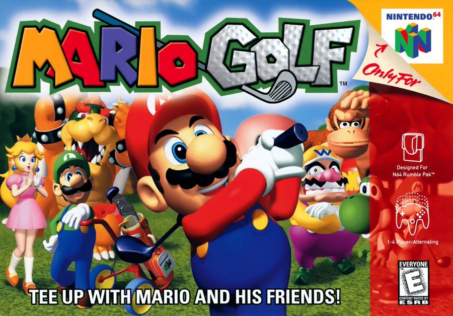
As box arts go, the US version of Mario Golf is a pretty standard affair. You've got Mario himself in the foreground who looks to have aced a shot that would make Happy Gilmore throw a tantrum, with the rest of the cast looking on in what we can only assume is total astonishment.
The slogan 'TEE UP WITH MARIO AND HIS FRIENDS' is slapped on at the bottom of the artwork, which caps off a composition that does a good job at indicating what kind of experience you're in for. This is a golf game, through and through, albeit with some added 'Nintendo flair'.
Japan

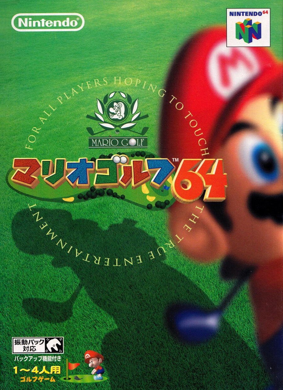
Okay, now this is interesting. The Japanese version of Mario Golf features perhaps one of Nintendo's most understated designs ever. You can see Mario in the extreme foreground, striking a pose that's fairly reminiscent of the US box art. The focus, however, is on Mario's shadow and the surrounding fairway; it's an interesting design and it's not one we're likely to see Nintendo attempt again anytime soon.
The logo itself is a bit of a weird one. We like how it incorporates a birds-eye view of a golf course, and the crest in the middle is pretty cool, but what's with that slogan?!
"For all players hoping to touch the true entertainment".
We're not even sure what this means, but it's, shall we say, unique?
Finally, let's just appreciate Baby Mario in the bottom left corner; how cute!
Thanks for voting! We'll see you next time for another round of the Box Art Brawl.


Comments 39
'For all players hoping to touch the true entertainment'
Ok, Japan wins with that alone! No way a golf game has any business sounding so epic! I like the focus on Mario's shadow on the grass. Quite arty. Not so sure about him out of focus and cropped out of the composition. Dunno, gives it a candid quality.
Glad to see the return of Box Art Brawl. And this is one of the few times that I think North America got the better version.
While the Japan one is oddly badass and artsy for boxart for a Mario game, I have to go with the NA one. That boxart feels like it does a much better job of capturing the spirit of a "Mario golf game"
I don't play N64 games but I voted USA cover for having full Mario looking on the cover than the Japanese version with half face, looks like amateur photo snapshot.
I'll go with Japan this time. It has an artful bent that's befitting of the more sophisticated side of the gentlemen's game.
While the NA boxart does it's job of showing you what kind of game you're in for, you can't help but appreciate the added flair that the Japanese one gives.
The Japanese box looks more artsy and evocative of the sport, so I went with that. It's also much more unique, so maybe I'm just so familiar with the NA box art that it's boring and I'll jump at anything new and different 🤷♂️
I'll admit the Japanese box art is something unique with the perspective, but it just doesn't work for me. Gotta go with North America (did Europe not get this game?)
I don’t like the American one that much. I may actually like the Japanese one more. But I still voted for NA, because it actually looks like video game box art. Kudos to Japan for doing something different - but I’m not sure it touches entertainment for me, despite the incredible slogan.
Back in the day box art for Japan and the West were very different now they are all the same. What happened?
Both are good, but I went with North America. I feel that it better captures the spirit of the game with the cast looking on.
Why no European version? I know its basically the same as the US version but still?
Either way the Japanese one for me, it's a little bit different, less busy, and just has more of a golf feel.
I get what they're going for with the Japan box art, but it feels like "photographers first day with a camera".
NA's is really cluttered and I don't like the white soft outline around the logo.
The slogan of the Japanese box art is also in the Japanese box arts of Mario Tennis 64, Mario Golf GB and Mobile Golf, but not in the box art of Mario Tennis GB. I guess they were aiming to make that the slogan for Mario sports games.
Anyway, I went with the Japanese one this time, I don't like how the red area in theNorth American box art blocks most of Yoshi and pretty much blocks Baby Mario.
Regardless of which box art you choose, both are lying, Mario isn't a character you can use from the get-go and needs to be unlocked.
I adore the composition of the Japanese box-art, it really captures the serenity and tranquility of golf in a way. No bold, bombastic, over the top art, just the green, Mario and his shadow. Lovely stuff.
Also, the fact that Japan's slogan is basically 'touch grass' is hilarious.
For the second week in a row, I'm voting for the North American box art.
North America's box art looks like a party. Japan's box art looks like an experience. I voted for NA, but each bring out a completely different vibe.
Gotta go with Japan. Not crazy on the out of focus Mario, but the clean grass with that Mario Golf logo gives it a really classy feel. Plus the nonsense english statement just puts it over the top. Haven't seen many boxes like it, so for that alone its my pick.
DEFINETLY North America. I don’t even particularly like that one, but at least you can see Mario’s body….
Almost Japan for me. But in the end I liked seeing all the characters together. A family photo if you will.
Out of focus Mario looks horrible in the Japanese one.
American one has the whole group, which is way nicer
I voted for North America mostly because I can’t decide whether I like the Japan design. It almost feels more like teaser art for an upcoming Mario Golf game than it does the game’s actual box art.
Well, that was easy. As much as I generally dislike the NA N64 covers, I voted for it. When I saw the NA cover, I thought the Japanese cover had to be much better, but that wasn't the case. Whatever the intent for the Japanese one, it fails at being a cover. I can't see that as grabbing anyone's attention or really having the right appeal. The composition isn't especially good for what it is. As cluttered at the NA boxes are, it was easy to go with that this time.
NA- bunch of friends for a round out on the links.
JN-announcers in hushed tones "Mario steps up to the tee".
With the Japanese one it’s like they only had one chance to take the picture and they had to use that one.
Japan, no question. It’s so Japanese. Much more likely to catch my eye on a shelf.
The Japanese one works for any other golf game that's not a mascot golf game, so not for a Mario golf game, in my opinion. Therefor, the US one wins hands down.
Box Art Brawls Current Total:
Europe: 30
Japan: 34
North America: 38
Australia and New Zealand: 1
Yay Nintendo Life! Happy brawls!
I really, really don't like either. I don't like golf. BUT...
Baby Mario and the circular over the top tagline on the Japanese one kind of saves it. I still won't pick either option as a winner though. I don't vote, especially not when all options are blatantly bad or obviously pretending not to be, or only have one quality: not being the other one.
@Franklin ... but how many times did they enter the brawl?
I can see what they were trying to do with the Japanese cover but didn't quite pull it off for me. Looks like a screenshot accidently cutting off a large portion of the character. The NA one for me (though it is cluttered)
The Japanese one is very unique and artsy.. I love it. I feel like the NA one looks like almost every N64 box that I would see at the video rental store back in the day...
Idk, but the Japanese box looks like I'm going to have to watch my grandfather's recordings of golf and my eyes will become dry from torture watching it, no longer I can cry from how much its rotting my brain from sheer boredom.
NA for sure. I like how the NA version has all the characters on the box art. Don't like the weird zoomed in pic of Mario on the Japanese box.
“Tee up with Mario and his friends” isn’t the expression “tee off”?
I think the Japanese one is genuinely bad design. Taking the focus off Mario is fine, but placing the focus on his shadow and ground behind adds nothing. Waste of space, in my opinion. Going with the generic, but solid US cover.
North American art takes this one; I like how most of the major characters are there and Bowser's expression makes me chuckle. Japanese box just looks like Lakitu took a mid-flight photo of Mario a millisecond too late and only got his ear.
I like the minimal Japanese one
Show Comments
Leave A Comment
Hold on there, you need to login to post a comment...