Welcome back to another edition Box Art Brawl!
Last week's bout saw us chucking Castlevania: Dawn of Sorrow for the Nintendo DS into the ring. The designs for this one were pretty similar, all told, but Europe ultimately lost out with its lack of supporting characters and, uh, copious stickers. North America and Japan bagged an impressive 73% of the vote, so well done!
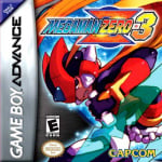
This time, we're going back to the GBA for Mega Man Zero 3, originally launched in 2004. The Inti Creates title was praised for its gameplay and more forgiving difficulty when compared to the previous titles, but most agreed that it didn't do enough different in terms of new ideas.
It's a proper three-way brawl this week and we've got some really interesting designs here. So let's not waste anymore time, hm?
Be sure to cast your votes in the poll below; but first, let's check out the box art designs themselves.
North America

North America's design looks like the quintessential Mega Man Zero artwork, huh? It's a nice composition, and our protagonist is looking suitably badass. The way that his hair seems to cascade around the logo at the top is a lovely little touch.
Europe

Okay, so this one... this one... oh no...
Moving on.
Japan

Right, let's just go back to that European design for a moment. It looks like someone basically traced over the sublime Japanese variant but didn't do a particularly good job of it. This one is gorgeous though and really makes use of the landscape orientation used in Japan for GBA games. The colours are incredibly bold, too; there's no missing this one on the shelf!
Which region got the best Mega Man Zero 3 box art? (2,409 votes)
- North America
- Europe
- Japan
Thanks for voting! We'll see you next time for another round of Box Art Brawl.
Comments 41
I'm going the European one, the simplicity of it makes it look really striking.
Going for Japan as it shows what I guess is an antagonist (haven't played the Zero games yet unfortunately) other than Zero and I also love its aesthetic, but I quite like the dynamic pose of the North American box art, too!
Yeah, not a fan of the European one either.
Why is the European box art just a bastardized version of the Japanese box art?
Easy dub for Japan, I prefer seeing the full art.
@HotGoomba you might be surprised to hear that’s not uncommon.
Here’s the Japanese cover for Yakuza 3 on ps3
And here’s the overseas cover for the ps4 remaster…..
The European art (especially the logo) makes it look like a bootleg. It's amazing how vastly superior the Japanese cover is in comparison.
While I quite like the Japanese art, I'm generally not crazy about the horizontal orientation of their GBA boxes, so I've had my heart set on the NA art this time around.
Japan hands down no question. What on earth is going on with the Europe one, it’s a badly traced version of Japan’s. Look at the size difference in the eyes!
The three are great but the European logo is hideous
Also if you stare too long into the European one … Zero looks quite cross eyed

@Yousef - …..You know that’s not the official cover…..right? (Also, the japanese cover of the remaster is effectively the same as the overseas version, with the only noticeable difference being the logo change)
—————
The European art would look decent…..if the art itself was professionally made. As it is, it looks more like a fan’s decent attempt at a copy than a piece of official artwork. The NA art isn’t that great either, which leaves Japan, and while I still don’t like the landscape style they use for their box art, it’s got some pretty good art, so it gets my vote this week.
Europe: MEGAMAN ERO 3
@FullMetalWesker I know and I know.
I posted that edit of the overseas cover because I found it humorous. I apologize if that confused you.
Also, not to bother you, but you pinged a different username. My username ends with a hyphen. xD (it’s not a big deal or anything I just found it ironic you called me out for allegedly making an error (that wasn’t there)/not paying attention while you yourself are the one who made an error/didn’t pay attention. All good tho don’t worry we’re all human)
The eyes on the European one are off so bad!
It's a cool illustration of Zero on the NA one, but I don't like how it's cropped.
EU looks like another artist traced the JP one. He's got weird googly eyes.
JP is definitely the strongest here.
I like the style of the European art, but as you look at it you start to notice the problems. Zero's left eye is way bigger than the right, for instance.
Tough choice between NA and Japan in the end, but I went with NA.
Japan always gets the best box arts.
@HotGoomba It isn't, it's a different piece of art, or an earlier version at least. Also, preference aside Europe is just much more skillfully rendered.
Shocked the EU one isn't getting more love.
I ended up voting for the North American boxart.
The Japanese boxart tells the most story. I love when boxarts give a VERY brief look at the plot and what to expect.
Shocked some people prefer the EU one when his eyes are so incredibly off, just doesn’t look right. The other two are great tho.
I can see how it's not visually appealing, but I get the feeling that European one is intentionally asymmetrical. The effect is better executed in the Japanese art and I'm guessing the other character is connected to this corruption or shadow-self. I haven't played it.
@Takoda I quite like the EU one.. except for, indeed, the eyes. Makes him look like a chameleon or something. ^^'
My vote went to Japan, the box-art just kept getting better as I was scrolling down the page.
The American to me looks cool, but I feel like it's a bit too large and not symmetrical in my eyes. Europe I don't think looks bad but just a but...lazy without details.
Japan wins it for me.
Japan by far.
The US one looks bad, the European one like a Knock Off.
Box Art Brawls Current Total:
Europe: 81
Japan: 81
North America: 93
Australia and New Zealand: 1
Japan. It has the best design and composition and the best use of color. It's actually quite brilliant. The artist was clearly very well trained, which is extremely rare on old video game box art.
I saw North America at the top and I thought it was an absolute shoe-in, but then I scrolled down and found out Japan totally blew it out of the water. I feel like that’s gotta at least be in a top 100 box art countdown or something, because that is just gorgeous.
Capcom Europe went through a period of very basic, colourful boxarts during this era in an attempt to grab people’s attention on store shelves.
North American box arts tended to be far more busy with action and casts.
Japanese boxarts were just sublime. A lovely balance.
Japan's box is well drawn with excellent composition. However, I prefer the more dynamic image for the NA cover, and that is enough to get my vote.
Both NA and Japan have great covers but I have to give it to North America. The design of that cover is amazing. The movement through the image is beautiful. It's more designed than the others and that speaks to me as a designer.
I don't no why they didn't just use the Japanese art across all regions.
I don't think it's much of a contest this week. Japan all the way.
For those voting for EU... LOOK AT HIS EYES
@JJtheTexan They stare into my soul and speak to me in my dreams, whispering - "true eyes are not symmetrical"
Grew up the NA version and it still looks cool with zero in a dynamic pose just wished it wasn't cropped so awkwardly. The Japanese version gets my vote for showing not just zero but also Omega ( the big dude on the right) giving you a subtle hint about the story.
They're all good but I prefer the north america version, the europa version isn't bad either, the japanese one is good but I play western version of gba games so I never have horizontal design cases for gba games.
I have to admit, I'm a bit of a sucker for Japanese GBA boxes.
They're so looooooooOOOOOng!
Wow, JP killed it. I like a good "mean mug staring at the 4th wall", but I thought it was boring after that. I went with NA, cause he looks badass AND is doing something, but to each their own.
@FullMetalWesker No that's definitely the real boxart. The remaster added Dante and Funky Kong, you must have missed those substories.
Japan wins (EU loses because it's a butchered Japan cover) because of something that nobody in charge in the West ever understands about boxart. They try to make it "cool and eye catching" for the kids going crazy at the idea of getting MORE GAMES, MORE GAMES, DAAAAAD.
But the cool pose of the US boxart doesn't tell me anything about the game. It's just Zero. The previous 2 games also have Zero in different "cool poses" and nothing else. Any casual customer would end up seeing no difference between the 3 installments. It's like the reaction at all the Pokemon games from an outsider: "Red, Blue, Gold, Ruby, Diamond, whatever, I don't understand, it's all the same game?"
The Japanese artwork tells us something about the game: We meet Omega, an antagonist standing next to Zero as a dark mirrored shadow of him. Like Dark Link. Or Dark Samus. And that's for a reason, and you have to play to find out.
Leave A Comment
Hold on there, you need to login to post a comment...