We are back with another edition of Box Art Brawl!
Last time, it was a one-on-one match-up for the GBA's Kirby: Nightmare in Dream Land and after a few weeks of close calls, we had a pretty definitive winner in this one. It was the darker European and North American variant that walked away with a comfortable win, taking 64% of the vote and leaving the light Japanese counterpart with the remaining 36%. Welcome to the Dark Side!
This week, we're jumping forward in time a little as we compare another two covers for Monster Hunter 3 Ultimate on the 3DS (or 'Monster Hunter 3G' in Japan). This entry might not be the most beloved in Capcom's series, but it's up against some pretty impressive competition. 3 Ultimate took the already wonderful Wii entry and reformed it into a great portable experience — the first time that we got the series on a Nintendo handheld.
There are just two options to choose between this time, with Europe and North America opting for the same design. Let's get this duel on the road!
Be sure to cast your votes in the poll below; but first, let's check out the box art designs themselves.
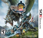
Europe / North America

Big monster. Big hero. Big armour. Cute little guys. Seems to tick all of the Monster Hunter boxes nicely, no? The large open vista in the background might be a series mainstay, but it does add to the epic nature of the whole thing. It's a pretty solid cover all in all, if not a little uninspired.
Japan

The Japanese variant goes dark. Buffeted by the back 3DS side stripe, this cover takes all the hallmarks of the aforementioned design but brings the setting to a gloomy cave. Our big creature now looms menacingly over the hero, with eye-catching neon green goo flying all over the place. It might not be quite as clear what's going on as the EU/NA variant, but there's a certain dynamism here that we can't help but like.
Thanks for voting! We'll see you next time for another round of Box Art Brawl.
Comments 24
As cool as the Japanese box art is, I'm voting for Europe/North America considering it has an actual background giving you a better idea of the in-game locations and the presence of those creatures on the bottom - if I recall correctly the one on the right is even on the game's icon (have this game digitally, but barely played it for several reasons including the ridiculously small text)!
Both of them are boring. But, NA/PAL one has a bit more things and the mountains background, at least. So, my vote goes to the NA/PAL one.
The NA/EU cover is a work of art.
The Japanese cover looks a bit messy to me. I like the EU/NA cover. I particularly like how the hunter is looking towards the camera, apparently oblivious to the huge threat directly behind him! 😆
NA/EU cover can mostly be read with one glance while Japanese cover forces you to focus on it to even understand what the thing is about.
Oh not the Wii U Version?
3 Ultimate was really a blast, being able to play with one Wii U and three N3DS multiplayer was incredible cool.
Taking your save Game with you and play wherever you want.
For me it was clear that NX was a Codename for Cross, so a Crossplay Device as the Switch came out to be.
Japan is a bit muddy and dark, the NA/Europe cover showcases the monster and armour much better.
The colour scheme of the Japanese box art alone is so much more everything than the generic fantasy schtick of EU/America.
Played and beat (on Wii U) MH3U before the online shut down. Was a fun time. The Japan cover has really striking colors and Brachy so it's my vote.
I absolutely HATE that they removed Brachydios (the game's actual flagship monster) and randomly replaced it with... Azure Rathalos of all things?!
Sorry but as a MH fan this a huge pet peeve, so Japan wins by default.
I really like the Western art. The cover gives the impression of an ambitious console game squeezed onto a modestly-powered handheld, which is fitting.
The Japanese art, while okay, makes it look more like a horror game, rather than fantasy-oriented.
I really like the darker tone of Japans art. That one gets my vote
I don't really like either one very much. Both have issues, in my opinion, of elements being undefined. I had trouble figuring out what I was looking at. On the US one, the main character's lower half gets lost in the background a bit. Also, his stance is very odd. I get what Japan's cover is going for, but the main character just looks unclear to me visually. In this case, I vote for the western cover.
I swear lots of Japan is colorblind.
The American one is better than the EU one. It has more blue
EU/NA because the Japanese one just looks... confusing in some parts, and I'm not talking about the Japanese text I can't read.
both look super cool
I don't think either cover's very good but that Japanese cover has an outright nauseating color scheme.
Box Art Brawls Current Total:
Europe: 88
Japan: 86
North America: 103
Australia and New Zealand: 1
At this point I start to wonder if you guys deliberately pick the games with bad Japanese covers...
I kinda like the Japanese art more for looking more chaotic. With the darkness and splashes of neon color, it kinda feels like it's more suited to Shin Megami Tensei or Devil May Cry.
This is a great brawl because they're so different. And for once I actually agree with the majority haha
Gotta go with NA for this one since it literally was what inspired me to get the game.
@Vyacheslav333 I don't know how you can say the Japanese color scheme is boring. It has a cohesive and unique one that goes with the 3DS label.
Leave A Comment
Hold on there, you need to login to post a comment...