Hello folks, and welcome to another edition of Box Art Brawl!
Last time, we looked at Kirby's Pinball Land for the Game Boy (jeez, how many Kirby games are there..? Don't answer that), pitting Europe and North America against Japan in a good ol' fashioned duel.
It was closer than we were anticipating, though as expected, Japan won the battle with its more varied, colourful option, bagging 61% of the vote.
This week, we're checking out Gargoyle's Quest II: The Demon Darkness from Capcom, originally launched on the NES in 1992. The direct sequel to Gargoyle's Quest, it's the second entry in the 'Red Arremer' series, culminating with Demon's Crest for the SNES in 1994.
It's another duel this week as Europe and North America take on Japan once again.
Be sure to cast your votes in the poll below; but first, let's check out the box art designs themselves.
Europe / North America

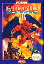
The Western design for Gargoyle's Quest II is simply oozing with attitude. It makes great use of colour, making the image look incredibly demonic and apocalyptic, but you've still got hints of the playfulness that's been instilled in the Ghosts 'n Goblins franchise.
Japan

Japan's variant is a bit more cartoony, a little less saturated with colour, and boasting heaps more characters and monsters. We simply adore the logo at the top, enshrouded by a shadowy demon, and the way the whole image is framed by a simple red border is inspired. Lovely stuff.
Which region got the best Gargoyle's Quest II box art? (1,540 votes)
- Europe / North America
- Japan
Thanks for voting! We'll see you next time for another round of Box Art Brawl.
Comments 37
The Japan cover looks a little too cartoonish for my taste.
My vote goes for the western one.
Japan for me as it has more characters and I personally prefer its aesthetic, but both show what the game is about well so I don't mind whichever one ends up winning!
Ok, this is a close one but I went for the Japanese version. Not really a fan of the realistic art style of Europe/ America but neither look top class to me.
I think that the EU/NA one looks a bit garish / sickly, to be honest. I really like the Japan one, it has a nice feel to it.
I like both but I slightly prefer the Japan cover so that gets my vote
I'm surprised this game is not on NSO yet, the first game and Demon's Crest are so I wonder why this hasn't made it's way there yet
JP one. His name was, is, and always will be Red Arremer.
This one was a tough one for me. I went with the US because of Nostalgia. But the Japanese is really cool as well. That would have made a great poster.
Western one makes it look like a cheap bootleg /gives me serious knockoff vibes.
Generic as hell.
I don't think either's very good but I went with Japan.
I’m kind of surprised by the results. The JPN one is such a mess, especially when you try to make sense of where the action is taking place. You have to squint to see that that’s not just a piece of roof lying on the floor.
Red Arremer looks goofy in the Western one, but at least the rest of the style and the scenes composition is more readable. Just my opinion.
The JP one is a mess. You have to look closely to see what is happening. My vote went for the NA/EU.
Both horrible
The Western one perfectly encapsulates the mystique feelings NES games I never heard of before gave me. It's up there with Little Nemo, Battle for Olympus, heck, even Mega Man (the bad one).
I love it. And I don't think I ever saw it before.
They both have a lot of 90s charm, but I think I prefer the saturday morning cartoon vibes from the JP version.
this game is great btw, I'm surprised it's not on the NSO yet.
@Zuljaras
The color composition makes it messy specifically with the bright green of those two characters and there’s not much in the way of shading to make it blend together, moody lighting like the EU/NA has would have fixed this.
Kinda more like Demons of Derpness rather than Darkness.
I love the Capcom NES box art style.
Not sure which to choose....Both have positive and negative qualities I like. Both have art styles I enjoy. Japan's is a bit too cluttered, but I like the expressions better there. Both also showcase the game fairly well.
Edit: Finally went with NA/EU.
I just took the japanese one because the dark shadow behind the title looks cooler.
That's... actually really hard. I honestly can't decide. Both are good in their own ways and also both are flawed and so yeah. Pretty even.
EDIT :
Went with japan in the end. The character art just looks better there. So that kind of bypasses everything else going for or against the two boxarts as it's a criteria that affects both, is front and center for both, but is objectively better on the japanese one.
I'm obviously thinking way too much about this.
They both have things going for them. The composition is not great for either of them. For the western cover, the design of Arremer is kind of odd as far as his facial expression. But it's well made and it looks like the artist put some effort into it. The Japanese cover is simpler in style, but it's also more stylish. I think that little bit of anime style is more appealing, and I think this is a case where it's important to make the main character as appealing as possible on the cover. I also like the enemy designs more on the Japanese cover and recognize them from the game. Based on that already, I think the Japanese one is better, but there's still the logo which is much better on the Japanese cover.
How appropriate! Is this a coincidence or are we celebrating the rerelease of SVC Chaos starring our boy Firebrand?
i don't know why but for some reason thie western cover looks weirdly awesome
I like the JP cover more (because Firebrand/Red Arremer isn't censored).
Neither? Japan has the better protagonist pic, but is too overcrowded, and Europe’s is lacking in anything other than Firebrand. 🤷🏻♂️
I hate both but at least the japanese one has the original vision. the EU/US is more like an adaptation for a "western market" which are rarely better than the original.
Come on Japan! No pupils FTW!!!!
NA for me , everything on it looks great (except for the eyes… theres something weird in those eyes)
It's a close call. I like them both. I chose the Western one by a hair. Always liked Capcom's box art for most of its Western games. They were generally great (Even Mega Man 1 and 2 had a so-bad-it's-good quality to them).
If we were talking logos Japan wins hands down. But the rest of the box art is a really messy composition, it feels like my eyes are being drawn all over the place.
And I do actually really like the rendering on the EU/NA one, so that gets my vote despite the really dull logo.
NA is just too ugly to vote for.
Box Art Brawls Current Total:
Europe: 81
Japan: 79
North America: 92
Australia and New Zealand: 1
I think the JP one is very busy, but I tend to favor JP key art from Capcom back then as opposed to western box art, so JP gets my vote this time.
I went for US solely based on the color composition.
Gemma go with Japan on this one for the look of it I like the cartoony look otherwise I don’t really have a opinion
Even though I own the Japanese version, I gotta vote for the Western art.
The drawing style on the Japanese box just looks surprisingly simple and cheap.
They're both pretty goofy. I'll go with Japan
Leave A Comment
Hold on there, you need to login to post a comment...