Welcome to another edition of Box Art Brawl — the first of 2025, no less!
Last week, we matched up a pair of beauties from Zelda II: The Adventure of Link (yep, we were shocked that we hadn't covered it already too), and after a week of voting, the results came back with a clear winner. The classic gold variant from Europe and North America walked away with 66% of the vote and the win, leaving the hand-drawn Japanese design with the remaining 34%.
This week, we're speeding off the start line with Crash Nitro Kart. Released in 2003 as the successor to Crash Team Racing, this one saw Crash and co. putting pedal to the metal in an intergalactic arena, smashing through crates and drifting around a decent selection of game modes. Mario Kart it ain't, but we still have some fond memories of the story-focused 'Adventure' mode and the remastered content in Crash Team Racing Nitro-Fueled on Switch slaps.
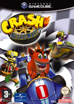
Nitro Kart launched on GameCube and Game Boy Advance on the Nintendo side of things, and both adopted the same three cover designs across the regions (albeit with a different shaped box, naturally). We've opted to show the GameCube version below — rectangular format FTW — but if you can imagine each of the following in a square configuration, you won't be a million miles away from the GBA design.
Be sure to cast your votes in the poll below; but first, let's check out the box art designs themselves.
Europe

We'll kick things off with the European variant. This design sees Crash, Neo Cortex and Nitrous Oxide speeding over a checkered flag with the game's flaming logo in the top left corner. It's not the most interesting thing to look at, but it certainly tells you everything you need to know about the game.
North America

The North American design uses similar character sprites to the European counterpart, but the trio now race through a desert landscape. There are a couple of tweaks to Crash and his kart, and there's the inclusion of the giant clock in the background, but the change of scenery is the big selling point here.
Japan

Well, this is a little more 'graphic design is my passion'. The Japanese design puts Crash and Neo Cortex front and centre, but the models are a little more... shall we say, game-accurate? The giant clock still looms in the background, but we can't seem to steer our gaze away from Crash's cold, dead eyes.
Thanks for voting! We'll see you next time for another round of Box Art Brawl.
Comments 39
Europe.
Absolutely adored this game back in the day on the PS2. Admittedly didn't play this on the Gamecube.
Alongside Sonic ASRT, my favourite non-MK Kart racer ever.
North America for me as it has just as many character as the European box art, but also has an actual background while Japan is automatically excluded unfortunately because of the altered characters!
honestly I think NA is best but voted Japan for having the least unlikable render of Crash on the cover.
As far as this week goes, let's go with the North American boxart.
I find Japan's the most charming but none of these are very good.
I voted the USA version.
Off topic, but I think the Crash rebootseries that came out years ago are underrated. Crash of the Titans and Mind over Mutant may have not been the best of games, but the the characters and story was over the top silly fun.
Uka Uka: "I will kill Crash Bandicoot. Kill him......forever."
Have the exact same reasoning as JohnnyMind, so NA for me!
Wow, can I select none? They're all ugly! Kinda telling how every branch decided they'd need to do something about it and ended up doing the same.
Japan is the least worst.
To be honest, all three are terrible. The Japanese one looks the most fun so voted for that.
God they all look absolutely terrible like they were drawn by a three years old seriously.
It really took them ages to nail the artwork for this series but at least now they do. Too bad the series itself is dead and after its best game no less! That's some great brand management there Activision.
On topic though it's all so derpy. I thought I was not going to vote since none of these is at least passable but I finally voted for jp because at least it made me laugh in its own derpy way.
I chose Japan because it's the only cover where he doesn't look like a psychopath.
Well, that went from bad to worse to absolute worst. EU, but not because it's good.
All managed to be horribly garish in quite different ways.
NA.
That was such a weird period for CGI.
The NA cover is much more vivid in terms of colors, so it seems more lively than the others. It may be a matter of digital reproduction and not the real thing, though.
Going with NA by virtue of having a more interesting background, though none of these are great IMO. Especially the Japanese cover with weird begging eyes Crash.
All of these are repulsive I’m sorry
North America. Crash seems to have the wildest fun in that one and I like how the rocket barely misses him.
Japan has the most likeable character designs.
I've always loved the European version using the same checkered flag motif as the original CTR cover art on PS1.
They're all dreadfully designed.
These are just terrible, I went with NA. I didn't like the checkered flag as the background for Europe and the less said about Japan the better
The Japanese one looks weird in a way that I dig.
Crash’s face looks terrible in both of these, but Japan always nails their character designs…oh
These all look SO bad. Voted NA because it has the best background.
This week's batch provides a good lesson in composition. The framing of the European cover is too tight and the frame is cramped. Crash feels too close to the viewer, in my view. The secondary racers are squeezed in and it feels that way. The logo is crushing everything. The checkered flag background is either badly judged or poorly implemented and only makes everything worse.
The Japanese cover makes most of those same mistakes. The framing is way too tight. Crash is way too tightly framed for what the art is trying to accomplish(for example, it's not dynamic at all). The other racer is practically right on top of him. The logo is crushing them. The clock behind them is also crushing everything, making the framing feel more cramped. The blurring of the background is probably meant to minimize that a tiny bit, but it barely helps anything.
North America's cover, whether it's good or not, is easily the best one here. There's actually a little bit of breathing room and I can feel it immediately. It is simply more pleasant and more coherent visually just for having a tiny bit of space, along with some other elements that show good judgement. Crash is front and center without feeling right on top of the viewer. The secondary characters are clear, but are better placed not feeling like they're right on top of Crash. The extra space makes it so the logo doesn't feel overwhelming. In addition to the background being an actual background, which is itself nice, the color enhances the little bit of breathing room making the composition even more pleasant.
why does the japan one look like "we got crash at home?"
Ewww yucky bleh
Japan cover is the best one! That NA cover looks horrible, looks like Crash has no neck.
Oh right, the Japanese version of 'American Kirby is Hardcore'
voted NA on this one
Cold dead eyes for me.
Box Art Brawls Current Total:
Europe: 90
Japan: 88
North America: 105
Australia and New Zealand: 1
They're all butt ugly
Holy crap, i don't like any of them.
They're all horrifical!
This time it's hard to say which one is "the least worse". They're all so ugly!
PS1, Saturn, N64, and some Game Cube games... Maybe this was the worst box art era ever with the introduction of 3D models. My God!
I don’t like this series but Japan is my pick. Maybe I would have tried this series if Crash didn’t look like an ugly weirdo freak on the box always.
Just noticed how tiny Crash's arms are in the US cover.
EU and America are both awful. Japan on the other hand is hilariously awful and wins on that count alone.
Leave A Comment
Hold on there, you need to login to post a comment...