Hello everyone, and welcome back to another edition Box Art Brawl!
We had a doozy of a brawl last week as we looked at The Legend of Zelda: A Link to the Past and Four Swords for the GBA. You folks really surprised us with this one, though: we weren't too keen on the Japanese box art for this, deemed it to be fairly busy in comparison to the others, but your votes are the ones that matter, and so Japan won the day with 47% of the vote. Europe came in second place with 29%, and North America managed 25%.
This week, we're checking out the wonderful Contra: Hard Corps for the Sega Genesis / Mega Drive. Released in 1994, this one had a completely different title in Europe and was known as Probotector (much like the 1987 original), boasting a vastly different set of playable characters. Its gameplay remained relatively unchanged from prior entries, but its stunning visuals and exceptional boss design made it one of the more beloved titles in the franchise.
We've got three incredibly unique box art designs to look at this week, so we reckon it's gonna be a good one. Let's get started.
Be sure to cast your votes in the poll below; but first, let's check out the box art designs themselves.
North America

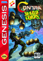
This is badass, huh? Perhaps the most recognisable of the three designs, it features one of the game's protagonists, the blonde-haired Ray Poward, shooting toward a formidable enemy. It's a cool design, and you really get a sense of the gun's size from Ray's stance; almost like he's buckling under the sheer weight of the thing.
Europe

Europe's is a bit of a more lighthearted affair. The group of robots showcased on the cover here look like they've come straight out of a Saturday morning cartoon; they're definitely lacking the attitude shown in the North American design, but it's a fun, colourful little composition regardless.
Japan

Japan's version leans into a more anime aesthetic, depicting various characters from the game against a Blade Runner-inspired background. It's a cool, dynamic composition that makes good use of the space with some pretty badass poses from our protagonists, but it's still lacking some of that signature attitude from the North American version.
Which region got the best Contra: Hard Corps box art? (1,623 votes)
- North America
- Europe
- Japan
Thanks for voting! We'll see you next time for another round of Box Art Brawl.
Comments 38
As always what matters the most for me in box arts is them showing more and/or better the contents of games - specifying that since it somehow caused confusion last time despite my participation in Box Art Brawls for a while.
Considering that, I'm going for North America this week as while Japan and Europe show more characters North America shows the Contra gameplay better!
@JohnnyMind And it looks far more dynamic to boot. The others are just posing.
The North America one is actually an amazing piece of art, the other two are mediocre, the European one is a pretty cool design.
Too much sweat in America, I prefer the Japanese anime style.
This was an easy week. NA all the way and it wasn't even close.
Europe obviously clears, because as 40 years of Transformers/GI Joe crossovers have established, mechs will always be cooler than generic army guys
Pfft NA by a long shot. I CAN'T EVEN READ THE TITLE ON THE LAST ONE.
Thanks to the recent Vampire Survivors DLC, I now know some of these characters instead of none.
Anyway, I'm picking the JP box for this one.
The NA box gets it, the NA box gets Contra.
Went with Japan as I prefer the anime aesthetic (since it originated in Japan and this is probably the most "intended" look), but will admit the US design goes absolutely hard, so it's a close second.
EU isn't even in consideration since it's a result of regional censorship, and thus the theme isn't an intended choice (even though I love Mecha and think the characters look pretty dope).
I like them all, though they're different enough that some might wonder if these are for the same game. I went with North America since it's all-in on the action, but I nearly went with Japan for the anime aesthetic. The latter might've taken it if they weren't just posing.
Yep, the NA cover is cool as hell.
This is a hard one for me. Japan just barely edges out US.
I wasn’t really into Contra as a kid, but that would have been very different if it was Probotector. I know the gameplay is identical, but I’ll take cool robots over army guys any day.
While the European and Japanese aren't bad the NA one just screams Contra. You need that 80s action movie look for Contra. While Europe looks more like the cover of a Gundam game and Japan is what I would picture an Japanese Anime adaptation of Contra would look like.
As I scrolled through the options and reached Japan, I instantly knew that was the one. Fastest decision I've ever made. The classic anime look is my favorite, and it's very stylish here. That is a box I would be compelled to pick up. I want to pick it up right now.
The other two are not bad. I like the Probotector designs. They're posed, but posed well. The way it's shaded and colored is so soft and it looks flatter than I think it was intended to be. The NA one goes for a dynamic layout, so kudos there. The composition is very good. I really like the enemy with the teeth. But it also looks overly soft. The main character looks a little off. Maybe it's the way the shading is done, or perhaps it's what we can see of his expression. That's one place where the anime aesthetic(or an authentic western comic book style, which this is not) would add something as the way the character is drawn just comes across as generic and lacking in appeal to me.
The Japanese one was my favourite at first, but the composition gets worse the longer you look at it.
@Olliemar28 The gameplay is "relatively unchanged" from previous games? I'm .
I think this allowed the player to use any weapon at any time, allowed the player to choose run-and-shoot or stop-and-aim fire modes (something I found out accidentally while playing with my friend) and the biggest of all exclusively to the Japanese version, A HEALTH BAR!
@Poodlestargenerica Was it another piece by, was his name Tommy Dubois? He did lots of amazing artwork for Konami America, the rare case of an artist for American localization boxarts easily beating out their Japanese originals.
The European one looks like it's for a completely different game. And except for the fact that the character from the NA one is recognizable in the Japanese one, I'd almost say those look like different games too.
Japan by a mile for its lovely anime-style art and because it highlights all the key characters rather than randomly picking the level 2B boss like the US one does. The Probotector one is pretty cool as well considering it had to deal with all the characters being changed to robots.
The dude on the US cover has horrible aim. I'd be firing at the giant skeletal head if it was me.
EU is intensely boring.
I don't actually like the JP art for Contra. It feels like a poor fit, but it does look good. So... JP, despite not feeling like a Contra cover.
@Mario500 I've seen you post this a few times. Are you botting?
I also really fail to see what you are trying to achieve here. It's not like they are posting really foul language. Can they do without the terminology? Sure... but if you find this vulgar, send them a personal message and let them know that way.
@Daniel36
"Are you botting?"
(answer: no)
Gonna resist the bare thigh and give it to the US cover, love the style on it.
The way “hard corps” stands out in the NA design ruins it for me, it looks like the kind of bad photoshop you’d see on a mid 90s internet fan site. Japanese cover has way more cohesion and a cooler neo noir style.
Box Art Brawls Current Total:
Europe: 81
Japan: 82
North America: 94
Australia and New Zealand: 1
NA easily. Looks like a 90's comic. Dynamic, full of action. Rad.
Super Probotector has the best Probotector Box Art with its Terminator Vibe
NA in a landslide. I don't know why some think a tower of interwoven characters makes for a good composition.
This is a tough one for me. NA looks really cool with the action pose, but the Japanese art style is relaly nice too. Truth be told, when I think about the 16-bit games, it never really felt anime style to me, so because of that, I went with the NA art.
Psh sega games... But i definitely like that Japanese one for it's intriguing anime style cover looks pretty epic
I usually prefer the Probotector art for this series, but for this particular entry the NA box is the clear winner
I almost voted for europe just because it made me laugh hard. But yeah no, go NA.
NA captures that feel, but I like the fact that JP showcases the key players of the game. I'm not a probotector fan... Sorry EU.
North America easily. It looks like a proper game cover and gives you a look at the awesome action.
Sorry, Probotector sounds like a device an alien would use, before it probed you with horrible lab equipment.
I love 80s & 90s anime style, but the JP cover looks just super cheap, flat and boring. Plus, it doesn’t fit the series at all, as it was always leaning heavily into 80s Hollywood action flick aesthetics.
Leave A Comment
Hold on there, you need to login to post a comment...