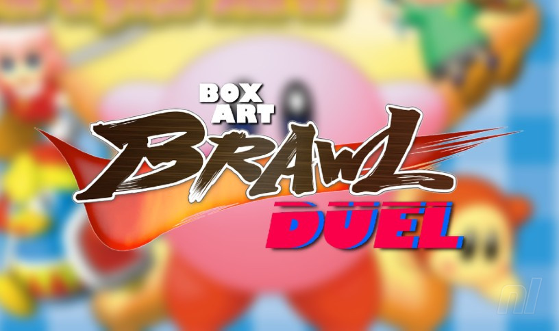
Hello hello hello, and welcome back to another edition of Box Art Brawl!
Last week, it was Mother's Day in many parts of the world, so we took a look at Mother 2 / EarthBound, where the box art for Japan and North America is very different. We thought this would be a close one since both are very good, but your votes declared North America as the winner with 67% of the vote! Not as much of a nail-biter as we thought, then!
This week, we're going back to Kirby again. NSO is treating us to Kirby 64: The Crystal Shards on 20th May, and what better way to celebrate than putting two pieces of box art head-to-head. Kirby's first — and only — core series outing on the N64 is a 2.5D platformer, and it was the last traditional Kirby home console game until the Wii! And even for Kirby's standards, there are a few pretty freaky moments in this classic. There's a reason it's rated Teen by the ESRB, folks.
So while last week's duel featured two very different box arts, Kirby 64 is pretty similar in both Japan and North America. That doesn't stop us, though — there are plenty of little details and differences to gobble up.
Be sure to cast your votes in the poll below; but first, let's check out the box art designs themselves.
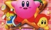
North America (& Europe)
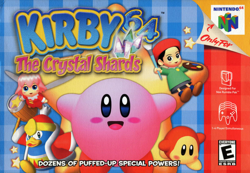
Well, isn't this lovely and bursting with Kirby's adorability factor? Kirby is obviously taking centre-stage here, as he should, and he's posing in front of a warp star like he's waiting to give you a big hug. We really like the faint star pattern on the 64 on the logo, tucked behind some sparkly crystals. Kirby is also joined by Ribbon, a very duck-faced King Dedede who's staring at us with murderous intent (not your best look, Dedede), Adeline, and a little Waddle Dee that feels a bit like he's just wandered in. All in all, this box art is pretty charming.
Japan
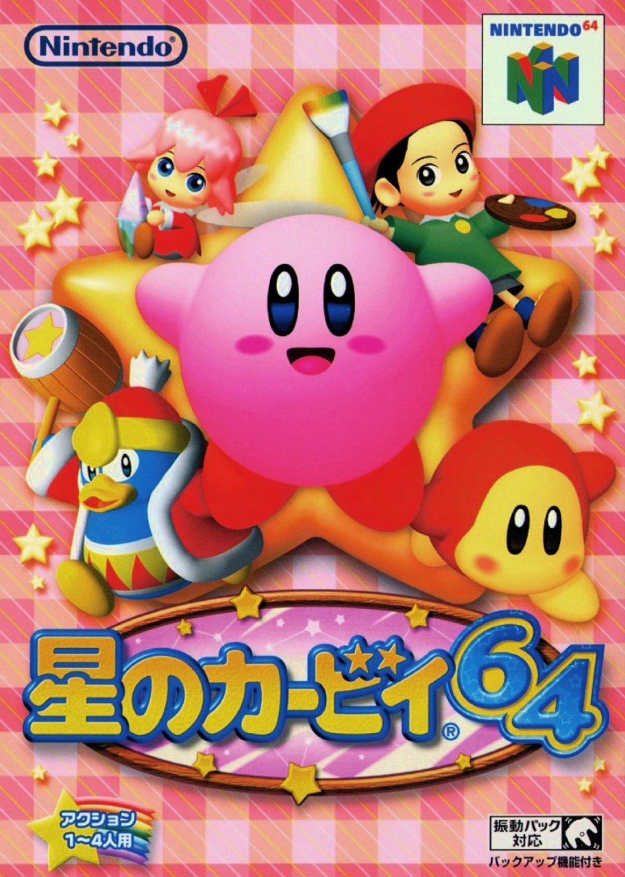
So, we said these two were pretty similar, didn't we? Japan's box has a lot more space to play around with, despite a bigger logo. There are a lot more stars dotted around, and the character placement is a little different — Ribbon is sitting down and holding a crystal, and everyone else is a little bit bigger. But the most significant difference is the colour of the plaid — now in shades of Kirby's trademark blushing pink. Even the logo gets a mirrored pink background behind it! But don't worry, Kirby is still the focus here, now in the very centre of the warp star, ready and waiting for a cuddle.
So, some less obvious differences, but differences nonetheless! Surely we're right this week and it'll actually be a close one, so make your voice heard and get voting!
Thanks for voting! We'll see you next time for another round of the Box Art Brawl.
Further reading


Comments 41
Both are similar, but the blue checkered background in the NA version kinda ruins it for me, so I'm going for the Japanese one.
As someone from the West, I cannot vote for either because Kirby does not look sufficiently angry.
Both are very similar but the Japanese one is perfectly centered and that is much more visually pleasing
Is this the only time that American Kirby hasn't looked angry?
The blue is a nice contrast that makes Kirby pop more, but the JP one is much more centered and symmetrical that it takes the cake for me
The blue looks a bit fresher to me, but the japanese one does ultimately look more appealing to the eye. Neither is that amazing.
Love the game though, one of the best soundtracks ever.
Japan by a landslide. Better character placement, more charming logo, and none of NA's trademark border art.
Can somebody answer something for me? Most of these box art brawls are missing the PAL versions. Do they not have their own box art?
Definitely America. Too much pink in the Japanese art. The blue background on the NA box gives a nice contrast.
The blue in the US version does provide better contrast than the pink in the JP version, however I still voted for JP as the art is better centered & isn't as cluttered.
North America. But only because they didn't give Kirby the angry eyes.
I like the contrast of the blue background on the NA box
They're kind of the same save for a few minor differences but I think I'll go with Japan for this one. I feel like the soft pink background coupled with the characters feeling more naturally placed on a vertical box-art rather than the horizontal NA one makes it far more appealing. They're both good though.
@homerstarfan13 Ironic considering the fact 64 is also the only game where the invincibility theme isn't happy and peppy and instead sounds like Kirby's on a killing spree.
https://www.youtube.com/watch?v=26O9rY3pp1c
Japan for me. The NA cover is really struggling despite it being a similar composition as it obviously suits portrait over landscape.
I like the Japanese box art more
Adeleine is falling off of the warp star on the NA one, while she’s looking comfy on the JPN box.
This was before the angry Kirby trend, which started in the next game, Kirby: Nightmare in Dream Land.
I prefer the blue background of the American box art, but that's about what I like of it compared to the Japanese one.

I do wonder how the Japanese cartridge art would look like if it had the blue background.
The symmetry of the Japanese box for me.
NA wins purely because of the promise of puffed-up special powers.
The blue background does it for me. Not because I specifically like blue backgrounds or anything, I just think the red clashes with the pink of Kirby's body a little too much (maybe it was supposed to be a pink background and my phone just makes it look red? Mute that background a lot and i think Japan wins it)
Japaness box + Blue background = WINNER!
Box Art Brawls Current Total:
Europe: 31
Japan: 35
North America: 41
Australia and New Zealand: 1
The Japanese has it look more like those two humanoids are sitting on the star, as opposed to how crampt the western one looks.
I definitely enjoy the Japanese better, but I can't lie... Special puffed-up powers does sound pretty cool.
I think both are great, but I'd say the Japanese box wins out solely because of the American's little console side bar on the right. Kinda messes up the symmetry of the Japanese version
Very similar and both cute, but colors on the Japanese version just pops out a little better.
Interesting that the Japanese has no subtitle. Just “Kirby of the star(s) 64”
Waddle Dee before the blue Bandana Waddle Dee and King Dedede's first adventure 'helping' Kirby.
I like the more centered view of the Japanese version slightly better, and the red meshes a little bit better.
The Japanese cover is so gosh darn cute.
I love it.
@Gryffin when it's only two, it's usually because there's very little difference. In this case, the PAL art is mostly the same as the NA one, but with the black border around it.
I voted Japan. Once again, the vertical format works better, largely because the NA art has to be adapted from the vertical orientation. But more than that, I hate that red side bar and silly curled corner at the top right. That really takes away from the box art itself.
cue the "They are the same picture" meme
I was promised inhalation on at least one boxart. You lied, NL tagline!
Boxart is largely the same. Comes down to if you like a blue or pink background.
NA because blue background it much much better.
Like others I enjoy the character placement better on JA version, but that pink background makes everything muddled.
Japan, I like how the logo and characters are centered.
Western boxart where Kirby doesn’t look ready to punch someone in the face? Where am I????!
Got to be Japan for me.
@AlanaHagues you have a small typo: ESBR
@CrazyCats Oops, got it! Thank you!
Since I saw some people asking about PAL box art, I'll ask about it today. This is the first time I've done Box Art Brawl, and I know Kirby 64's PAL box is basically the same as NA's but with a big black border, but I know we've often done those comparisons in the past. Would be good to get the third horse back in the race!
I'm gonna go with NA, because blue is my favorite color and I've never been into pink much. That's literally my only reason because the only differences are color and making the character models smaller/bigger.
Tap here to load 41 comments
Leave A Comment
Hold on there, you need to login to post a comment...