
Greetings, and welcome to another edition of Box Art Brawl!
Last week, we took a look at the SNES classic Super Castlevania IV, and boy, you folks really didn't like the Japanese box art, did you? The North American variant took a resounding victory with 94% of the vote; one of the most decisive Box Art Brawls we've perhaps ever seen! Hey, at least the game itself is ruddy brilliant wherever you play it, right?
This week, we're taking at look at Earthbound — or as it's known in Japan, Mother 2: Gīgu no Gyakushū — a game that had a bit of a rough time when it initially released in the West, but has since gained a substantial following. Our very own video producer, Zion, cites Mother as his favourite game franchise of all time, so that's saying something!
We're pitting North America against Japan in this edition of Box Art Brawl, because well... They're the only two regions the game exists in its original form. Have fun with this one, and we wish all moms out there a very happy Mother's Day (even the ones that celebrate it on a day other than the second Sunday in May)!
Be sure to cast your votes in the poll below; but first, let's check out the box art designs themselves.
North America
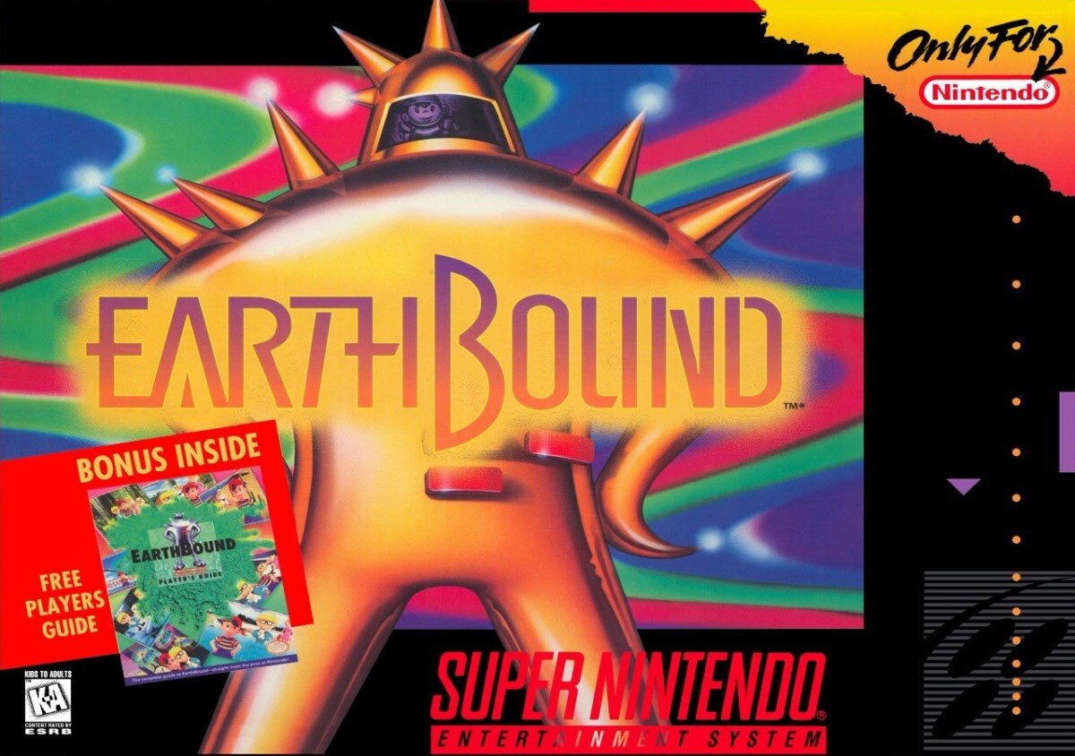
The North American box art for Earthbound depicts the iconic Final Starman, with protagonist Ness just visible within the visor. It's a colourful, almost psychedelic box art with swirling patterns that resemble the backgrounds during in-game battles, along with a futuristic logo that blends in really nicely with the Starman.
It's also worth noting of course, that the box itself was significantly larger than other SNES boxes at the time, owing to the inclusion of a strategy guide within.
Japan
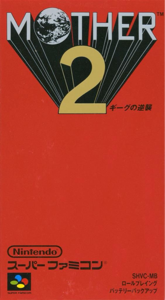
Okay, we're not going to lie, we love the box art for Mother 2. It's got a gorgeous, minimal design that definitely reminds us of Square-Enix's Final Fantasy series. The red background is distinctive, but it's the logo itself that really draws the eye, with the word 'MOTHER' almost zooming out from behind the big number '2' just below, along with the awesome planet in place of the letter 'O'.
We reckon this one will be pretty close, but make sure to make your voice heard and vote via the poll below!
Thanks for voting! We'll see you next time for another round of the Box Art Brawl.
Further reading:


Comments 42
This game stinks!
Box Art Brawls Current Total:
Europe: 31
Japan: 34
North America: 41
Australia and New Zealand: 1
Yes, i always thought of the FF series as a good comparison. The Mother series always used simple red box art with the games titles in the center.
The Space Odyssey-esque look to the Japanese one is pretty nice but there's something about the NA one that really just captures the weirdness of Earthbound as a game, with the background doing a lot of the heavy lifting here, really feeding into that extremely 90's aesthetic. Going to go with NA on this one.
"Gorgeous design". It's just a red box with an ugly logo that doesn't fit the game...
One of the rare cases where western marketing did a way better job.
Both of them kinda sucked. But i think the jp version is the better one
For me, Japanese cover all the way. It’s logo and minimal, clean design are so powerful!
If the Mother 2 one wasn't 90% just red I might've chosen that one, but as it stands it just doesn't look right to me. Could've at least centered the logo, right now it just looks like it's missing something.
Earthbound box art just looks better, though not perfect either if only because of the "bonus inside" portion.
that Starman with the weird background is just so strange and memorable.
Mother games with bright red boxes are also iconic in their own way. But EarthBound clearly wins here.
@HenHiro let's agree to disagree. Sometimes, extremely minimal is its own evocation. Big fan of this minimalistic look.
Japan easily wins this for me. It’s clean, it’s simple, it’s sophisticated. NA one has far too much going on. You could get away with the graphic if all that other clutter wasn’t over and around it.
I’d frame the Japan one, I’d stick the NA one in a box in the loft.
We didn't have this game in Europe, but I hope we wouldn't have the ugly american box if it happened.
Whatever, this contest was fun at the beggining, but I assume it now turns into a "we vote for the box we used to have in our country whatever the other one is".
It seems obvious when I see the weekly results. What a shame.
If the idea was to catch the attention of a kid at the time, the NA box gives at least some idea what you're in for, whereas the J release can be used to tease bulls
If I'm being honest I don't like either of this.
But I'll go with NA since it's not just boring text.
Neither is great but I went with NA. I don't mind Japan going for the minimalistic look but it's still bit weird that the middle third of the box is just plain red. NA box looks like someone vomited on it. I guess it goes well with their marketing for the game. I like that you can see Ness on the box though. I didn't notice him for the longest time. Probably because I've never seen the actual box, only images of the box art so the resolution may have made it more difficult to spot him.
It rare that I say NA, but I have to go with it this time, it just looks so much better to me!
If I'm being honest, they both suck but if I had to pick one, gun to my head I would choose the North American box art.
@Franklin
Wonder how often this comes down to just nostalgia. I assume that the games you played in your childhood have at least a bonus even though they might look worse.
North America; it's way too iconic in my mind, though nowhere near perfect. Plus, while I don't mind some minimalist designs, Japan's box art for Mother 2 is too much so in my opinion.
I don't like all the blank red space on the Japanese cover, but that NA one is just atrocious.
Neither are great, but I refer the Japanese cover. I've always really liked the Japanese logo (and title) too.
I never thought the NA box was anything particularly special so I was ready to pick the other one but once I saw the other box I realized the NA box is at least better than that.
@Fulkaffe Agreed!
Japan for me. It reminds me of a clean, simple rock album style cover or something (from the 1980s). The art for the NA boxart is just so-so. Don't know if it has aged well. There's like a bit of a tacky smudge behind the lettering as it is spliced on top of the artwork
For me the Japanese box art perfectly captures the feel of the game. It's consistent with a world where Giygas is a serious threat, but nobody bats an eye at a time traveling super bee or the cult that just paints everything blue or the fact that Mr. Saturn exists at all. It was weird, zany, and funny, but also cool, bold, and adventurous. The NA box art shows you some elements of the game, but the Japanese box art sets the stage for what the game actually is
That was a tough choice, but in the end I opted for the psychedelic colors of NA. I really like them both though.
According to the Link to the Past poll, the Japanese one should win.
I do like the acid trip shown in the North American box art, though.
My first vote for Japan since this was resurrected. Nails the b-movie poster thingy.
Neither one tells you what the game is about, but at least the NA one makes you curious. The perspective lines approach on the JP one is ruined by how silly a round letter looks with it, or in this case, the Earth.
The NA one is so iconic to me especially the size of it. Still have mine to this day.
Ngl North America wins in the name category too. ‘Mother’ is a terrible name for a game series
I don’t think either of them are amazing, but the NA one is a bit better, because it at least has an image. It’s definitely more iconic.
Always loved how clean and simple the Japanese one is, but the NA one is just straight up iconic and memorable to me, so I gotta go foe that.
I would be non-interested with both and if I didn't know much about them I wouldn't play, but I'm such a sucker for a vintage looking box art so JP wins my heart.
The comments on these threads always disappoint me. Yeah, art is subjective, but there is a world of design language that can be analyzed, compared and contextualized both in and out of the world of gaming. "The logo isn't centered" is not a valid criticism of the JP art.
The thing that jumps out the most to me is how cluttered the NA box is with irrelevant elements. "ONLY FOR" and "BONUS INSIDE" are huge eyesores and I personally hate the black frame all our SNES games got. That's not this game's fault, obviously, and with those elements removed I think the art would be pretty strong, especially the wordmark.
One is arguably too much, one is arguably too little to capture the attention of an average consumer not knowing what they're getting. I kind of like both, maybe slightly prefer the Japanese one for mystery instead of too much. I also prefer the title Mother. Maybe I just like both because I know the game. Which brings me to the next point: it has such great and wacky characters, plenty of inspiration for interesting 90's sci fi artwork that DOES capture the game's direction much more...
@HenHiro I'm with you. While I kind of like the logo design, the overall design of the box does nothing for me. "Gorgeous" is quite a stretch here for me. I think minimalism rarely works for game boxes.
I voted for NA, though I didn't really like either of these boxes.
This vote is not looking nearly as close as the NL team hoped.
I like Japan on this one. It's a real throwback design to the days of early RPGs and wargames, and it grabs the eye.
I like the NA design too, but I prefer Japan.
I also like the title Mother, rather than Earthbound. Earthbound definitely rolls off the tongue nicely, but it's a bit generic, even back in the day. As someone who has no nostalgic feelings for the series, it doesn't evoke much.
NA was my choice for this one, but I think it's cool that the JP version actually says it's "role-playing" and has "battery backup" on the cover. I wish the NA covers for SNES games did that.
The Japanese box art is cool, but it just doesn't convey the game's lighthearted wackiness. If I knew nothing about the game and these two boxes were sitting side by side at the game store, I would think they were two completely different games. I would also assume that Mother 2 was a much more serious game than EarthBound.
Now, Mother/EarthBound Beginnings on the other hand... The mock boxart we got for NSO is hideous. The boxart for Mother is much, much, better.
US box art by a mile. I saw that big box in Blockbuster one day in 1995/96 and it instantly made me curious. I rented it, became my favorite game of all time, bought it afterwards and the rest is history.
Show Comments
Leave A Comment
Hold on there, you need to login to post a comment...