
Welcome to the latest instalment in our nostalgia-inducing column, Memory Pak, where we deep-dive into some of the most memorable moments in gaming – good and bad.
Today, Secret of Mana turns 30 years old in Japan, and to celebrate this seminal action RPG's anniversary, Alana is reminiscing about how the game's use of colour inspired a fascination with RPG worlds...
What do you remember first and foremost when thinking about Secret of Mana? The squeak of the Ring Command menu? The stunning 16-bit score by Hirkoi Kukta? It being one of the first action RPGs you ever played? That it was a Square RPG on SNES that, surprisingly, got released in Europe?
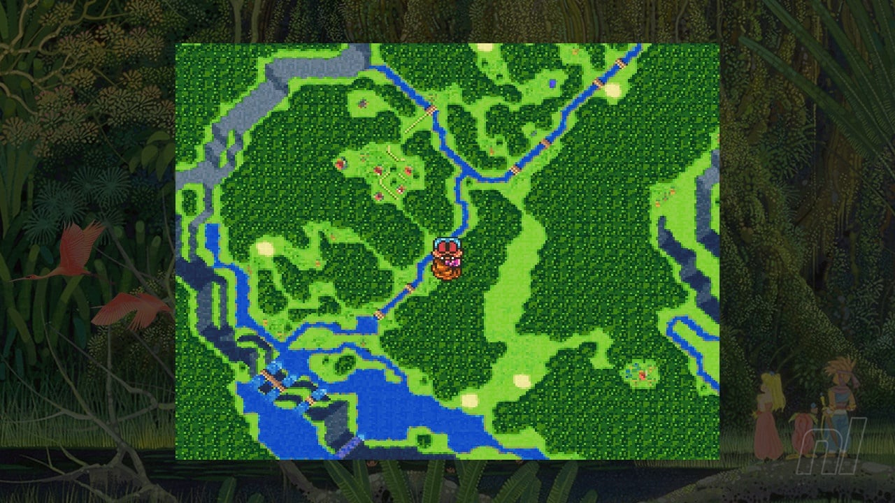
I think of colour. The verdant greens of the Mana Tree. The splashes of pink from the birds. The shadows of the tree’s roots. The yellow font of the game’s title. That’s all just from the title screen, but when I think about Secret of Mana, it’s the sea of greens, golds, and browns used to paint the natural landscapes in the Super Nintendo game. Spring trees blossom with pink, while rivers and lakes brush against the banks with a blend of blue and white pixels, and metallic structures knot together rusty browns, stony greys, and shiny silver perfectly.
Secret of Mana is a kaleidoscope that has lived in my mind ever since I first played it, and I thought it was the best-looking game ever back in the day. Except I didn’t play it in 1993 (or 1994 when it was released in Europe). I played it in 2004.
The colours of Secret of Mana have created an almost synesthetic nostalgia for me.
My Super Nintendo — a second-hand console bought by my mum because she could see I enjoyed video games and wanted to share experiences she’d had — sat proudly next to the GameCube. I’d jump from sessions of Tales of Symphonia to a retro blast from the past. Even next to games like The Legend of Zelda: Four Swords Adventures and Paper Mario: The Thousand-Year Door, Secret of Mana’s pixel art rainbow palette was hypnotic.
I’ve played Square’s action RPG maybe ten times since that first playthrough. I’ve gone through it with friends and family, on my own, and in different forms – on Virtual Console, the PS4 remake (ew), the SNES Classic version (lovely), and through the Collection of Mana (amazing). I know the game hasn’t aged well – heck, the Collection showed me how far action RPGs had evolved between this and Seiken Densetsu 3 (known as Trials of Mana in the West). But I love it. It's home to me. The sequel is better in every way — and other action RPGs like Terranigma are, for sure, better — but I know the ins and outs of this game unlike any other, such as how to navigate the Ring Command menu quickly to cast endless chains of magic, and even the wonky enemy hitboxes.
I can look past pretty much every flaw when the world is this beautiful. As a little kid, I would collect colour swatch cards – the cards they had in DIY or decorating stores to show you all the different tones and shades of that colour. I had over 100 of these and I would obsess over the minutiae of the difference between powder blue and sky blue. It was a no-brainer, then, that this game's colour palette is what won me over, and Square created a magical world that enraptured me, not just with beautiful pixel art, but with colour.
The colours of Secret of Mana have created an almost synesthetic nostalgia for me. I can listen to ‘Phantom and a Rose’ and map out the deep blue house roofs with the cerulean river weaving its way in between houses. ‘Into the Thick of It’ conjures up images of greens – from olive, forest, leaf, and sea – broken up by swaying grass, pink and yellow blossoms, and rivers. ‘A Curious Tale’ is just Gold City – a city made entirely of gold. It’s easy to spot on the world map, and when you land, the hit of warm bronzes, yellows, and golds will still blow you away. It was the first video game I felt like I could reach out and touch the grass – 16-bit visuals and 15-bit RGB can really do that.
The Upper Land Forest is still one of my favourite areas in any RPG, despite being such a simple idea on paper. Otherwise known as the Forest of Seasons, this area is composed of four interlinking screens, each with different enemies, colours, and visuals, all representing the four seasons. The blush of spring sits next to verdant summer, with copper autumn and pristine winter side-by-side.
The stark contrast of these four strong colour palettes – each area also a sort of mirror image of the others – and the way the four screens loop together was enticing. It’s also probably one of the best places to grind magic experience in the early game. So I spent hours and hours here, walking in circles, menuing deftly and observing my surroundings. Every pixel, every single shade of every single colour ingrained in my memory for the rest of time as a result.
Plenty of other Super Nintendo RPGs use colour so effectively – Seiken Densetsu 3, Chrono Trigger, and even Final Fantasy VI – but I can’t think of anything as vivid or bright as Secret of Mana. Even while playing the anime, cel-shaded GameCube title Tales of Symphonia alongside it, Secret of Mana’s attention to detail struck me, thanks to its use of shading and its simple elegance. That Mode-7 world map also helps, too.
As I was truly getting into video games, it taught me something pretty essential and helped really define what I love in the medium; colourful, expressive worlds are one of the RPG genre’s true pleasures. Sometimes you need a bit of grit and darkness – Final Fantasy VII’s industrial, dieselpunk aesthetic would feel pretty strange if everything was sugary and bright (and that’s what Gold Saucer is for, anyway – even if there’s a dark underbelly there). But I think about some of my favourite places in the genre – Skies of Arcadia’s titular world; every single Xenoblade game’s setting; the El Nido Archipelago in Chrono Cross — and they’re varied, they’re full of life, and, most importantly, they’re adorned with a kaleidoscope of colour, texture, and brightness.

That’s not to say Secret of Mana doesn’t play around with darker shades or even a lack of colour, though. When the world is doomed, the sky turns a brown-orange shade, and the imminent danger feels oppressive. The Pure Lands – the home of the Mana Tree – might be beautiful, serene, and verdant, but it’s a bit washed out thanks to mist. Every single screen feels claustrophobic – the branches trapping your characters in, and big black borders surrounding the area. There are all of those mechanical structures, too. Even when things are insipid, there’s still a uniqueness. The musical energy of the Pure Lands is driven home because of that mist. And Shade’s Temple of Darkness, wouldn’t do any good for its elemental namesake if it was, you know, yellow, gold, and white.
For what is considered such a simplistic action RPG nowadays, Secret of Mana was revolutionary. For me, it’s not because of the Ring Command menu or the way it advanced action combat, or even its fantastic multiplayer – a rare thing in the RPG genre. It’s because of how its world uses colour to create a rich fantasy landscape. It might follow all of the genre tropes of having a forest, a desert, a big city, a small hamlet, etc., but Secret of Mana’s pixel tinctures help to make the 16-bits pop off the screen and help a little girl fall in love with a genre.
And I know Seiken Densetsu 3 looks even better, I know, but like I said — Secret of Mana feels like home, and nothing will change that.
What are your favourite colourful worlds in video games? Did you play Secret of Mana back in the day? Let us know down below.