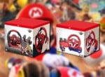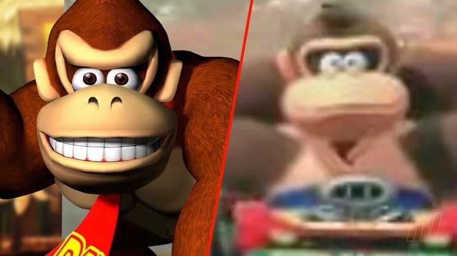
In case you somehow missed it, Donkey Kong seems to be getting a makeover in the upcoming Mario Kart title. His redesign has led to all sorts of conversation within the DK and Nintendo community, and now, some new themed items have been spotted on the My Nintendo Store.
This includes some "charm straps" (featuring DK and Diddy Kong) for $7.99 / £12.99 in the US and UK, and Nintendo's Japanese online store is offering bookmarks, pencil cases, and various other Donkey Kong themed items. Here's a look:
US & UK:
"You'll go bananas for this Donkey Kong™ inspired charm strap featuring DK and his beloved bananas. Each charm has a clasp on top and a ring on the bottom to allow for additional charms to be connected in an endless configuration."
Japan:
You can read a bit more about Donkey Kong's update in our previous coverage here on Nintendo Life. This includes a poll we ran - where almost half of the respondents were seemingly happy with his new look on the Switch 2. The Donkey Kong Country artist Kevin Bayliss also shared his thoughts.
Would you be interested in any of this new DK merch? Let us know in the comments.
Please note that some external links on this page are affiliate links, which means if you click them and make a purchase we may receive a small percentage of the sale. Please read our FTC Disclosure for more information.
[source reddit.com]
Comments 74
Pretty much shows this will be Donkey Kong’s new design going forward.
I don’t hate the new design, but I think it will grow on me over time.
Removed - off-topic
reminds me a lot of DK King of Swing for GBA
Yeah, the more I see of this design the more I despise it.
It's not a radical change. The difference is negligible.
That said, I think I like the new look a little better? It looks like he's relaxed his brow, which makes a slightly more cartoony and lighthearted appearance. It's ok.
I feel indifferent.
The new design is funny ngl.
I like the new look because it gives him a kinder default disposition without keeping him from making the old face by furrowing his brow which will make it more impactful than when it's permanent.
@Lizuka I've seen even the most strong-willed haters of design changes of many other things in the past grow to like or at least tolerate them.
Eventually it'll take you too.
Anyways, the more I see this new design the more I like it, especially for bringing back more classic-looking DK art. He looks friendly
@Lizuka I'd say I'd was surprised to such an extremely negative reaction to a single low-res screenshot, but sadly I've become used to it by this point.
Yeah i like it.
Loved the design in the mario movie.
So yeah, hope they bring this design in smash also and keep the other one as an alternate costume character.
It's not bad, really. The new design isn't too radically different, it still screams DK style. Plus, I like his new tuft of hair on his head.
@DanijoEX-the-Pierrot Honestly, I dunno how to feel about that. On one hand, yes, it makes sense for a big furry ape, but I liked how the original had it look cleaner and well-groomed. To me that and the tie gave off the impression of a guy who wanted to look a bit more put together than the average ape.
Or, y'know, I might just be overthinking it. Wouldn't be the first time.
As weird as it is to get used to I honestly kind of like the new design. Anyone who’s watched DashieXP’s Mario Kart 8 videos however knows that this friendlier look is probably nothing but an act…
This is not my Donkey Kong. I’ve always wondered why he looked so dumb / grumpy but grew to love him like that over time. Needless to say I grew up with the Rare trilogy …
What I really don’t like is this pixaresque Mario Movie version with the usual hectic exaggerated facial expressions that EVERY SINGLE animated 3D movie character has. To me that’s a lost opportunity for being different. But sigh I’ll (have to) get used to it I guess
I genuinely hate this new design. This DK isn't king of anything. He's dumpy unemployed DK.
Like, he isn't even movie DK. He's a DK who has raided your fridge and is asking if you'd go out and pick him up some chicken nuggets before he binge watches something off of your streaming services while crashing on your couch. Like he's between jobs and desperately trying to figure out how he'll freeload off of you for another day.
If they wanted to move away from the DKC Donkey Kong look, you could have still gone with either the movie or the Game Boy game version. This dead-eyed doofus does nothing for me.
@N00BiSH Actually? The DKC cartoon Donkey Kong has way more dignity than this redesigned one. It's like, someone was dared to make the worst Donkey Kong, and DKC cartoon DK breathed a sigh of relief when they succeeded.
With or without hair.
Good thing we can still play the old games.
DKC was my very first SNES game way back when and I've loved both the games and the characters since then, gotta say I really like this new design, I dunno, the look feels very Nintendo to me and can see this character at home at Kong Isle or Mushroom Kingdom 🤷🏻♂️
Removed - trolling/baiting
@MasterGraveheart ...See, I was getting on the other person for hating it so much, but I think you are in genuine agony looking at this design, and frankly at this point you're not worth saving.
Screw this new design, feels like a final insult to Rare.
Loving the new design. It feels retro in every good way.
So he looks less angry 24/7. Seems like they are going back to the NES/GB/SNES style with Mario. Unexpected to be honest, really thought they would go with the movie style. Looking forward to the next 3D Mario to see if that changes style to
Can barely tell it's different in some of these items and regardless, as much as I like DK's previous design I definitely don't mind a more classic one personally!
@dok5555555 My thoughts exactly
I think they made a good move making the eyes more rounder.
Really like the new design. Reminds me of the drawings in the old "Club Nintendo" Magazines in the early 90s. The more relaxed baseline expression will allow for more expressiveness overall. Funny enough, there was an article over on polygon a few days ago about "Angry Kirby" and how in the 90s and 2000s they gave the pink fluffball a much more fierce and determined expression in marketing him to American boys. They have dialed this back since and maybe DK just follows suit and Nintendo returns to its original designs …
I mean...it's barely changed there, he just doesn't look angry. I think the MK redesign goes a bit further.
Have the people who've complained ever noticed that Link's looked a "little" bit different through the years?
So Nintendo wants to regress their character designs, then do Mario next as his Jumpman design. I'm sure it'll win people over like the new DK look because it's classic.
https://imgur.com/a/classic-jumpman-OLKPEXN
I think the new design is really awesome!
I think in Mario games (Kart, Party, sports, etc.) DK will look like this, but if he ever gets his own game in the Country series, I think he will look like DK used to.
Derpy Kong amiibo when?
Lots of DK and Diddy merch, but no Dixie or Cranky or Funky. I guess their focus is on DKC Returns and its subpar port at the moment
@Jayenkai I still remember that space world 2000 tech demo, and after that the showed the wind waker design. There were a lot of angry fans. Funny thing, they pulled the same thing with Wii U. Amazing tech demo and after that wind waker. They have a cruel sense of humor sometimes.
any website selling genuine Nintendo merchandising in Europe ?
@macaron35 The Official Nintendo Store is... At least in the Netherlands we have access to this "pop-up store":
https://store.nintendo.nl/nl/merchandise/nintendo-pop-up-store-merchandise/nintendo-pop-up-store-donkey-kong
It’s like they are writing out the rare legacy.
Plenty of DK stuff recently (merchandising, theme park, classic GB games on Switch, DK Country Returns HD)... it feels like they are paving the way for that rumored Switch 2-Day 1-DK Open World game.
Or not. Maybe not. This is Nintendo, after all.
Since they’re obsessive over DK’s design like this because of the movie it’s really no surprise that they replaced Martinet now.
I don't know why people are crying about this. It's not a radical redesign like the sonic boom era...
@Horstofthefuture
that's because nintendo is throwing away their beloved timeless designs in favor of Dreamworks, cookie cutter, factory made, kid tested mother approved trash.
imo. ✌️
@Lord That was Retro Studios being removed but yeah I do think Rare's work on Donkey Kong is fading away.
And how have we had Goldeneye, Both Banjo-Kazooies and other N64 Rare titles on NSO and still no DK64 in sight?
Booooooooooo 👎
I may still prefer Rare’s cooler-looking DK, but if I didn’t mind his movie look, I can live with this. It’ll be interesting to see if other Kongs with a brow like Cranky and Funky are affected, too. I don’t know if this is “Nintendo-washing” DK’s westernization.
I actually don’t mind this that much. They switched up everyone’s design for Wonder, so I don’t see why changing DK a bit is that bad
Removed - trolling/baiting
I'm gonna say again what I said the last time.
The design finally matches the character's name, his name is Donkey Kong.
I'm not saying that as a bad thing. Sure I like his Rare design, but I'm not gonna act like they commited a murder just because they redesigned a character we don't even know if it was just for a game (which in turn we don't even know anything beyond "it exists") when everyone else seems to be going for a classic design/style.
Looks ugly. And childish.
@Anti-Matter Ngl, I kind of like the characters from Switch Sports and would honestly prefer those over the old Miis. But the best scenario would be if we got both types of avatars.
still trying to convince himself that the Mario Kart footage from the Switch 2 reveal was fake because 24 racers would be a nightmare
Honestly, I like the new design. It looks like an evolution of the classic design from DK '94 with some cues of the more cartoony styles of King of Swing on the GBA and the Illumination movie while still retaining elements of Bayliss' Country design. Feels like a fusion of classic and modern to me.
@MasterGraveheart good grief, don't be so melodramatic.
@HammerGalladeBro
How does the new design evoke a donkey?
Supposedly the reason he is called donkey is because Nintendo were looking for the word stubborn ('stubborn as a mule', I guess), and the new design looks goofier, not more stubborn. Nor does it look more like an actual donkey for that matter.
I honestly love it. He can still furrow his eyebrow when he’s fighting or whatever, but he looks so much more kind. It’s so cute to see him look genuinely happy to have Diddy hanging out on his back.
I love the throwback design. I hope it's a sign of something new incoming from the Donkey Kong world. With all the Donkey Kong love, Maybe DK94 will release on NSO at the least, or a new game similar to it.
Yeah...Not a big fan of the eye change. Sure, the last design makes him look angrier, but I always took it in a cool, "I mean business and will do anything for my friends and bananas" way. Overall, the redesign is minor, and maybe it'll grow on me. I'm not losing sleep over this.
I genuinely do not get the hate this is getting. I know people don’t like change but this is such a minor redesign all things considered there’s no reason to hate it.
In the end, I need to see this new DK in action. I need to see how he looks when animated. Just seeing artwork isn’t enough. Maybe the expressions will make DK even more endearing?
@Uncle_Franklin
I don't know how much it is used in English, but in Spanish we use the word Donkey (Burro) to refer to someone silly or stupid. This design is certainly evoking that sensation, at least to me.
@HammerGalladeBro
Oh right, interesting.
I suppose in English we use ass to mean foolish.
This older animation-style version doesn’t bother me. It barely resembles the monstrosity that was shown in the new Mario Kart trailer. He still looks mostly like the old DK fans of the series know and love. I’d rather they create a new character than completely change one of their mostly beloved ones.
The old, Rare design was better than this new one.
Unnecessary change.
I'm a bit surprised by the negativity here. I don't really like his design in the Mario movie and I wasn't sold on the way he looked in the new Mario Kart from the brief glimpse we saw, but I think this 2D art looks pretty good! Not massively different to how he looked before, but his face is a little more expressive and it reminds me of the original arcade game art.
I still definitely prefer the previous design, but I will grant you that these little art pieces look a heck of a lot better than the MK9 model preview. It's not so bad here, while the preview we got of MK9 makes him look a bit...like someone stole his brain. There's nothing up there. Look out, he's driving straight off the road-!
Hopefully the MK9 model isn't finished, and the final version looks more like this art and less like he's been put through a dozen bloody wars and simultaneously isn't bothered by it.
It seems the original designer of his DKC look is himself in favor of the remodel: (via Polygon) “Unfortunately, when I designed him, because he basically had Battletoad eyes, it [was] hard to give Donkey Kong any expression other than ‘annoyed,’” Bayliss explained via X (formerly Twitter) on Jan. 25. “This is something I take a little more into consideration when creating characters today!”
@Lord If this is more about Rare's influence on DK, perhaps Microsoft negotiated with Nintendo over transitioning DK's "likeness" away from what is now a Microsoft studio.
The redesign makes him look more like a mindless moron.
I grew up on DKC and Dk64 But lowkey I know things have to change and I kinda like this.
I love this new design! Seeing DK with the classic look, makes me smile!
All the new-design!DK has to do is narrow his eyes and furrow his brows angrily when he finds out his bananas have been stolen yet again, and presto!
@squidduforeal Well now, we're all forced to accept change eventually via time. However, just because we accept it doesn't necessarily mean we grow to like it. We just normalize it and it stops bothering us. That's kind of the issue when changes happen that are from a corporation. Edit: To clarify, that is to say that people tend to feel like they never have a say when something they love changes, and often, companies do that without thinking.
Now, as for DK: If they decide to use this going forward, im okay with it. AS LONG as he can still have an attitude. We don't see him acting very DK-like from what little of this new form is out there, and i'd really personally prefer they not change his depiction from what DKC established. Granted, to pass judgement at this stage is premature, but what i'm saying is I hope this isn't a sign of regression to his more "Whimsical" incarnation of yesteryear. That, and I would like for this not to mean the end of the DKC/Rare continuity as a whole. We shall see.
i love this new look ngl
Leave A Comment
Hold on there, you need to login to post a comment...