We've seemingly had our very first look at Mario Kart 9 during the Switch 2 reveal trailer, and one thing you might have noticed is the similar but slightly different-looking character designs.
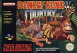
Perhaps the highlight is Donkey Kong's new look, which has been labelled a "redesign" by some. It's been a bit of a talking point within the DK and Super Mario fandom, and now we've actually got a response from the artist who was behind DK's modern (and arguably most iconic) look - former Rare and Donkey Kong Country veteran, Kevin Bayliss.

He says "everything changes" and "change is good" in response to a fan video by YouTube channel 'LUIZ do Comercial' suggesting Nintendo has taken Rare's design out of the Kong and reverted to DK's earlier looks.
Kevin Bayliss: "You can take the KONG out of the Country, but you can't take the Country out of the Kong! (I love it - this is really funny! - Everything changes! - Change is good!)"
We ran a poll on Nintendo Life last week about DK's redesign and almost half of the respondents were seemingly happy with his new look on the Switch 2. Apart from Kevin's version, as the trailer above references, DK was originally crafted by Shigeru Miyamoto, with Shigehisa Nakaue also involved throughout the years.
DK's redesign reveal actually follows the release of Donkey Kong Country Returns HD last week, which was a game originally released by the team behind the Metroid Prime series, Retro Studios.
How are you feeling about DK's redesign a week later? Let us know your thoughts in the comments.
[source gonintendo.com]
Comments 51
Doesn't matter at all for me since I never use Donkey Kong in Mario Kart games, not a fan of Gorilla character.
I prefer using Mii with Amiibo outfits in Mario Kart 8 Deluxe.
Nintendo can't win. They are stale and boring for never changing character designs and as soon as they do, suddenly that's sacrilege.
It’s honestly not even that major of a redesign.
He just learned how to relax his eyebrows.
Cool, new design still looks awful.
It does look a bit odd. They should have went with the version they used in the Mario bros animated movie
this era they took the modern designs and brought them to HD, and im all for them doing that with their cartoonish 2d designs. unless you want more visible mustache hair and pores on mario, this is a nice way to graphically differentiate mk8 and 9 as well
Relax people it's probably just a redesign for the Mario Kart series. To make him fit the decidedly more cartoonish tone this time around.
I prefer the redesign. I've never felt his eyes were right.
Donkey Country sounds like a certain nation right now 😛
The DKC design is still the best… LOOK HOW THEY MANGLED MY BOY! ;_;
@Dee123 There seems to be a lot of people who will complain about literally anything they can find when it comes to Nintendo but ultimately the engagement and publicity that comes from it probably works in Nintendo's favour anyway.
I am wondering, why no one seems to think about the possibility, that this might just be an additional version.
We've got Mario in several forms in this game, why not DK and Retro DK as driver.
Since the drivers have been doubled, there might be a need to add new characters, instead of replacing them.
I actually like both designs equally. The OG Rare design is cool-looking and iconic and the newer one is funny and goofy-looking (in a good way!) I actually see some elements from his retro design and a little bit of DK Jr. in the redesign, and I wouldn’t say it looks entirely like his movie design.
It’s not a bad redesign in my opinion, I think there are other video game character redesigns that look far more worse and make the character actually look off-putting. I do feel like the redesign might be a one-off (and as one of the comments stated above) it might be an additional racer/variant that uses a different design instead of the OG one.
Sounds like a cool guy.
Way better now, his aesthetic fits the universe he’s in now.
Imo the origounal DKC was the best design. It always will be for me.
I'm a simple guy, I like funny monkey.
Oof. I still don’t like the redesign (tho I’m still holding out hope that this is a variant or some other character). DK has always had a little bit of attitude and edginess that the rest of the super Mario characters (excluding Wario and Waluigi) lack. He brings a different vibe, which I’ve always loved (especially from 1994/DKC-era onward). It’s a minuscule thing in the grand scheme of things, but it’s genuinely sad to think about them permanently changing his look and vibe this much. Don’t go, Donkey 😢
Are we sure this just isn't Donkey Kong's distance cousin? He looks so cartoonishly goofy for MK9. Unless we're getting different skins like Tour has for everyone.
He looks like Donkey Kong Jr from the SNES Mario kart.
Love that video, and i forgot how much Dennis Hopper looks like trump
Call me old fashioned but I still prefer the original. Also his comment on change, often it is good, but that's certainly not always the case 😂
Here's the thing- look at the render of DK in MK8/D. It's...not the best. Same with his look in Smash. They always seem a little off. Retros recreation of him is great but I can imagine animating his fur in Mario Kart would be a pain. I think this arcade inspired design with little hints of Country is a good design for this type of game.
@Bunkerneath poor Dennis Hopper.
@Ravenmaster I believe that IS the design they went for, I think I recall Miyamoto-san stated or implied that the Mario Movie Donkey Kong design will be the design that Donkey Kong will kinda pull from in future new DK titles.
Personally, I really don't mind. Mario and co. was redesigned for Super Mario Bros. Wonder and, sure, it takes some getting used to, but they're cool. Personally, I think DK is more in line with the old 80s stuff, which seems perfectly fine to me. And maybe there are multiple versions of DK to choose from in the game? We don't really know that much about the new Mario Kart in the first place.
@danzoEX
Sounds exactly like the type of mandate he’d make.
@Fake-news Sorry, I meant in that film
Great re-design.
A shame the re-design isn't brought to life on a system that doesn't make it look like exactly like the previous installment released 11 years ago 🪦🪦
People who say they're "glad DK looks more like his old arcade self" do NOT understand DK canon at all. Canonically, Cranky Kong is the one in the old arcade/NES games, NOT our Rare-era DK. There is no reason to make Donkey Kong look like "his original design" because that original design isn't him. Furthermore, it introduces a major problem because all of DK's Rare-era Kong relatives look like him..Ya know.. Because they're related. Diddy, Dixie, Kiddie, Funky, Wrinkly, Tiny, Lanky, etc. They all have a familiar resemblance. Redesigning DK would require also redesigning all of those other Kongs, and I don't even really know that they'd all look right in this new art style. If Nintendo really wants DK to look different for Mario Kart 10 and their little animated movies, then so be it, but DK had better not change in the next Donkey Kong game. Why? Well, change the way Mario looks drastically too back to his plumper self in the original Donkey Kong or Mario Bros Arcade asethetic and talk to me then about character design.
Went from creepy (to me) to silly looking, and that’s a good change
I think the new design will allow for more dynamic facial expressions. So in the long-run, it's a good thing.
Definitely for more dynamic facial expressions! Which they want to emphasise for this title. He can still do his signature frown, and I'm sure he will a lot. And every time it will be a "oh sh-- there it is" moment
Ain’t that how he looked before the 90s?
@Yoshi3 as a bonafide American patriot, I agree with this. My country is so over reactive sometimes.
The death of a gorilla was the herald of bad tidings in 2016. Is the death of (a design of) a gorilla the sign of bad tidings in 2025?
New design looks really bad. However, don't really care unless they use it in a new 3D DK game.
I really wish we’d get an official artwork/screenshot of the new design rather than relying on that blurry screengrab.
Pretty funny video and as much as I like DK's country design I like that they went for a more classic one for the next Mario Kart - even better if it's just an optional costume as some speculate and so everyone wins (also in the sense that we could see costumes for other characters, Peach for example who currently has her usual dress instead of her Mario Kart suit)!
I dunno, it looks like I may be in the minority here but I think the redesign actually looks better, feels at home with similar eye design from the Blooper enemy from Mario
LOVE the new design! Very retro and can be more expressive with the brow muscles.
I wonder if the redesign is even Donkey Kong III (modern Donkey Kong) or is actually Donkey Kong JR. It could even be the young version of Cranky Kong (the OG Donkey Kong). I could see it being any of them tbf.
The new one makes me laugh. I don't find it unappealing.
I have no problem that. As the years wear on, I expect all Nintendo characters to evolve, as they have in the past.
@Ravenmaster That IS the version they used in the movie.
Why is this labeled ‘random’? This isn’t random at all; if anything, it’s expected for someone who designed the character to comment on a redesign.
I think that category needs a refresh, or rather, to go away.
I really hope it's a "skin" thing you can select on the player screen. I'm not ready for a full DK redesign like this lol
As long as the new 2D DK comes out I don't care lol.
Country's DK was designed to fit a whole different aesthetic in the first place, and while they've made a few tweaks here and there over the years here and there to fit him in with the rest of the Mario crew (The Mario vs Donkey Kong series' version was excellently done, if you ask me) the entire Mario franchise seems to be shifting more than ever towards a cartoonesque style these days. Not changing Donkey Kong to fit in with that might have just left the big ape exiled from the Mushroom Kingdom entirely, which you could argue might be a worthwhile trade but I think most people still associate DK with Mario and would like to see him cropping up in Mario-related games. It also brings him way more in line with Illumination's take on the character in the movie which is probably how most new Nintendo fans are going to get to know him in the coming years.
I don't mind the redesign, it seems to finally be in line with the character's name. His name is Donkey Kong, not Burly Kong.
I like it, reminds me of the YoGo gorilla. But I’m old and got used to the DK look from the Game and Watch we owned lol. Think it was Donkey Kong 2, brown on brown and had young DK rescuing old DK.
Edit: just looked up the price in that thing, maybe I should try and find it from my parents shed and list it on eBay haha.
Leave A Comment
Hold on there, you need to login to post a comment...