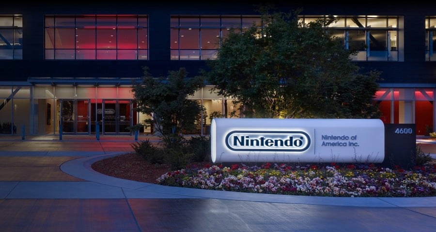
Nintendo's next-generation hardware is on the horizon, and with this in mind, NoA appears to have freshened up its signage.
As spotted by eagle-eyed fans on social media, the American headquarters has swapped from a plain silver sign to the trademark red and white logo. This new paint job has been shared on X by user 'Caleb_Bravo99', with Nintendeal also showing the before and after comparison shots:
Nintendo is once again on the cusp of a new generation, with company president Shuntaro Furukawa revealing the Switch "successor" announcement is coming "this fiscal year" and reports claiming it's best described as the "Switch next model".
As of the latest financial earnings release, the Switch has now sold more than 140 million units since launching in 2017.
What do you think of NoA's new sign? Are you excited about what's next for Nintendo? Let us know.
[source x.com]
Comments 55
Gotta appreciate how clean it looks…that’s a nice sign.
Took them 7 years.
took them 10 years to realize the wii era was just a fad and the true essence of Nintendo is bright RED. embrace the red color Nintendo
Oh. It’s literally a fresh coat of paint.
its so nothing but i really like when nintendo updated their branding to red. something about their old white/grey logo felt sleek in a boring way
plus it pairs well with the 3 colors of the competitor consoles, now the question is who will be daring enough to be the 4th yellow console
Shouldn't that shade of red be called Nintendo red already?
Really leaning into "Team Red." Looks fantastic.
That Nintendo red looks so good 👌
It's a sign of things to come
Looks like they updated the sign to match Switch era company branding, as the old one was part of old Wii era branding.
@mlt There is only one red you can buy a modern Ferrari in, and that’s Rosso Corsa. So, we should call the Nintendo colour „Mario Red“.
This probably should have happened back in 2016 when the logo change actually happened, but better 8 years late than never lol.
Looks much better in RED.
Very nice. It looks just like the Nintendo logo on the startup screen of Paper Mario: The Thousand-Year Door on Switch.
Red is Nintendo
Blue is PlayStation
Green is XBOX
So glad we are coming out of the ''in the future everything will be white' phase.
It makes the sign look shiny
Love to see the classic Nintendo red back also there!
Makes the old one look positively industrial. Better.
Looks WAY better
I’m taking this as a good sign!
Waverace 4 confirmed!!
Signing on to a new generation perhaps? Or a red herring?
Looks better now. The old sign looks like the nes.
I associate Nintendo with red more than blue and black just like how I associate Sega with blue more than red and white.
aw, I liked the white and grey era!
I was pleasantly surprised when I saw the red Nintendo screen at the beginning of Paper Mario The Thousand Year Door.
@boxyguy It probably felt boring because a lot of corporations like to use some combination of white, gray, and/or black. Playstation used to have a colorful logo (and colorful buttons on their controllers). Now it's all black and white.
@L27 But why?
it's looks the same
It looks way better now, it really pops!
It opened up my eyes.
Interesting. Also noticed a red 'nintendo' splash screen when booting up TTYD remake and thought it was odd. As I cant recall ever seeing that particular splash screen when booting up any of the other 1st party Nintendo Switch games. Makes me wonder what they're cooking up, and if they're at all related somehow
Must be a slow news day. We are discussing paint drying lol.
Questionable news worthiness. 🤣
looks good! very clean shade of red, though i imagine itll fade over the years without upkeep
Well that's a sign.
A sign of what?
Nintendo of America.
@boxyguy Steam, but they would be orange 😉
looks really nice.
now they gotta update their localizing team by getting rid of most of them.
@Lanmanna I feel like the grey and white gives it a more professional look, and steers the company away from being a "Designed for kids" company even though that's their target audience.
@boxyguy I think that's the Playdate. They are much smaller and niche, but still got a healthy little community of developers and players. Just like Nintendo, doing their own thing. As an owner of one, I'm quite happy with the role it covers for me (screen nicely visible in bright sunlight, small self-contained games, truly pocket-sized).
That's super slick. Nintendo looks so much better in red. They never should have changed to gray.
It should have been that.
"Nintendo of America with a fresh coat of paint (red and black is new)"
Maybe go back to school? 🤣
@Eel "Oh. It’s literally a fresh coat of paint."
Yet another remaster.
@mlt "Shouldn't that shade of red be called Nintendo red already?"
Yes and Nintendo's lawyers should incarcerate people using this red colour for anything else.
@Banjo-
Nintendo of America: Reggie'd Edition (yes, I'm fully aware Reggie isn't there anymore)
@HammerGalladeBro I miss Reggie.
@boxyguy "the question is who will be daring enough to be the 4th yellow console."
Apple? Apple Peeppin?
I love the grey for the NES kinda look, but yeah that looks exciting in NintenRed. Makes me wanna play!
Nintendo's been very "loud red" again since the reveal of the Switch. And it suits the brand.
@Dr_Lugae I see what you did there haha
Now stick Mario's mug somewhere on there.
I like it, looks fresh and red is basically Nintendo's color.
You think Nintendo? You see red.
Sega? Blue.
Xbox? Green of course.
Pick a color stick with it, marketing 101
I'm not sure you exactly have to be "eagle eyed" to notice a large sign going from grey to bright red, kind of just.. not blind.
Good to see Nintendo joining in on the red wave that's washing across the country though!
I hope more companies start rediscovering color. I guess this is being annoyed over nothing, but the minimalist, colorless logos everyone has gone with in the last few years, just seems soulless.
from corporate headquarters to toy museum (at least to someone who would not know otherwise)
Actually a huge improvement. Makes me think Nintendo is feeling confident.
It’s to match the Mother 3 box art, of course.
Ah. So that's why they started charging for online.....
Leave A Comment
Hold on there, you need to login to post a comment...