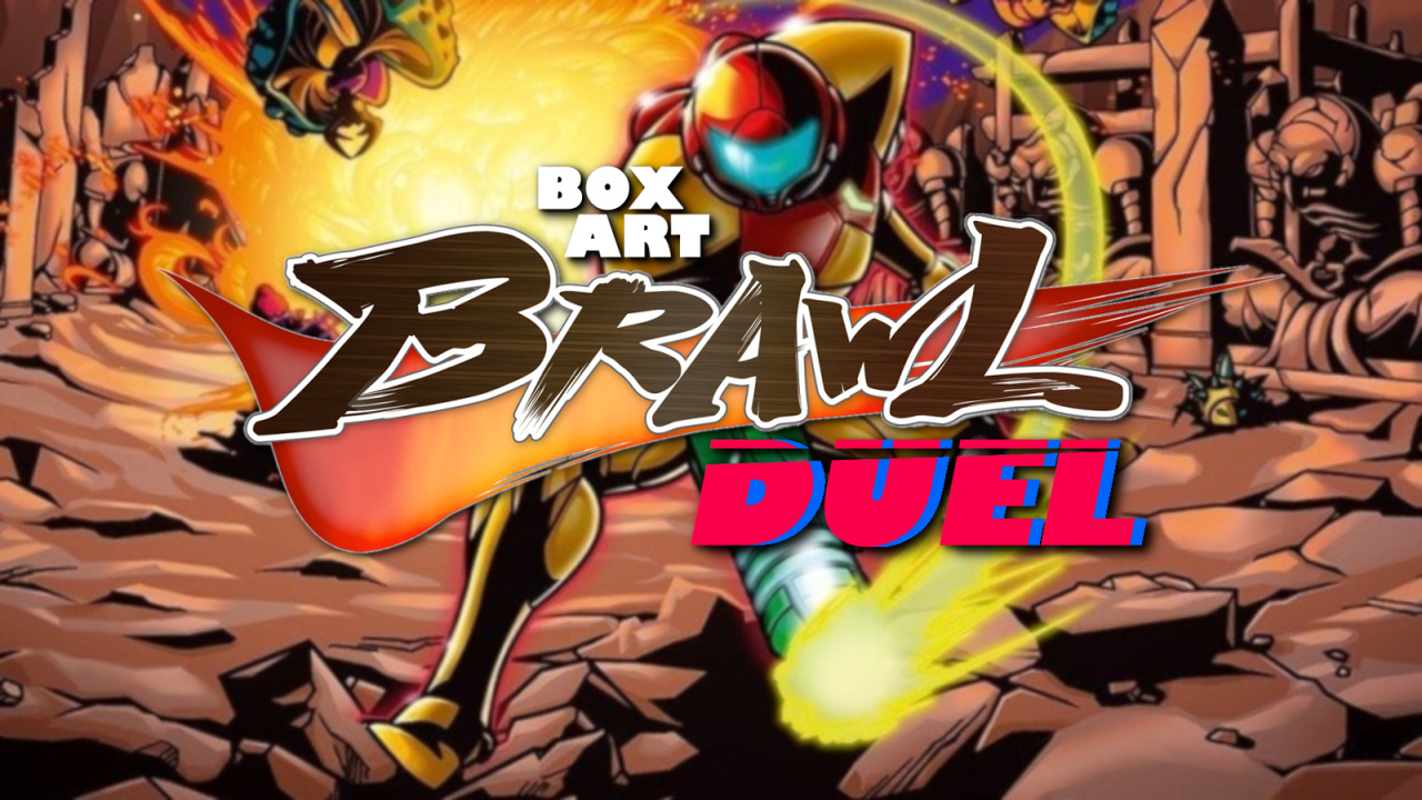
Welcome back to Box Art Brawl, our series of retro box art polls to decide the best regional variants from two or more territories.
Last time we celebrated the 30th anniversary of Rare's Battletoads on NES. Europe and North America teamed up with the same cover on that occasion (same as this week, in fact) and utterly overwhelmed the Japanese version after winning a whopping 90% of the vote. We can't recall a win quite so decisive in the 86-bout history of the brawl to date.
Today we're going to take a look at Metroid: Zero Mission, the 2004 GBA remake of the original NES Metroid that half the world is revisiting if our social media feeds are to be believed — the announcement of Metroid Dread for Switch has all of us going back to the previous four 2D Metroid titles.
Subscribe to Nintendo Life on YouTube849k
Grab your Varia suit and let's get hunting in one of the very best remakes ever made.
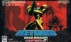
North America & Europe
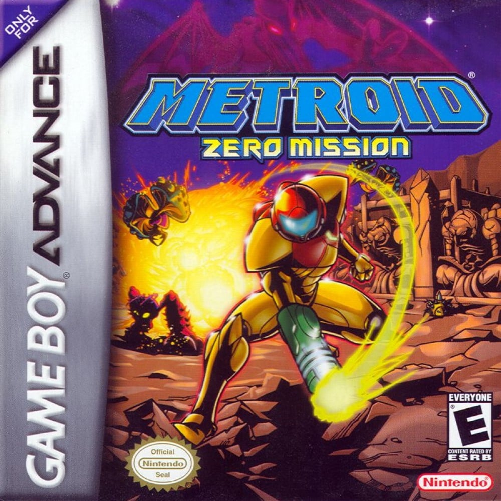
It's another Duel this week, and another tag team of EU and NA sharing the same art. We like the thick black inking and retro lines of this cover, with Samus positioned dramatically in front of an explosion (always cool) amongst the rubble and dust of Zebes.
Samus' suit, the big yellow blast and the arc of yellow light might draw your attention away from the statues on the right, as well as Ridley subtly swooping in behind the logo. It’s a strong opener from the West.
Japan
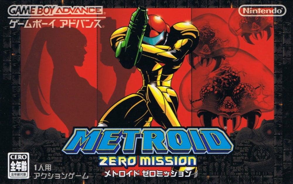
The Japanese cover also features Chozo architecture, but it's much more subtle here: a ‘frame’ housing three red screens. Knelt in the middle is our favourite bounty hunter, with her Zero Suit silhouette on the left (this was the game that debuted Samus' Zero Suit, after all) and three of the series’ eponymous creatures on the right.
Subtle, colourful and evocative. The fact it's got a Metroid on the cover will probably be enough to swing it for lovers of more literal covers, but both efforts are decent this week. A hard choice to be made!
So, you’ve seen this pair of 'roids, but which cover do you covet? Click on your favourite below and hit ‘Vote’ to let us know:
Thanks for voting — you may now return to playing the game. It's this writer's opinion that Zero Mission is the very best 2D entry in the series, so any excuse to play it again is most welcome. We'll catch you next time for another Box Art Brawl.


Comments 49
Japan. Easy decision.
Oeh, i like the Western one a lot, that ‘hidden’ purple Ridley in the sky is especially cool. But I had never seen the Japanese one. And I love that one!
James bond vibes
Edit: shouldn’t that box art contain a massive spoiler tag?
Both are indeed cool. But the JP version is by far much more evocative and interesting.
This is actually one of the tougher choices as both look good. I voted the NA/EU one but they are equally good
Both are cool, but I love the NA version. The cool blue/purple palette at the top leading down to the firey red/orange palette on the bottom half is an interesting contrast. It's got more going on than the JP version, in a good way imo. The chozo statues in the backgroud is an added bonus.
Defo the Japanese version for me…
Oh no! This is difficult this week. Umm...I think I'm going to go with the moody Japanese cover. But honestly, if you would have asked me on a different day, it could easily have been the western cover.
Japanese one.
Japan. Dark and artsy at the same time.
North America & Europe. I like the vintage 80s looking art style to it!
Not a fan of all the red in the Japanese one.
I loved the games vibe so much, and the European one captures it perfectly for me!
Japanese version definitely.
I hate how the GBA silver strip takes so much space and reduces the visible art in NA/EU boxes. But the MZM NA/EU cover is very nice, too
The Japan one is rather boring. She's in the same pose almost from return of samus and there's too much red.
I prefer the Japanese cover but like both.
@Friendly how did I not see that?!
The North America one is better composed, but the Japanese one just looks awesome
NA for me. It's a more exciting pose and colours are better. It's nicer all round. If we adjust for the usual bias to Japan, NA leads the poll, too, despite currently 56/44 in favour of Japan.
Japan because of that goofy pose on the NA.
It’s the fault of the NA box art that we got the stupid counter move in Samus Returns.
Both look pretty cool, but the North American/European cover gets the slight edge from me.
The Japanese cover is interesting but all in all I like the western cover a lot more.
I like the western one mostly because it's something different from the standard battle-ready pose they like having Samus do, plus the background is much more interesting. I also feel like the Japanese one features a bit too much red. Both are good though.
Want Japanese cover art - minus the white logos in the corners - as poster!
METOROIDO ! ! ! ! !
Great brawl. That Japan cover art is awesome!
Japan for me. The background art of NA & Europe doesn't appeal to me. This Japanese boxart pose was also used for a Metroid amiibo, wasn't it? I like it.
Box Art Brawls Current Total:
Europe: 30
Japan: 33
North America: 35
Australia and New Zealand: 1
Ooh, tough one this week. Finally went with NA/EU. I slightly prefer the action and background art. At the same time, I do prefer Samus's pose on the Japanese art, and I do like the screen background on it. Truth be told, I'm not sure any of these have had me debate for this long.
I like the Japanese one better because it sort of foreshadows the events after the original ending.
But the Western one also looks cool.
Can't really go wrong with either one.
Both are really good this week, but Japan edged it out with a look that's a bit more artsy.
@BloodNinja It goes even further, according to my ninja spies.
Here is some behind-the-scenes discussions logged:
2004
"... Alright, use this drawing if you like it so much, but first explain to me why she's firing in such a weird angle."
"Erm... Give me 15 years and I'll find an explanation that makes it look cool!"
"You have 14 years."
2017
"I did it in 13!"
"Did what?"
"Justify the weird shooting angle of the box art of Metroid Zero Mission, and make it... CANNON."
"Nice pun."
"Thanks."
"Just kidding."
"Oh, nice joke."
"Thanks."
2019
"Good game, but why doesn't Samus shoot in weird angles? Cancel the entire game."
Oooh, hard to decide between the two. I'm so used to the NA version, and it shows Samus beating the snot out of monsters,
But the JP version is also really cool. It's got that film noir feel to it, and kind of reminds me of the intro to Cowboy Bebop.
Ah, if only I could choose both.
As others have said, this was a tougher comparison. There's a lot to like with both covers. The Japanese cover is well put together as I like the red background with the silhouettes with a full-color Samus up front. The background of the western cover is also nice. The pose on the western cover is a bit odd because of the arc of energy coming from the canon and what's going on with the space pirate. It doesn't quite work for me. Because of that, I think the Japanese cover works better overall and that's why I voted for it.
@Shambo LOL
I needed that.
NINJA APPROVED
Answer me this: Are there people on here that vote Japan no matter what? Don’t get me wrong, often the Japanese cover is superior, and in this case I mulled over both, but I find the level of certainty in how some people have voiced their votes in this instance peculiar. I don’t think either is a no-brainer in this case.
Japan. It's waaay better. That's it.
For once they're both good, but the Japanese one looks like a movie poster, easy win!
I think both covers are great. I give the nod to the Japanese version. I love the silhouette of zero suit Samus and the presence of metroids.
I like both but I love how the Japanese one reminisces the Famicom box art
I liked the western version more but Japanese version isn’t bad
I really like both here, but I went with the North America & Europe one because it had cool little details like the Chozo ruins in the back and Ridley hidden above.
I like both, but I'm giving this one to Japan because of the dope background
NA for me. I like how it doesn't spoil the surprise of Zero Suit Samus, and has the little details that others have pointed out. I do like the border artwork for the Japanese release, but having the Zero Suit advertised on the box art rather than just the surprise partway through the game is disappointing.
This was a close one, but man the red and black images and background of the Japanese cover is fantastic.
I don't really care for either of them. They're merely ok
North American version 100%. The Japan version is dark and lifeless.
This one is actually close. I like Japan just a bit more.
As a piece of artwork, Japan takes the prize fairly easily, but as a piece of box art that's representative of the game, I feel the NA/EU cover arguably does a better job overall.
These polls desperately need an option for liking each box art equally
Show Comments
Leave A Comment
Hold on there, you need to login to post a comment...