
Welcome back to Box Art Brawl, our semi-regular retro box art poll to decide the best regional variants from two or more territories.
Last time went on an epic JRPG Dragon Quest in celebration of the series' 35th anniversary. Following a spirited duel between North America and Japan, it was the caricatured beast from the East that eventually emerged victorious with a convincing 72% of the vote, leaving the Western wyvern to wing it away sharpish.
Today we look back on Battletoads, the NES game from Rareware that turned 30 on the 1st June. Come with us as we brawl our way through badguys and wrestle with brutal difficulty with Rash, Zitz and Pimple.
Subscribe to Nintendo Life on YouTube847k
Grab your bike and let's head into the turbo tunnel.
North America & Europe
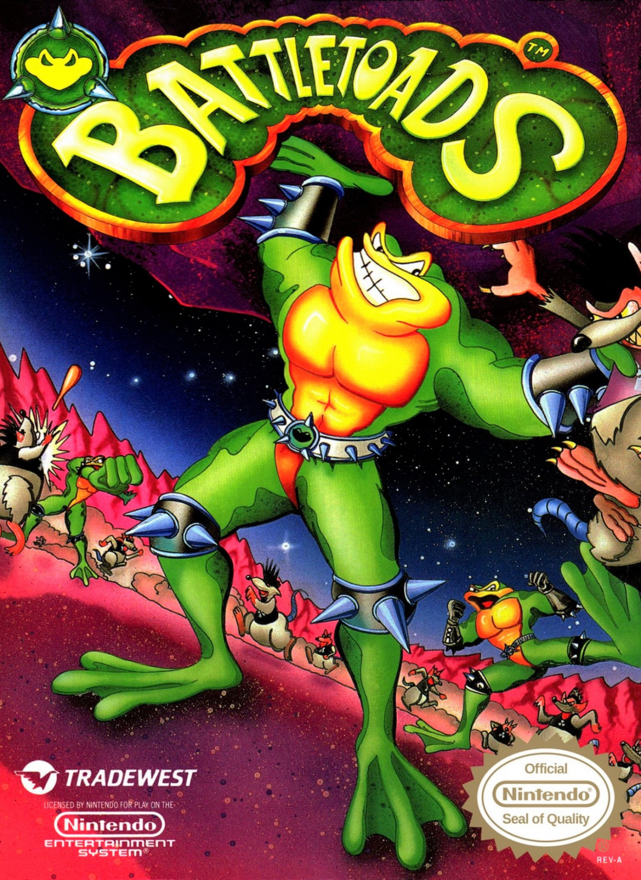
It's a classic cover — one which was also used in Europe — that captures the beat 'em up action of the game and features the three 'toads kicking some serious tail. We like the slanted horizon line a lot, and the rich pinky-red terrain and glistening star field work well against the green and yellow of the toads.
Throw in a big bold logo and an epic icon in the top left corner, and there's a lot to like here.
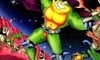
Japan

The Japanese Famicom box art gives the 'toads recognisably different appearances but removes the background in favour of green blotches on white (or is it white blotches on green?).
We love that you get to see the personalities of the protagonists reflected here, and their slimy skins look great, too, but we're not sure it's worth sacrificing the background. The kickass chromed Battletoads icon is gone, too.
So, you’ve seen the options, but which way are you leaning? Click on your favourite below and hit ‘Vote’ to let us know:
Thanks for voting. Have an excellent week and we'll catch you next time for another Box Art Brawl.


Comments 43
Nice cheesy cover art on the US release.
North America walks away with this one, which is rare for me to say in these boxart wars.
Wow, I thought this was the most savage beat down I've seen on here, but then noticed only 51 votes. haha But if it stays at this rate 92-8, this will be the most one sided I've seen.
@SoIDecidedTo With good reason. The Western box is perfection.
What about this cover rofl
https://imgur.com/gallery/Jcw7bDP
Western all the way, it’s so ballsy. That being said, I hate the abuse this game put me through LOL
Lord I miss that game. I wish MS would allow a reboot for Switch
As others have said, I went with the North American boxart, as awesome of a cover as you can get. Absolutely loved the game when I was growing up.
@BloodNinja
Did you laugh though? I played that game with my son and we always laughed all the way though.
Throw the Mega Drive/Genesis cover in as a bonus and I'm sure the voting would be a bit more split.
https://www.retroplace.com/pics/genesis/packshots/35953--battletoads.png
Wish I had bought the Famicom cart when it was available cheaply. The version that was designed for humans to finish playing.
Box Art Brawls Current Total:
Europe: 30
Japan: 32
North America: 35
Australia and New Zealand: 1
North America easily.
Japanese version reminds me to much of the Ninja Turtles.
I think this game is where my distrust of technology started. “Moooooom, the computer won’t let me win!”
@Zidentia Haha, I laughed at the music, but the game itself made my cry lmfao
No contest. Definitely NA
I will put a hit out for whoever prefers the Japanese one. Vinny and Rocko will be paying them a visit real soon. Blub blub blub blub
Rash for Smash!
@Tandy255 IKR? And Q*bert, Dig Dug, etc... these are the types of video game characters I want to both play as, and see represented.
(And to further add to the obvious; the NA box art kills it this time. Probably because it was made by a western developer who gave a damn about their game, unlike when a Japanese release is handled by a somewhat detached localization team... especially back in the 80s-90s.)
North America, easily.
That iconic NA artwork is probably a part of why people always ask if Gamestop have it.
Love blinds you all, Japanese cover is better.
JPN looks like teenage mutant turtle....
As great as it is to have all three toads on the
japan cover, the background for the NA cover is really awesome..
They’re both pretty bad. I prefer the JPN characters but the NA background.
I'll be honest I don't like either design, but the Japan one is just awful
North America on this one.... Even when the art seems like a highschool kid drew it.
@Scrubicius Well that was the idea of the game in the first place.
Japan's cover looks like someone put some Battletoads stickers on a marble notebook like I used often back in grade school. Not much of a battle this week. Western cover gets my vote.
I got the game when it was new. As a fan beat-em-up games, I really enjoyed it straight away. I even had no major issues with the Turbo Tunnel. Yeah, it required fast reflexes and memorization, but I did just fine with it and used the warp when I wasn't in the mood. But some of the later stages I just hated. The more I played Battletoads, the more I grew to despise it. It's one of the earliest exampled I can remember of just not having fun with a game anymore and thinking "never again."
I have to go with the NA cover art, the Japanese one looks like someone had fun all over it.
Box art aside, I recommend the Famicom version to anyone who bemoans the ridiculous difficulty of Battletoads. It a SUBSTANTIALLY easier version of the game.
@Zequio okay, yes. 🤔
That’s why it reminds me to much of the TMNT. 😁
Yes sir Nintendo Life, another brawl! More please.
🙄 Hmm... on the NA boxart is the toad wearing a red thong with a spiky-black- studded belt with a kiss mark in the middle?
@AvianBlue Pretty sure that's a toad head. Similar to the one on the logo... At least that's what I hope it is.
I like both equally.
No vote.
@AvianBlue well I’ll never un-see that now!
I've never heard of battle toads until now
@AvianBlue I think that picture on his belt is actually the shape of a frog
We need a BattleToads revival on Switch. It'd be a great co-op brawler, racer, platformer addition to the platform. So many good/frustrating/hilarious memories fumbling through the original on NES. Definitely an achievement to have beat it lol.
Btw the BattleToad characters should also be represented in Smash!
... Wun can only hope.
I have to say: both of these are hideous. Yeah yeah, I have the same nostalgic attachment to the NA one as y'all do, but facts are facts.
japan because one of the toads looks constipated and thats just too funny
Show Comments
Leave A Comment
Hold on there, you need to login to post a comment...