It's that time again, folks - yes, Box Art Brawl is back!
In last week's battle, we looked at Dragon Quest III for the NES, pitting North America against Japan. As we'd expected, the Japanese variant, featuring gorgeous artwork from the late Akira Toriyama, won hands down, pulling in 73% of the vote. Gosh, the North American design is nice though, right?
This week, with the announcement of five Mega Man games from the Game Boy coming to Nintendo Switch Online, we thought we check out the inaugural entry, Mega Man: Dr. Wily's Revenge. Released in 1991, it was the first Mega Man game to be outsourced from Capcom and was developed by Minakuchi Engineering. It was well-received and folks generally thought it was a strong take on the earlier NES games.
We've got a proper three-way brawl this week, so let's get cracking!
Be sure to cast your votes in the poll below; but first, let's check out the box art designs themselves.
North America

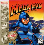
Okay, so North America's version isn't great, we'll be honest. At least in our opinion. It showcases Mega Man front and centre, but he just looks a little... off, don't you think? Granted, it's not as egregious as the original NES art work, but it ain't far off. Still, it has its charms... we think.
Europe

Europe's variant is much better, with Mega Man looking a lot more familiar. It's a neat little action shot and you've got some nice effects going on to indicate movement, but we must admit, we're not keen on the logo for this one. It's very 'Microsoft WordArt'.
Japan

Japan's version changes the name to Rockman World which, okay, that's fine, but the artwork itself is very cool. We've got several characters featured here, including Mega Man himself, and the use of colour is just lovely. It's taking advantage of the more elongated box design and we dig it. Nice.
Which region got the best Mega Man: Dr. Wily's Revenge box art? (1,907 votes)
- North America
- Europe
- Japan
Thanks for voting! We'll see you next time for another round of Box Art Brawl.
Comments 47
Artistically it's Japan, compositionally it's Europe. I think I'll vote the latter.
A moment of silence for all of the brain cells that anyone who picks NA have lost over the years 🙏
Like I said in another comment: Europe!
Puffy cheeks of the North American one makes me feel the iron suit is too tight 😆
USA version, seems that an bee hit the Megaman face.
The North American one its just reusing the art from NES Megaman 3…
its weird they insisted using such ugly design for the Gameboy game
American Capcom was awful with their box art but they where even worse with their game manuals…
I chose NA. The ‘inquisitive maniac’ facial expression which Mega Man is sporting really sets him apart from the rest. 😂
I’ve never seen that Europe artwork before, but I dig it.
The European one is the Dutch/Belgian box art. I love that! Also the first time I realise Mega man could be a translation of the title and no one would know! (/May-Gah-mahn/)
I obviously choose the Japanese one though, look at that beauty!
Japan for sure since it has more characters with the enemies surrounding Rock/Mega Man and an actual background, but I have to say that the European box art is pretty good and cool, too!
The North American one, on the other hand...
@NeonPizza
That made me lol irl. I now feel sorry for Mega. Definitely voting for NA!
I have never seen the EU box art before today.
It's pretty good! Feels like a 70s science-fantasy novel.
Japan is the only one to depict Megaman as he is and, for that, Japan deserves all the love.
Box Art Brawls Current Total:
Europe: 78
Japan: 77
North America: 89
Australia and New Zealand: 1
Japan for sure (europe version it’s not bad either) anything but the NA gnome version pf megaman (I’d rather have the fat old dude NES megaman cover, than the impish one)
Japan for the art style alone, though I like Europe's more focused approach too. Seriously though, what IS IT with the earlier Mega Man series box art in NA?
Uhh. Yeah. Rather obviously japan.
I mean it's litteraly the comparison I made last week when explaining comparing US DQ and JP DQ was like comparing US boxart megaman and OG rockman.
Easy choice, Rockman World it is.
Anyone who voted for the horrible Jonathan Taylor Thomas keebler elf American one is out of their mind.
I'm going with Europe
That tear is very stylish!
NA's Megaman just looks.... so funky. Europe looks pretty cool. Japan's though just has that cool and iconic classic Mega Man artstyle and you can't go wrong with that.
Also shoutout to toy store Bart Smit for being the one to have probably ruined that EU Dutch box with its big ugly sticker lol. Hated when they did that.
EU one looks like some kind of Mega Man Rollerball-style racing game. Which would be pretty cool. I’d play that.
North America keeping the tradition of horrrible Mega Man art alive and kicking. Though I must say, Japan's covers for Mega Man games always disappoint me too. They always look like fan art by someone who hasn't quite nailed the style down yet. His face looks funky.
Megaman's weird face on the NA cover reminds me of a garbage pail kid or something, haha.
I like those funky speed lines on the Europe cover so I went with that.
It’s weird how the NA box is a variant of the Mega Man 3 NES box art, yet the EU version has the same ‘MEGA MAN’ font as the NES Mega Man 3.
Japan’s Rockman World box art easily wins this category, however.
None of them are 100%, even Japan looks a bit off in places. But it’s the best by a county mile either way, and I do love that it looks like a scene from a Saturday morning cartoon.
@Olliemar28 What I like is this "Mega Man V" boxart from, I believe it was, a Canadian EBGames catalog from 1994. It's amazing in its unprofessionality: a edit of the Dr. Wily's Revenge boxart done in about five seconds in Windows Paintbrush (as MSPaint would've been known then).
https://hosting.photobucket.com/albums/g155/sahagin/mm5gblol.jpg
I don't recall if I saved it, but I remember they also listed a Game Boy with the Sonic 2 GG boxart superimposed on the screen.
@larryisaman It's just a cropped version of the NES Mega Man 3 boxart, which was reused by not only this but the famously terrible DOS "Mega Man 3" which was not only its own game but also a misleadingly titled game as there was no DOS Mega Man 2.
@KingMike And guess what it’s still terrible!
Japan is going to be the one for me. Original key art usually gets it done for me when it comes to Mega Man, especially in the early days. That NA one is using that MM3 (NES) art, which was a more proportionate take on Mega Man than the first two NES games, but he still looked like a troll in the face. That Europe art actually isn't bad and would've preferred it to the NA box.
@Lizuka Personally, I think the European composition is all over the place. The logo starts over a similar dark blue (hard to read). The three bands of colorful void that the characters are for some reason floating through… it just doesn’t make sense on any level to represent the game.
“Dr. Light, I know it’s your design and my input wasn’t asked for, but does the robot child really need to look this muscular? And something looks really off with his face…”
“Hm, y-you’re r-right, I did-didn’t aesk for your input”
What the NA cover communicates to me is that Mega Man is an abomination and always was the villain. That thing in blue just makes me want to ally with the righteous Dr. Wily to eliminate the threat.
Europe looks too cut-and-paste for my taste. Japan could be tightened up a bit, but the general composition and art style are pleasant. Japan wins for me easily.
Japan. Definitely japan. Although Europe’s is decent. Thank god we dropped that “American Kirby is hardcore” garbage.
@Poodlestargenerica OMG. "Jonathan Taylor Thomas keebler elf". Sir, you are a poet.
I will always vote for bad box art Mega Man.
@Lizuka And spiritually, it's North America.
I think all three are bad in their own way. Some of that early Inafune art is super amateurish and has bad composition to boot. But it is definetly the best of the three.
I love the 'awful' NES Mega Man. He gives new meaning to Sleep Paralysis Robot Master. The GB art is somewhat lacking comparatively.
Japan wins this one for sure. I always liked the Japanese art for classic Mega Man anyway. It has a simple, clean look that looks like it came right out of a tv anime.
Choose a game with more competitive options to have more excitement in voting 🤷🏻♂️
The NA artwork looks like a Troll doll in a mecha suit.
Japan's the clear winner here.
Europe. It's what I got as a kid and it's still in my possession. It's the first Mega Man game I ever owned and I still love it to bits, even though it has its flaws. To me, it's perfect and top 10 Game Boy material.
dude the NA is hilarious
Europe gets my vote today, like Japan's too
You guys in the top comments are cracking me up
Ahhh jeez that American box brings back traumatic memories of that very, very stressful game.
Leave A Comment
Hold on there, you need to login to post a comment...