Welcome one and all to the 39th edition of Box Art Brawl, a weekly bout between box art variants from around the world where you vote for the victor...
Last week Mario threw one of his dos on the N64 with Mario Party 2, a swinging shindig from before the formula palled a bit. Looking back we can say with certainty that Japan's cover was your favourite, with North America a distant second and Europe and even distant-er third. Mario parties harder in Japan, it seems.
This week we're sticking with the Nintendo 64 and 3D puzzler Wetrix. Lesser-known perhaps, but fondly remembered, versions of the game appeared on PC, Dreamcast and Game Boy Colour. Wetrix is something of a cult favourite and we looked at the making of this addictive little game a few years back. It’s worth a read if you're a fan or anyways wanted to check this puzzler out but never got around to it.
Subscribe to Nintendo Life on YouTube841k
Enough of that, though. Today we're only interested in the details of the covers that adorned the boxes of our three main territories. Let's dive in.
North America

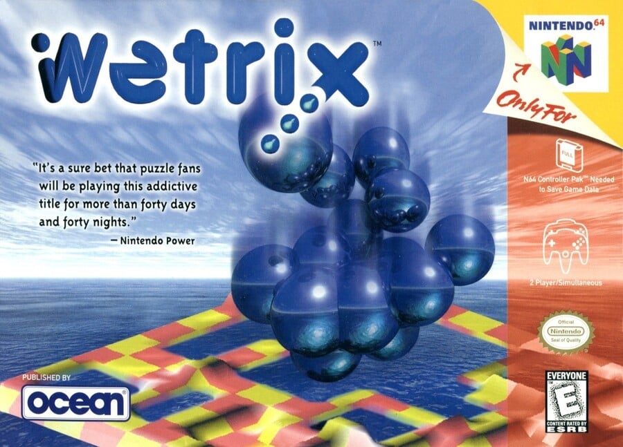
Beginning in North America, we get a blue sky against a blue ocean with a blue logo and blue spherical drops falling. Plenty of blue, then. Fortunately, the yellow-red patchwork terrain from the game below breaks things up a bit and mirrors the red strip down the right side of the box and the yellow background 'beneath' the peeled back 'Only For' in the corner. It's also noteworthy that this game required a 'Full' Memory Pak to save its data.
A Nintendo Power quote that makes reference to the great biblical flood occupies the space in the sky on the left, but does little to liven things up. There's a fine line between tranquil and boring, and we're not sure if this cover gets the balance right. Gotta love that Ocean logo, though.
Japan

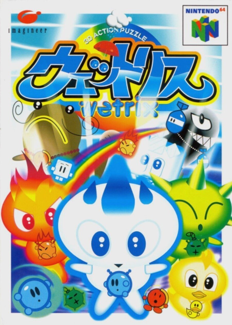
The portrait orientation of the Japanese box was given a white frame with cute characters from the game breaking out of it. The 'Wetrix' logo is still there just beneath the Japanese version, although it's partially obscured by light emanating from beneath the characters.
It's colourful, it's cute, but it's not grabbing us. Still, it manages to use a lot of blue without making us think they got a special deal on that colour with the printing firm, so that's something.
Europe

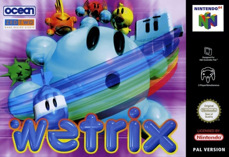
The PAL box put the cute little characters front-and-centre again, with the chunky logo taking up a sizeable portion of the cover along the bottom. The art doesn't give you any more idea of the gameplay than the Japanese version, but the reflective light blue of the characters implies some sort of liquid-y fun. There's no quote to tell us it's a puzzle game, but the '-trix' of the name probably provides all the clues you need on that front.
The black strip is a bit bland, but it sets off the colourful image, we suppose. It's a tight one between Europe and Japan for us, although this probably edges it. Our opinion means nothing, though - the choice is yours...
And there we are! Click your favourite below , hit the 'Vote' button, and sit back to see democracy in action.
Ah Wetrix. It's one of those games you always meant to play back in the day but may have never got around to. If you did sample its damp pleasures, let us know below; the rest of you feel free to hit ebay or your online portal of choice to see what a loose cart is going for these days. Catch you next week!


Comments 35
I know I’ll be in the minority, but I like the US box for actually representing the gameplay, instead of the character-loaded “3D Action Puzzle” of the others, which looks like it should be a very blobby 3D platformer.
NA, I appreciate the honesty of the cover in describing the game I’m about to play. @Gaga64 exactly what you said.
I had to debate between Europe and Japan. Gut reaction was Europe. But Japan won out. I never played this game when it came out because the box art was so bad here in NA. I had no clue what it was but if was just blobs of marbles falling from the sky on a platform below, ehhhh.
I loved marble madness though. If it was something like that, I missed out.
God they are all awfull
None of them even remotely tell you what the game is about.
The Japanese cover might as well be for an cartoony action platformer
I don't know whats going on on the pal one.
And the American one is just plain 90's cgi ugly.
Maybe next time we can have covers that are less of an eyesore ?
It's a tough week, and honestly none of them are good. NA's accurately represents the gameplay but is bland, Japan features the most appealing character & art direction but looks cheap, while Europe is probably the most technically impressive but has absolutely fugly character design (and the latter two don't really tell you much about the game itself).
I went NA for it's honesty, though.
The North American art box is so NOT appealing
This game needs a sequel/remaster, together with Tetris Sphere. Played both a lot on my N64!
Oh no you don't, I saw you add that period.
As for the brawl, the European one looks the most appealing while still showing the name.
They're all awful. NA is too literal and the representation of the gameplay on the cover doesn't give a single clue as to what's going on in this game. It looks like a cross-biking track. I chose Japan for aesthetic reasons because I think it's less messy than the Pal version.
@gaga64, I would want pictures like that on the back of the box. On the front I'd rather go with the Japanese or European covers. NA:s cover art may be honest, but it would certainly not have me picking it up in the store.
Thank you for choosing a game with 3 very different box arts 🙏 It's more fun that way
That Japanese one is bonkers! Love it 😊
Love the game btw, would really love a remaster on Switch.
That blue sky and sea combo on the North American version resembles that Microsoft PowerPoint slide background that everyone used in the early 2000s.
The American one is pretty soulless. I really like the Japanese artwork, though the European one is perhaps more in keeping with the style of the game (not that I've actually ever played it). It's one where that sort of overly-rendered late-90s 3D artwork actually kind of works.
They’re all rather ugly. But Japan I guess, since it’s the least ugly.
The US and Europe ones look like they're for 90s trance CDs.
@KitsuneNight ...but the US one is quite close to how gameplay is
I went with Europe's cover, though it and the Japanese art are close in my book. NA's is boring by comparison.
Many moons ago, back in the ol' N64 days I won a competition in Nintendo Magazine and they sent me a copy of Wetrix. I loved it... but was unfortunately absolutely rubbish at it.
Japan easily wins for me. The characters on the European cover suffer from looking like typical, plastic-like 3D renders from the '90s. As for North America, those covers start at a disadvantage in general due to the red strip and the peeled corner, which detract from the box art, in my opinion, the way they're implemented.
Genuinely can't understand choosing Japan or North America over Europe this week.
@TheBlixt true enough. To be fair my initial reaction was mainly “there were characters in there?” I really enjoyed the game back in the day and remembered the power-ups, but never realised they were meant to be characters... so the US box kinda felt more honest...
Japan's bonkers art wins me over again!
Interestingly, the Katakana is read as "uettorisu," or "Wetris." That's a better name, but I suppose someone was trying to avoid a lawsuit in the west.
Easy. Never even played the game or know anything about it, but any cover that doesn’t look like an N64 cover gets my vote. N64 covers are all just the WORST. Designers, drunk with power over the discovery of computer generated imagery, left to their own devices. It’s truly horrid stuff.
The Japanese katakana title sure looks like "Wetris" to me. I'm not seeing the addition 'ku' which would distinguish the -x (uettorikusu) from the -s (uettorisu) sound.
Cheeky.
@Corum I think Europe's one summarize it very well.
@DockEllisD
But there is a blue Kirby in the Japanese cover version, see botton and left.
For me, the European box captured that elusive dreamy feeling that probably would be described now as sitting in between vaporwave and Y2K aesthetic.
I bought the game because of that art (and because I'm a huge Tetris nerd) and I liked it very very much.
Enough that I was always a little bit annoyed about not getting to play Aqua Aqua on my GameCube.
Rented this from Blockbuster back in the day and really enjoyed the ensuing weekend’s gaming. The boxarts are all pretty terrible but the game itself is really addictive.
I hope Nintendolife talk about the box art for "Advance Wars: Dual Strike". The Japanese box is just plain terrible. Why use plastic figures? No wonder Advance Wars flopped in Japan.
https://gamefaqs.gamespot.com/ds/924889-advance-wars-dual-strike/images
@KingMike
ヰ (Wi) and ヱ (We) are obsolete characters in modern Japanese, which is why they don't go with ヱトス (Wetosu) for the title.
So they instead use ウェ to make the ヱ (We) sound instead. So this makes the Japanese title: ウェトス (U~etosu)
This makes me wonder, do Japanese players pronounce it as we do in English, or use the Katakana pronunciation?
Box Art Brawls Current Total:
Europe: 11
Japan: 15
North America: 13
@RadioShadow I don't think it's that bad. Not sure how exactly the franchise was marketed overall in Japan but that certainly gives a more comical feel. I mean, Super Famicom Wars' intro animation has one side attacking the other with a giant cardboard tank.
Indeed, the Japanese commercial is looking pretty ridiculous.
And it doesn't look the others were very serious either, with drill sergeants making troops sign about the game.
https://www.youtube.com/watch?v=moMR1kZKtRM
I would guess part of the reason Advance Wars DS might've flopped is that it was released half a year after Nintendo had just released the two GBA games on Japan as a single game in Japan. That sounds like overload.
(I know about the unfortunate timing of GBAW1's Japanese-non-release, but I don't know if it quite makes sense logistically. They would've had to had presumably thousands of JP copies all printed up and ready to release and you want to tell Yamauchi to never, ever release them? Even if they were to call a delay of release with only half a day notice, I don't know how feasible that is in reality.)
REBOMB
REBOMB
REBOMB
What a fantastic game! I wish I still had it.
Wetrix is my #2 puzzle game of the 64-bit era,
with only Tetrisphere topping it.
Where are the remasters???
@gaga64 I agree - but it still looks boring, so I voted for the other ones.
Show Comments
Leave A Comment
Hold on there, you need to login to post a comment...