Hello everyone, and welcome to another edition of Box Art Brawl, the weekly vote to find the best of three regional retro game box art variations.
Last week we ran away from the headliner in Resident Evil 3: Nemesis. For the first time ever in this series the votes resulted in a dead heat between North America and Japan, both tied with 37% of the vote while Europe languished in a guaranteed third place. Unprecedented!
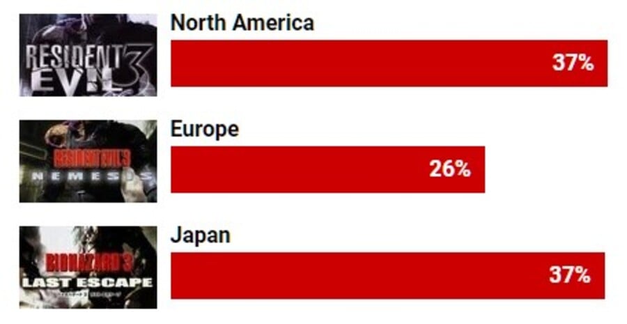
Fortunately, we were able to unscrew the back of the buzzing mainframe here at Nintendo Life Towers and get a more precise look at the figures behind those percentages. Exactly one week later we can reveal that there's only 5 votes in it - the winner of Box Art Brawl #37 was in fact (drum roll)...
North America with 605 votes to Japan's 600! That's the closest result we've had thus far in this series. A shame neither of the covers was a masterpiece, but - hey - that's all part of the fun.
This week the fun goes up a gear as Mario throws another party in the imaginatively named Mario Party 2 for Nintendo 64. This game celebrated its 20th anniversary at the beginning of the year and it's a very solid entry in a long-running series which has had its ups and downs but keeps on trucking, most recently with the rather good Super Mario Party.
Ready, then? What do you mean you'd rather stay home? C'mon, it'll look bad if we don't at least show our faces. Oh, it'll be fun! Grab a bottle and your N64 pad - you know his are always knackered. Yes, yes, I remember the last one; it'll be different this time! Oh, come on, get your coat...
Japan
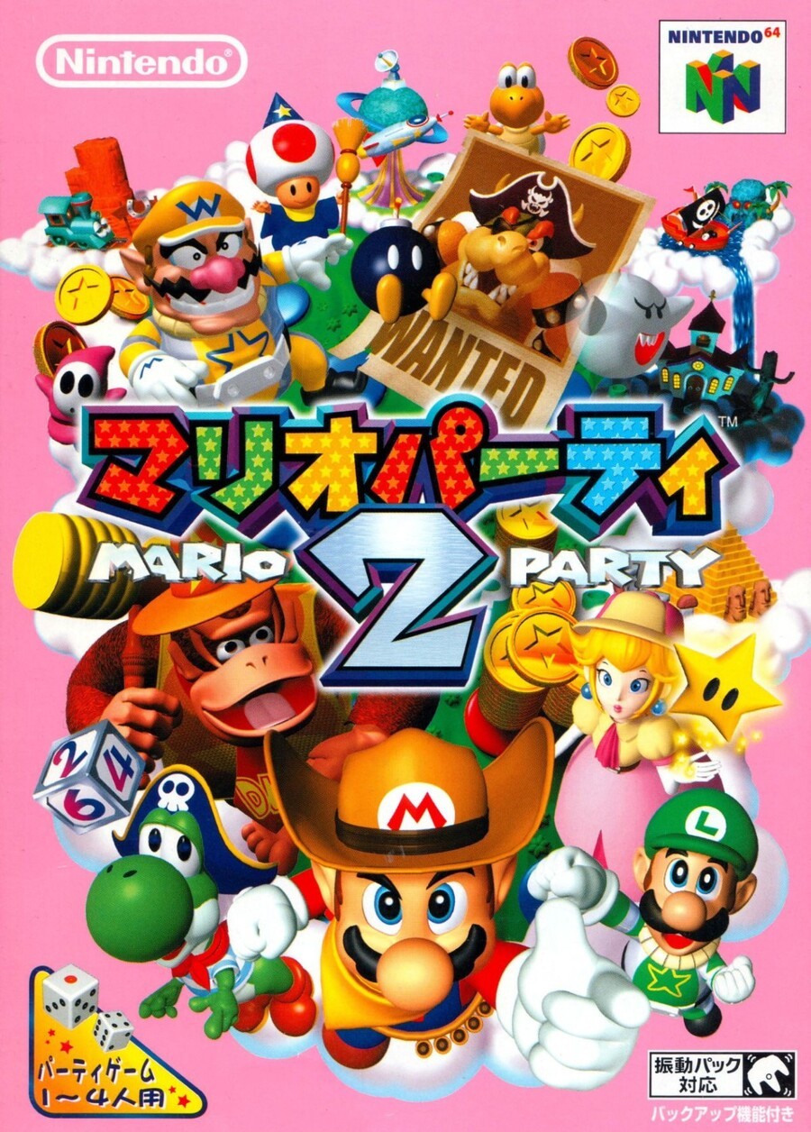
We begin in the East with an explosion of characters against a pink background. Beneath the Japanese title the logo includes the English title, although stylised as 'Mario 2 Party'.
All of the Mushroom Kingdom crew are wearing fun costumes, with Mario in a cowboy get-up, Luigi sporting an Elizabethan ruff and Yoshi only missing an eye patch for his pirate costume. There's lots going on, perhaps too much, but we like it. Extra points for Wizard Toad.
Europe
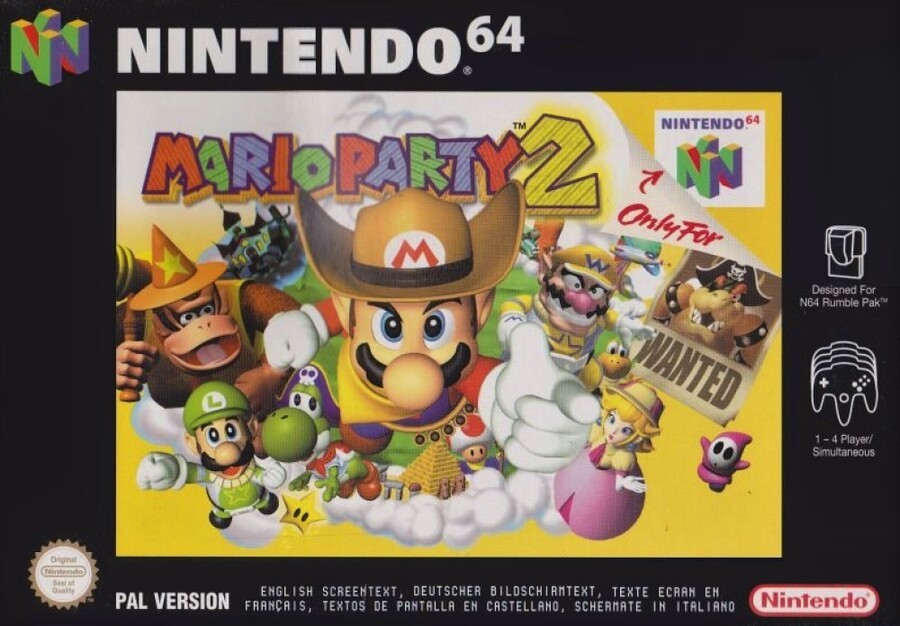
The EU cover uses the same bits of key character art rejigged to work in a landscape orientation. The pink background is replaced with yellow and it's framed with the standard black border common to most of the Nintendo-published N64 catalogue.
Including most of the elements from the Japanese version, we like the way this brings the focus on Mario, although minus points for hiding Wizard Toad's hat.
North America
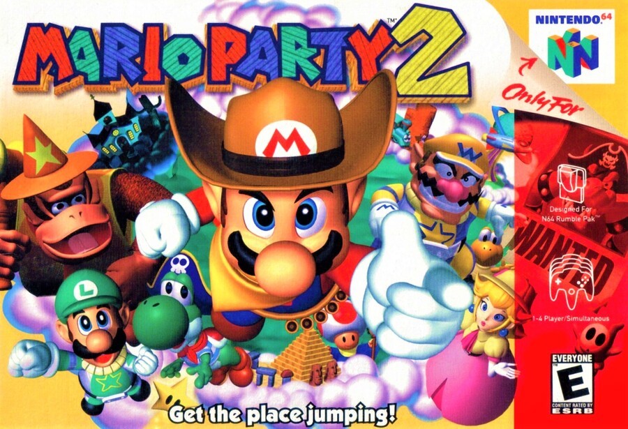
The North American variant uses the same art as the European version, although it replaces the black border with the region's trademark transparent red strip down the right side. This means everything is larger, although the cool Bowser 'Wanted' poster is obscured. This version also gets an exclusive tagline: "Get the place jumping!"
The difference between the European and North American versions are slight (as with so many of Nintendo's Western covers) but significant. We like them both, although we think they missed a trick with that tagline. The 'g' on the end of 'jumping' betrays a straight-laced, repressed attitude that implies more of a genial soirée with delusions of grandeur from a desperate host. This Mario Party (the Second) sounds like warm G&Ts and a plate of vol-au-vents, that sort of thing; not an out-and-out, furniture-in-the-garage, lock-away-the-china, proper party-party. Mario needs to chill out if he really wants to get the party jumpin'.
Or maybe we're reading too much into it.
And the party's started! Click your favourite of the three below and hit the 'Vote' button to let us know which one you think looks like a riot.
Yeahhh-y-yeahhh-y-yeahhh, que no pare la fiesta, don't-stop-the-par-TAY! Have fun lovely people, and remember to pace yourselves. Until next week, stay fresh.


Comments 38
This is the easiest one yet. Wizard Toad for the win!!! Japan all the way this week.
Lets get the place jumping
Heh Pirate Bowser. Japanese for this one
Too easy. Europe’s colours are too muted and the border really hurts it, and the US one feels too busy and cluttered.
Japan by a country mile!
Toss up between Japan and NA for me, however the tagline "Get the place jumping" really didn't resonate with me. Japan this week.
Hiiiiiiiiiya! Its a ko for japan.
People have horrendous taste. That’s all I’m learning from these polls. Last week more so than ever.
Japan is the obvious winner.
Why were Japanese SNES and N64 games boxes portrait while Western one were landscape and it was mainly vice versa with the NES?
Wow, I hated the Japanese cover. It's a visual mess, like Nintendo barfed all over the cover. The other two are pretty bad, too. Much too busy, all three of them. Showing less is more.
This is the closest I’ve come to voting for the US artwork yet in terms of the look but it loses too much of the artwork so I’ve got to go with Japan.
@Enigk
That's a good question. N-Gage is the only other format that I can think of that used a landscape orientation for their boxart. That is something that an interviewer should ask next time they interview someone higher up. I wonder if it was just to be different or maybe intentionally taking up more shelf space to crowd out their competition (although that could really backfire).
Another bunch of ugly covers.
Torn between the pal and USA versions.
I like the clean austerity of the black border of the pal version, but the colors are so muted
Neither of them are a horrible cluttered barf-ball of a mess the Japanese version is though
Next time could we get a NES or SNES or maybe even a GBA orDS title comparison ?
I'm digging the layout and pink background of the Japanese version.
I believe that North America won last week with 38%.
I always wonder what the point of these is when all three covers are just the same image, but framed differently. Anyway, only the Japanese cover has the full image, so that gets my vote.
I don't know. US and Europe are the same and I don't like the look of the "2" on the japanese one.
I remember as a kid always hating how the wanted poster for bowser was “hidden” in the NA version.
Seeing it so clearly in the JAP cover makes me even more sad! It’s so cool.
JAP by a mile.
Definitely Japan this time. It has the best character spread IMO.
WIZARD TOAD. WIZARD TOAD. WIZARD TOAD.
I really like these more when the covers are actually different. The RE3 one was just which had the better lighting and colours. This one is just more that they had a picture, so which one did the best with conforming that picture to the box size in each region (or cramming as much of it on there as possible as the case may be).
In this case, the Japanese one would be the original art and has more spread as it was originally designed for that box.
The NA one crammed as much of it as they could better than the European one did. I don't know why they insisted on that awful black border on so many titles.
European one I'm not keen on due to the black border (as with most if not all 64 games here), the US one the red strip on the right ruins it so Japan wins for it's lovely use of pink, my favourite colour.
Japan for me. The artwork is originally in portrait orientation and the cover looks better that way. The Euro border doesn't look good. The NA red strip is also not so good. Plus, I don't like the tag line.
Clearly from a time when making a gun gesture on product aimed at children was deemed acceptable.
Never noticed the Bowser wanted poster on the NA version. Eitherway that is the one that gets my vote. The Japan feels off to me.
The Japanese cover is just the NA one with more characters and more chaotic nonsense. Easy pick this one!
Love that pink background. Once again, Europe's box ends up looking like a rental store's reproduction.
I've never cared for the tacky look of the pastel background / super-busy smattering of objects combo in other promo pieces. Makes more sense with something like Hello Kitty or some such. Less can definitely be more, and it doesn't have to be as extreme as the SMB3/SMW NA boxarts. NA gets this one (although that color saturation is super-noticeable).
Wizard Toafd gets my vote. Wizard Boo in Mario Party 4 is also adorable
While Wizard Toad is pretty cool, I'm just not a fan of all that pink in the Japanese Box (even on Easter!).
Went with NA this week.
I have a lot of nostalgia for the NA cover, but I think Japan is the clear winner here.
Colours seem off to me in both the PAL and NA scans, the saturation is off in the PAL and there’s a blue cast to the NA. However, even if these were good scans, the design is just better for the Japanese version. Still all bad though! The N64 covers, man. What a dark time for design.
Well definitely the Japanese box. PAL boxes are just like the NA boxes except they got that ugly/pointless border around them.
As superior as the Japan box is, this is some really great cover design for a Nintendo game. I'd love to see a future Mario Party game dress the characters up in costumes again. Also how about that Pink backdrop? I feel like there was still a strong distain for using pink on most products because pink had been seen as something exclusively feminine by that point.
Japan all the way for me.
Box Art Brawls Current Total:
Europe: 11
Japan: 14
North America: 13
@Kabloop
Huh? The european one is the same as the north american one. 🤨
Japan for me but they could have chosen a better background colour scheme.
(Probably still arguably the best MP game to date)
Show Comments
Leave A Comment
Hold on there, you need to login to post a comment...