Welcome to Box Art Brawl, the weekly perusal of regional retro box art variants that ends with a vote on the best of the bunch.
Last week Perfect Dark for the Nintendo 64 battled itself in round #34 and, quite frankly, we thought Japan's moody red and black cover would absolutely destroy the competition, as lovely as they are. We'd even avoided doing Perfect Dark because the result seemed so painfully predictable, but it turned out to be much, much closer than we expected. Japan still won, of course, but with 41% to Europe's 33%, with North America coming in just behind that with the remaining 26%. A far more even split than we had anticipated.
Subscribe to Nintendo Life on YouTube843k
This week you might have heard that there's a new Animal Crossing game on Switch? Well, we thought we'd go back to the very beginning and take a look at the first one. To be honest the differences between the European and North American versions are minor, but with a couple of bonus Japanese covers to enjoy, we threw caution to the wind.
Come on, city folk, let's go to the forest...
Japan
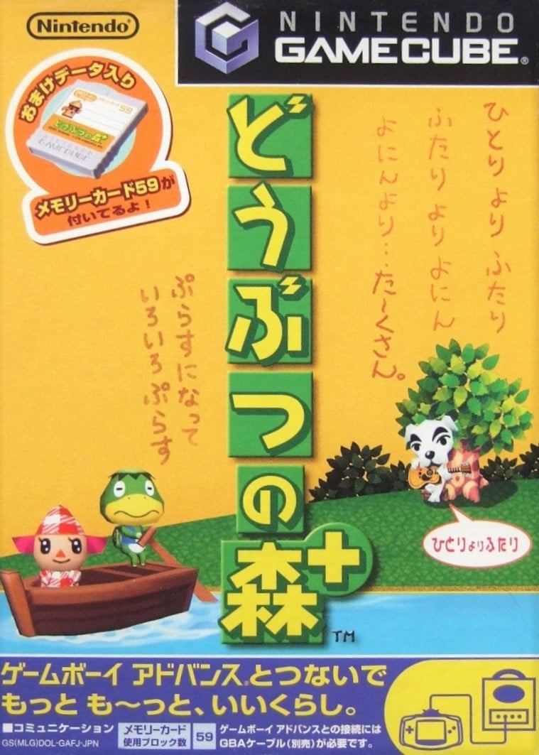
The Japanese version for GameCube wasn't the original - the Japanese game began life on Nintendo 64 - but it carried over the yellow theme of the original (which you can see at the bottom of the page). The GameCube port of Dōbutsu no Mori or 'Animal Forest' had a '+' added to it along with GBA connectivity enabling you to visit a tropical island via Kapp'n's boat, and you can see this referenced with said boat at the shore.
We love the yellow, we love the characters, we love the boldness of the logo. The top half is lacking a little something, perhaps, and the strip at the bottom is a bit noisy, but it's not bad.
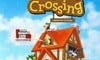
North America
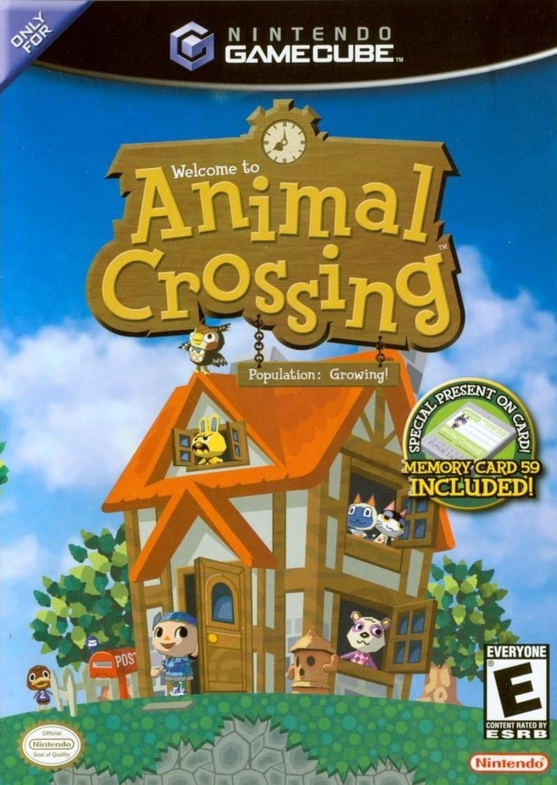
Again with the Memory Card 'sticker', the North American version puts a lovely house front and centre, with various animals poking their heads out of windows and the villager coming out the front door to check the post. It's all set against a beautiful blue sky as Blathers stands on the roof, presumably about to nod off as a new day begins.
Full of optimism and promise, it's a winner in our eyes. If we're really searching for issues, the wood-to-letter ratio of the logo is a little wood-heavy, maybe.
Europe
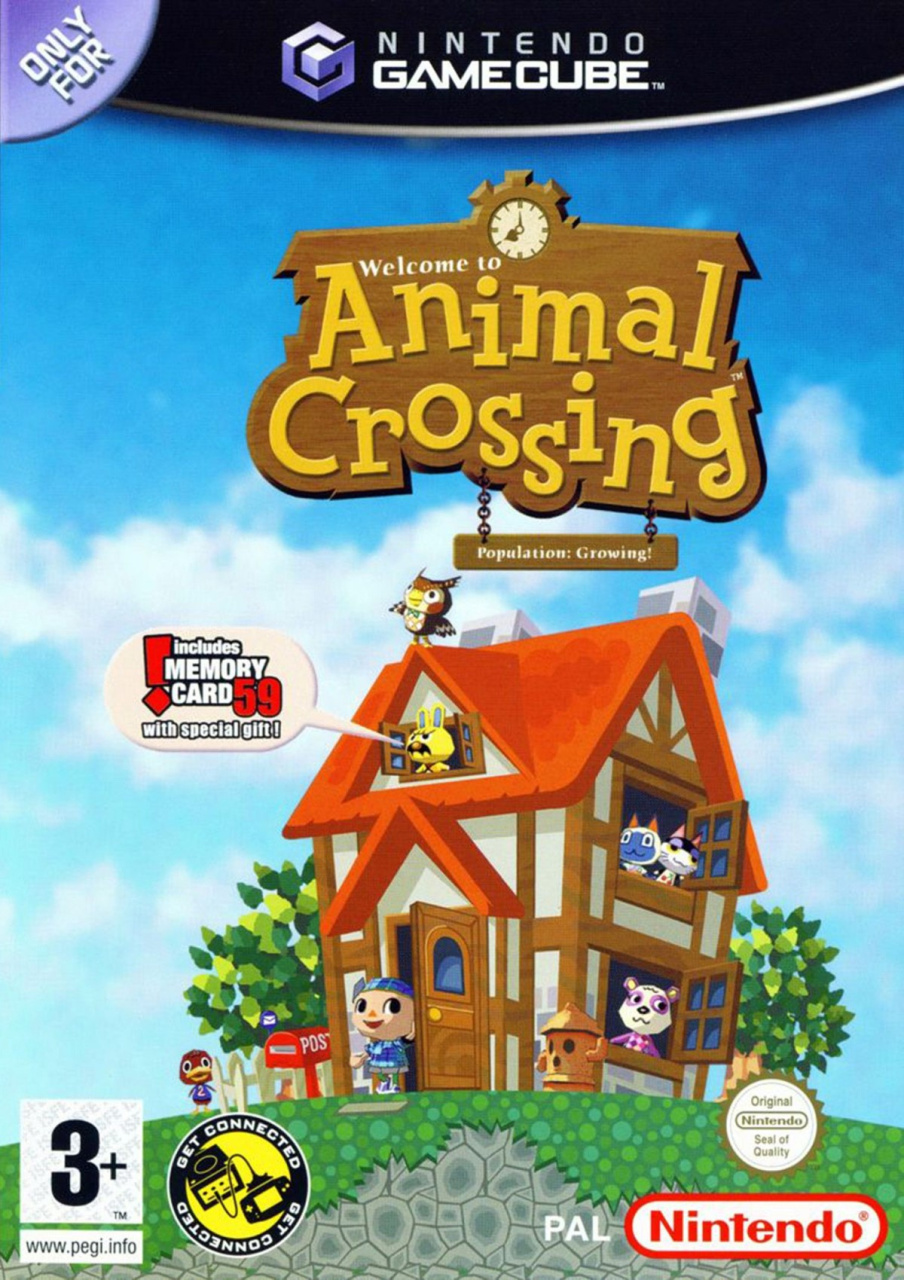
Finally we have Europe which reduces the size and reframes the house and the logo slightly to the right. The memory card 'sticker' is replaced here with a speech bubble coming from Gaston the grumpy yellow rabbit. This one also highlights the GBA connectivity that wasn't advertised on the NA box with a natty little black, yellow and white stamp which we're rather partial to.
It's all much of a muchness between the non-Japanese pair, to be honest. It all depends on the details you prefer. Bigger house or speech bubble? PEGI or ESRB? Get connected or... get a better view of the grass?
Bonus!
Seeing as Japan got not one, not two, but three versions of this game (the N64 original, the Gamecube '+' port and the 'e+' version which added e-card features and a host of updates that brought features and events from the North American localised version back to Japan), we thought we'd include the other two for your delectation and delight. They're not in the poll, but are here to be enjoyed all the same. We particularly enjoy the postage stamps on the N64 box:
And there you have it! All that's left to do is click your favourite variant below and hit the ol' vote button:
We hope you're enjoying New Horizons. Let us know below if you think the N64 or 'e+' versions trump the three in the poll and we'll see you next time for another round.


Comments 36
I like the brighter colours, slightly more zoomed out perspective, and the angry yellow rabbit with a moustache yelling from the window that a memory card is included better then the US alternative, and I like both better than the Japan one.
But the enveloppe N64 one is a very close second, and in a different mood it might actually be my favourite.
I voted the USA cover.
@Shambo I think the vibrancy in colours between the NA and EU copies is just the image that’s been uploaded rather than the actual artwork but I agree I think the zoomed out view is slightly better
First time I think I voted a US cover. Looks more balanced than the PAL one.
I could see "!includes MEMORY CARD 59 with a special gift!" becoming a meme, like this:
Gotta give it to Europe this time. Much nicer looking.
What were they thinking with that cover in Japan?
I don’t usually end up voting for the NA ones, but I have to admit it’s better balanced. The Japanese one is, unfortunately, a bit busy, and doesn’t really capture the vibrancy of the game’s world IMO. Yellow is never a colour I’ve much associated with AC. All about that triangle grass.
9% of people are trolls, apparently.
USA just edges it due to better presentation of memory card. The EU one would have won due to being brighter but the god awful speech bubble kills it.
@Robzilla Or, and follow me here, they have a different opinion than you do?
Good to see a North American cover that was actually nicer than the others for a change.
@WesEds
Ah... I went for Europe because of the extra vibrancy of the colours. Have I been accidentally hoodwinked here? 😆
I went EU for the color difference as well. Shame on NL if they used a bad image of the NA one then. 😝
NA, easy. Europe's is mostly redundant, with an off-center house and an unsettling amount of wasted space.
@Dtbahoney Some things are just objectively less appealing than others. Like that Japanese cover.
North America and Europe box art both win.
Both of the bonus Japanese boxes trump all the others.
Definitely America and Europe over Japan. They look a lot more "Animal Crossing" to me. I went for America over Europe, because the Europe one is off-centre and thus looks odd.
I went with Europe this time. I prefer the slight color change on the box art and the slightly more subtle memory card blurb.
I think the Japanese cover is pretty bad, and between the other two I like the sharper contrast in the Europe version.
Hmm, missed last weeks, but I would have said US on that one. Just showing here eyes was effective. Also, prefer the art of her there. Japan's looked rubbish to me. Maybe people liked it because the woman was real? This time I say Europe. Colours are far more vibrant. Seems I usually have different taste to the majority.
Technically the first Animal Crossing was the Japanese-exclusive N64 version.
Also between the American and PAL version, which shape do you like your "ONLY FOR Nintendo" icon: circle or triangle?
I don’t like how the EU version shifted everything to the right, especially the logo. The logo should at least be centered, because otherwise it just creates too much empty space. And while the JP one is soothingly subtle, you also don’t get a clear picture of what the heck the game is actually about.
US is winnah
Box Art Brawls Current Total:
Europe: 11
Japan: 12
North America: 12
The off-Centre logo and the shouting rabbit ruin the EU version for me giving NA the win this week. The Japan N64 and e+ editions are both really nice though.
I'm still amazed that you thought Perfect Dark's Japanese cover would be the overwhelming favorite. People have different opinions and that's fine. But I never saw why you'd think it would be nearly universally loved, and the poll results showed it wasn't. It's not even a good cover in my opinion. As for this week, I don't really like any of the Japanese designs. I like some of the details of Europe's cover, but the composition takes a hit due to being off center as others have mentioned. As a result, I picked the North American cover.
Voted NA. It just has a bit better presentation than the EU one.
The Japan cover is... not great haha.
God they are all ugly.
The japanese covers are hideous, voted Europe because the colors are brighter .
And the fact that the hideous Z- Grade softcore erotic thriller "cover" of the Japanese Perfect Dark actually WON, last week is an unpleasant surprise
I thought that thing would be flushed down the drain by the better competition.
@Jayofmaya
It was thankfully just a very smal margin but the Japanese cover of PD is garbage
It has nothing to do with the game what so ever.
@WesEds Yeah probably, the logo's all seem like the colour quality of the picture is just not very good.
@KitsuneNight Nice to see I've got another in my vessel! Let's set sail, first mate.
@Jayofmaya
Arr Keptin !
From what I recall a lot of the comments hated the Japanese PD cover last week.
That rabbit seems quite angry about the special gift.
North America all the way!
the US box art really capture the essence of Animal Crossing.
Show Comments
Leave A Comment
Hold on there, you need to login to post a comment...