Eyes. Yep, this is the latest controversy amongst Pokémon fans. We've left behind the five frames-per-second Gyarados' and Magnezone's flying through the skies of Hisui in Pokémon Legends: Arceus already because there's a brand new Pokémon game to talk about.
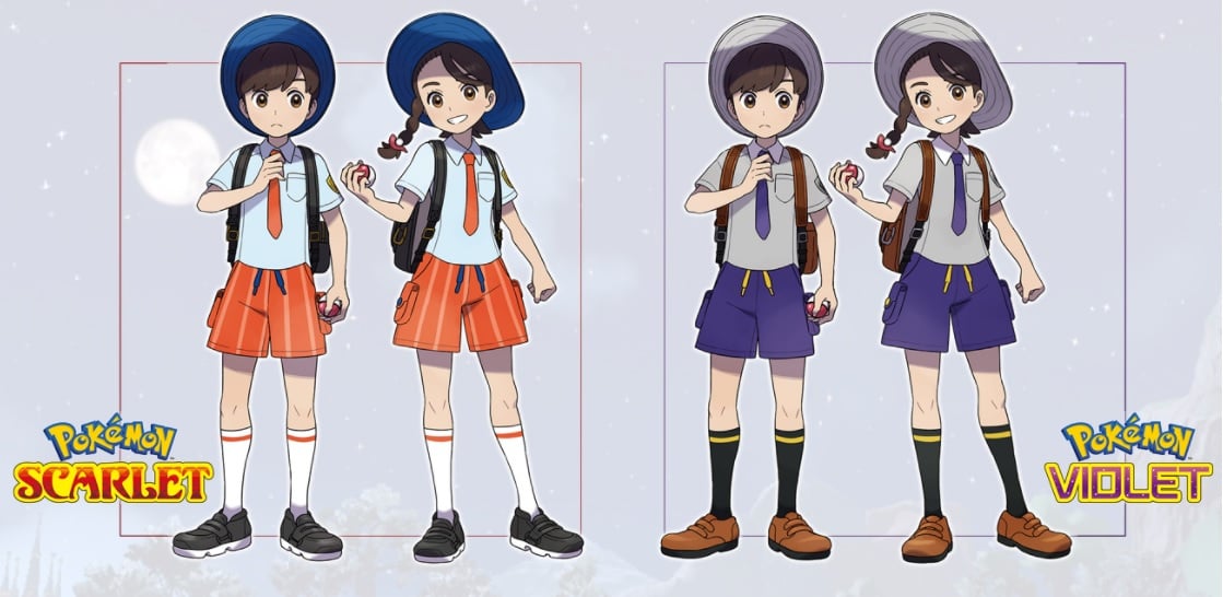
Pokémon Scarlet and Violet introduced us to a sparkly, sunny new landscape, three utterly adorable starters in the form of Sprigatito, Fuecoco, and Quaxly, and two new trainer designs. And it's that last thing that's got people going.
Kotaku recently reported that many budding gen 9 Pokémon Masters are unsettled by one particular part of the new male and female trainer designs — their eyes.
The trainer designs themselves are quite a bit different from previous generations. Most notably, both the male and female trainers are wearing the same attire — a white collared, short-sleeved shirt, a tie, a blue hat, and a pair of shorts. It's the first time the pair are (initially) identically dressed, though Legends: Arceus' pair were pretty close too. We think it's great that The Pokémon Company is standardising these designs, regardless of gender. And besides, who actually keeps their trainer in the default outfit once you unlock shops and customisation?
But it's the eyes that people are fixated on, specifically how round they are. Just comparing them to previous trainer designs, Scarlet and Violet's pair have smaller more realistically shaped eyes, as opposed to the bigger oval eyes we've become accustomed to. Some Japanese fans have even said the eyes make the characters look like dolls!
This seems like a logical jump forward, however. Since the series' jump to the Switch, trainer designs, in particular their in-game character models, have been a lot more proportionally accurate. Even the 3DS games, and Brilliant Diamond and Shining Pearl, were experimenting with this by just using full models in battle and chibi-fied models on the field, or by using a slightly-bigger character model across the board.
We've barely seen them in action at this point, and there may even be options to change the eyes in-game, so whether this is a bit of a reaction to some bigger design changes, remains to be seen.
The trainers aren't the only thing about Scarlet and Violet that have been subjected to eye-related analysis. Our little Grass Cat Pokémon has a case of the old Scarlet and Violet eye problems too if you look really closely...
Can't see any problem? No, neither could we originally, although various fans took to correcting the perceived issues with the official art. For example:
Still can't see? The eyes have been levelled in the edited versions, and one has been rotated a bit. The ears have also been tweaked very slightly.
It might just be the angle it's looking out at, or it might even be deliberate (a dizzy, grassy cat does sound pretty endearing, doesn't it?), but it doesn't change Sprigatito in our eyes. Who says Pokémon have to be perfectly symmetrical, eh?
What do you think of those soul-piercing eyes? And do you still love Sprigatito despite their off-centre eye? Make your vote heard below, and drop us a comment if you want as well!


Comments 113
Sprigatito is my child and I will do anything to protect her
There was no problem with the eyes in the first place Just a stupid rumor from some "influencer"
Why does Gamefreak always design human characters with two eyes.
What about Pokemon fans that have only one eye? Gamefreak is so insensitive.
@Erigen Roggenrola.
Just some uptight digital artists over-scrutinizing. It’s what people do on the internet.
I didn't really notice Sprigatito before...I can see it now but it's not a massive deal to me.
The trainer eyes I really don't care about, they look fine.
I guess someone is bored so they need to come up with something "controversial."
@Z-Core fixed it. :3
I'm just saying, always flip the canvas on your work. Always.
@Erigen We only ever see one of Cynthia's eyes. And she's a league champion!
CrEye baby issues, yes 👶
Eye problems?
...
Eye problems???
........
No, seriously, EYE PROBLEMS?!!
Even by fandom standards, Pokemon fandom can officially go eff itself.
Eye don't see any issues.
This is a non issue.
Oh my golly gosh, pre-order cancelled!
Out of all the potential issues that the games probably have, eyes would be pretty low down on the list.
@swoose If you flip her image, you can see the other eye.
I'm happy that I'm able to enjoy games without complaining about every nonsense
Removed - offensive remarks; user is banned
@nhSnork My thoughts exactly!
I swear these internet complainers are trying to make any and everything about these games controversial. If you don't want the games, think they are too early, etc. That's fine, just don't play them. But trying to turn everything into a controversy is just tactless and childish. I just saw a fool's article yesterday about how to starters are too cute. Like, what? 🤨 The clowns are out in full force guys. 🤡
@MostHandsieBoy Your avatar works really well with this comment hahaha
Sure wish Nintendo would call in a favor with Bandai Namco to teach Gamefreak how to achieve a proper anime art style.
This soft, edge lit, low res texture style is getting old quick.
Guess the next issue will be "Quaxly looked too much like Donald Duck".
"Oh no, Gamefreaks was so lazy. Donald Duck ripoff. Boooo....!! I'm done with Pokemon games!!"
Btw, the eyes was an issue?
Look at the eyes design for my Chibi Boxers. I drew with big cute eyes.
People love to complain. It’s fun.
@Erigen 'Monoshade' the eye patch pokemon
'Eyes'? Geez, its anything and everything with this fanbase...
I think, with the Spirigatito eyes, it's a thing that artists notice. Eyes are really hard to get right with where the gaze is and the proportions.
We'll never be able to stop arguing about the smallest of things in this series, will we?
Anyway, I didn't think people were getting too up in arms over the trainer's eyes (I thought they were just annoyed over the literal childishness they emanate compared to other protatgs). As for the whole Sprigatito thing, seeing it when it's pointed out, yeah it does look a bit odd but from the angle of the drawing it's not a big issue. Even when it's flipped, it's not really meant to be viewed from that perspective so obviously it looks bizarre in comparison. That's my outlook on it at least.
And hey, I'm not even picking Sprigatito so it really doesn't bother me in the slightest.
Really? Eyes? This is a new level of whining.
If the eye textures were like, egregiously bad, sure, but they’re fine. Not a huge deal.
The Sprigatito thing is funny though.
@Dubbicakes Hey Bandai can you please teach us how to not sell 30 million games a year like you guys?
hou du u draw swordfites bandai
like that?
They were so lazy they just threw a blue hat on a duck and said "Oooo Look, new Pokemon" but the eyes were the problem? haha
I really like the new avatars.
Leave the adorable new avatars alone!
I don’t think I’ve ever cared less about anything than I have the Sprigatito eye thing. Could be intentional for all we know (and if I were the artist I’d for sure come out and say it was purposeful regardless of whether it was or wasn’t just to get to people shut up).
Removed - unconstructive feedback
The outfits being similar makes me think of uniforms. Especially the hats. But people are saying the new region looks Spanish so it makes sense to wear a big hat.
Is this some sort of joke?
OK, this is a joke, right? We're really debating this? This?
I guess that's why I initially thought these were fakemon.
No issues with the eyes, but I do have a issue with them standardizing the designs, as is I can't tell the playable trainers appart on screenshots unless I look at their haircut. I hope the genders atleast have some exclusive clothes later on, I liked to be able to tell the characters appart and pick my favorite, if this trend continues, either both will be ok or meh
@MostHandsieBoy The Pokemon games are in dire need of a better art direction, or better use of their assets in general. There's no reason environments and objects should look blurry because of low textures when Nintendo owns a large portion of the Pokemon Company and could actually teach them to make games look as clean and crisp as their first party titles.
You act as if Gamefreak doesn't have room to improve because they're already successful.
@Dubbicakes my point is Gamefreak doesn't need to take lessons from a company who relatively unsuccessfully cloned Pokemon in anything.
People have a problem with the baby doll eyes but not the giant, anime eyes which are even more unrealistic?
On the plus side, everyone in this comment section doesn't seem to have a problem with any of this. What a non issue.
Jesus there just eyes I think yeh new Pokémon look awesome and that fire Dino is mine 😊
Who knew such a small issue could attract such eye…r.
…Eye…yerr.
IRE! AS IN ANGER OR ANNOYANCE!
I’M MAKING A JOKE
@MostHandsieBoy You do realize that Digimon and Pokemon hit the market within months of each other? Neither was a clone of each other (...both were of Shin Megami Tensei but that's another story)
The trainer designs are butt ugly to begin with, not just the eyes but the overall designs are God awful and incredibly boring. They're the first who I'll actually be really happy to customize out of those ugly outfits, then the eyes can be hidden behind sunglasses too.
@MostHandsieBoy Whether their games sale well or not Bandai Namco games objectively look far better than Pokemon games and have a better understanding of how to achieve an anime art style. Pokemon as a whole is marketed as anime in its art direction no matter what genre or medium its in, Gamefreak clearly doesn't have a grasp of how to achieve that in their 3D games and could benefit from any number of studios already achieving incredible anime styles. I've only suggest Bandai Namco because they have a very close working relationship with Nintendo.
@NinChocolate that plus media outlets need those extra clicks because of this "news"
One of my friends pointed out how this new art style isn't necessarily "new" and it was something that actually came out of Bandai Namco, coming from... you guessed it: New Pokémon Snap!
It's definitely not a bad change, certainly a push for something less...anime (yep, love those jokes about how Pokémon is no longer an anime).
I do wonder why they went for the change
And Quaxly looks like Trump.
I knew there was something going on with Sprigatito's eyes! They looked very odd but couldn't point out why.
thanks for saving me a headache
I have been staring at the Sprigatito flip for several minutes now, and I still can't figure out what people are complaining about... Nothing at all looks off to me.
Removed - trolling/baiting
The boy has got to be the most boring trainer design I've ever seen, and now the girl got dragged into that too. Hopefully both will get good and varied customization options this time around.
As for the cat, I don't understand the obsession with perfect symmetry and likely never will.
I don't get why the eyes need to line up, the cat is clearly looking slightly to one side and the "mis-alignment" is trying to convey this.
If it needs fixing (which I don't think it does), it needs one eye to be slightly larger than the other to convey the slight angle of the head. They may have even tried that and found it looked odd so just went with the eyes offset.
This is the dumbest thing I've ever heard, today.
@nessisonett Thanks, that duck was my favorite of these starters and you made it funnier. Now I can't unsee it. Might nickname it Donald Duck if the game lets me give it a name that long
Let my baby be a lil' cross eyes, it just makes him cuter.
lol After staring at the "fixed" cat picture for a minute, I can only barely even detect a difference. Someone is neurotic.
The trainer designs are... weird. I dunno how I feel about them. They look like NPCs you'd run into, tbh.
@nessisonett Still not as bad as Gumshoos in that regard.
Personally, this game looks terrible so far. The environments looks downright ugly and in need of some real polish. Looks like a PS2 game.
I'm also baffled that pokemon still hasn't just incorporated a character creator. The male design here looks the same as the girl...
@link3710 They didn't come out within months of each other. The first Digimon video game (Digimon World) came out in 1999 while Pokemon Red/Green came out in 1996. If you want to be technical, the Tamagotchi like toy that spawned the Digimon franchise came out in 1997, but does that really count?
But I agree that both were influenced by SMT.
As far as the eyes go...I see the difference but it doesn't bother me. As long as I like Sprigatito's final evolution, she's going to be my starter. Don't be like Litten, please keep her on all four legs.
I don't get it.... I didn't see an issue, and after looking at all the images on this article, I still don't see anything out of the normal. It just looks like eyes to me.
The people in the article are the crazy ones and not the people here getting irrational upset about the fact that somebody dared to have a mildly critical opinion? Yes it’s a non issue… so why are you all getting so worked up about?
I normally am quite susceptible to the flipped art issues but with Sprigatito, I don't even notice it. Weird.
@Allspice Okay, but Digimon World has basically nothing in common with Pokemon in terms of gameplay. A clone would imply... Some sort of similar mechanics? They're both JRPGs (sorta) but that's it. I don't see why that game counts as the start more than the V-Pets.
This is more just pointing out something professional artists should be doing because it's a rookie level expectation by most big studios, rather than saying everyone's going to notice it and be upset by it. Obviously most average folk not into graphic design arent going to spot something like this or care but a studio as big as GF should still expect their artists to have art fundamentals from a 101 college class under their belt regardless. I love the grass kitty's design but as an animation major my OCD flag went off right away.
Also I love the new realistic faces. Sure they look younger but the old anime look still somehow felt more childish to me, I'd prefer to play as a realistic 10 year old thang a cheesy looking 16 year old.
I don’t like that the protagonists look to be wearing school uniforms, but otherwise don’t mind the design.
Eye can’t believe this
Don't mind the designs, don't mind old catch mechanics back. I play a gane foe what it is and not what it isn't, otherwise I just wouldn't buy it.
I honestly don't have a problem with them.
Yeesh, anyone can find such a minor thing and make a big deal out of it with no problem nowadays. And honestly, I just don't give a rat's tail about it.
Some people ought to find more constructive things to do in their spare time.
@Erigen Is that thing Ghetsis wears over his eye like a scouter or is it an eyepatch? Like, Wolf from Star Fox wears one but he canonically has one eye.
Some people just need to get a life
This reminds me of people getting mad that a puddle was removed from Marvel’s Spider-Man lol
No big deal, but in fairness, you should always mirror your work...
Removed - trolling/baiting
@JakedaArbok Eye see what you did there 👀
It's promotional artwork. In game it'll be a 3D model, so like, who really cares about Sugimori's art? Also it's really not even that noticable in the first place.
Also I just realized that these people are losing their minds over foreshortening, Sprigatito is standing at an angle. "Flipping" the art isn't going to accomplish anything if you've used foreshortening, which is like a basic artistic concept. The art isn't drawn from straight on and I don't understand how people can't see that.
@invictus4000
It doesn't look like PS2 games at all.
About the trainer design, I think it has something related with Spanish student's outfits design by general. Maybe it looks weird as the boy wear big hat also like Culture Club but we know we can customize their looking later in the game.
The only problem up here is both characters look practically the same. One just has a pony tail. Why doesn’t game freak make them each unique or just let you make your own character.
@Anti-Matter
When people make these “ x game looks like it is on ps2” I begin to doubt they have actually seen what a ps2 game looks like.
The trainers give me weird shovepware vibes despite this looking like a potential graphical upgrade to previous titles. The eyes are just not Pokémon looking.
I think they are using this for other problems they have with the game itself and picking the low hanging fruit only. I think it's the fact those are kid like character is the Real reasons not the eyes.
Game Freak, Level-5, please collaborate, and make something beautiful and amazing.
@HXLXIII
Pokemon x Yokai Watch ?
the player characters look like a Disney/Pixar character.
@blindsquarel
I think for the boy and girl outfits design, it remind me of preppy school outfit design with some beret hat. Looked a little bit silly if you have never seen before.
Maybe they are the students of something.
It’s less the eyes for me and more the flushed cheeks/red nose that definitely give off the porcelain doll vibe.
........ What?
No, no I don't.
.....Now there's a "controversy" with the character's eyes? lol wow.
I also don't see the difference between the original and "edited" versions of Sprigatito's art.
@Anti-Matter
Probably just how they dress in Spain or wherever this is based on. Still looks weird to me.
I am thinking this is going to be the first Pokemon game I purchase since way back when I bought Y on 3DS. After that they kind of fell off my radar. I am also going to break my rule of always picking a grass type starter as Fuecoco is
So.
Damn.
Cute!
I absolutely did not find the eyes weird but in fact adorable! I just wanna pinch their cheeks for how adorable the players are! (When I get the game someday ill probably stick to the default male trainer) if someone doesn't like them the game probably has eyewear options to cover them.
Sprigatito is fine aswell, and people are just nitpicking, I figure there is a lot other art mishaps along the years of pokemon and this is just some silly gripe. As a artist myself flipping art is always not on my mind and I assume that if multiple people that work for pokemon didn't notice it than it wasn't an issue.
I really didn't know what it was about the trainers, except that i thought they looked very likeable! Now that you're saying it...yeah, it's the eyes...i like them a lot, they look very friendly!
Ugh people need more stuff to do
@Royalblues i see you compensated for the fact theres like 4-6 gen 1 pokemon that can be described as "just an orb/cluster of orbs" here
I just think all the designs are completely lazy so far. Excited for the overall games and not at all upset over these designs, stage 1 starters are the most throwaway designs anyway only the 3rd really matters since you spend the most time with them anyway. Helps if stage 2 looks cool also. Kinda why I like Grovyle over Sceptile.
@Royalblues I don't understand this comment. What you described literally describes a lot of pokemon from gens 2-4: a collection of shapes that vaguely resemble an organism
Sprigatito's eyes do look really off. Try downloading the original and flipping it around. The thumbnail for this article hides it a bit by tilting the image. It's not a disaster, but I would have expected better art for a game as successful as Pokemon.
I mean, it’s not Pokemon unless someone has something to complain about.
Or any large fan base, really
People have WAY too much time on their hands...
Spoiler alert: nobody cares (and I think it's intentional, if you look up for images of cat eyes, you can see their pupils are slightly oblique)
Yeah there are eye issues. The starters are a grass type Litten, a cross between Tododile and an apple, and ducklett. They--they basically made Ducklett a starter.
Pokemon Company...do you even care anymore?
@Anti-Matter well they copied the Digimon human design in the Pokemon Journeys anime, so why not?
Lately it seems that gamers aren't happy unless they have something to complain about lol
The eyes have it!
@nhSnork I think it's more an issue of game journalists and social media magnifying the faux complaints of a minority that isn't even very vocal. =P
Game Journalists: "LOOK AT THIS IMPERCEPTABLE THING!!! Get outraged!! Complain!!!"
Also Game Journalists: "Never criticize us!!!"
The new trainer designs are the best we've ever had, I always thought they looked ugly in previous versions. Not so much in game, since they were usually quite abstract/Chibi, but in artwork, absolutely. The original artwork style has not aged well in an age where you can have more definition in game than in those old art works. As for the wonky eyes, you guys have way too much free time is all I can say. Get a life.
They look like "we only know how to draw bereaved and depressed children" Studio Ghibli characters, and that just does NOT translate well into bright, happy, "nobody dies they just faint!" world of Pokemon. Maybe that's the issue? Those children look HIGHLY disturbed; I mean some real "he who walks among the rows" creep vibes.
The people should have oval eyes, but it doesn't bother me. As for the pokemon's eyes: I really don't see any difference!
Tap here to load 113 comments
Leave A Comment
Hold on there, you need to login to post a comment...