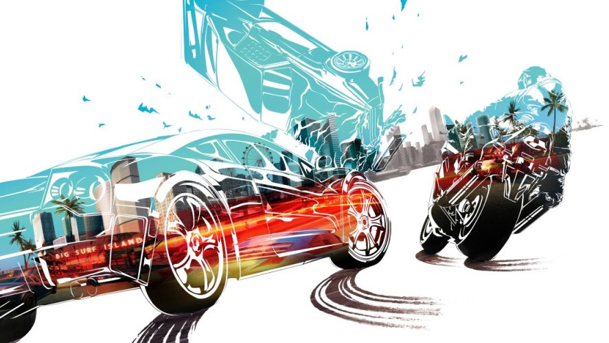
Criterion Games' fantastic open-world racing title Burnout Paradise Remastered is now available on the Nintendo Switch.
Let's just make this clear - despite the price being a "car crash" it's still an outrageously fast and fun experience that we would highly recommend checking out if you haven't already.
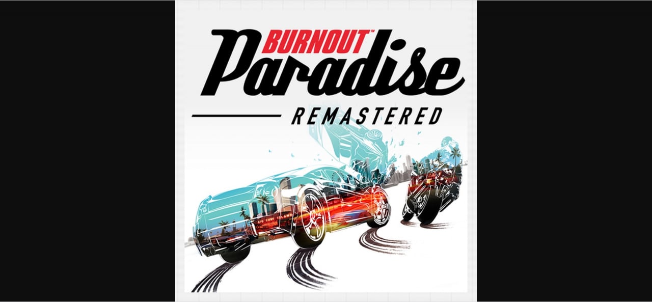
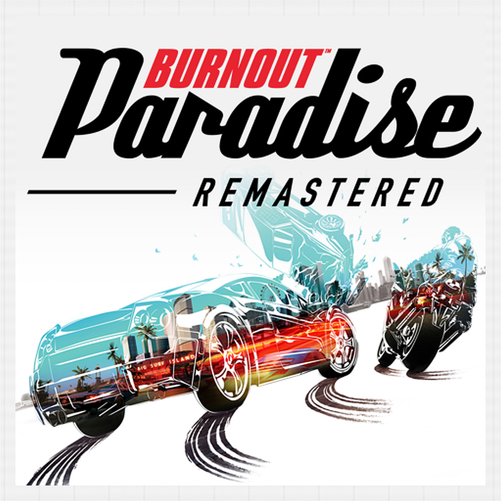
All that aside, there appears to be trouble in paradise. A Nintendo Switch subreddit user from Germany has noticed how the HOME Menu icon for Burnout has a border because it hasn't been "scaled properly" and well...they're not particularly happy:
I did not wanted to join the EA hate-train. And I was excited to get Burnout on the Switch ignoring the price tag. (edit: and I still am) But well ... it seems like EA really doesnt care about the Switch.
The icon for Burnout Paradise is not scaled properly and the grid of the graphic software(!) is still visible as a border around the actual icon now.
I am assuming EA is already aware of it and it is gonna be fixed by a day one patch. At least that is my hope. They are a highly professional company after all.
I know most people dont care. But for me a good icon is important. Especially on a pricey title like this. And since the Switch homescreen is all about the icons.
It just makes me very sad that nobody checked twice.
Here's a close-up:
While we can understand how some players might find this a little irritating, it's not the end of the world. It's also something that can be easily updated in the future. And hey, it could be worse.
Did you notice the border around this particular icon? How are you finding this remaster so far? Tell us below.
[source reddit.com, via gonintendo.com]


Comments 70
I seriously don’t see why this couldn’t have been the intended look. It looks completely fine to me.
With all that's going on in the world we need to complain about this?? If it wasn't brought to my attention I would have never noticed.....
Dude got nothing better to complain about?
I don’t see anything wrong with it tbh. I think the icon looks fine. It’s definitely better than the...
OG Lego Worlds Switch icon. *shutters...
I think it's probably intentional as without it the logo would go too close to the edges to look good. It'd look better if it was just all white but it's really not that noticeable so the icon is fine. Still not going anywhere near the game though.
And here I thought people made way too big a deal about the old Snake Pass icon.
The border is barely there to begin with.
Though yeah if you look very VERY closely, there's a grid there. That would be funny if that's an error.
Not sure why a reddit post that looks like a 4th grader typed it up is being taken seriously as a source, especially over such a miniscule issue.
Hum what’s worst... Complaining about it, or reporting about it.... can we expect an article on every single complaint on reddit about a switch game? Even if only high profile one?
This is news, really?
I’d rather no news than this news. QUALITY CONTROL PLEASE!
Don't mind me, I'm just here to complain about this website's complainers complaining about the complainant from reddit... and how today must be a slow news day (and yet we're all still here reading this article!).
I could hardly see it until I zoomed in on the picture above.
switch icon complaints are the bottom of the barrel, just in general
EDIT: 0 UPVOTES AND THE HYPERBOLE TAG FROM THE SWITCH SUBREDDIT, wow
the super saturated colours in the jumprope challenge game icon are way more of an eyesore in that screenshot lol, who cares
What a weird complaint
This is the quailty content I signed up for.
I mean I didn't even notice this at first. The icon isn't even that bad. I got why you complained about Snake Pass' icon because that looked like a mobile app icon, and even then I thought people were being too harsh.
Your garbage news "stories" makes me want to never go to this website again. There isn't even much reason to be here anymore. My news these days are from GameXplain and your YouTube Channel. Im just here for the community at this point.
I'm just asking for quailty control and not garbage reviews. I mean who gives an 8 to a gross port of Outer Worlds?
At least IGN doesn't have dumb posts like this.
Is it easy to complain about EA or do EA make it easy to complain about them?
edit : this is the kind of harmless news i love waking up to, please keep them coming
I don't think this is a problem. Looks fine.
That's it! I'm cancelling my order right now!
Who’s looking at the icon that long ?
You can’t see it when ur playing the game
-_- really. I love my switch borders as much as the next guy but dude you cant see it!
Please can articles like this not be posted as its so pointless and actually makes me more likely to not come back 😂 I know its slow in terms of news but come on really this is a post about nothing!
Millennials with the need to complain at everything.
Seriously???
Whats the point of this?
Dont see any problems.. grab a tissue and wipe those tears.
It might not be a huge deal but I think it points to EA's laziness.
I thought for a second there was a black border around the icon, this would have made the icon seem smaller than others if you were sing the black theme background, as it stands I can't see the slightest issue with this, far worse if the picture is bad, just like "Thimbleweed park" when it was released, then got sorted with an update.
Wow... as someone said before me.... Quality Control please
@mlj11 Ever thought about running for office? You spit the straight facts the rest of us are too scared to admit. We need this kind of brutal honesty.
They also need to drop the price too.. Hehe
Rolling my eyes.
ZOMG! The icon for the game doesn't match up. I must tell the world... as a news article instead of a forum post! Dun dun dunnnnnnn.
The icon is OK IMO.
However, again, being fair, you'd be surprised how much ppl care about the look of the Switch icons when posting on social media (twitter!). So I can see why the site put this up as an article.
I don't care like most replying though.
Even though I don’t get why this guy is having a winge, it would be nice feature if games had alternative icons that you could choose, especially with retro games, having the original art work for Sega Ages and Arcade Archives would be fantastic
And yet we still have that gross Sonic Mania icon.
2017 called and it wants its Switch icon fan dramas back.
I mean me personally? I blame Reggie.
When you spend hard earned money on something, you expect it to reflect your investment. You would expect something like this if it was £5-£9 and dumped on Switch to test the waters. Not from a premium experience. I (still) feel sorry for anyone that paid full price for this game, even if it is (still) good 12 years after it first came out.
Haha, let's complain about how someone else should have better things to complain about!
For such a huge price tag, the game did not deign to add the Russian language. But the PS4 and XBO versions have it. Well, at least for 60 fps "thank you".
Yawn! Come on Nintendolife desperate for news?
Who the heck cares!?
@Raccoonius i live in a german speaking country and no this dosent suprise me at all lol
Borders?! The person that picked up on this should’ve been around in the PAL SNES days, then they’d have something to moan about!!!
I don't even know what I'm supposed to be seeing.
I for one am HAPPY that the game is Version 1.0 out of the box and didn't require any patches. That to me is a VERY good thing and more companies ought to follow suit rather than dumping unfinished builds on a cartridge and hoping to patch things up by launch day.
I would hate for there to be an update simply because some idiot didn't like the menu icon.
For everything that seems to be wrong with the game technically in handheld mode to the price this seems like the oddest thing about the game to complain about.
@Toy_Link Well English isn't his first language so not everyone who writes things in English has a complete understanding of when to use certain words and the grammar.
First world problems ...
If the game works fine then who cares what the menu icon looks like! Just enjoy the game.
@Toy_Link I mean, the guy is German. It is not his first language.
@Mrnotultra NL has a quota to fulfill, that's why most of the articles on this site are crap just with the "random" tag plastered on it.
One of the worst Switch game icons is Starlink.
It's so dark you can't see anything, it's just ugly to see.
I think the boxart looks much, much better.
Someone hates EA and needed to find an excuse to complain. I am ok with hate comments twoards EA, but come on... at least protest for something that is worth complaining about.
I'm more bothered by the two subtlely different shades of white (one behind the logo, one behind the artwork)...
Man, and to think people wasted 50 bucks on this lol
This is the most non-issue issue that’s ever issued.
Bordering on the obsessive.
I am absolutely fascinated by the non-intersection of two groups on display here: graphic designers and Nintendo Life commentators. I am not personally offended by the logo at issue here (it seems somewhat bland, but it is clearly identifiable). Even so, knowing a few graphic designers, as I do, and considering the visual orientation of our hobby, I would have thought people would be more concerned...
I'm enjoying the game!
It really is a good game, this is my first time to ever play it so I paid full price.
******* psycho, seriously, chill out man.
People who do not notice or care, do not understand anything about game design interface ... seriously. How can they not notice or think everything is ok? There is a design department just to create this thumb and still create it wrong
I usually would care I suppose, but this ain't one of em. It's hardly noticeable and at least is symmetrical and frames it well. So no actual problem here =:3
Maybe they took it from the Master System box art.
It completely baffles me that somebody actually found this and thought it was an issue.
The saddest part is that NL staff will see all these comments and will (probably) ignore the feedback, continuing to post garbage content just for the sake of posting.
I truly hope im wrong and you guys stop posting everything that pops up on Reddit just to be with the "in-crowd."
@COVIDberry
You may be right. I've been working with designers for about a decade, though in copywriting roles, and this sort of thing is, you know, something people get paid to notice and correct. I mean, in the projects I've worked on, we'd have back and forths on the colors of ties and shoes in illustrated characters, and the exact frame when a cut or transition would come in, or the resolution of the most infinitesimal detail. So, having this icon be the wrong size is, from a design point of view, definitely worth complaining about, and it's curious no one caught it internally.
I never noticed. And while I Burnout Paradise on Switch (the only Burnout game I've ever played was the DS version), I like NFS Most Wanted U better.
@Toy_Link “A reddit user from Germany,” where last I checked, English isn’t their first language spoken.
@Raccoonius What we should be complaining about is EA still abusing Switch owners with higher prices than other releases. I've resigned myself to paying more for physical releases because of the cartridge format but full price for (digital release of) a game that cost 20$ on PS4 (physical) ?
Show Comments
Leave A Comment
Hold on there, you need to login to post a comment...