
Oh, hello there! We were so involved with the freshly released Super NES games on Switch we almost forgot about the big bout. Of course it's time for Box Art Brawl, the weekly showdown where three regional retro boxes battle to find out which was the fairest of them all.
Last week Mega Man 3 gave itself a sound thrashing, and it sure was a close one! North America was out of the running early on, but Europe and Japan grappled until the bitter end until Europe ultimately won out, securing the title by slim a 3-point difference. Congratulations to Mega, commiserations to Rock.
We had another brawl lined up for you this week, but following the 'surprise' arrival of the Super NES games on Switch, we're barrel rolling down a different path. This week we'll be seeing which one of the three varieties of Star Fox on the Super Nintendo is a proud McCloud who did his father proud, and which is a sorry Slippy Toad that got squished in the road.
Let's strap in and take a look at the pilots, shall we? And we promise, we're done with the 'barrel roll' references...
Japan
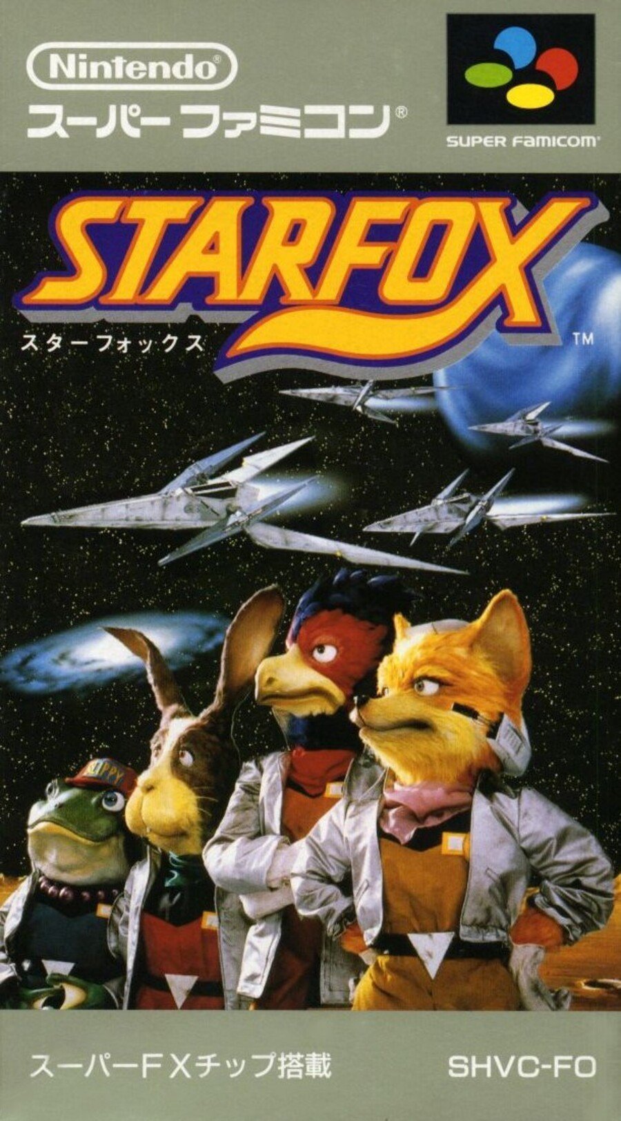
"Oh, Japan always wins!" Well, looking at the results of the last six brawls, we beg to differ! There's no denying that this is a solid entry from the east, though. The iconic puppets of the three heroic figures (and Slippy) standing proud in front of an epic star field with their Arwings (presumably on auto-pilot) speeding away from Corneria, out into the Lylat system with the Milky Way suggesting the vastness of space to explore and adventures to be had. Topped off with the bold, fox-tailed logo, we're off to a good start this week.
North America
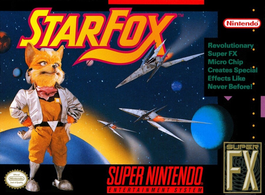
The North American version featured the same puppet version of Fox, but ejected the others and spun him around. He stands breaking the frame in front of various planets with three Arwings meandering through the Lylat System. The Super FX chip contained in the cartridge gets prominent billing here, with some text promising 'Special Effects Like Never Before!'
The standard black border frames it all and the logo's back, though without the 3D drop and slightly recoloured with 'S' and 'F' made larger. Some might say it lacks the dynamism of the Japanese version, others might question the composition - we couldn't possibly comment.
Europe
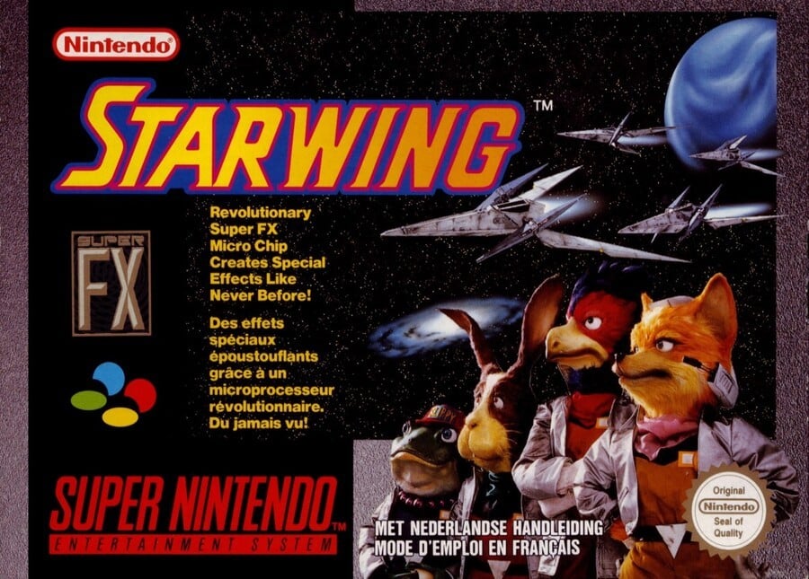
Finally, we arrive at the European version which combines elements of the previous two. While other variations exist (including one that expands the star field out, puts a rocky terrain behind the Star Fox team and adopts the black border and basic layout of the North American version), here we've got a granite-y grey border, yellow text bigging up the Super FX chip and the art from the Japanese version repositioned to the right.
Perhaps the biggest difference is the name change, though. Thanks to a German company with a similar sounding name, back in the day us lucky Europeans knew the game as Starwing. Let's not talk about what we called Star Fox 64. You might say that this one combines the best of both worlds, or perhaps it just can't make up its mind.
Bonus Stage
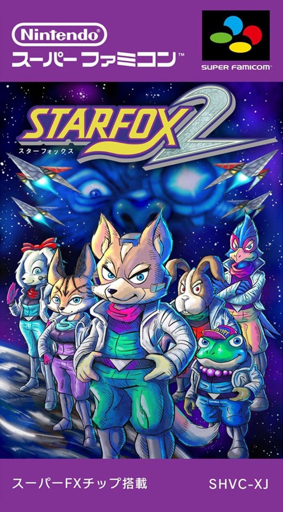
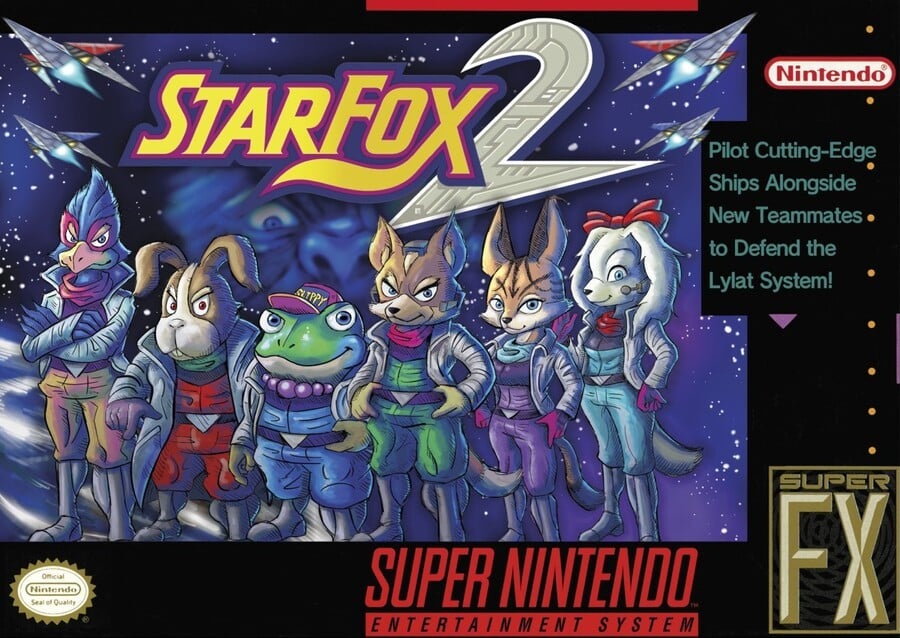
As a cheeky little bonus, let's also have a look at the box art Nintendo mocked up for Star Fox 2 which, after many years in purgatory, finally got released from the company’s Kyoto vaults when the Super NES Classic Mini launched. These obviously won't be in the poll, but it's fun to see Nintendo playing with its old box art formats again all those years later:
And there we are! All that's left to do is choose your favourite, click the corresponding pic below and hit the 'Vote' button to cast your vote:
Which region got the best Star Fox box art? (776 votes)
- Japan

- North America

- Europe

Please login to vote in this poll.
That's all from Round 7 of the Brawl! Feel free to voice your preferences and predictions below and we'll catch you again next time for another blast from the past.


Comments 61
All a bit grim, but I think Japan wins this time.
Want to vote Europe for sentimental reasons (StarWing!) but Japan wins again. Clean, uncluttered, quietly dramatic.
I kind of like North America’s version because there’s less text on the cover.
Starwing because.
Because I like hot wings
Japanese. It features the same muppet art as the euro one but without the super FX advert text.
Another victory for Japan. The image composition suits portrait much better. So much so, the EU version with the same piccy has cropped it to fit half a landscape lol! (Rubbish lol). As for the US version...umm...was this image taken moments before a horrendous collision? Also, devoid of any teamwork ;(
Nostalgia is a tricky mistress, because when I go back and analyze MOST (always some exceptions) box art from the 90s, invariably my conclusion is “they’re all sooooooo BAD!” Back in the day, I would gawk at these things. Now, I see it as the dark ages of design. There’s likeable design work from the 60s, 70s, 80s that holds up today so much better than the bulk of design work from the 90s. What the heck happened in the 90s?! Must have been some crazy drugs floating around.
Japan wins this time. Much more memorable.
@GrailUK Not all PAL box arts are the same. This is definitely the worst example. Take the German cover for example; looks a lot better IMO, bigger image and less text:
Still not as good as the Japanese cover, but they definitely picked the worst PAL cover for this poll lol.
Definitely Japan this time. It shows the whole crew and isn't encumbered by much text.
Peppy looks like a drug dealer in the Star Fox 2 cover.
North America. More colourful I think. Japan close second. I kind of like them all lol
Japan all the way. It's a box that tells you loud and clear 'this game, you must play It', no Super FX logo necessary.
@Octane Ah, at least the Germans have their heads screwed on. Eek, does this mean our Switch covers will take a hit with no deal Brexit? Boooo! Stop Boris Johnson!!!
Japan because it doesn’t have a lot of text.
To be fair, the american version's boxart is justified since Fox does all the work, while his teammates are too busy being chased down to do anything useful. He deserves all the credit.
They are all pretty bad tbh
This is why I removed the clips on my SNES that normally prevents Japanese games being inserted. Not only do I save tons of money on games: Mega Man X3: $200-300! Rock Man X3: 20 bucks. But the cover art is almost always better.
Also, what’s with the weird prosthetics for feet? I always wondered that when I was a kid lol
Box Art Brawls Current Total:
Europe: 2
Japan: 4
North America: 1
A lot of people here not liking the Super FX mention. That was the major selling point of the game and definitely needs to be on there. Voted the European box art, despite it being a little wordy.
Voted NTSC-U out of nostalgic, I remember my 10 year old self getting offered to take a huge chunk of SNES carts from a bag because they were moving out of the country and didn't want them.
I started quickly checking if there's a specific game I wanted, and pulled out this creepy looking puppet guy thing, luckily I had played Melee a ton by then so I knew Star Fox was supposed to be important or something so I grabbed it.
I didn't like the game, but I had also pulled out Batman Returns and Star Wars VI, so it was all good.
Close between Europe and Japan for me this week, I voted Europe because the puppets seem a little too big in the Japanese version.
Not to be mean, but those Star Fox 2 covers look so amateuristic to me..
@Franklin I'm sure I've told you this before, but I still laugh when I see your profile piccy lol.
all l can say that Fox looks ugly n creepy on all the box arts, but once again Japan always gets the best art box.
Once again, I found myself torn between choosing the Japanese and European box art for this round. In the end though, I chose the Japanese box cover, because at least it got the name right.
I voted Japan because it looks more dramatic.
I wonder what they did with the muppets/stuffed animals afterwards?
Japan wins this one. The NA cover is just a bit boring with it being only Fox, and the EU cover is too cluttered with text.
Nintendo spent a lot of money financing the development of the Super FX chip, they wanted to make we'd be impressed by it back in the day!
So that is why it got a huge mention.
Japan, looks like it could be a movie poster
The NA one has less noisy text than the EU version, and it gets the name right. But I have no clue what they were doing with that image composition.
On the other hand, the EU handles the background better. But the text is too messy, and I hate the name change. At least for that version. GrailUk shows a German version that's a lot better.
Overall, though, the Japanese version is superior on all fronts. I mean, I much prefer the box shape of the NA/EU SNES games. But their artists definitely utilized the vertical length of the box to good effect.
Europe obviously, as it’s called Star Wing ☺️
Japan is the best of the Star Fox 1 art, but that Star Fox 2 artwork is the overall best.
It's going to look dated no matter what, but at least with the darker color balancing, the European box makes the planet and nebula not look like stickers or bad photoshopping.
America. What is this? Fox is Galactus or something? Dipping his feet in some cool, refreshing PLANET AQUAS before he gets attacked by gigantic space fighters? What's with the yellow corona? Nah.
Japan, easily.
@Mr_Muscle All the pilots have their lower legs cut off so they can fly arwings. Has something to do with blood flow and inertia while flying. Realistic I guess but rather dark...
@Octane Honestly I might've picked EU had they used this version instead. Thank you for sharing this; I did feel like something was off there, namely like I've seen better PAL box art around for this game.
Even ignoring the name change, the European version is just a smaller version of the Japanese box art with the extra space used by a bunch of annoying, overly large text and logos, so I don't see how anyone could vote for it.
@Leuke That theory has been officially debunked by Nintendo, while "Game Theory" pointed out that the supposed reason behind it wouldn't work, anyway. Despite how their boots look, the Star Fox pilots are not amputees.
@BulbasaurusRex Well I stand corrected. I can't help thinking amputation was the original story, though. All the art for the original Star Fox looks like robot legs, so perhaps they retconned it.
@Leuke Holy crap that is freaking scary. Thanks though! Made my, uh, weekend?
The Japanese version again.
For me I think it's gonna be the Japanese version 99% of the time.
Gotta say the Japanese version, mostly because it has the whole crew. Star Fox isn't just about Fox, ya know!
...Even if I agree with some of the points, shouldn't you be less blatantly biased on a vote you're running? You kinda praised the Japanese version and dumped on the North American version pretty quickly and clearly on this one.
Gotta admit, the Japanese version is best. The NA version has potential, with its much brighter coloring than the others, & I can see a much better composition being made here, but it never seems to come together. The EU version, meanwhile, feels like it's a messy version of the Japanese box art, cutting it down & slapping a chunk of text to the side to offset the thing.
Is the image of Fox an actual photograph of a puppet? Something about it is super creepy. Also, somewhat related, does Fox have robot legs? I am realizing now I don't know much about Fox aside from barrel rolls.
You should have taken the German PAL version to represent the EU boxart.
The UK/Dutch EU version shown here looks like a second run re-release.
The Japanese one is my favorite simply because it shows all of the characters. Yeah, the European version does too, but the title on that one completely ruins it.
Had to go with EU because of nostalgia. 'Nederlandse Handleiding' for the win!
I just love the colour of the box for Starting. It's the one I know. I know it's not the ideal name for it but it still gives me all the feelings.
all of the options are trash
@Nintendolife I’ve been away for a while to find out you have all kind of new series(ranking best games for GC and this for instance). Great stuff!
Japan clearly wins of course. You want those puppets to shine.
Japan by far. It feels like a movie poster. EU one has waaaay too much crap on it and whoever thought it was a better idea to have Fox stare into oblivion alone for the US version?
Japan for me - closely followed by Europe.
A few musings on these:
NA - why only show Fox and not the other main characters?
All - why no sign of any threat or opponent?
All - what's with the Jim Henson puppet look and feel on the characters?! It's really cool, but it's also kinda creepy!
EU - I know they decided to change the name but I'm still surprised they didn't integrate the Fox tail into the game title's lettering - I guess by choosing a name that had a letter that it could be applied to? Even stranger that StarFox 64 and Lylat Wars both dropped the Fox tail entirely.
Holy crap! I'm 7-0 in terms of siding with the majority on these so far! I'm usually not that closely synced with "the masses".
As far as Star Fox 2 NA vs JP, they actually have all the same assets on them, just shuffled around. As such, it all comes down to positioning, and in this case, while on first blush, I initially preferred the NA version, after a second look, I would vote JP.
There are things I like better about both. But the ultimate tie-breaker for me is actually Andross in the background. He looks super imposing, particularly that non-standard eye....which is totally obscured by the Star Fox logo.
Love these! Do Ogre Battle 64!
North America loses, and it seems I am not the only one.
Japan easily.
The dutchBelgianFrenchUK version looks hopelessly cluttered
and the American version is just dull.
Japanese box art all the way:)
Not really liking any to be fair but the European one just shades it for me.
Show Comments
Leave A Comment
Hold on there, you need to login to post a comment...