Ding ding! Round 6! Welcome once again to Box Art Brawl, the series where regional retro box art variations duke it out to discover which one rules the roost. Last week we saw Super Mario Kart race itself ragged until just one version took the chequered flag. The winner? Super Mario Kart, followed closely by Super Mario Kart, with poor old Super Mario Kart bringing up the rear.
We jest - Japan collected the Gold Cup last week with North America not too far behind and Europe picking up Bronze with just over a tenth of the vote. Those covers shared many similarities, though - this time the competitors are a more varied bunch. Yes, this week Rockman will take on the Mega Men in the bluest brawl you've seen since your gran got drunk at that Carlin gig in the late '80s.
We've chosen the third entry specifically to level the playing field a little. It took until the third game for the east and west to get on roughly the same page as to the Blue Bomber's design on the box; we're not sure they were even reading the same book before this. Of course, there's plenty of nostalgia in those 'so-bad-they're-good' western versions of the earlier pair - and we may go back to them in the future - but let's make this a fair(er) fight, hmm?
Without further ado, let's take a look at the brawlers. In the blue corner..., hang on, that's not going to work.
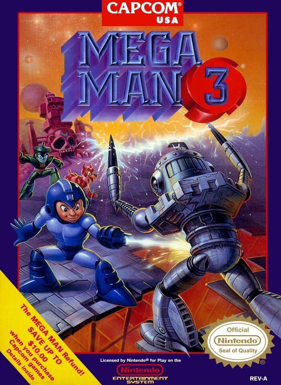
North America

While his face still has something of the leprechaun about it, Mega Man appears appropriately proportioned here as he blasts an oncoming enemy sans pistol. You can see Rush in the background and a splash of reddy-orange in the foreground mirrors the starry sky. The whole thing's finished off with Capcom's trademark blue border. Tidy.
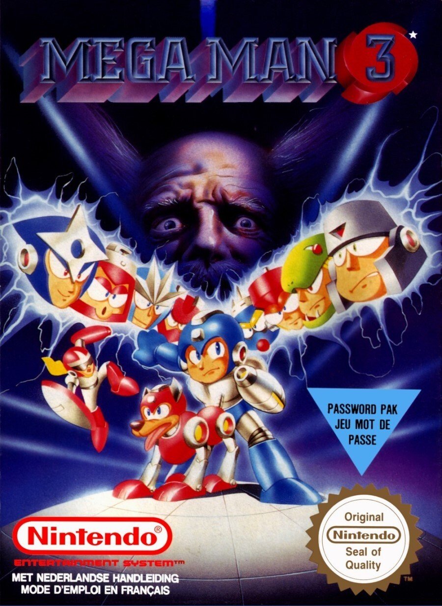
Europe

The European variant lines up the heads of the robot masters behind the hero with Proto Man jumping out in an unsportsmanlike fashion. We like to think that Mega Man's outstretched fist is ready and waiting for his opponent's face. Rush takes centre stage with his master as the disembodied head of an unhinged (and oddly realistic-looking) Dr. Wily stares at you menacingly from the rear. The Blue Bomber is sporting a little more silver than you might expect, but it's definitely him.
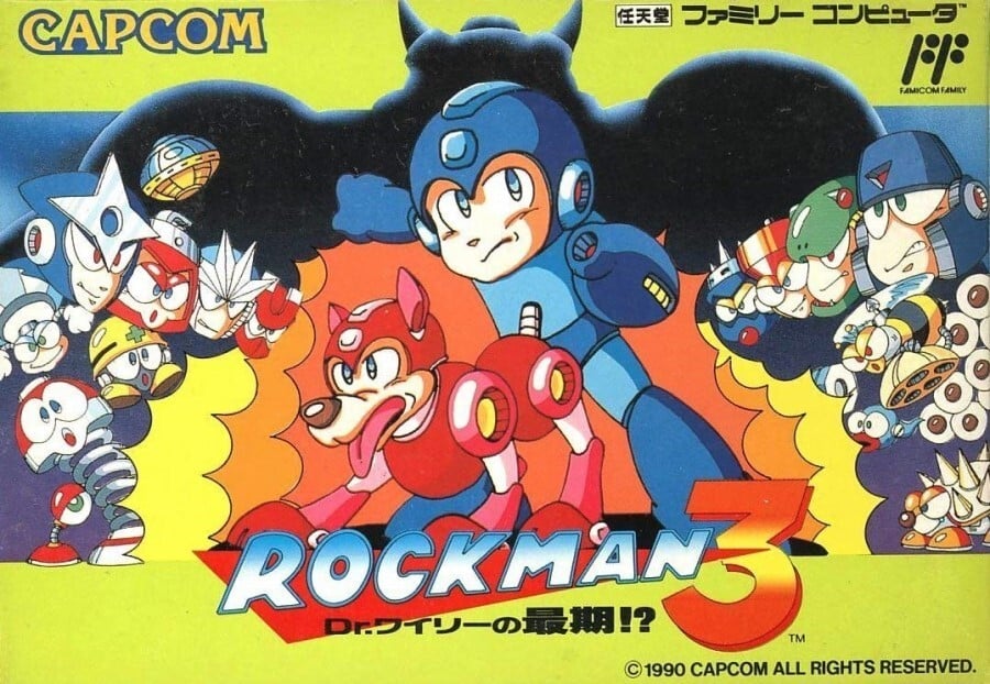
Japan

The Japanese version seems to have provided the template for aspects of the European cover, although there's more colour and the landscape perspective naturally changes things. It throws in a bunch of enemies with a unified style and its certainly vibrant, using virtually every option on the colour palette in one part or another.
And there you have it! There are aspects of each of these that we like and dislike, so it'll be most intriguing to see how the vote goes. Whatever your criteria - compositional harmony, palette, style, sheer nostalgia or any other factor you care to use in your decision-making process - simply click your pick below and hit the 'Vote' button to power-up your chosen brawler:
Which region got the best Mega Man 3 box art? (667 votes)
- North America

- Europe

- Japan

Please login to vote in this poll.
That's all from Round 6 of the Brawl! Feel free to voice your preferences and predictions below and we'll catch you again next time for another blast.


Comments 68
I don't really mind... as long as it's not NA. It looks horrific to be frank
America... the birthplace for many ugly Mega Man box arts.
I went with Europe because Protoman
It's funny how the European covers for 4 and 5 used the American boxart, but changed Megaman's face to the more cutesy anime style.
That smug on Mega Mans face while shooting the robot in the crotch...
Nice one, NA
Definitely Japan, it has a classic 80's cartoon look to it and the art style all around just works. The NA box makes Mega Man look kinda weird, his face looks kinda freaky. The European box isn't bad, but that somewhat realistic head in the background looks really odd with the otherwise very cartoonish characters.
Europe hands down.
Megaman on the NA box art looks like he should be on a particular register.
It's Japan. It's always Japan. Why do white people do weird s#!t to the box art
Japan, it looks like a Saturday morning cartoon.
Totally Europe on this one. Japan looks like something a kid doodled in their notebook at school, and NA just looks demented and not in a good way. It doesn't help that he is leering at the enemy's crotch in the NA version (shooting the belly maybe, but definitely looking farther down).
Box Art Brawls Current Total:
Europe: 2
Japan: 3
North America: 1
Dang, not every day Europe wins the box art war. I wonder if UK will start getting its own box art from November onwards?
Europe. That style is very reminiscent of the time. You could use that for an action movie title. The Japan one is forgettable. And the US one... just no.
@Friendly I wouldn’t say smug. To me it looked a bit vindictive. Like a bad guy inflicting pain, but to a specific bit.
American mega man was a bit insecure, maybe?
Europe, for Wily, and only for Wily.
Different strokes, I guess. Personally, I think the Europe one looks terrible, especially Wily in the background. I couldn’t decide between NA and Japan. I’m sure my nostalgia and love for the series makes me think my NA box art is good.
@JayJ I totally agree! I'd go with the European box art if it wasn't for the clash between the cartoon megaman characters and Kazuya Mishima in the background...
In this case, Europe, hands down.
I like the cartoony look of the Japanese box art the best. The self satisfied look on Mega Man’s face for the NA one is priceless though.
Mega Man 3 is my favorite of the original Mega Man NES games. I know a lot of people like 2 better. But I think 3 is better than 2 in every way. Levels. Bosses. Music. Etc.
I picked the Japan one. Probably would have gone with the Europe one but the giant Wily head doesnt fit with the rest of the art on the box.
I went with NA this wee- ok, I can't keep a straight face typing that!. Erm, close between EU and JAP this week. EU looks more polished with the decent recolour, however Heihachi (I refrained from saying big Wily) lurking in the background just doesn't suit. So, close, but JAP gets my vote. Maybe I'm just a sucker for simple manga art (besides, the extra robotic minions are a bonus!)
Dear lord who picked North America?! WHO?!!
I'm surprised that Europe is winning and not Japan. I personally thought Japan's was the best one.
America MegaMan looks terrible but had a cool background. Eu has worse background and that Wiley head... And that akward position mega Man and Rush are in.... What the hell?
Has to go to japan. Japan being the most normal. So strange
The Europe one looks like it's targeting a sonic audience.
I'm down with the USA version this time...tho it's made cheap with all the poor fonts and sashes
Always loved the JP boxes for the Mega Man games...
Who voted for the American box art, lol.
Anyway, a more interesting poll would've been the box art for the original Mega Man. I just LOVE the European version. It really has that old school theme of not following the source material exactly, but at the same time it's still as accurate as you can get, and the art overall looks amazing.
Don't mind me, I'll just be over here...wondering why anyone would vote for the abomination that is the American box art.
IF Mega Man didn't have a monkey face, I'd have voted for the NA cover, because I think it's quite striking.
Not sure what's going on in the European cover, but it's boring.
As usual, Japan wins.
I voted for Europe because of the trippy realistic Dr Wily head in the background.
I'm going with Europe on this one. That Dr. Wily probably gave some kids nightmares.
I like the action in N.A.'s. Europe and Japan's are boring portraits.
Easily the Japanese art for me, although the UK box art is interesting in that it looks like someone copied the design of the Japanese one but coloured it using airbrushes (or something, I don’t know art stuff).
Japan, as it captures the essence of the game the most.
Europe, just because Wily's face looks hilariously distraught.
American Box Art Mega Man shoots Spark Man's crotch off while Top Man and Rush watch uncomfortably
European Box Art Wily is always watching!
It has to be North America!!! I remember this cover as if it were today. MM3 was my first "real" game ever. The one I could play by myself on my own NES without having to go to friends' houses. I have really fond memories of this one
I vote for the original Mega Man 1 cover, for the US.
@Noid Or just the face of outright obsessed madness. It's an excellent artistic choice.
I clicked this article expecting to vote for the Japanese box cover, the European one is clearly the best one here.
Definitely Japan on this one. The anime look, while simple, best represents how the creators envisioned the characters, so it has to win.
The american cover is hilarious, that one definitely. Though the european cover is pretty cool as well.
I liked everything about the NA cover except how mega mans face looks off / wrong. I chose Japan because the art looks right, but the rest of north America’s cover is good I like the landscape etc, classic blue border. Europe’s cover.... scared me.
I chose NA's cover because I love just how bad it is.
I was torn between NA and Europe. I voted NA. The realistic Wily, while hilarious, is a little off putting.
North America looks like a mature man was used instead of a younger guy. It missed it's mark though
North America is the best because mega Man has a terrible grin while shooting the guy right in his......
@NintendoByNature but it's an evil grin
@Alucard83 the best kind of grin
Picked Japan over Europe for having the proper antagonist. If you remember, Dr. Wily and Dr. Light were working together to build a peace-keeping robot called Gamma until, well you know what happens. So it makes more sense for Gamma to be lurking in the shadows than Wily making his "I surrender!" face in the background. The story was only available in the instruction book at the time; MM1 and 3 are the only ones on NES to not have an opening cutscene.
@Friendly
Or is it the other way around? I think the robots firing off his crotch rocket. or maybe its a lightsaber.
Jesus, the look of sheer existential horror on Wiley's (?) face on the European cover. It's like he's wondering what abominations his hubris has unleashed upon the world.
I like the NA cover, if only because of that refund I've read so much about.
This one's tough, actually. I went with the EU cover.
Dr Wily's always watching
@talgore And now I can't un-see it...
Why is wiley looking so realistic in the Euro one? He looks like Emperor Palpatine.
Did Mega Man 3 only have one PAL cover art, compared to its predecessor which I think each had at least two variations among different "PAL" countries?
(only some getting the MM2 art known as the "Patrick Stewart bowling pin" cover )
Japan or Euro. Just not USA. Mega man shooting that robot in the crotch and castle gray skull in the background just looks sooo tacky and bad
I was gonna vote Japan automatically but then I saw Europe. That gets my vote.
@Noid That's half the reason I voted for Europe. XD
@talgore I...I didn't notice that till you said something. 0_o
I don't get why Nintendo always felt the need to change the packaging so much back in the day. I think only the Wii era and later did they actually use the same size and shape box around the world.
Is that the best scan of the Famicom version you could find??
A close one but I think Europe
@Wavey84 I completely agree. I remember not having a problem with the face and trying to copy the art work when I was younger. N.A.'s definitly more thoughtfully done.🍻
@Wavey84 Yeah I have to admit that once you get past the awkward face, the NA box art has by far the best background art work. The European box art is definitely the worst IMO, they just took the character art from the Japanese version and cheaply enhanced it while awkwardly laying everyone out on a generic background with a freaky looking giant head that has a completely different art style. The whole thing looks mismatched and like some intern just lazily slapped it together.
For me, Japan, because that's the most correct artwork for Megs. NA will always (like MM1 and 2's box arts) have a special place in my laughing heart. As for Europe, I see it's gotten a TON of love to rival Japan lol. It has so much W in T entire F I have ever seen from gaming box art! Silver and blue Mega Man (it's like the two-toned green and blue Mega Man from Captain N lol)? Realistically constipated Wily?? Lmao, for me, this was my best laugh of the day-- For the rest of Europe, it's just a Tuesday...
Show Comments
Leave A Comment
Hold on there, you need to login to post a comment...